-
SERVICES:
- Packaging Design
- Concept
- Art Direction
-
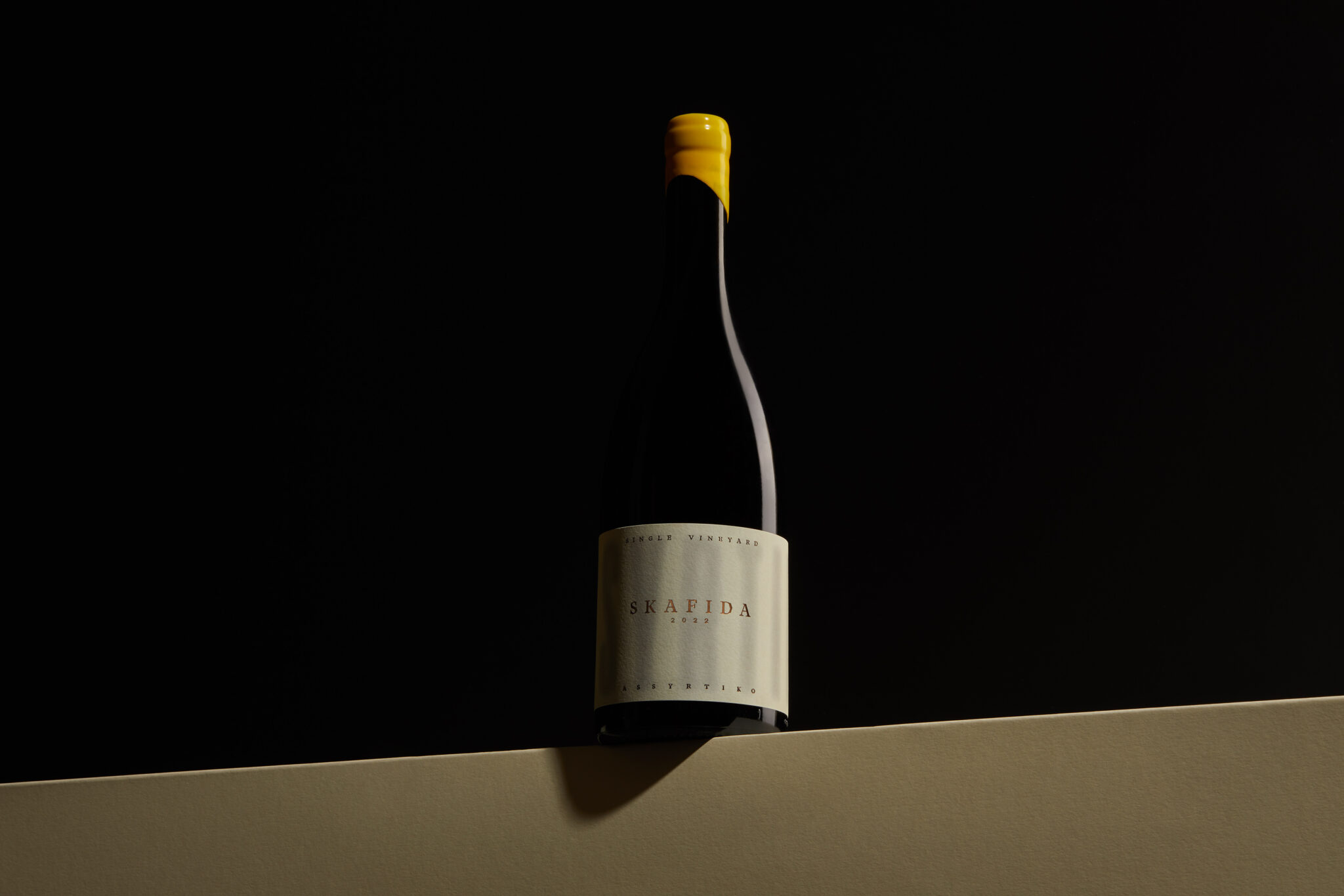
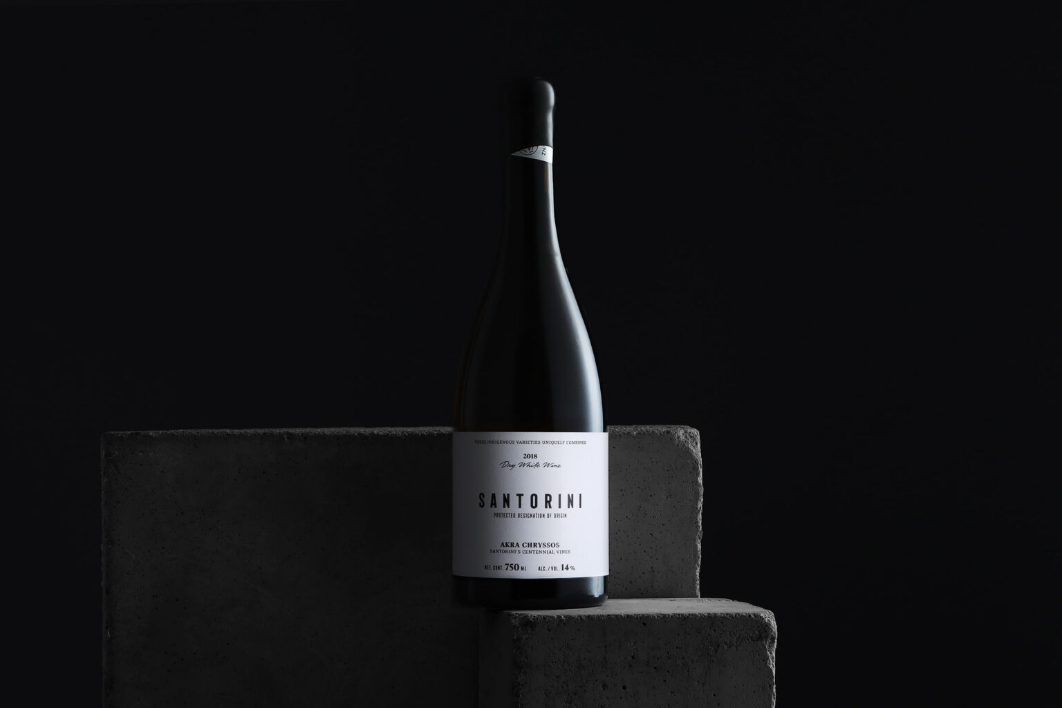
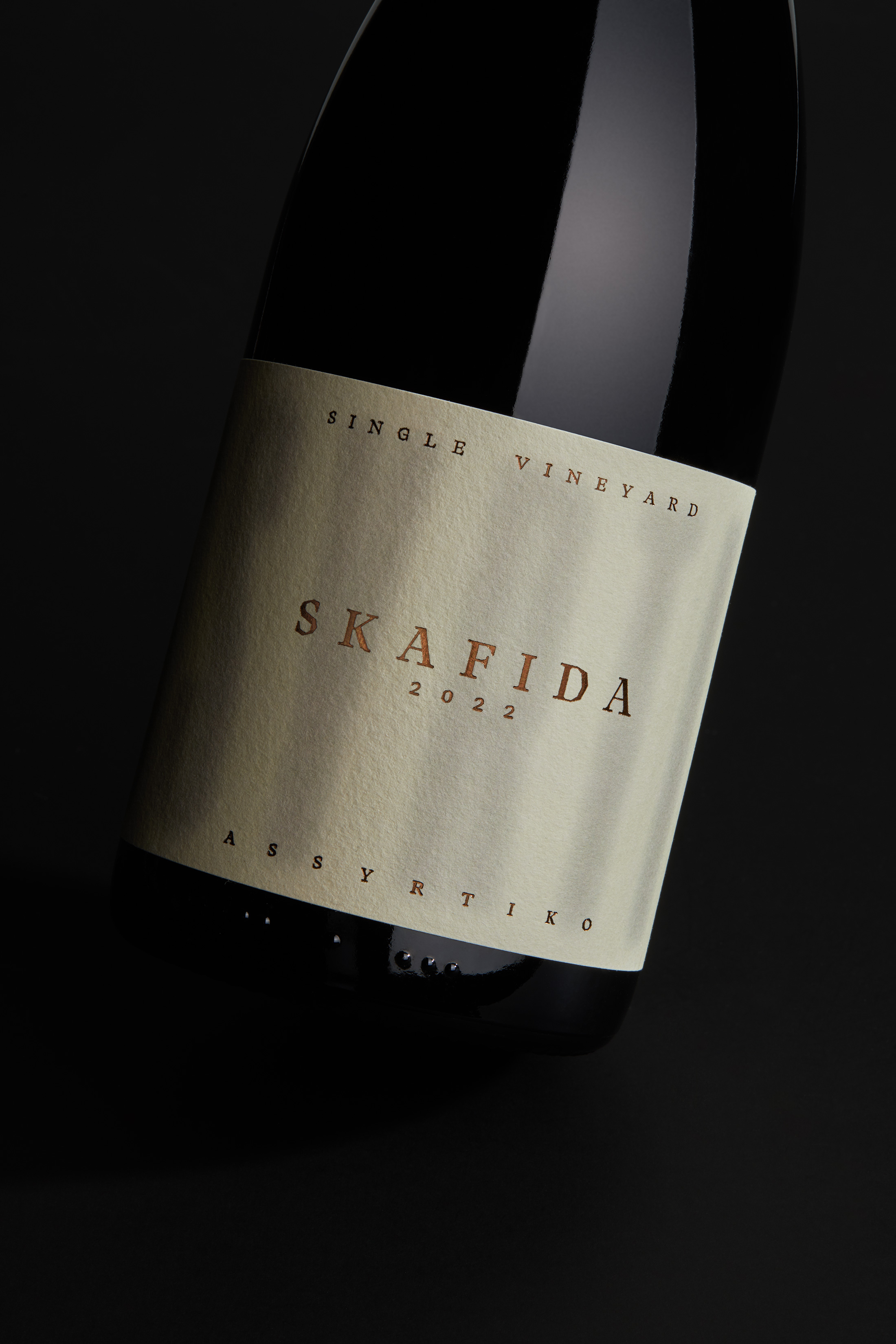
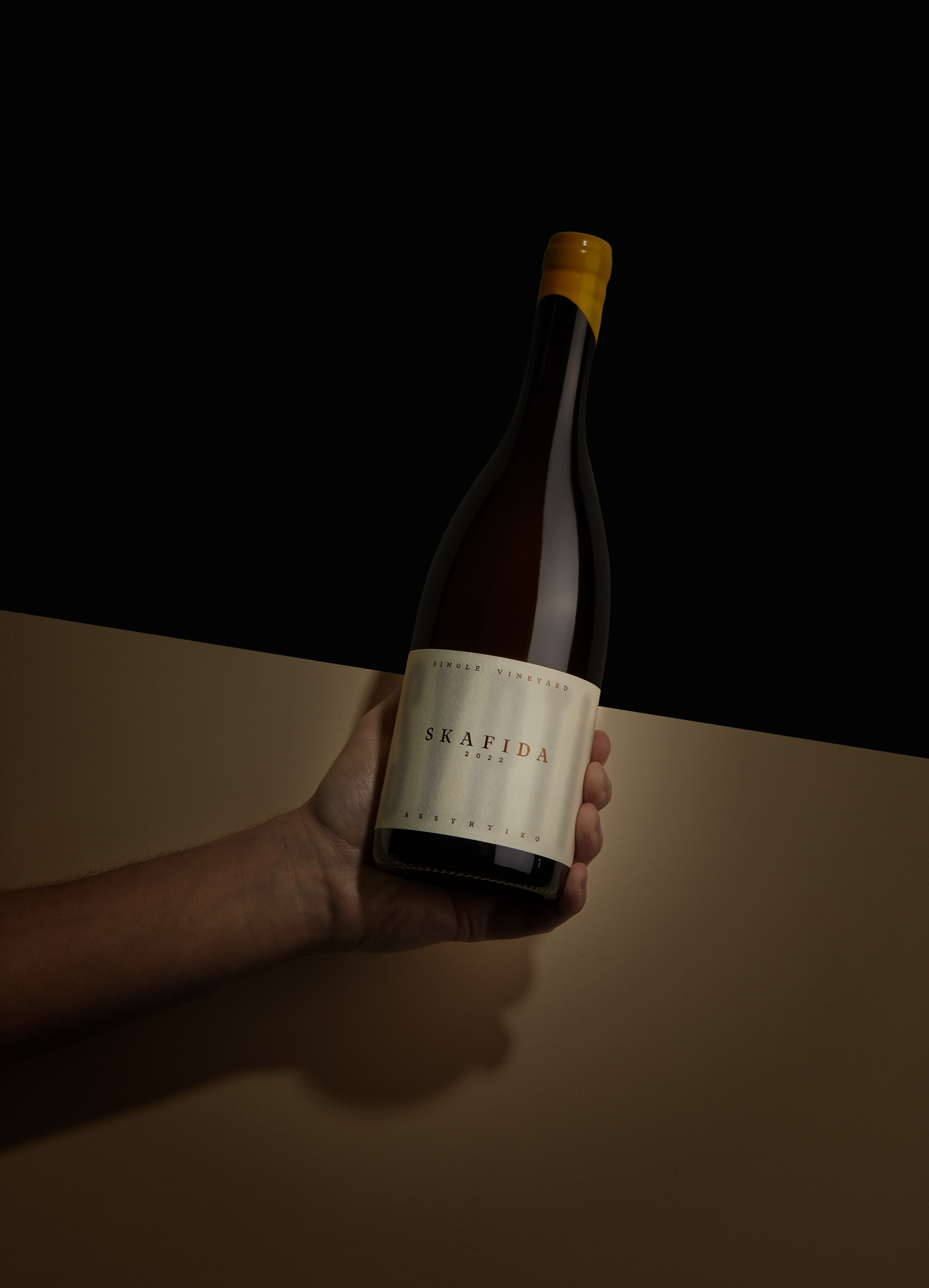
The design of the Skafida wine pays tribute to the enchanting mornings of Santorini island. The hazy typography “ASSYRTIKO” adorning the label’s background echoes the ethereal mist covering the vineyards in the early hours.
This phenomenon is inseparable from the microclimate of the vineyard and the cultivation of Santorini’s exquisite wines, while also subtly and distinctly communicating the wine’s variety.
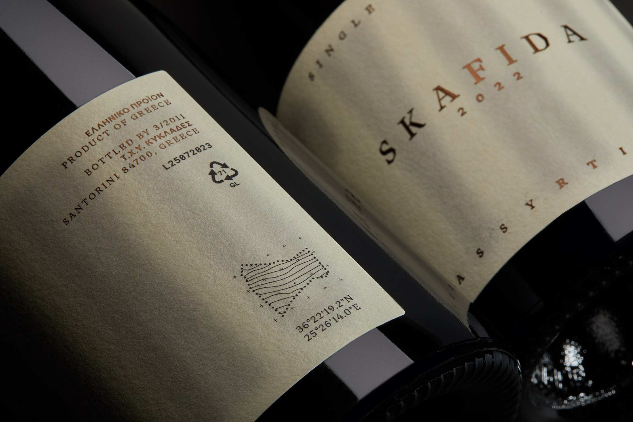
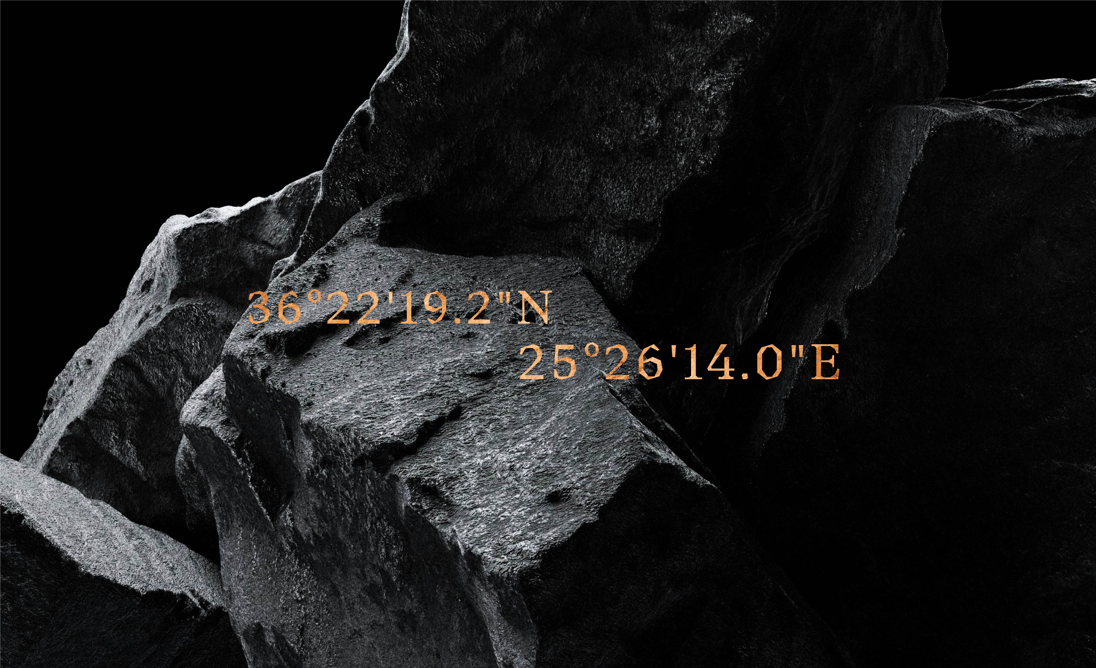
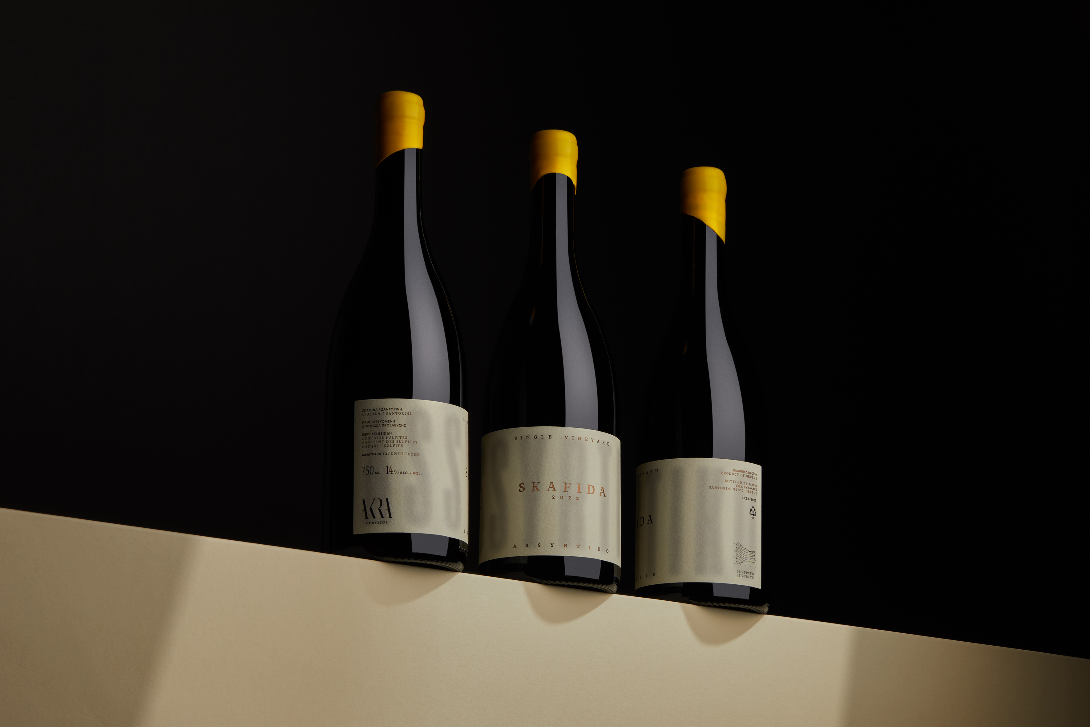
The name “Skafida” originates from the unique geometric shape of the specific vineyard. The characteristic geometric shape of this specific vineyard resembles a “trough”, as referred to by previous generations and is schematically depicted on the label’s back as a map to scale. The addition of this map and its coordinates is not just a decorative addition but a fusion of functionality and design, symbolizing the intersection of precision and craftsmanship.
The bold geometries of the typography harmonize with the “wild” natural landscape of the vineyard, while the overall text is laid out with precision, aiming for easy peripheral readability.
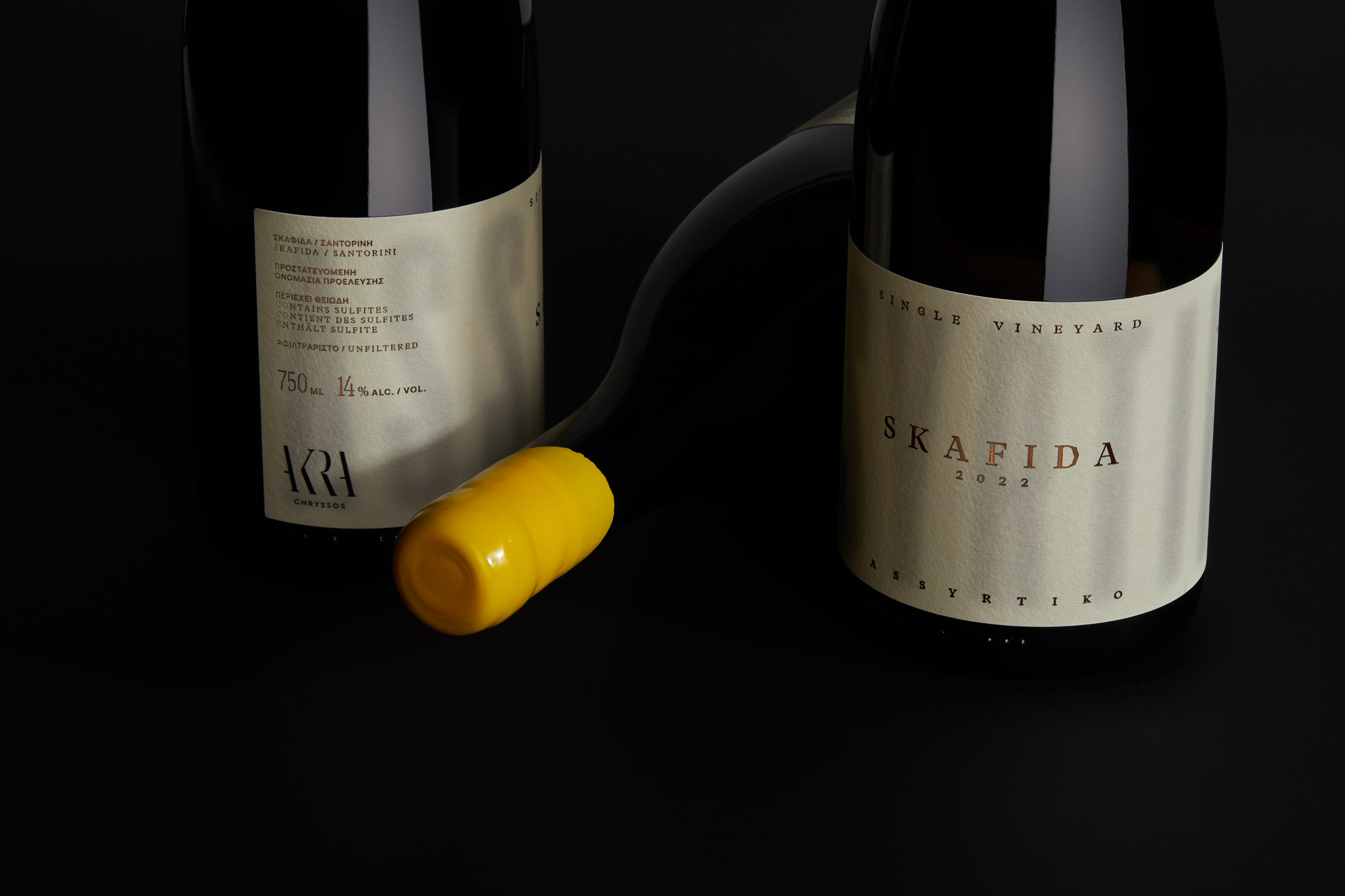
The brown hot foil stamp on all typographic elements enhances the premium status of the wine, the flagship of the Akra Chryssos winery’s overall range.
THE BROWN HOT FOIL STAMP
ON ALL TYPOGRAPHIC ELEMENTS ENHANCES THE PREMIUM STATUS OF THE WINE, THE FLAGSHIP OF THE AKRA CHRYSSOS WINERY'S OVERALL RANGE.
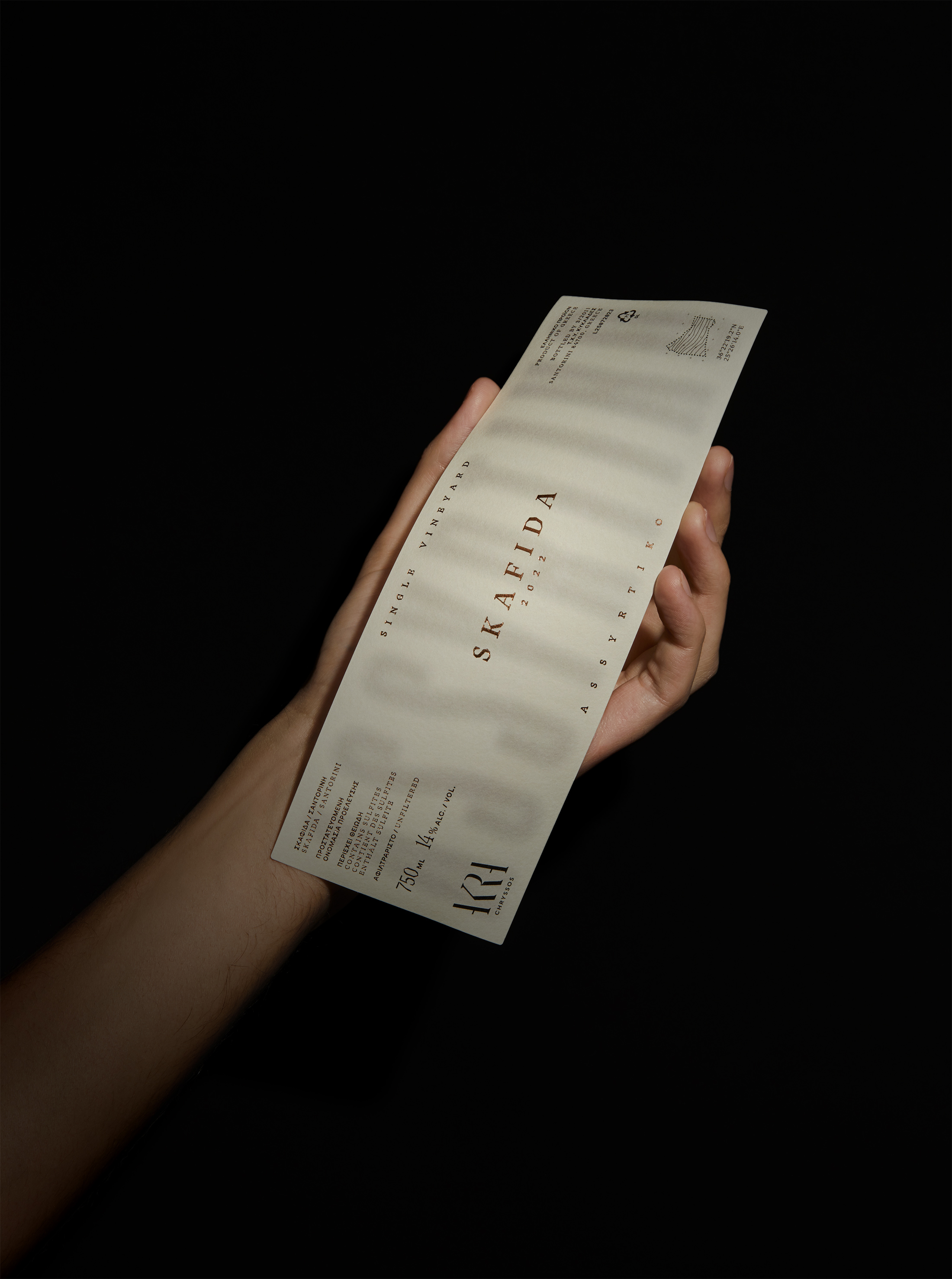
THE CHARACTERISTIC GEOMETRIC SHAPE OF THIS SPECIFIC VINEYARD
RESEMBLES A "TROUGH", AS REFERRED TO BY PREVIOUS GENERATIONS AND IS SCHEMATICALLY DEPICTED ON THE LABEL'S BACK AS A MAP TO SCALE.
RELATED PROJECTS