-
SERVICES:
- Packaging Design
- Concept
- Art Direction
-
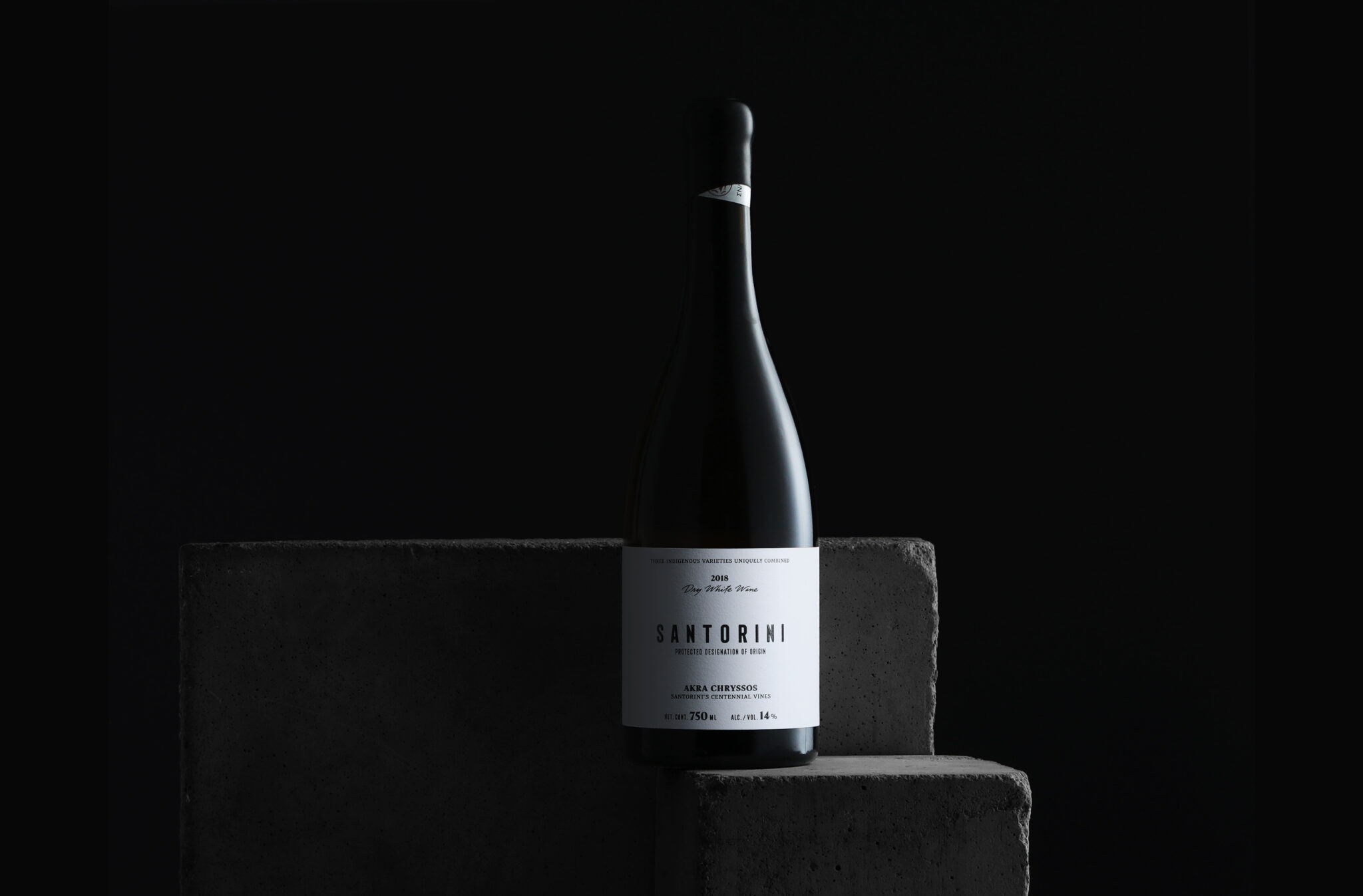
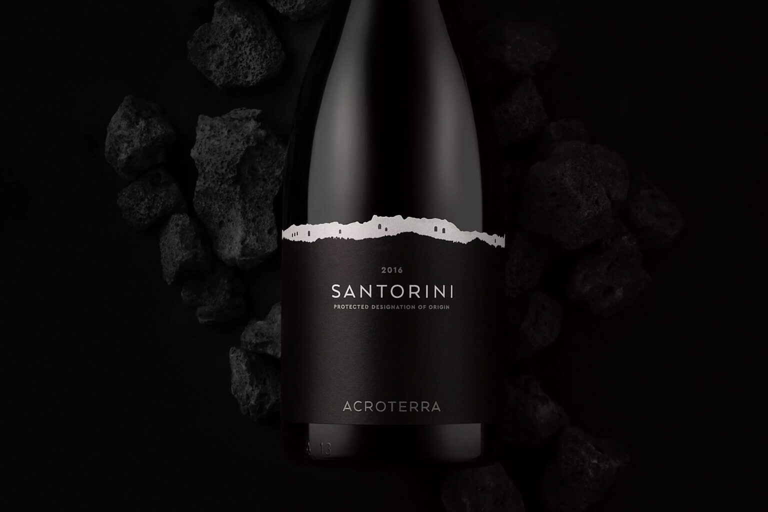
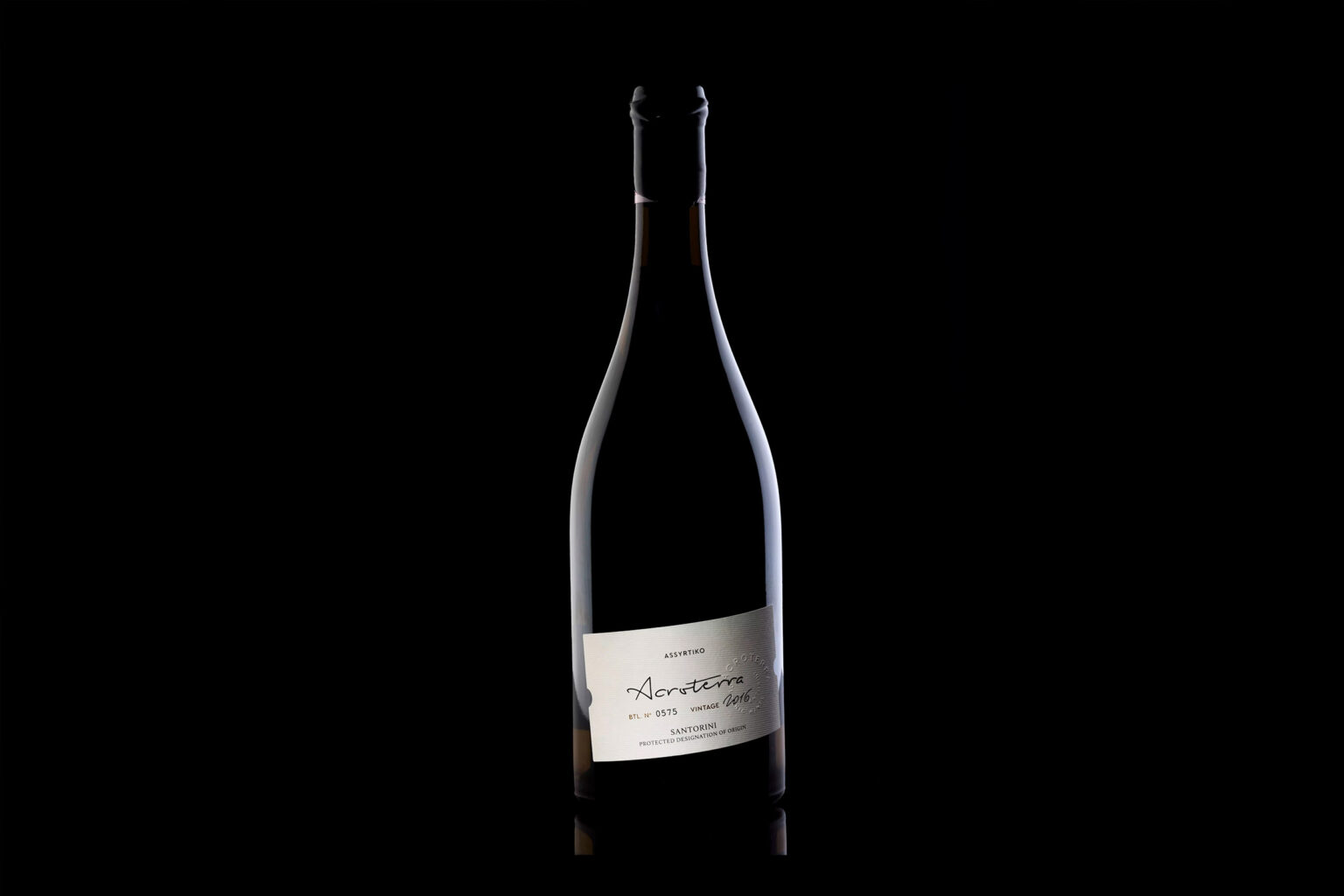
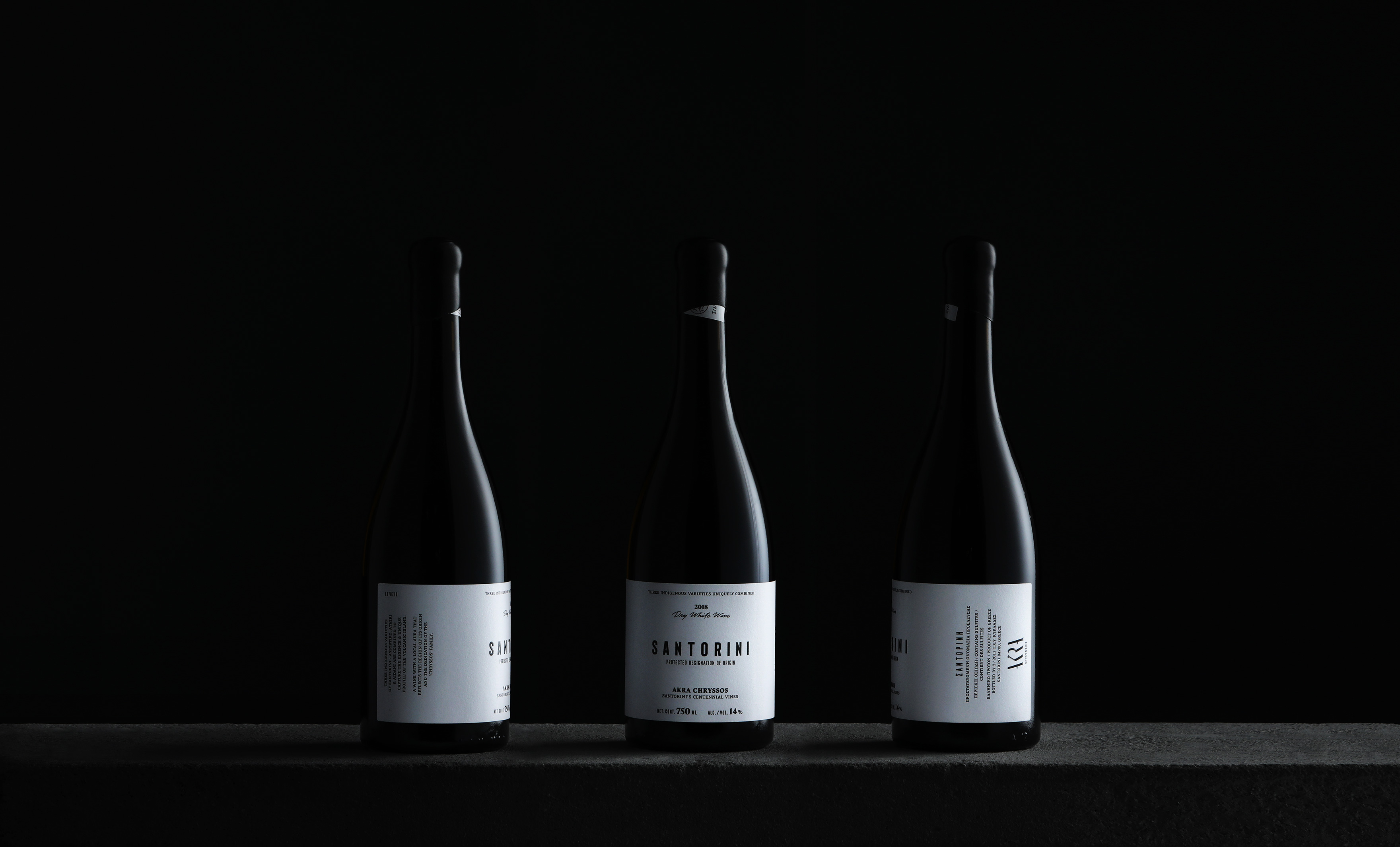
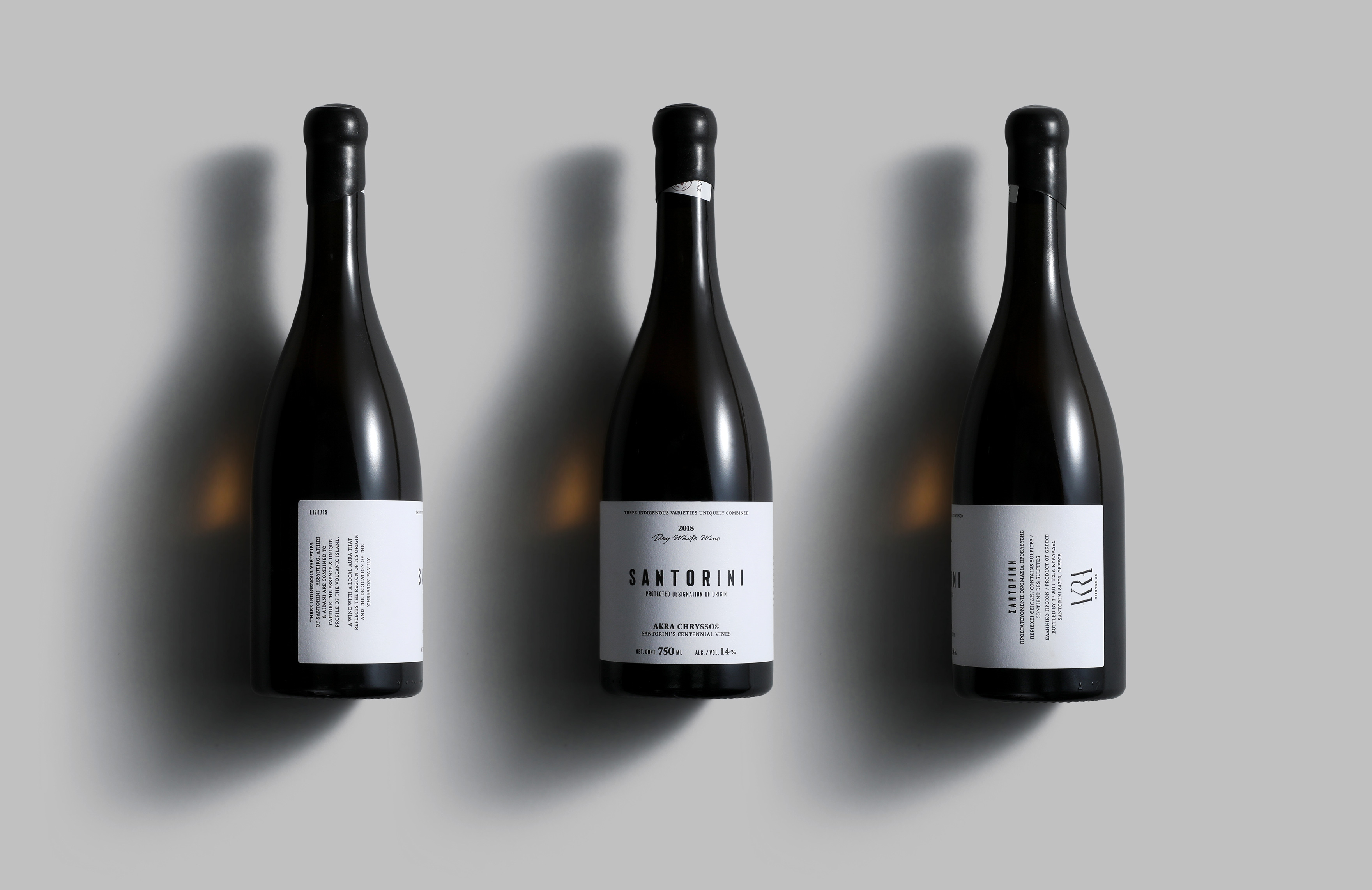
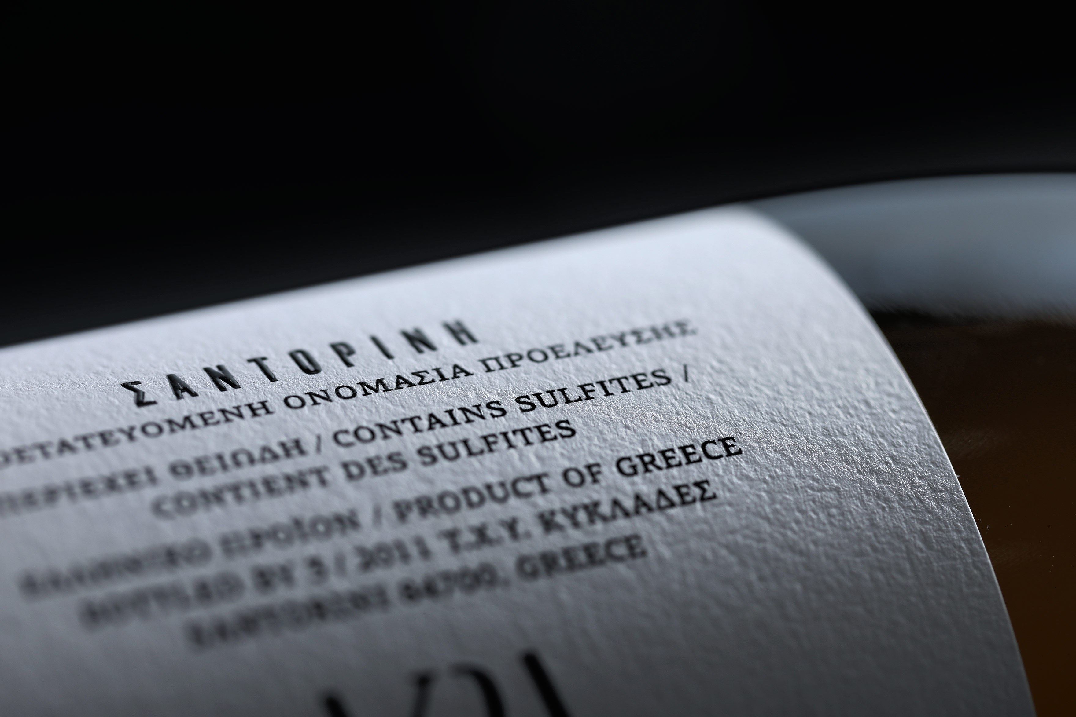
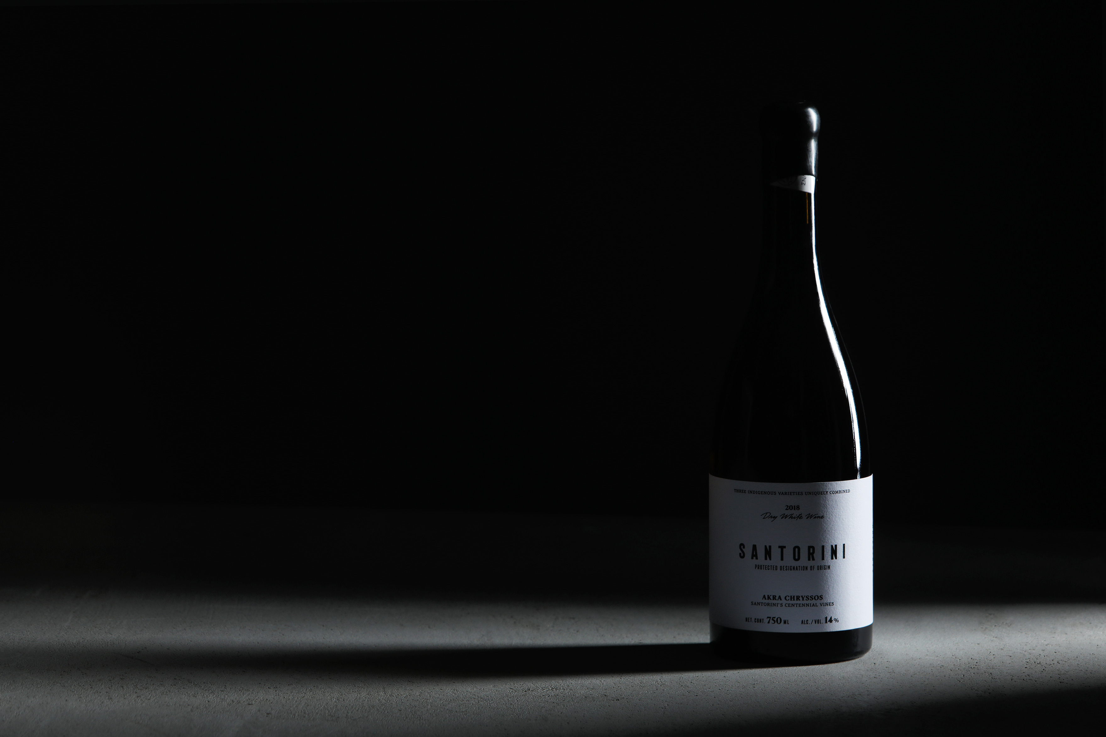
Label design for a premium wine from the volcanic soils of Santorini.
For a wine from one of the world’s most famous terroirs, intended for wineries, wine bars, restaurant owners and wine lovers, it was important to focus on communicating the name of origin. We avoided all the cliché references but instead we brought up the uniqueness and status of the product, in a minimal design with a visual based on the Cycladic aesthetics.
A white canvas with black typography on it, is a visual representation of the characteristic white architecture of Santorini combined with the black volcanic soil, from which this unique wine comes from.
The minimal at first sight design communicates the unpretentious nature of the wine, in a performance however that is combined by careful – custom at some points – typography, large breaths in the spaces and unexpected vertical lines, which combined, exude the high aesthetics of the product.
The relief varnish in selected places on the label emphasizes its premium character, while the black wax on the capsule encapsulates in the most ideal way a wine originating from the lava subsoil.
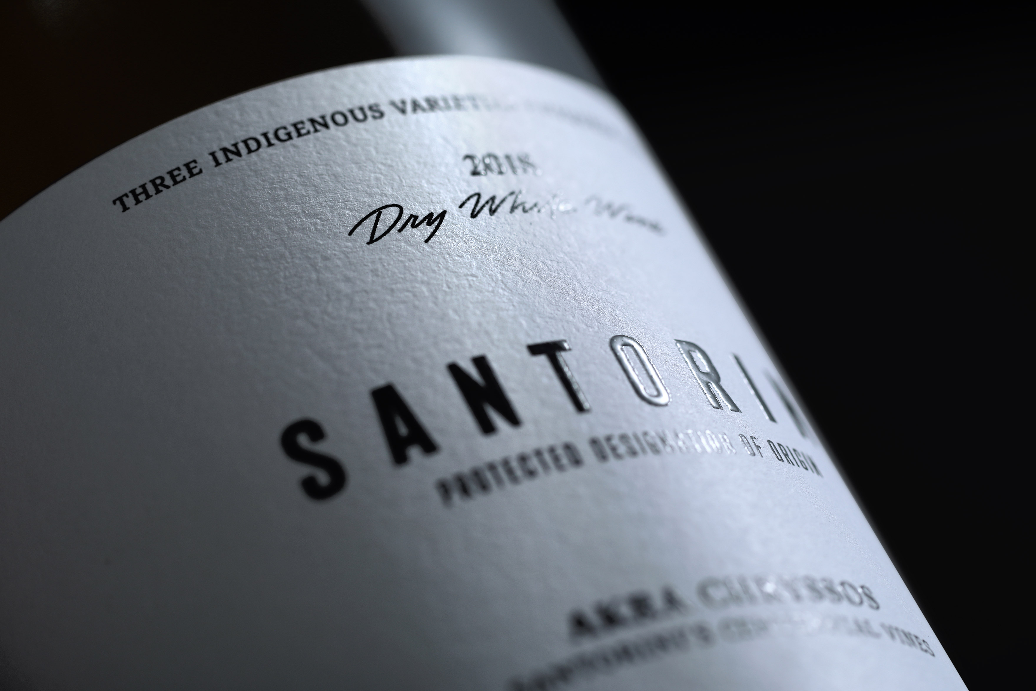
THE RELIEF VARNISH
IN SELECTED PLACES ON THE LABEL EMPHASIZES ITS PREMIUM CHARACTER.
RELATED PROJECTS