-
SERVICES:
- Branding
- Strategy
- Typeface design
-
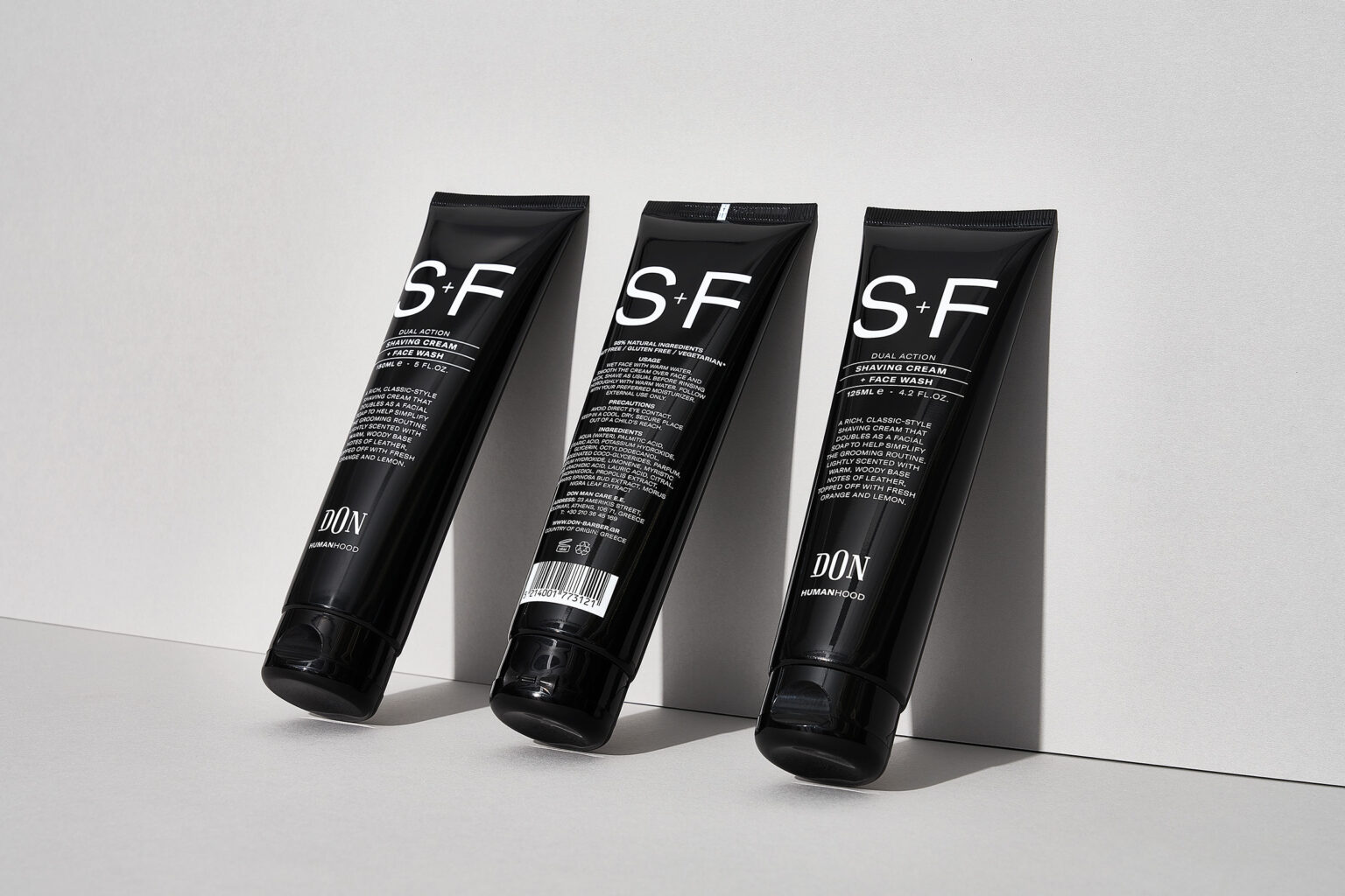
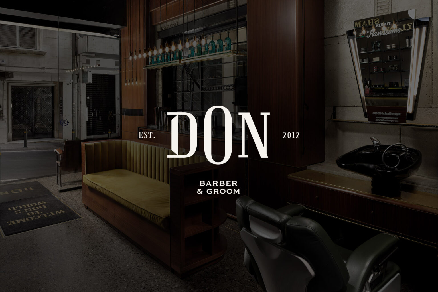
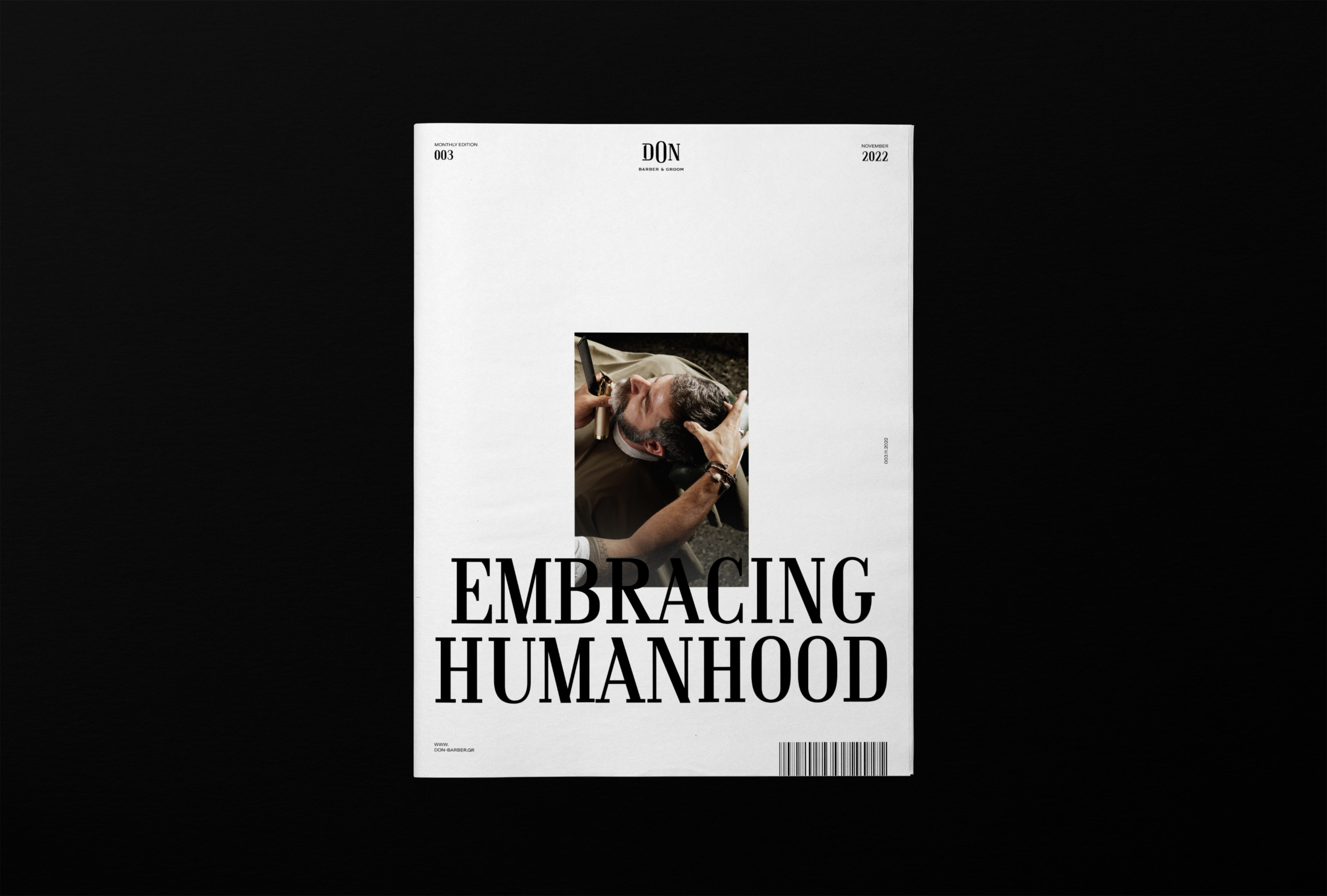
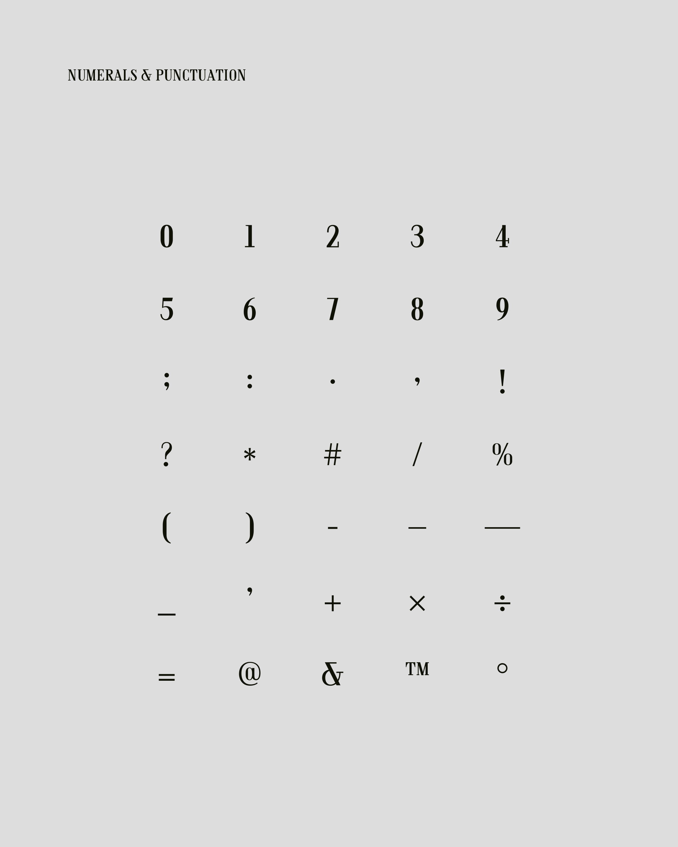
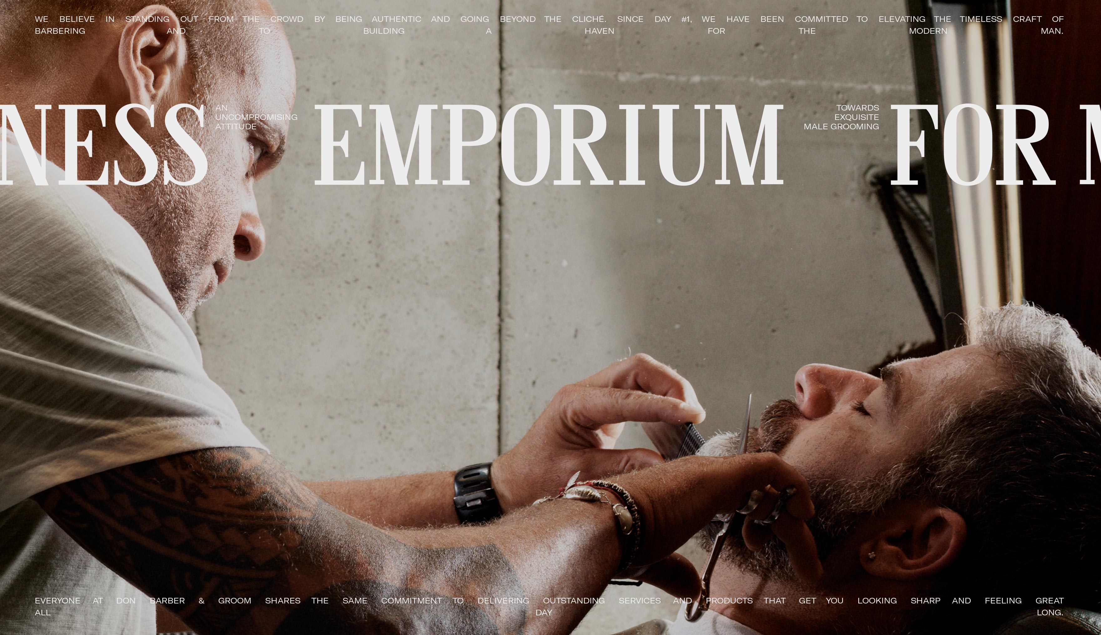
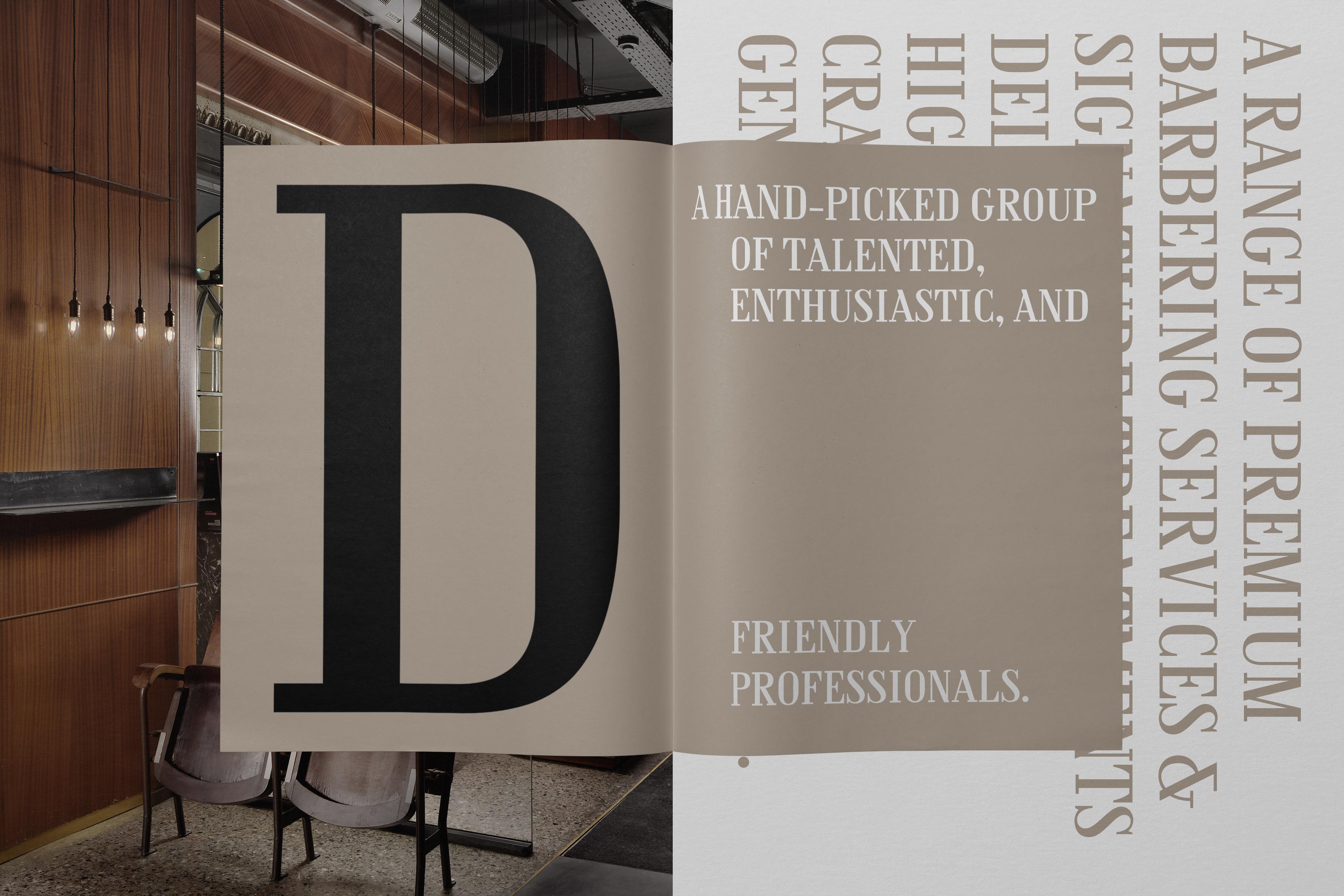
Having completed the design of the new logo of don barber & groom, we moved on to the design & development of the fully custom typography of the brand’s new identity, in a complete typographic family.
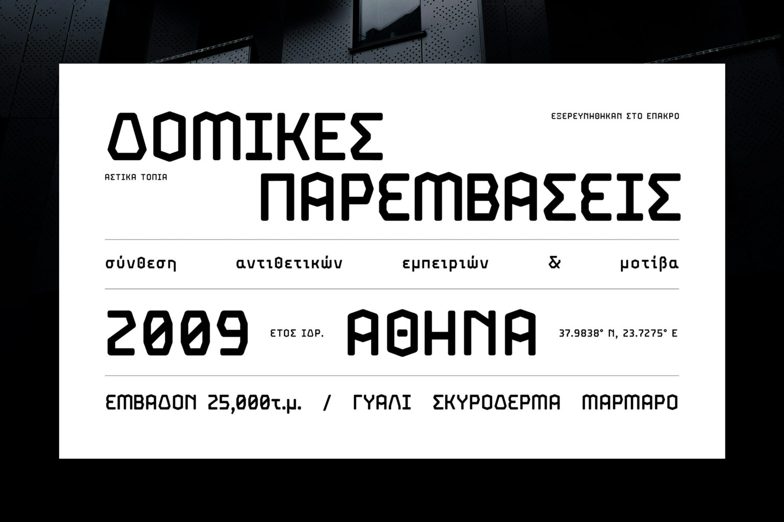
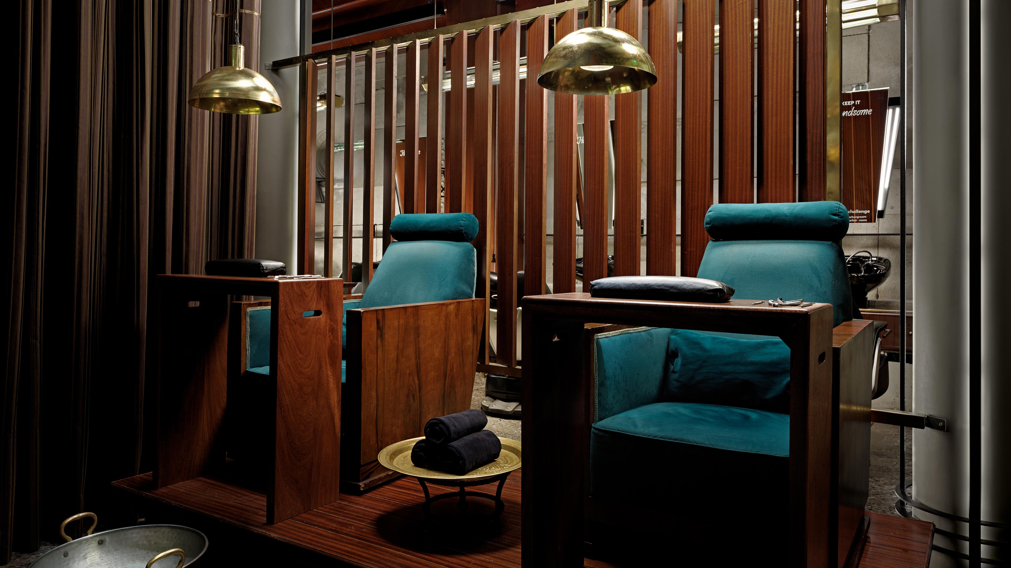
Don is a neoclassical font, designed for use in titles, but with the potential to support packaging design and branding.
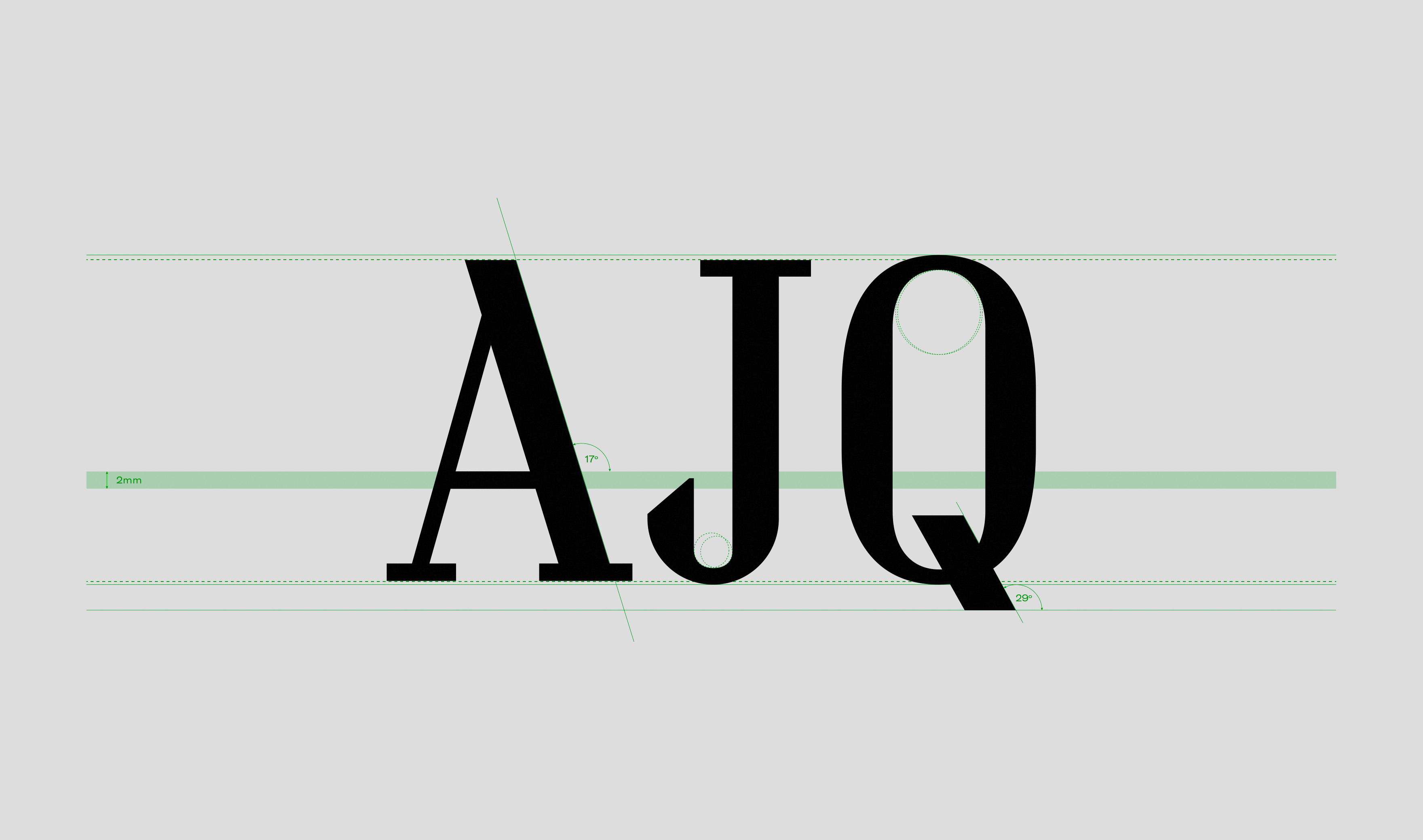
Following the tradition of Bodoni & Didot, its design is characterized by the intensity on its lines, the vertical axis and the thin straight strokes.
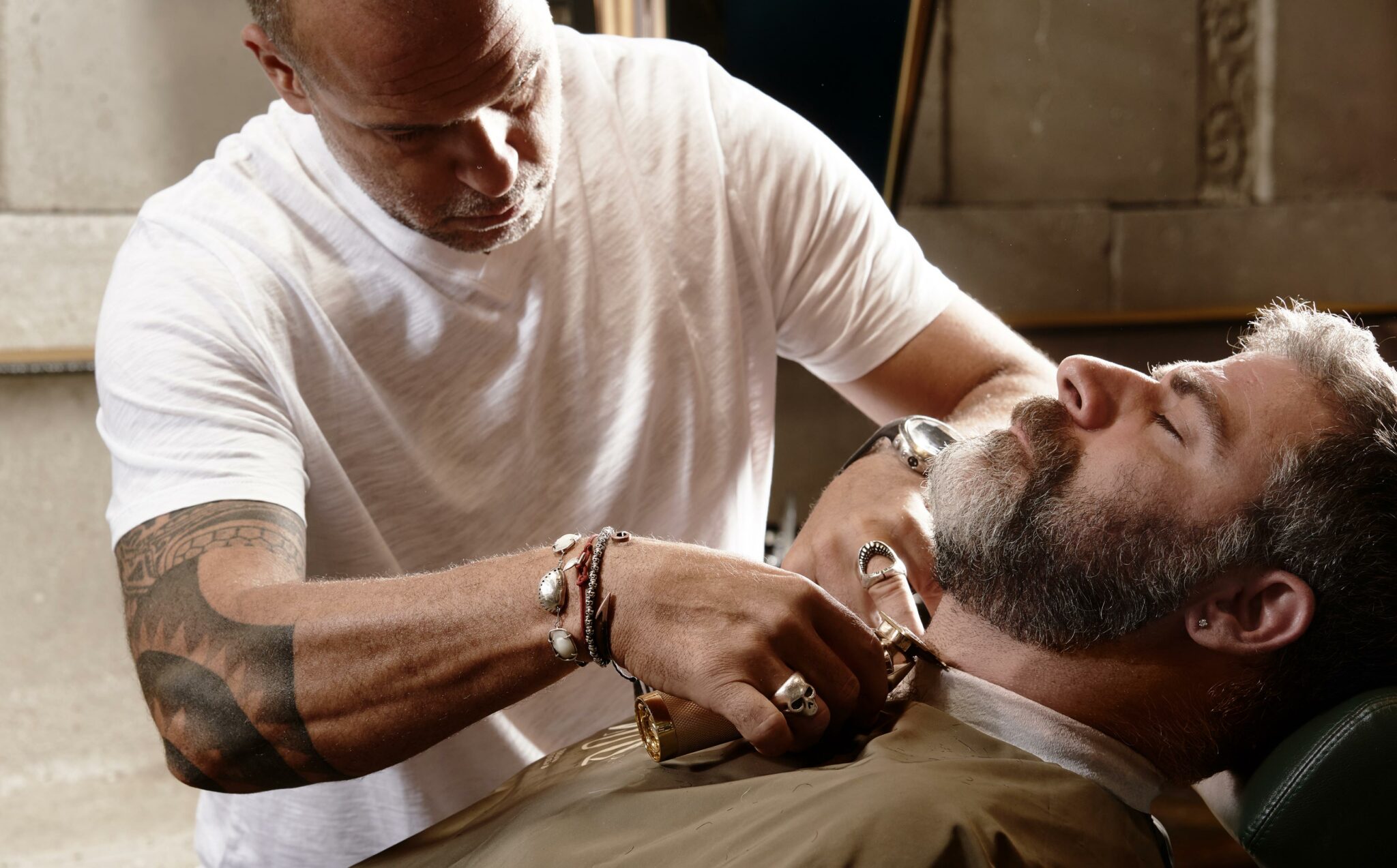
The sleek silhouette of typographic characters comes to emphasize the finesse we were looking for, while the sharp cuts create the connection with the characteristic barbers’ razor.
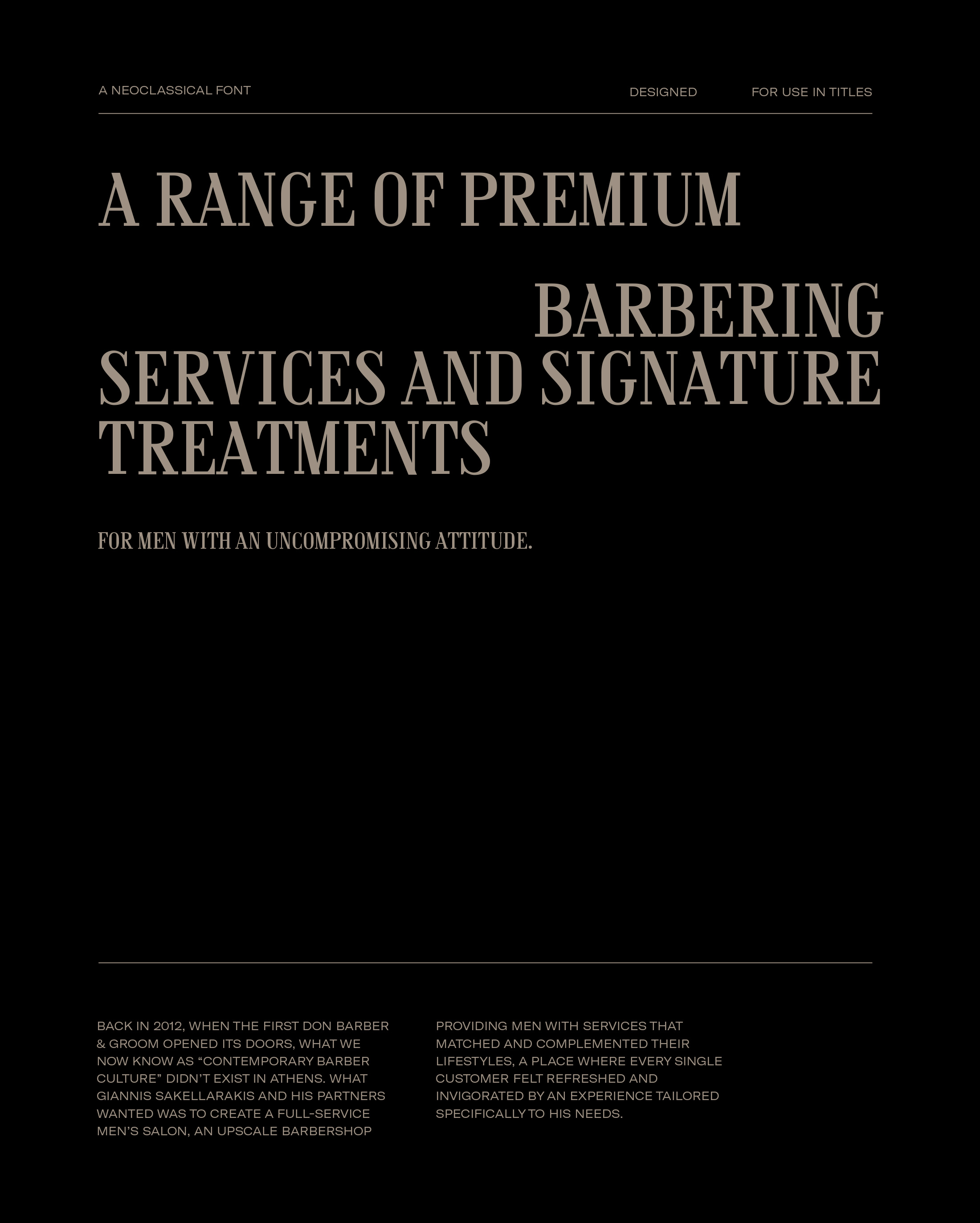
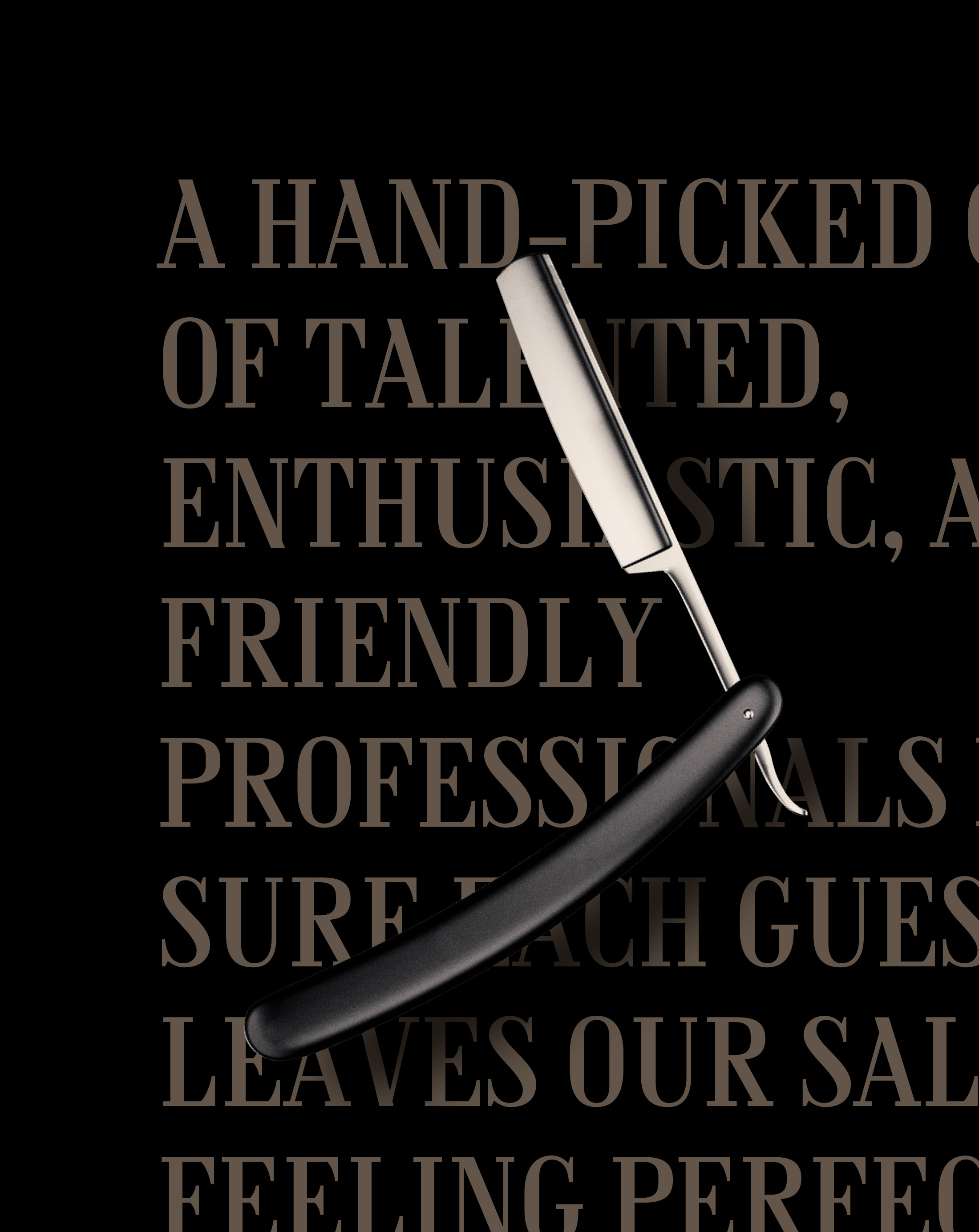
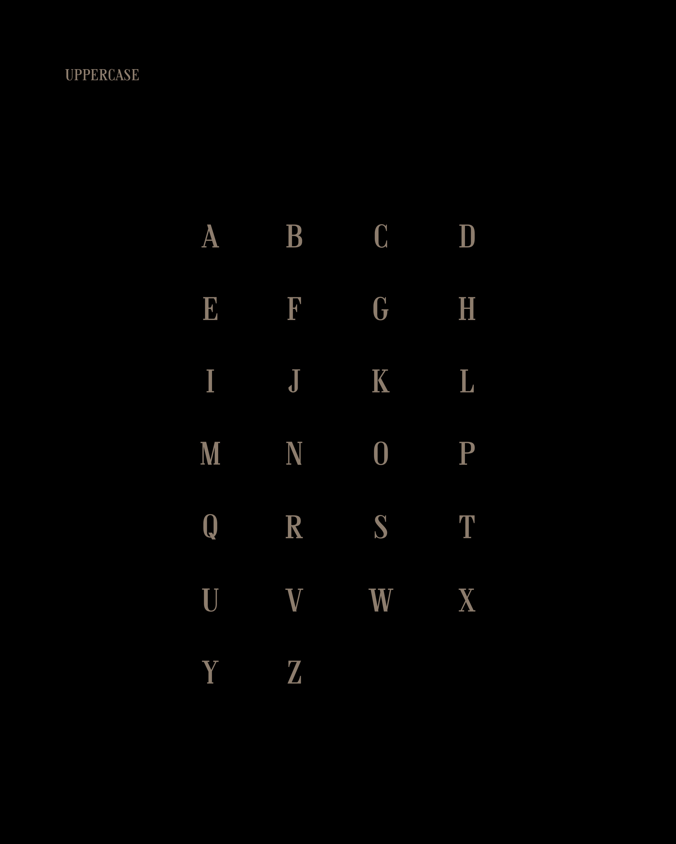
A FONT DESIGNED TO BE USED IN TITLES
WITH THE POTENTIAL TO SUPPORT PACKAGING DESIGN AND BRANDING.
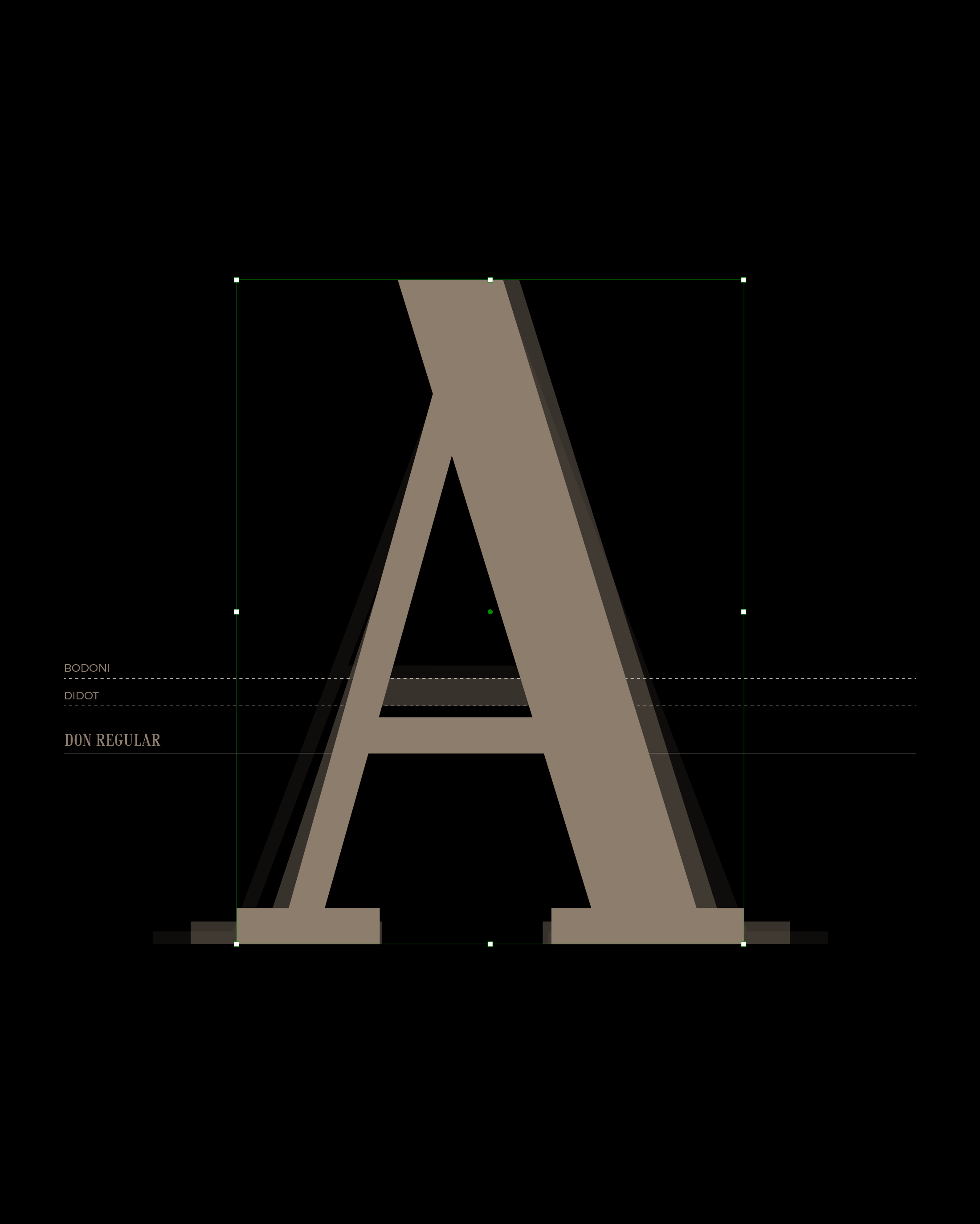
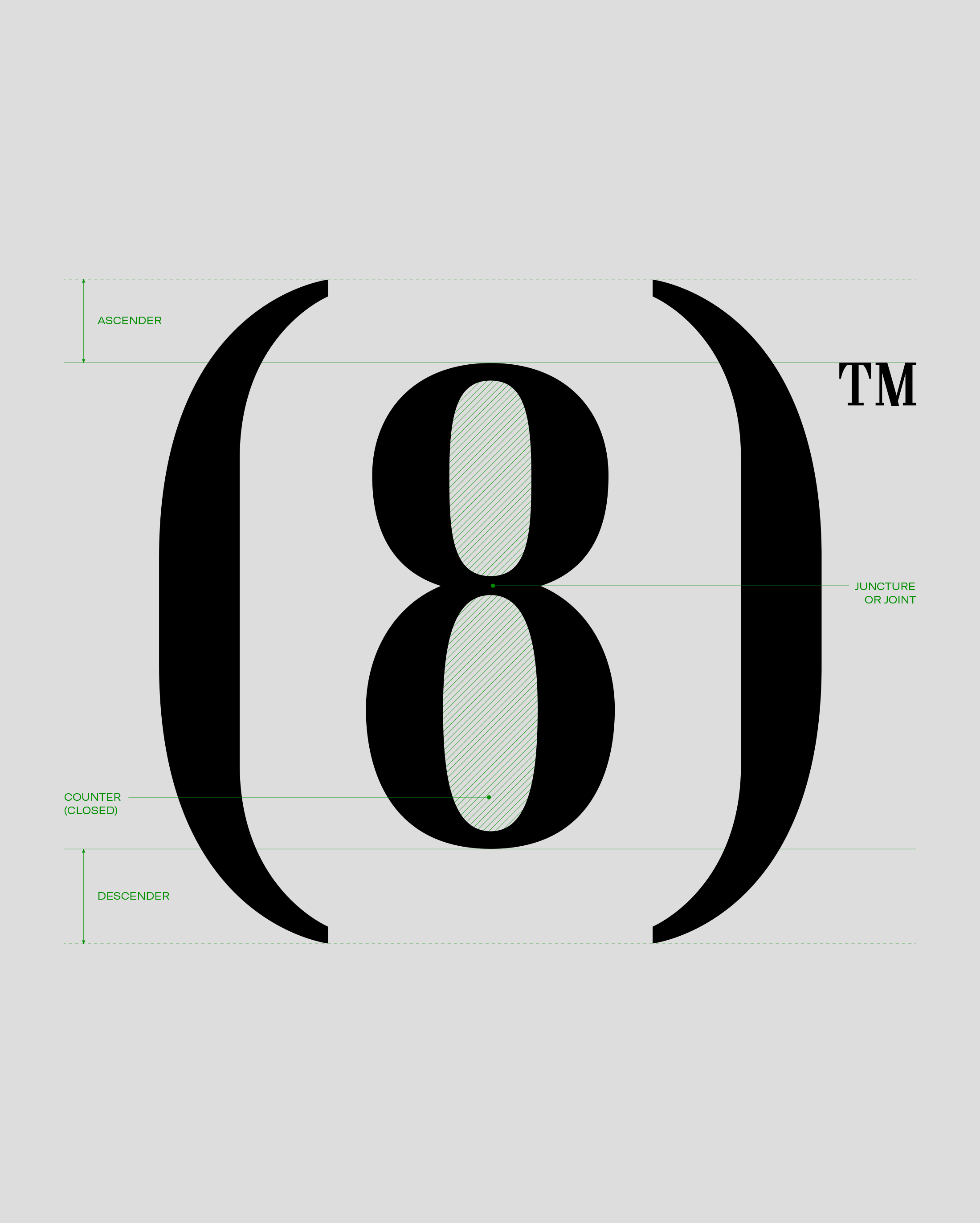
THE DON TYPEFACE DESIGN
IS CHARACTERIZED BY THE INTENSITY ON ITS LINES, THE VERTICAL AXIS AND THE THIN STRAIGHT STROKES.

RELATED PROJECTS