-
SERVICES:
- Packaging Design
- Art direction
- Concept
-
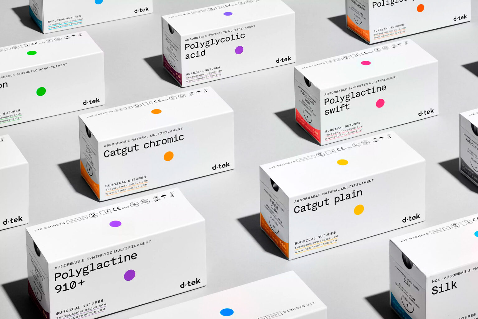
Demophorius Healthcare is a British company that operates in the field of manufacturing high quality medical products since 1996.
Kommigraphics’ cooperation with Demophorius Healthcare began a few years ago, by redesigning the company’s logo, which lead onto the design of the packaging of most of its products.
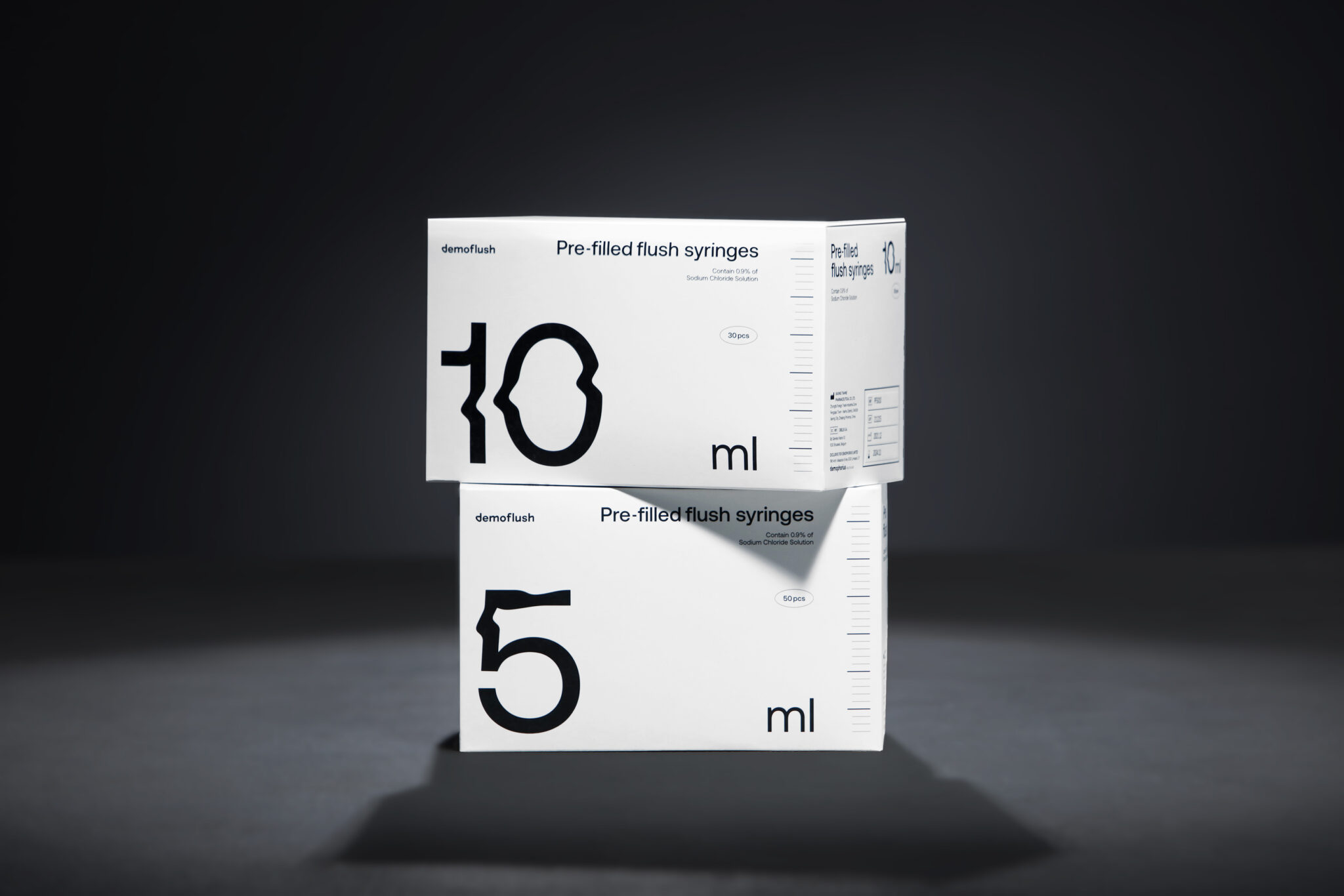
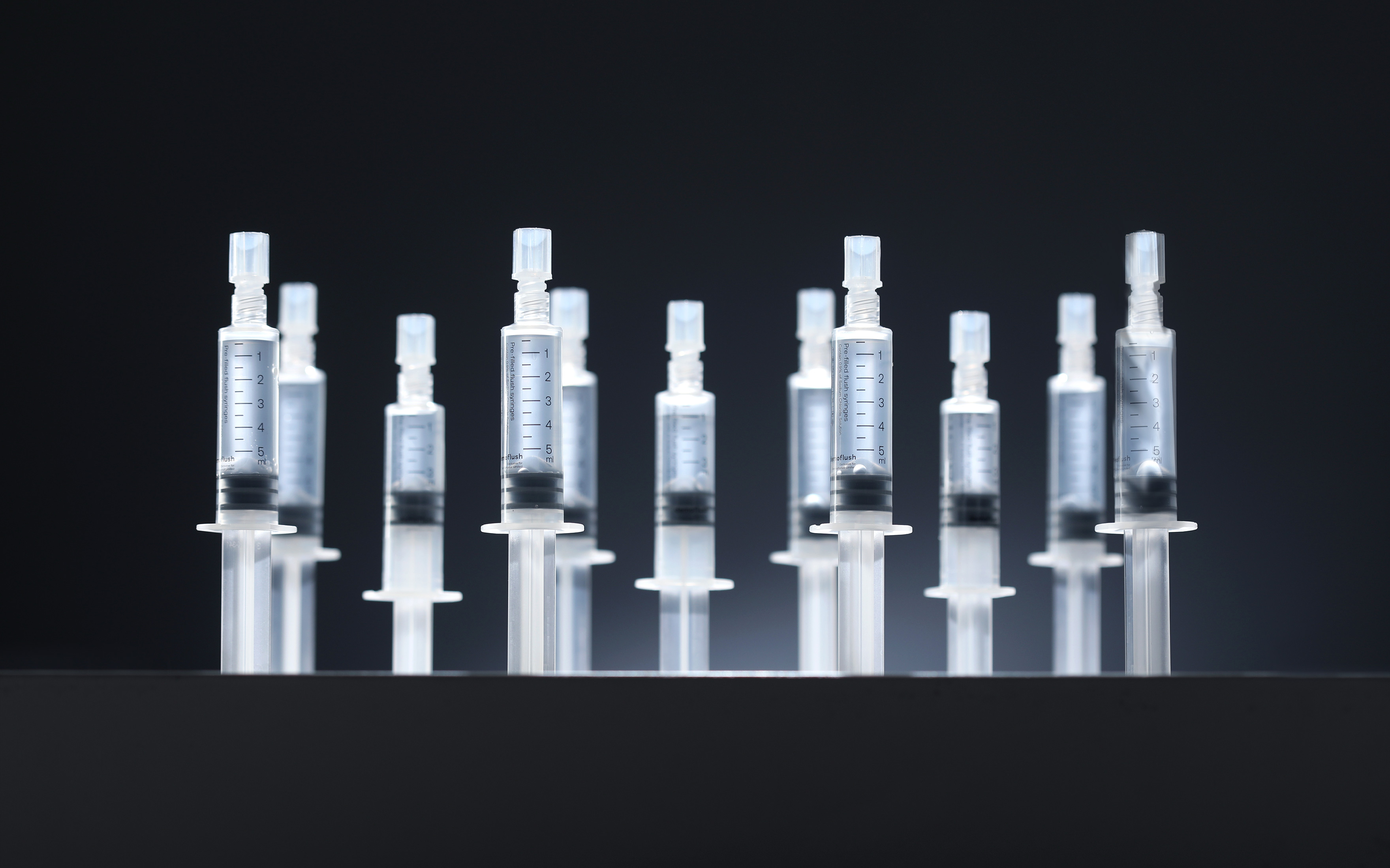
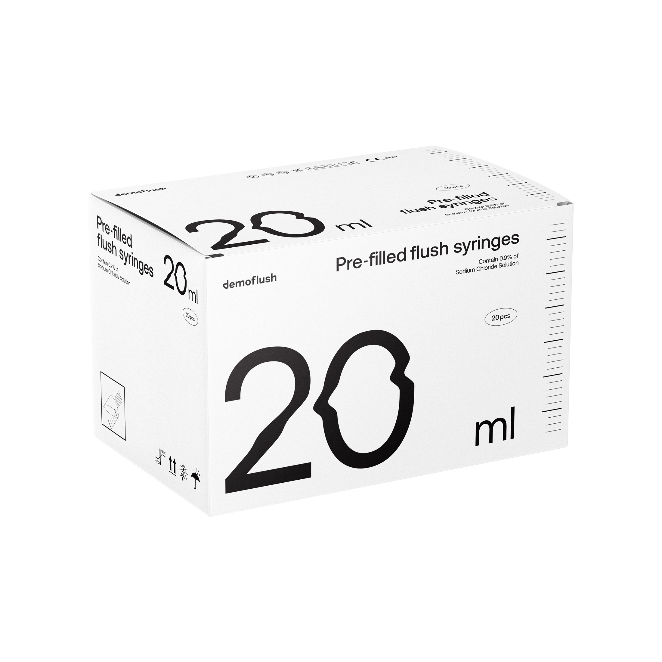
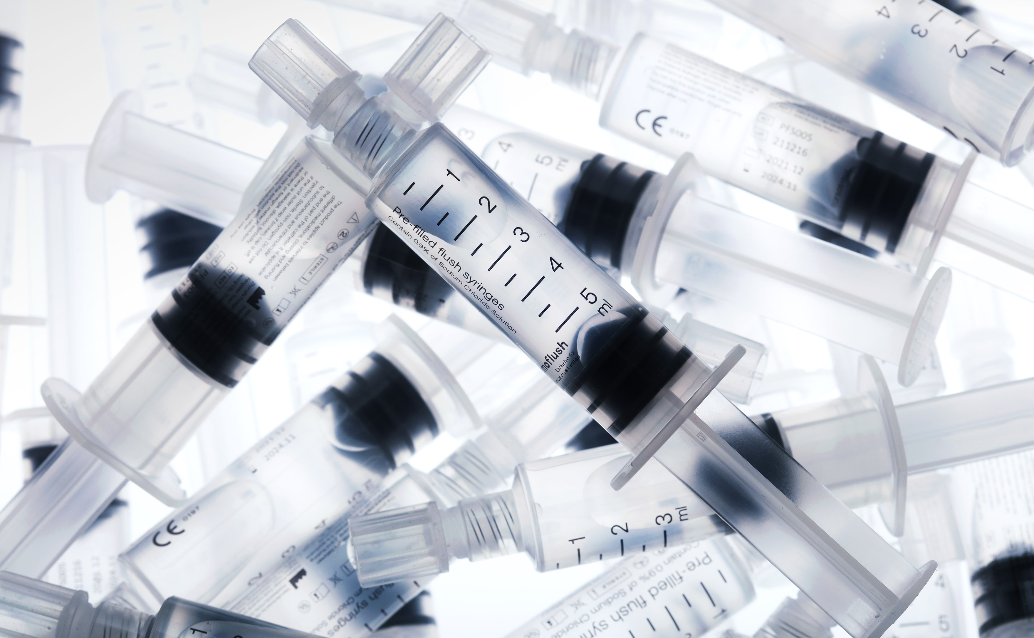
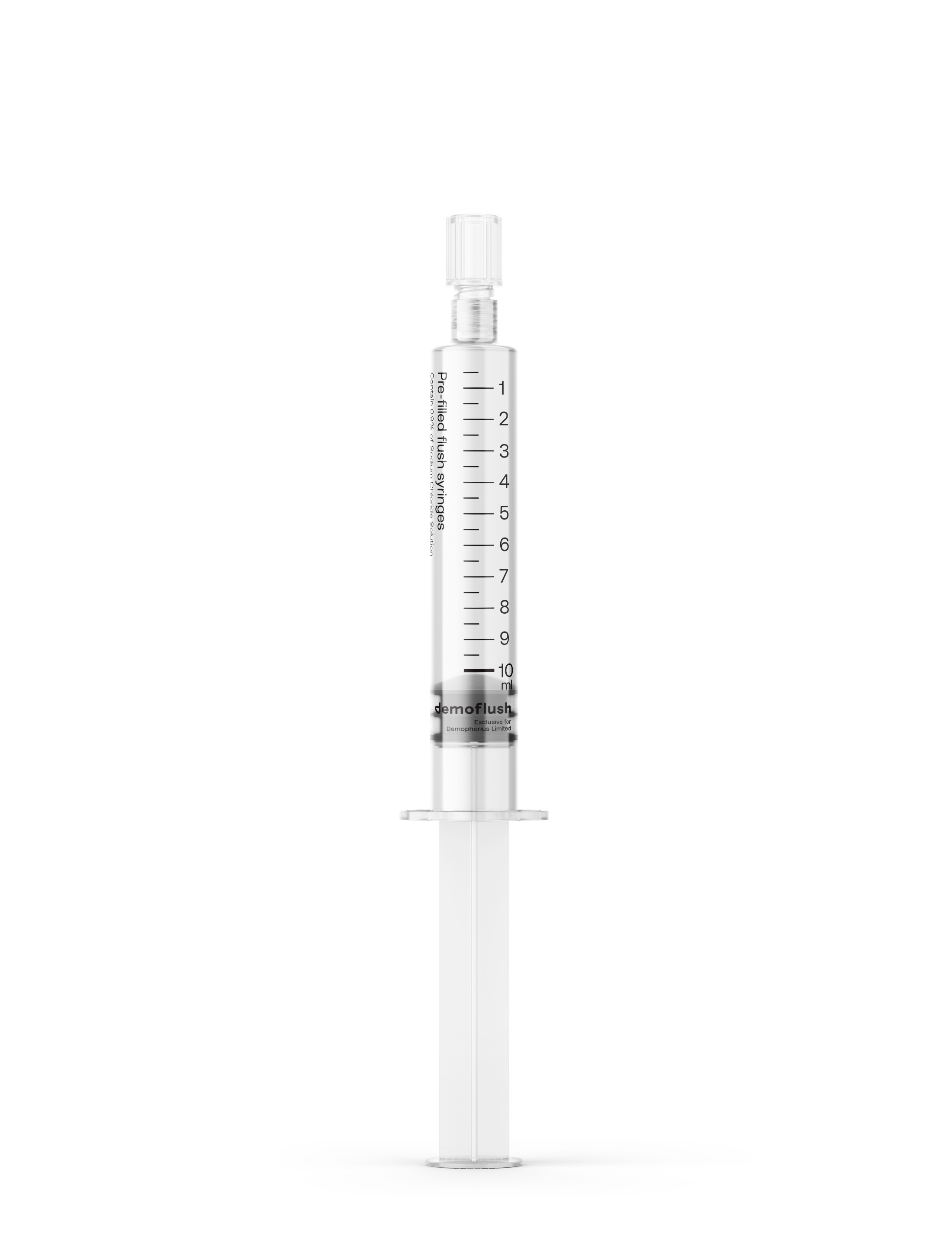
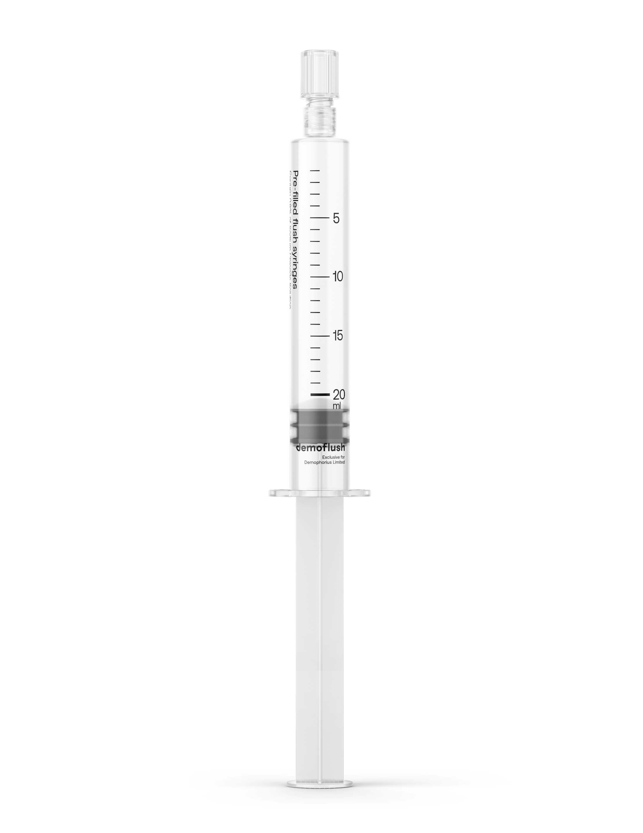
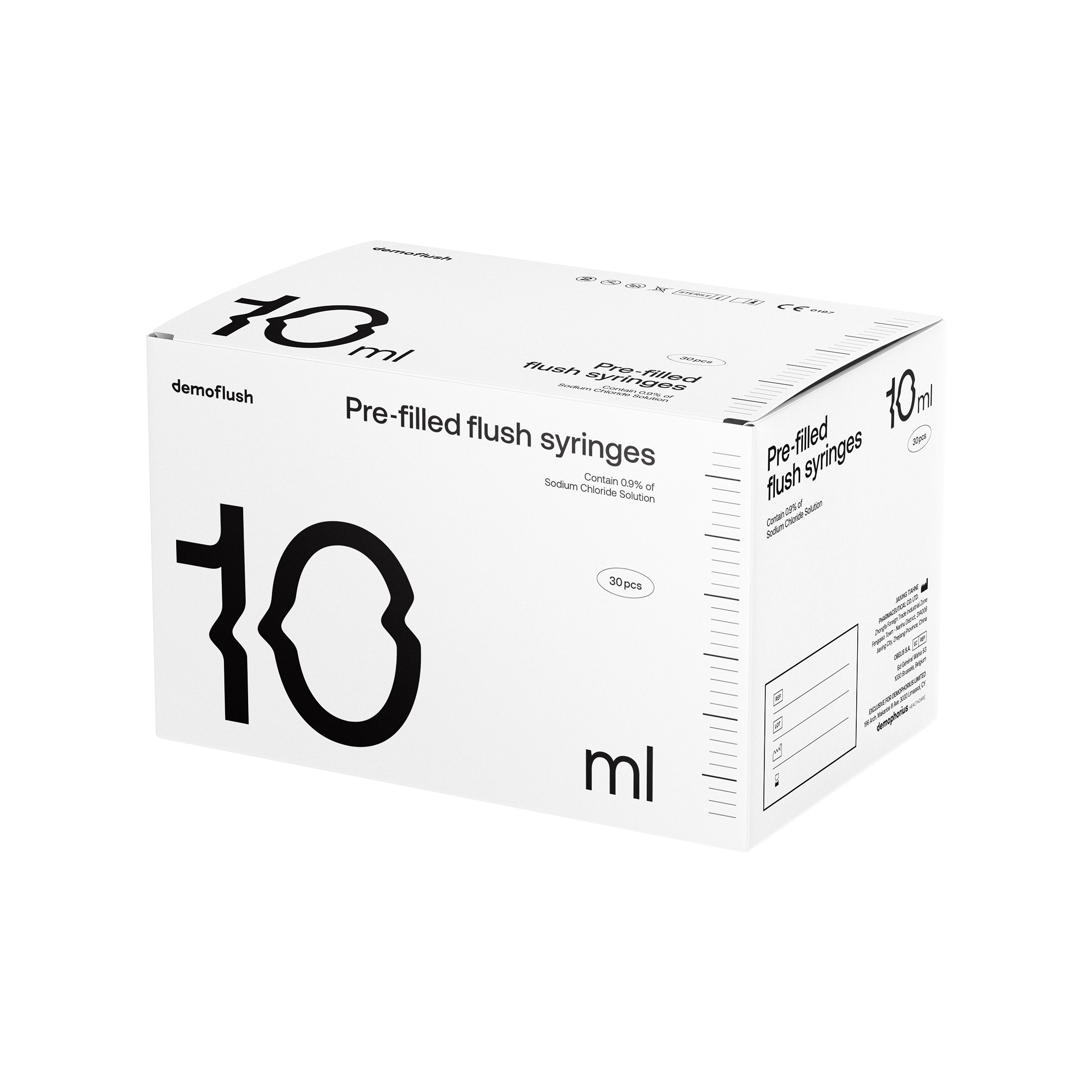
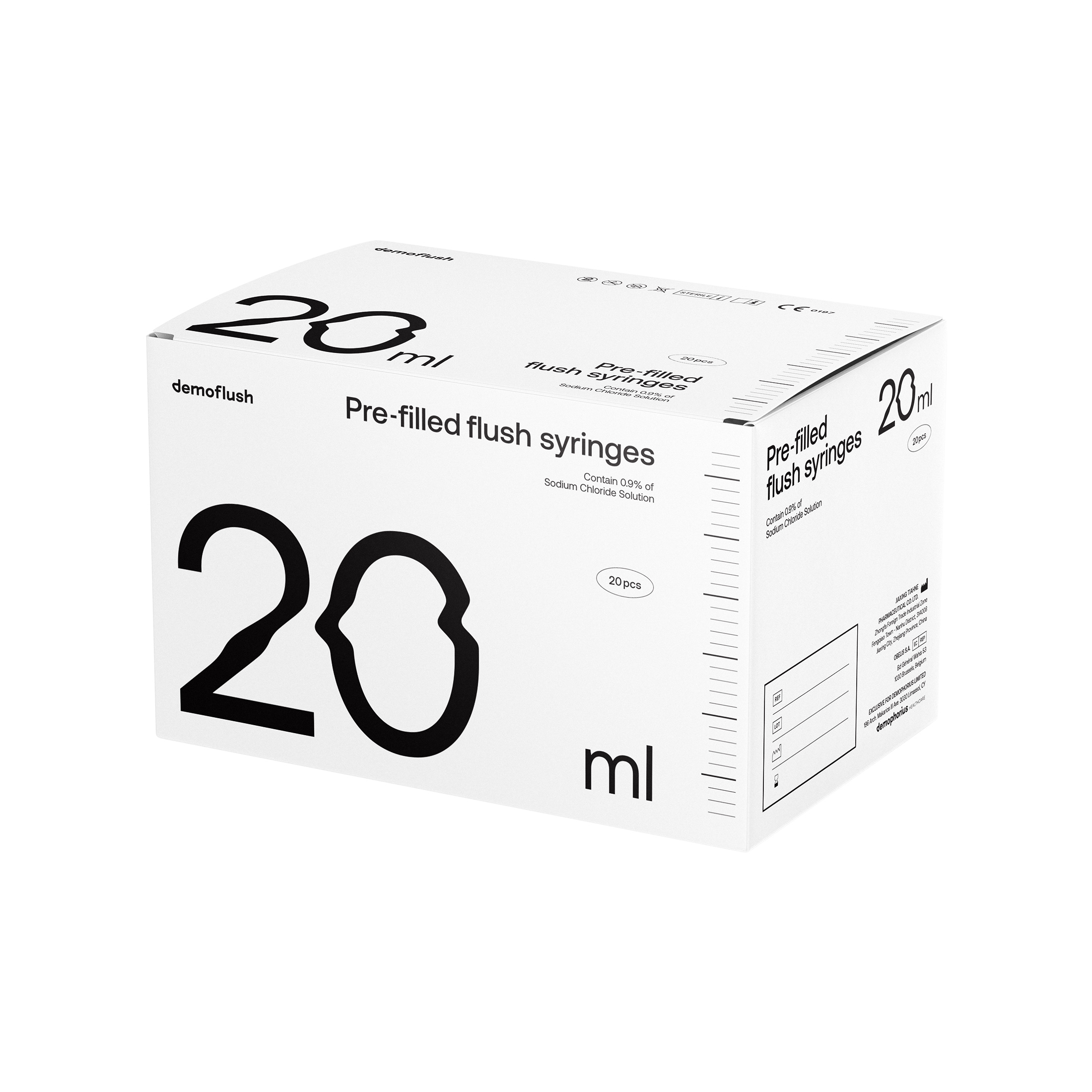
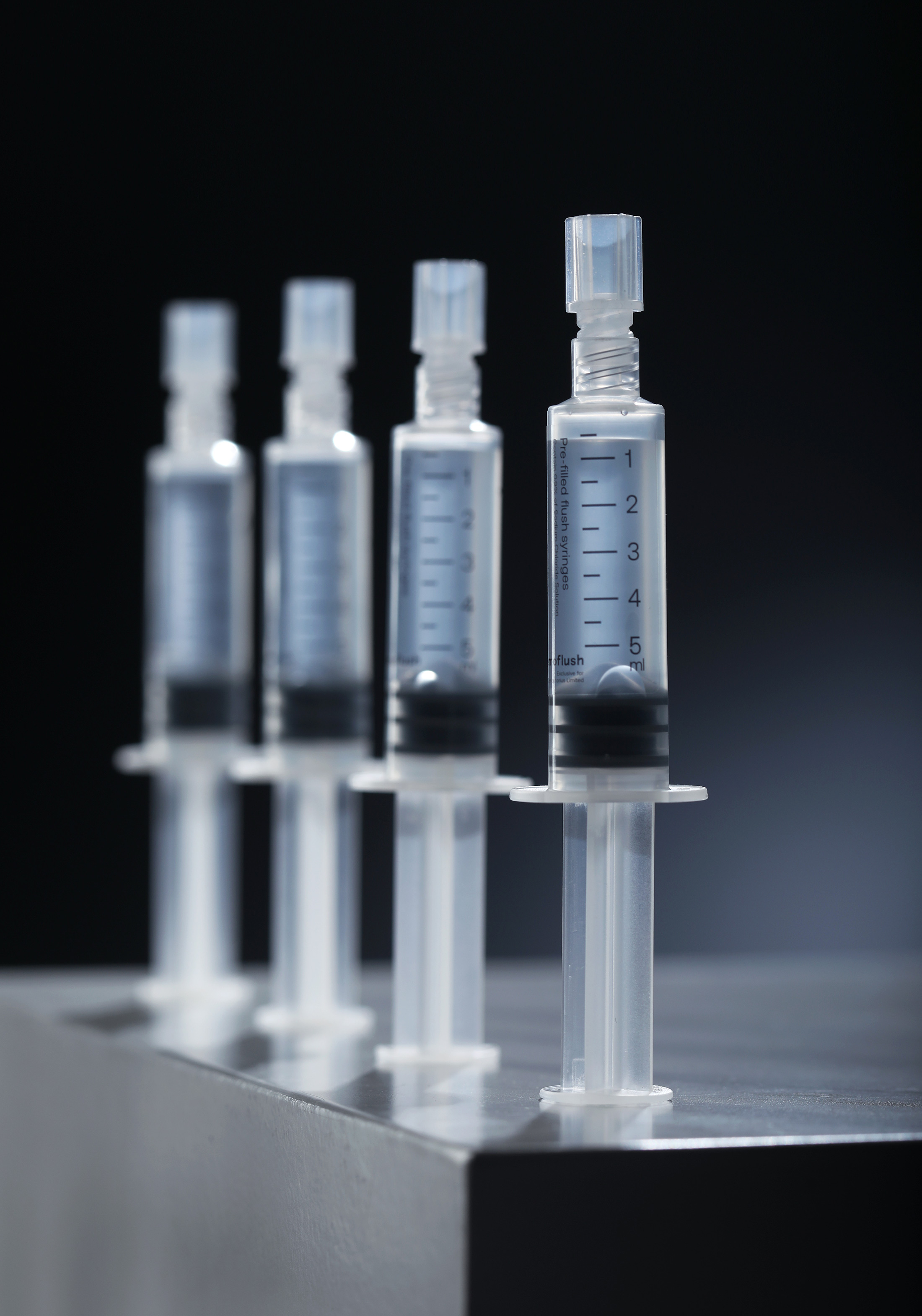
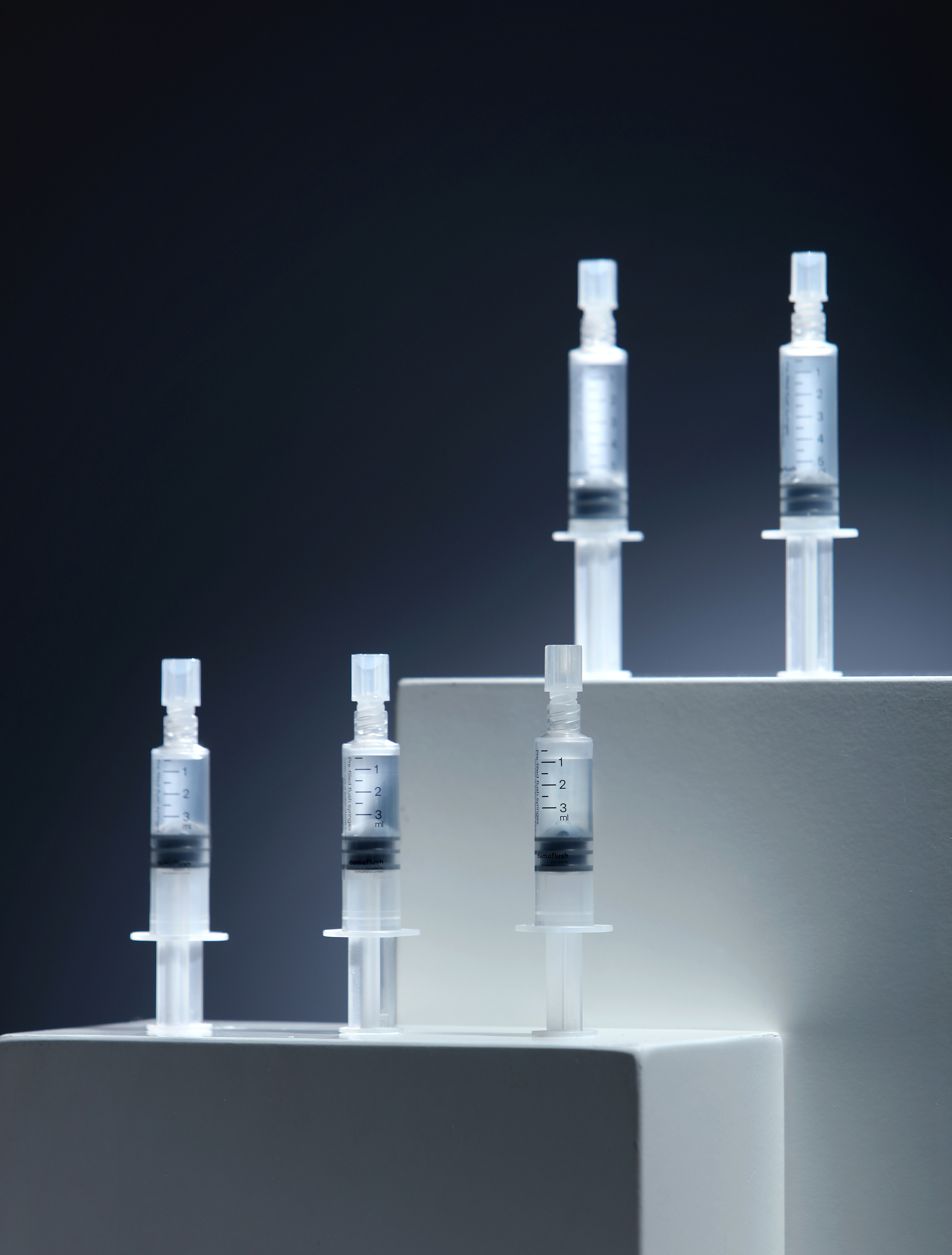
Part of the project was the packaging design of the Prefilled Syringes of the company’s sub brand Demoflush.
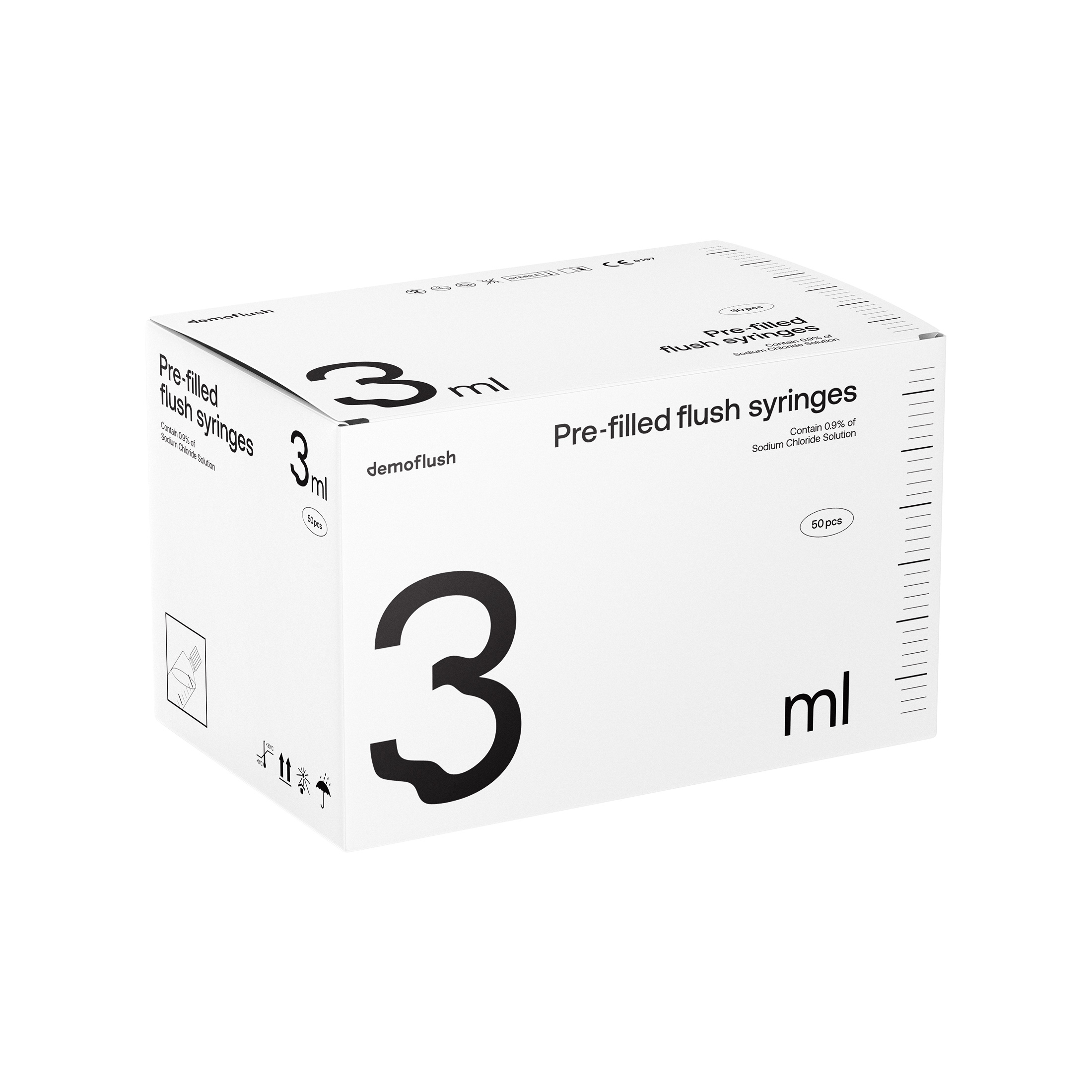
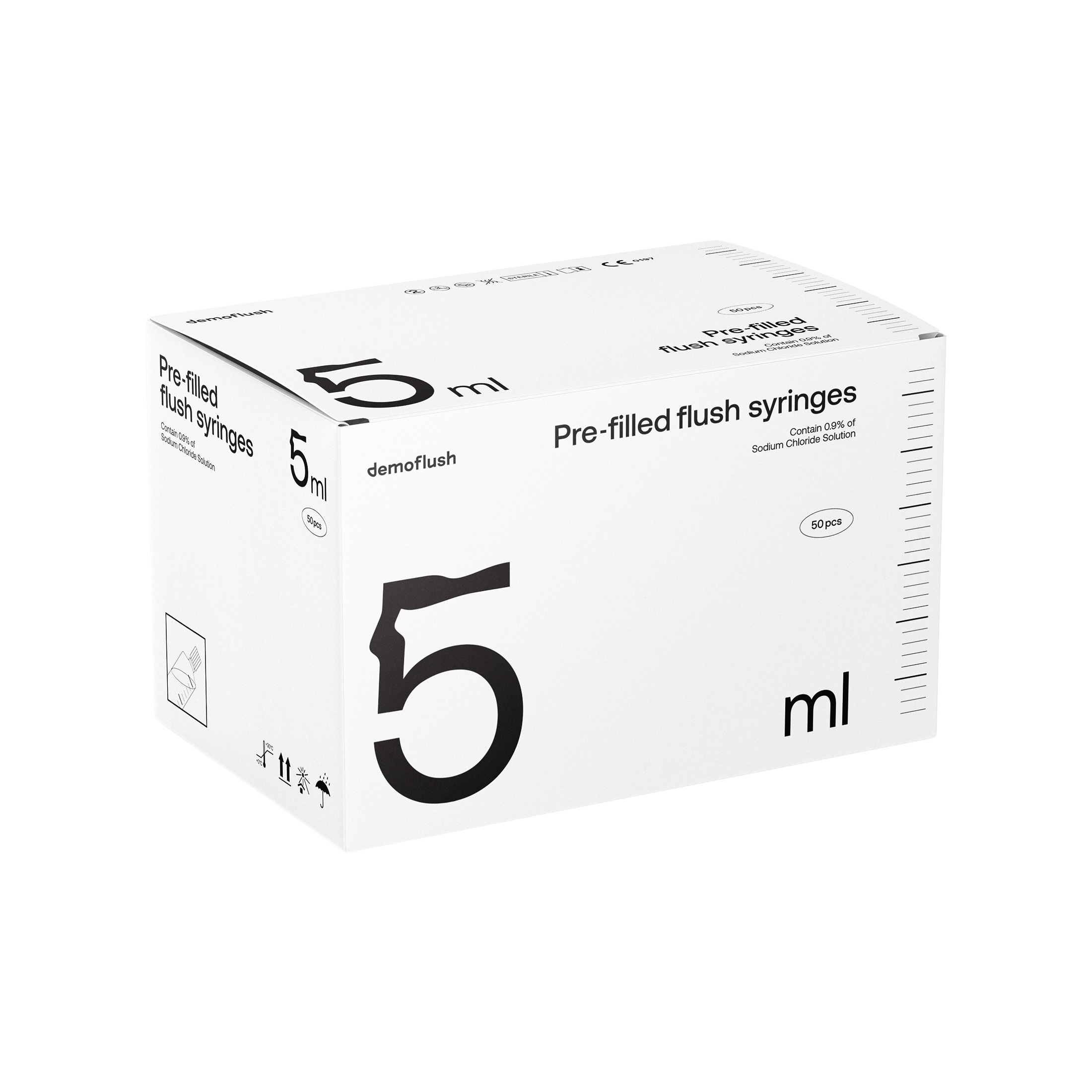
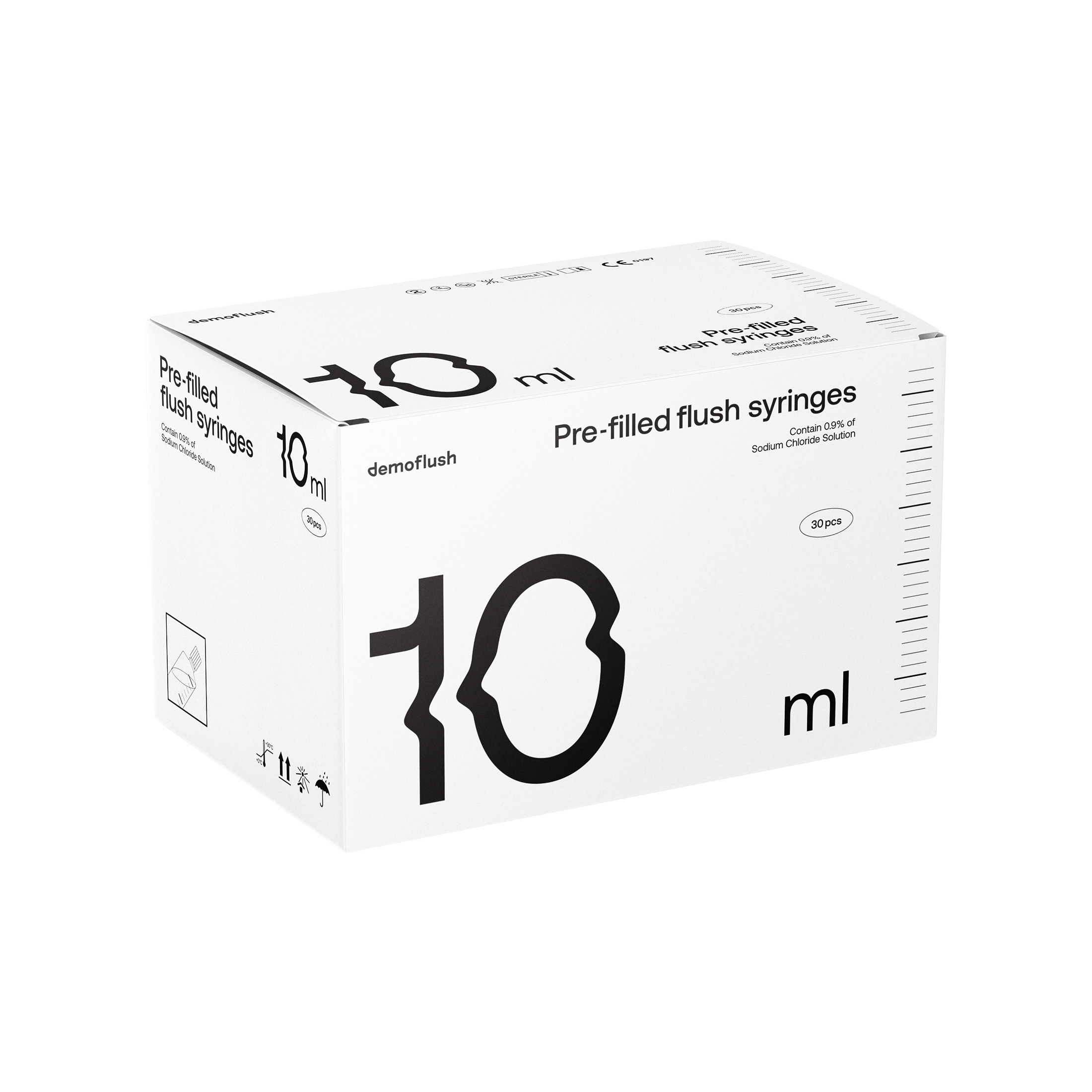
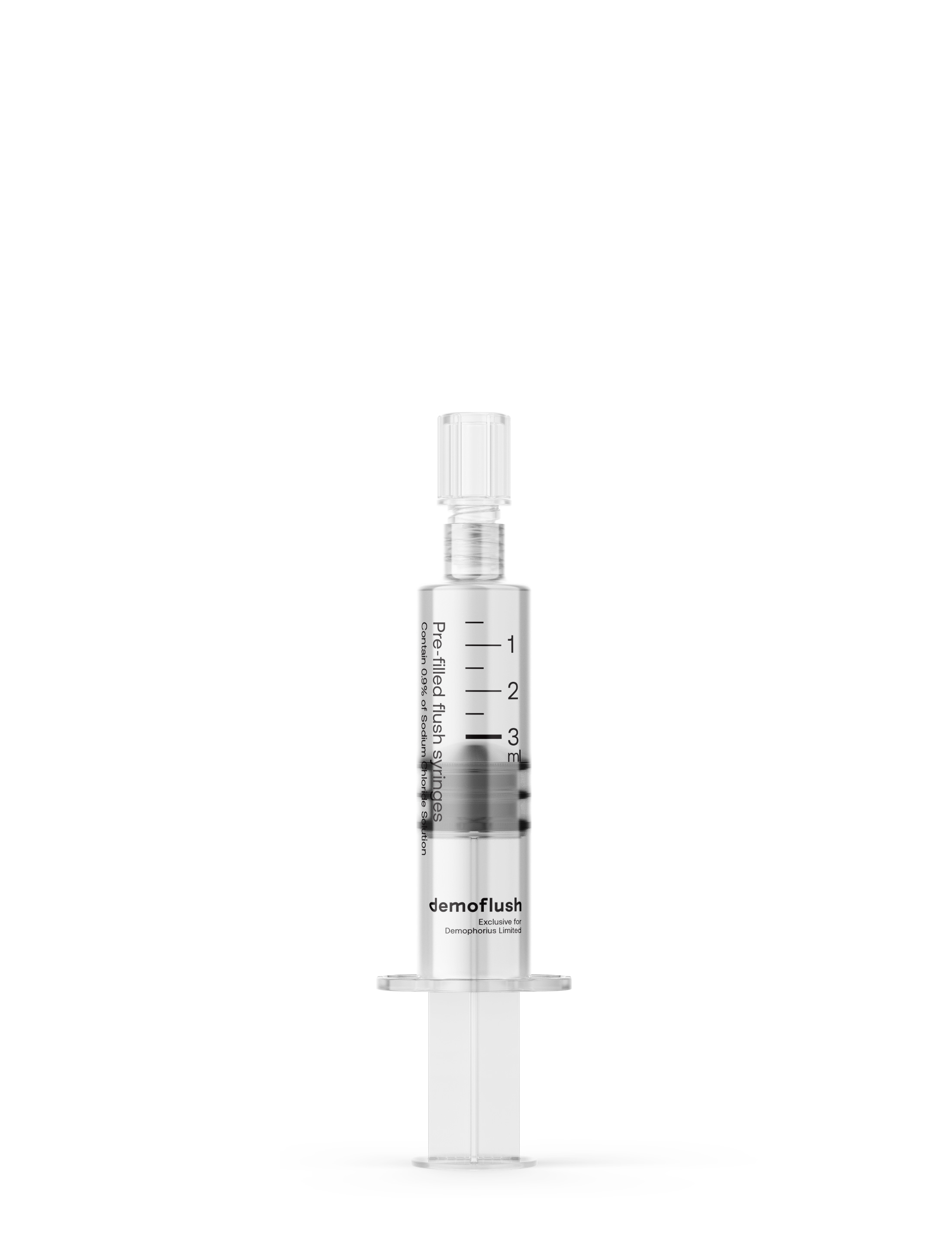
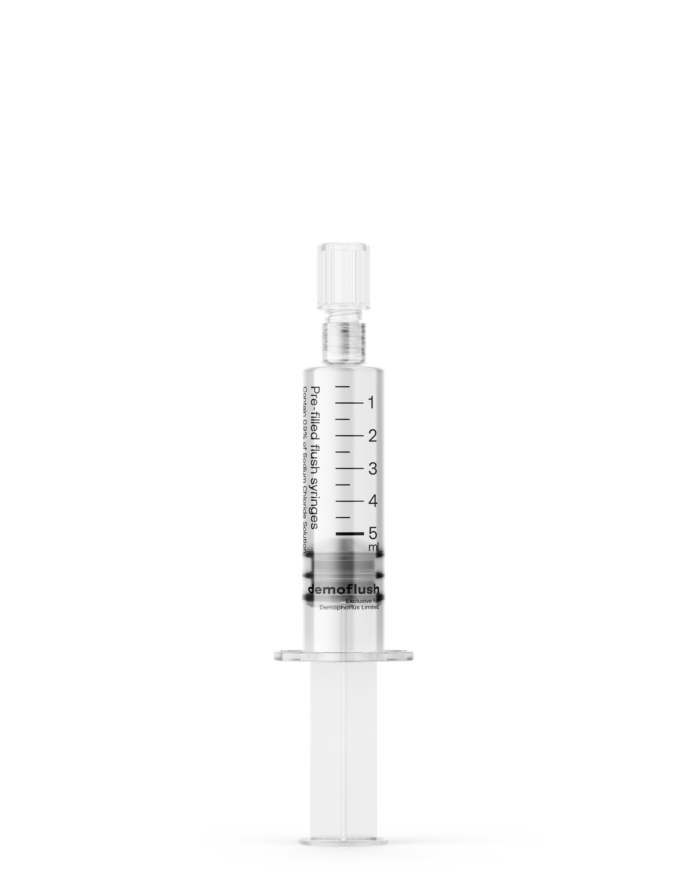
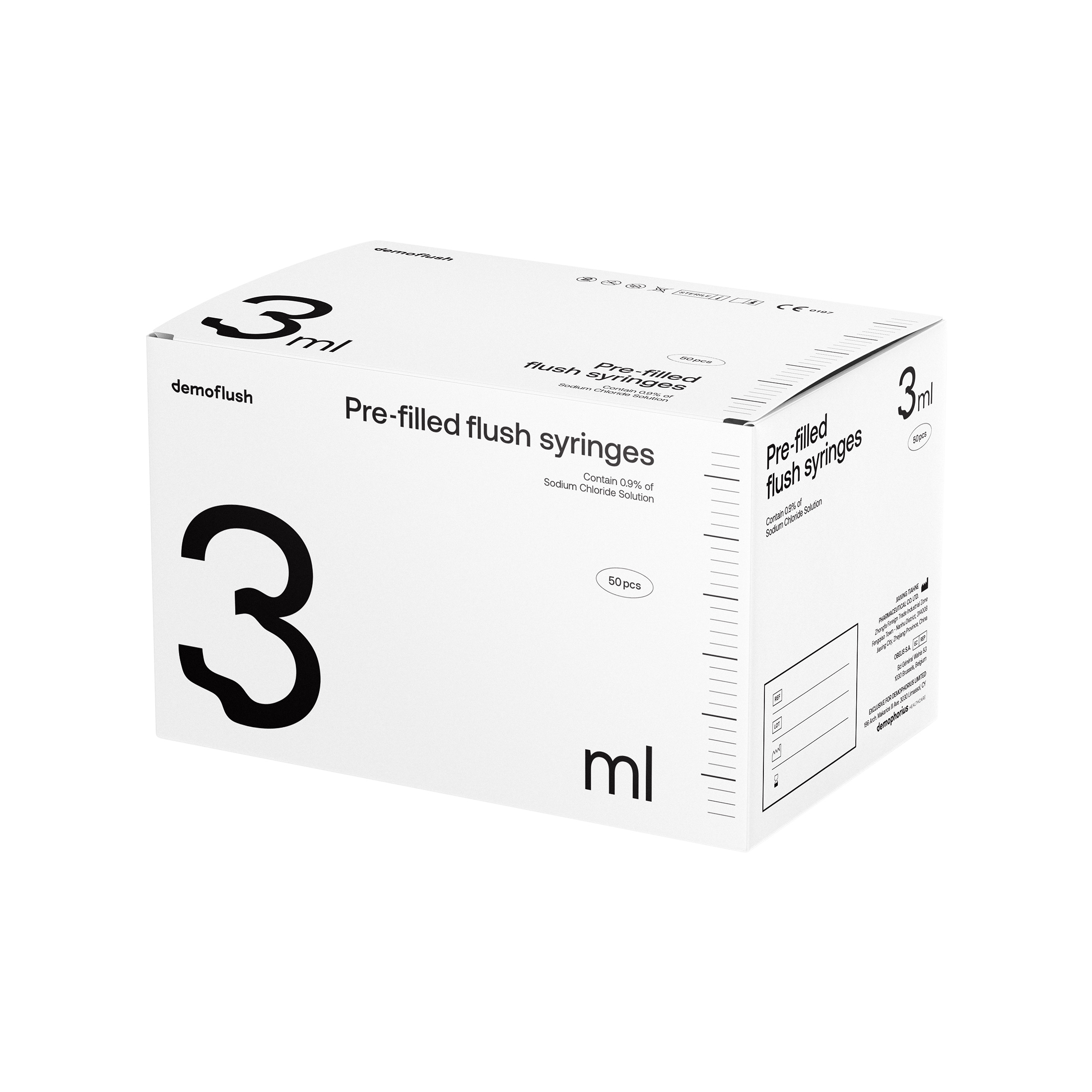
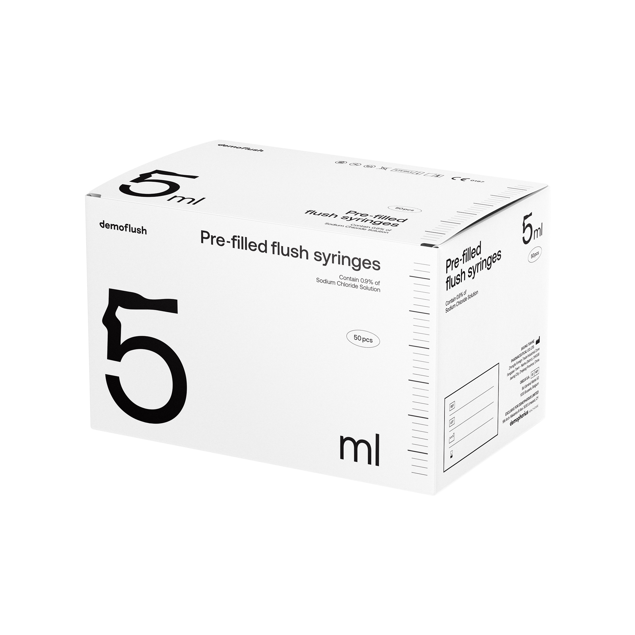
The pre-filled syringes are grouped into 3, 5, 10 and 20 ml and the assignment included both the design of the basic packaging of the syringes box as well as the blisters (stickers) that the syringes are labeled with.
Having to come up with a design that would be acceptable for a very rigid and uncreative industry, we had to approach the project with boldlness, without sacrificing the functionality and without losing out on the message the products must communicate.
The main design factor was the volumetric separation of the packages (ml), an element that we brought on the foreground in an intense way to serve a doctor’s a quick search through different selves.
Our wish was to bring out a feeling to a “sterile” package, so we distorted the numerical indications in a way that indicates their refraction or even their deterioration when they are mixed with water. This way we found a solution that communicates the liquid element in a more understandable way by all.
The rest of the product’s indications are balanced on the empty space of the package, creating typographic contrasts on each side of the box.
The reference of dosage is also seen on each A side, being attributed by using horizontal lines, an element that enhances the direct visual understanding of the content, without necessarily having the cliché descriptive symbol of a syringe.
THE MAIN DESIGN FACTOR
WAS THE VOLUMETRIC SEPARATION OF THE PACKAGES (ML), AN ELEMENT THAT WE BROUGHT ON THE FOREGROUND IN AN INTENSE WAY TO SERVE A DOCTOR’S A QUICK SEARCH THROUGH DIFFERENT SELVES.
WE DISTORTED THE NUMERICAL INDICATIONS
IN A WAY THAT INDICATES THEIR REFRACTION OR EVEN THEIR DETERIORATION WHEN THEY ARE MIXED WITH WATER.
RELATED PROJECTS