-
SERVICES:
- Brand Identity
- Storytelling
- Concept
-
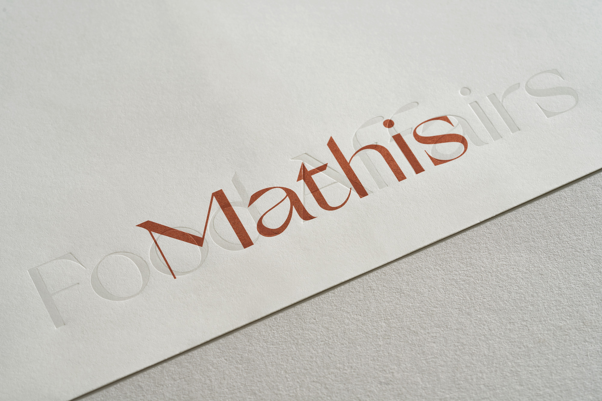
This corporate identity was designed for the world-famous chef Reto Mathis, who has developed a variety of businesses of gastronomic interest-based in Switzerland and more specifically St. Moritz.
Their activities include restaurants, catering services, training courses in the field of haute cuisine and retreats of similar content, sales of refined products, etc.
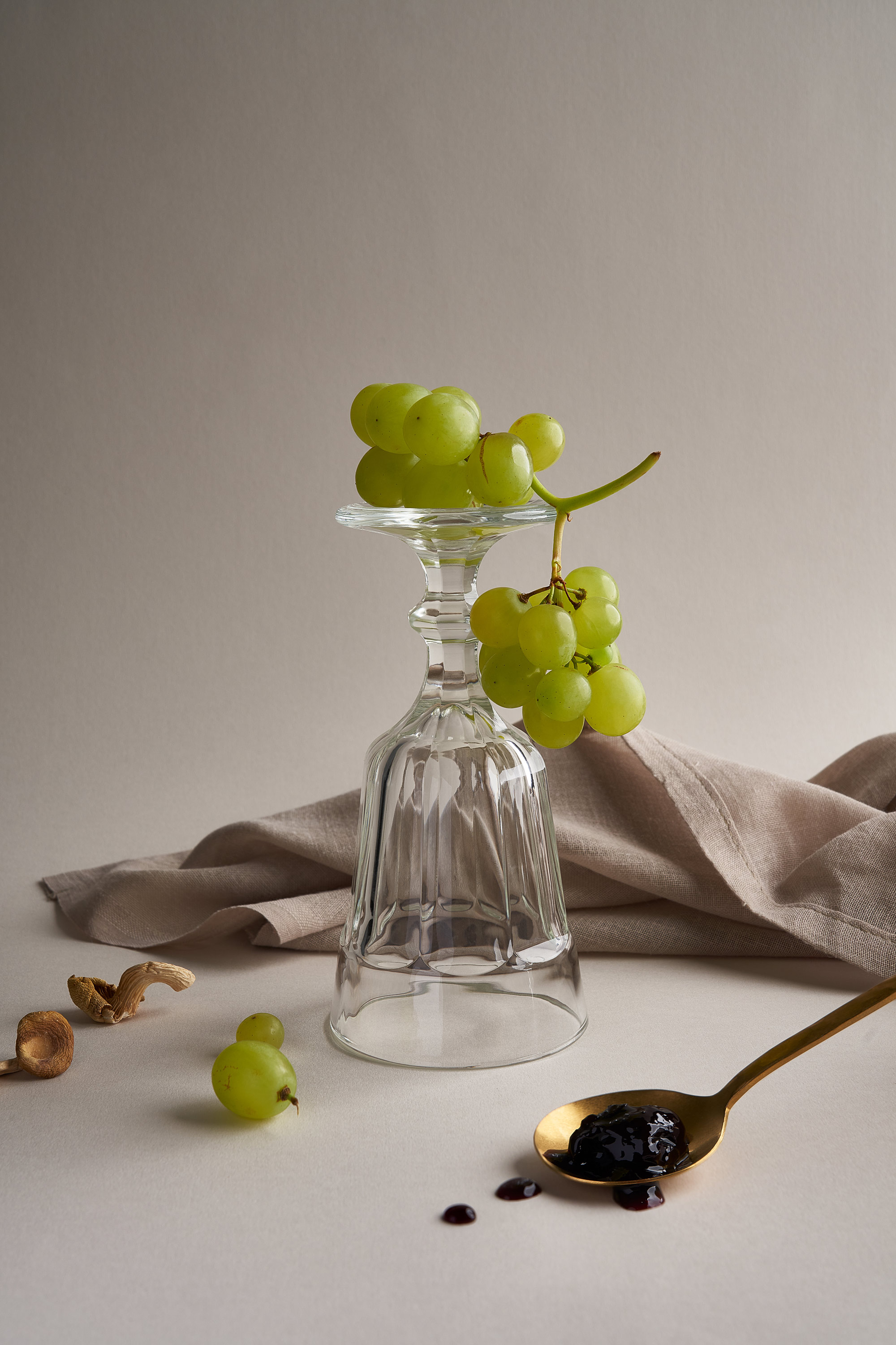
The overall aesthetics and design of the corporate identity were based on the refined gastronomic experience that customers experience when they visit the places established by the chef. The gourmet character of his creations and the flavors that result from them can be defined as special, an element that pushed us to create an identity that harmonizes with them, without competing with them.
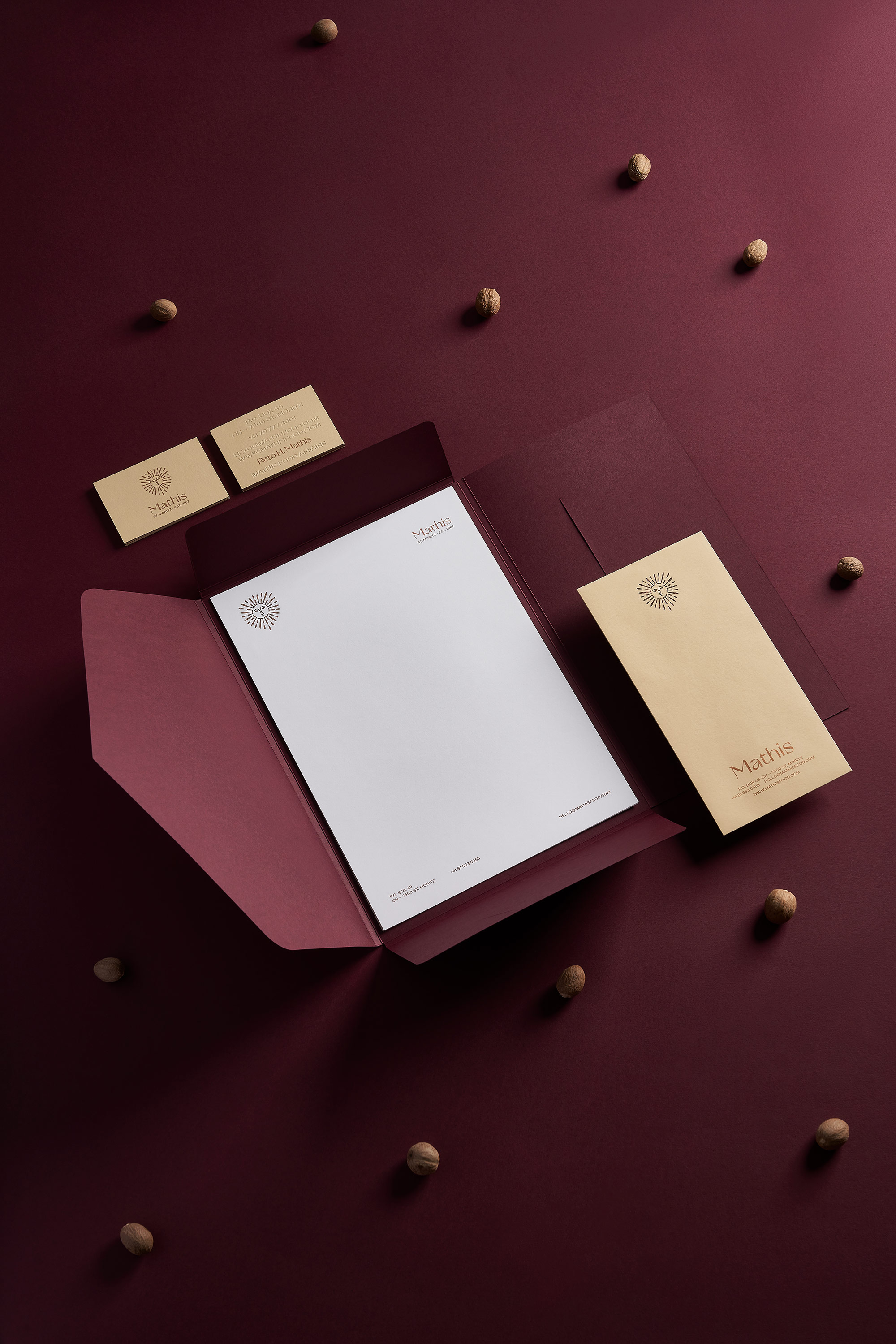
An important factor is the location of the restaurants, which are located in the usually snow-capped mountains of St. Moritz, having an “airy” landscape with a view from above. We wanted to capture the same “airy” and premium feeling in each application of the corporate identity separately.
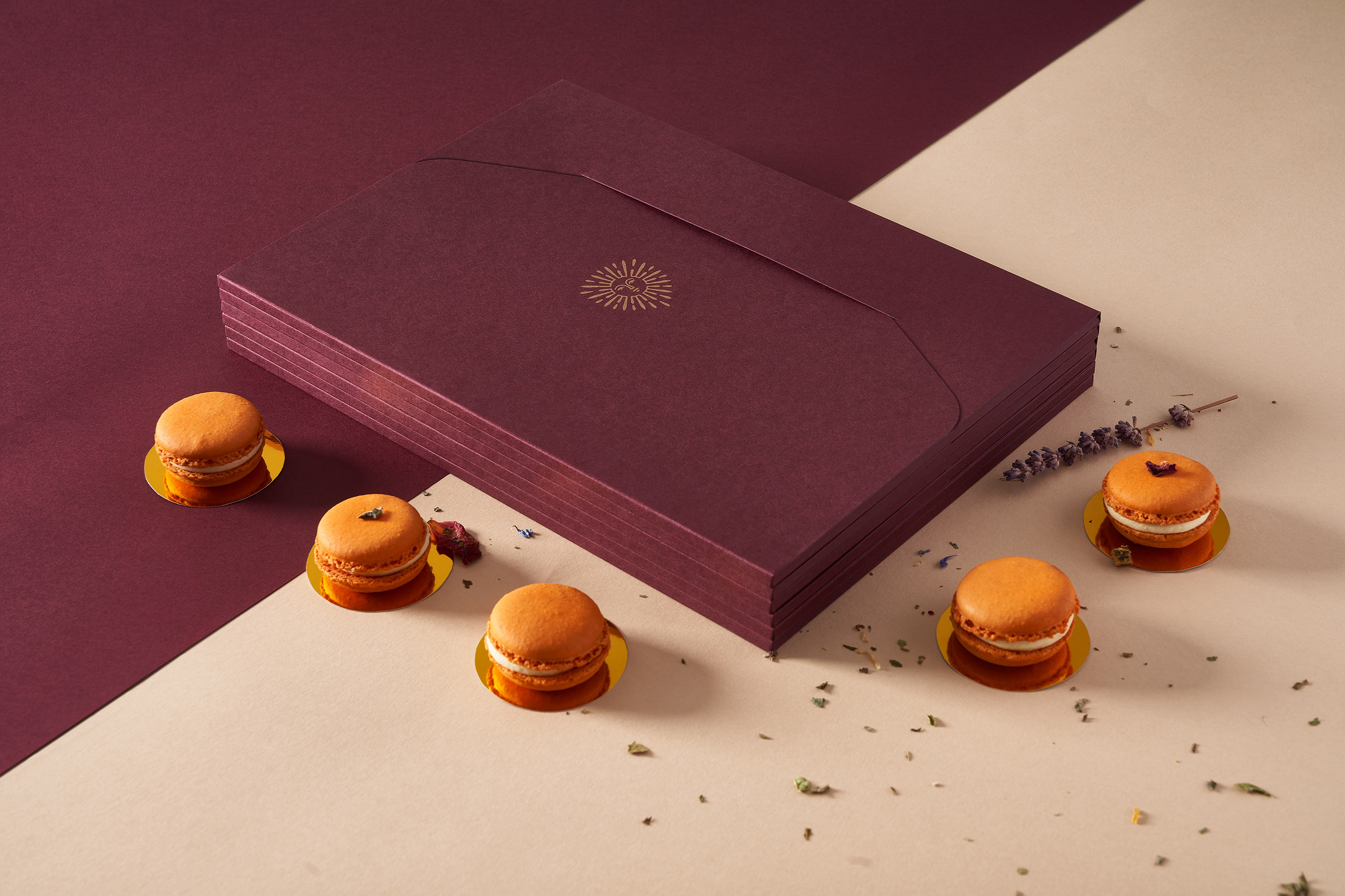
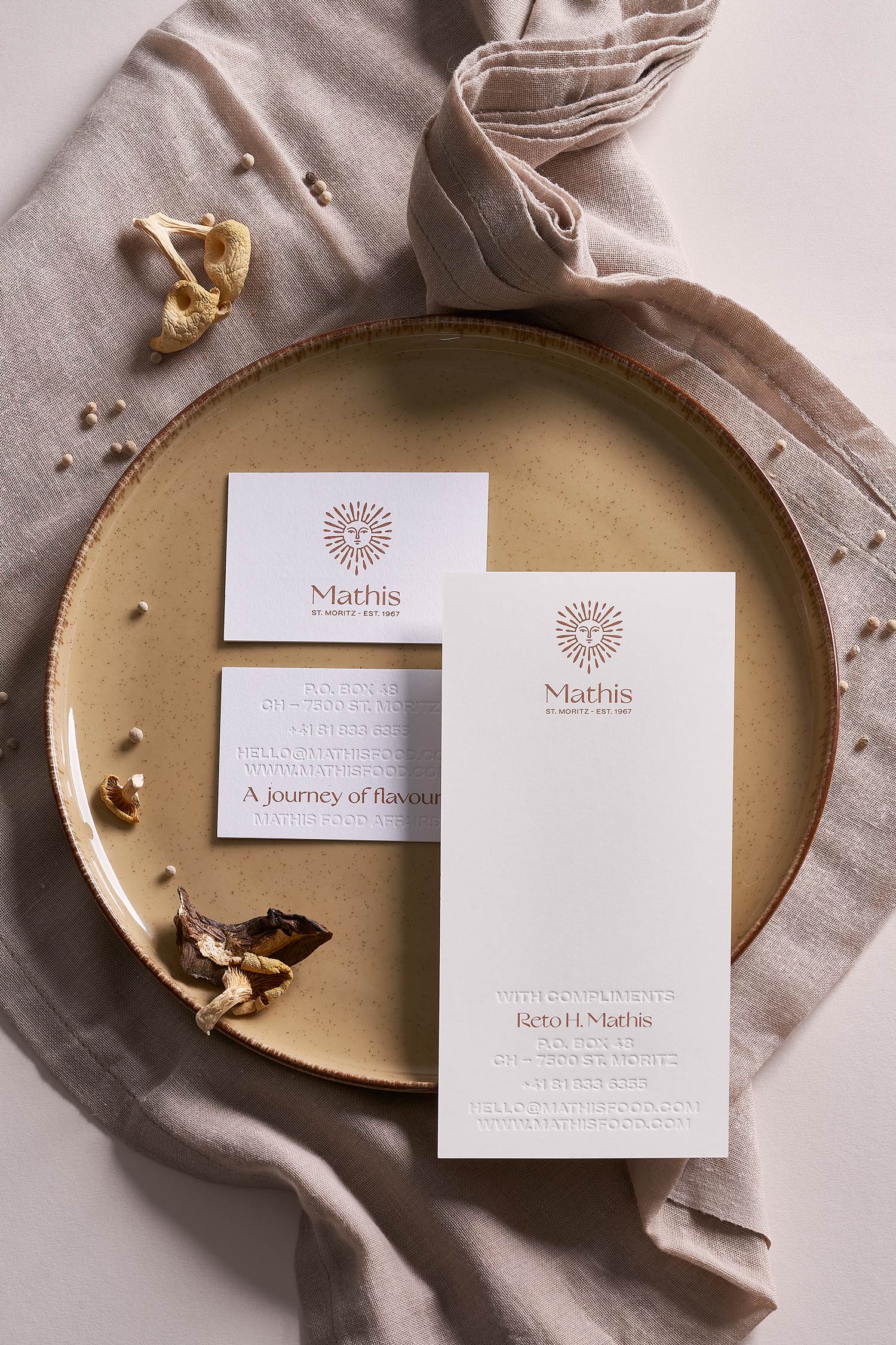
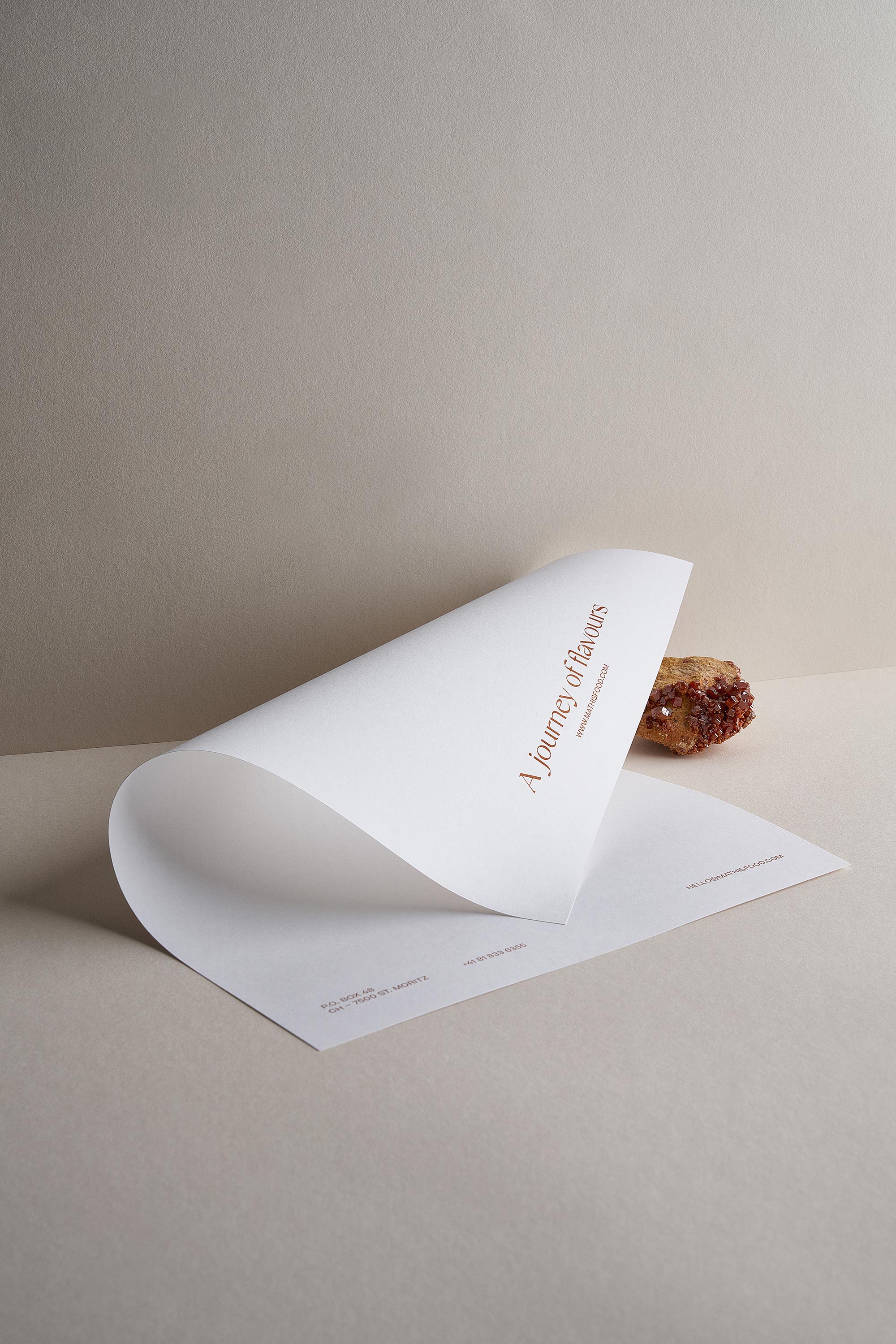
The papers were carefully selected in order to create an earthy color palette, which reminds us of the interior and colors of the restaurants and can complement all food creations by the chef.
The typography is based on the Chef Reto Mathis logo, which was also designed by Kommigraphics. The refined basic typography is a modernized version of serif typography, while at the same time we meet a more staccato and timeless sans serif typography. Together they create the perfect balance between the history of the Reto Mathis brand and the sophisticated quality of its services.
The typography got used in some of the applications with blind embossing techniques, emphasizing the “airy” character of the brand overall. The only printed color is the metallic bronze Pantone, which creates a bright and premium character.
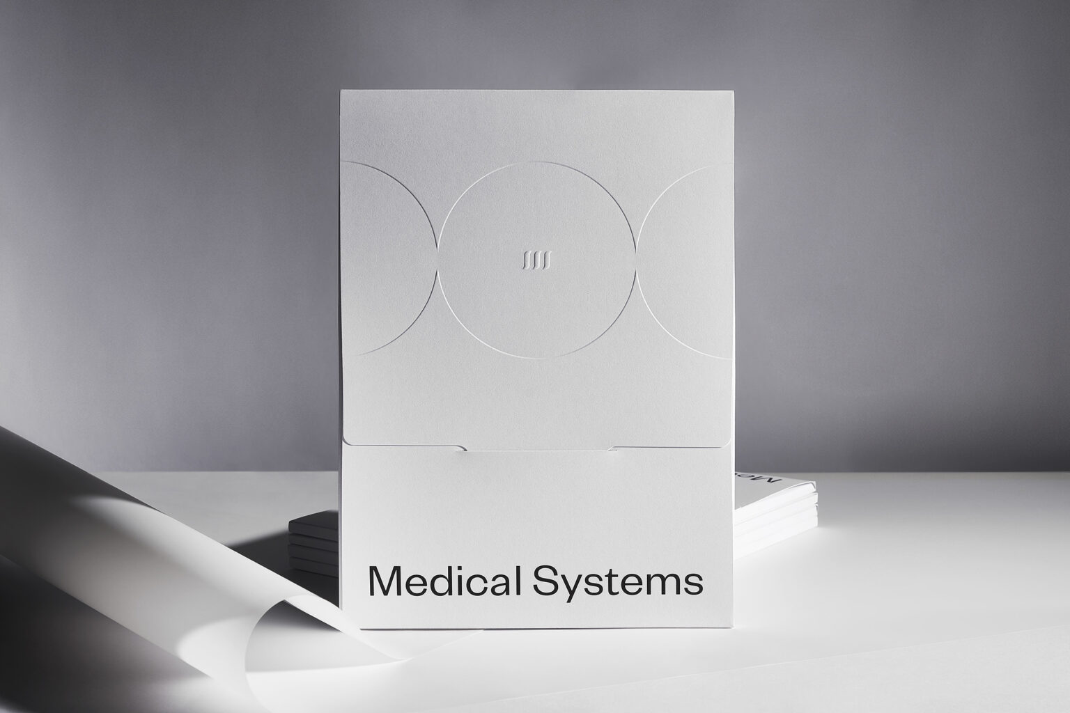
The folder was designed with a custom cutter, which was inspired by the curved lines and the design of the logo, while the selected paper creates the necessary color differentiation throughout the corporate identity.
THE OVERALL AESTHETICS AND DESIGN OF THE CORPORATE IDENTITY
WERE BASED ON THE REFINED GASTRONOMIC EXPERIENCE THAT CUSTOMERS EXPERIENCE WHEN THEY VISIT THE PLACES ESTABLISHED BY THE CHEF.
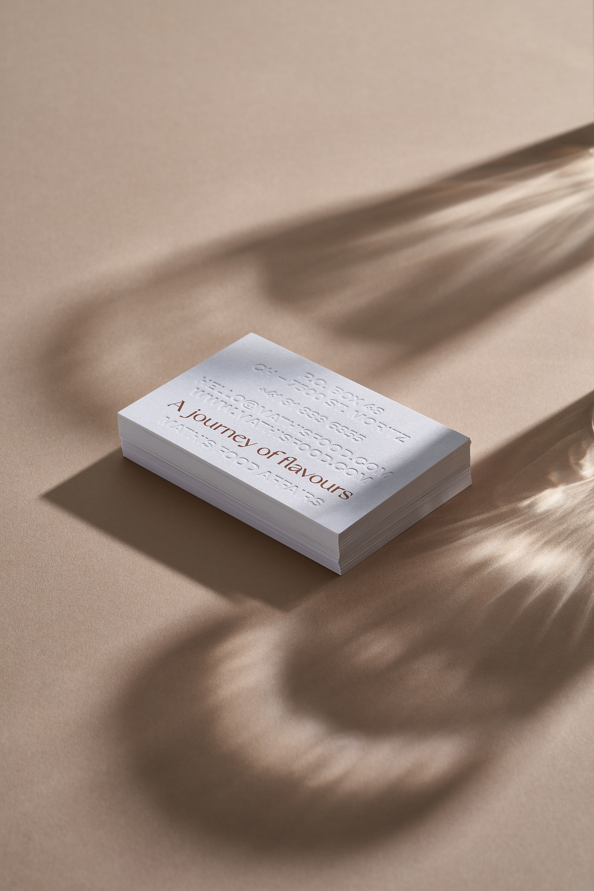
THE REFINED BASIC TYPOGRAPHY
IS A MODERNIZED VERSION OF SERIF TYPOGRAPHY.
RELATED PROJECTS