-
SERVICES:
- Design system
- Logo redesign
- Βrand manual
-
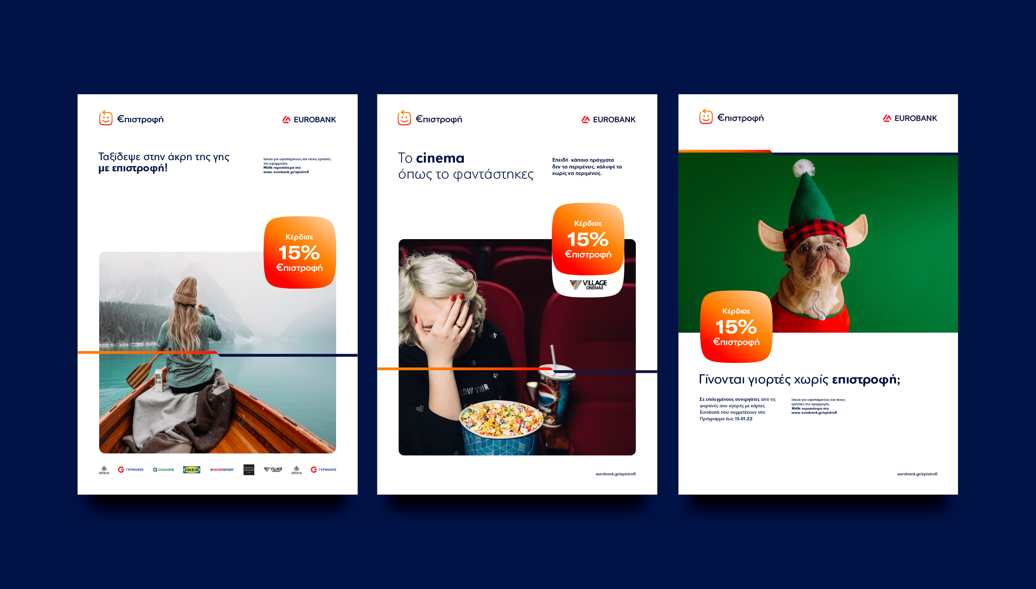
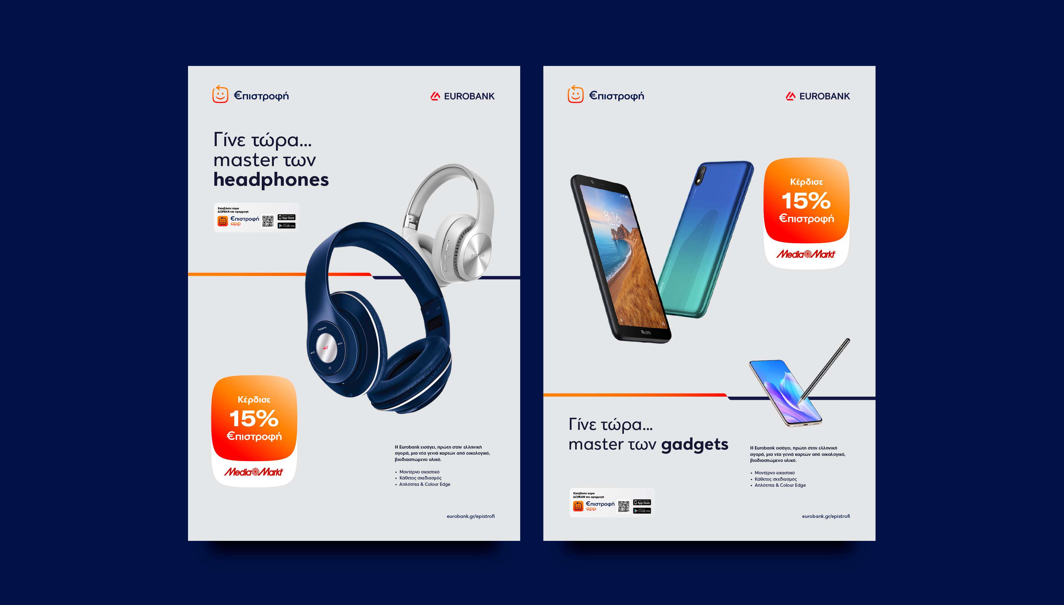
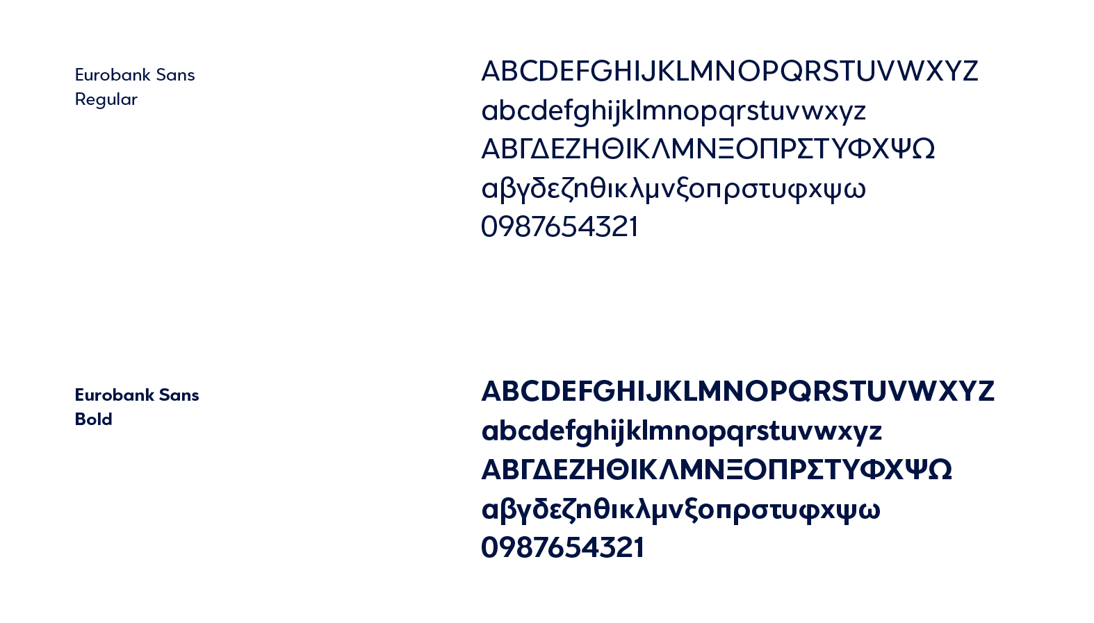
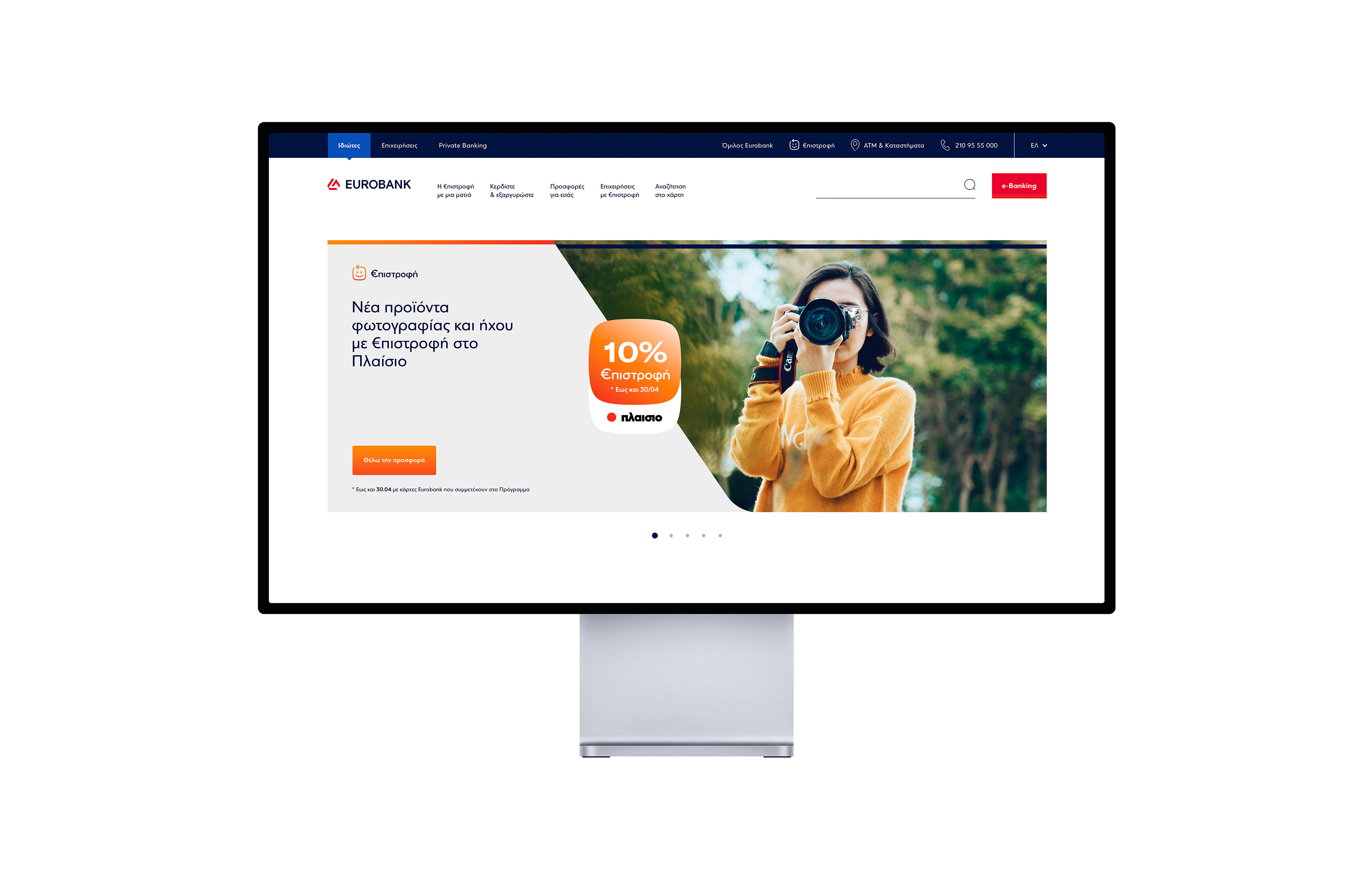
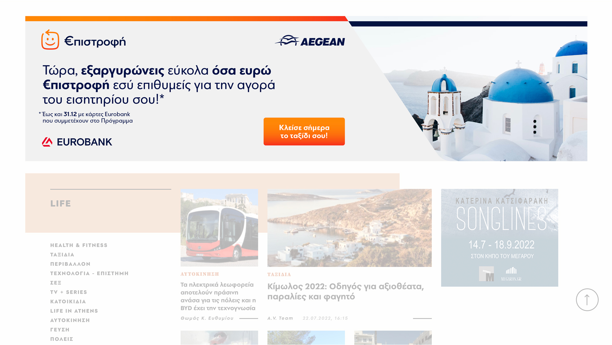
EUROBANK, through its cooperation with Ogilvy Greece, assigned us the study and the design of its €pistrofi reward program’s visual communication system for all online and offline media.
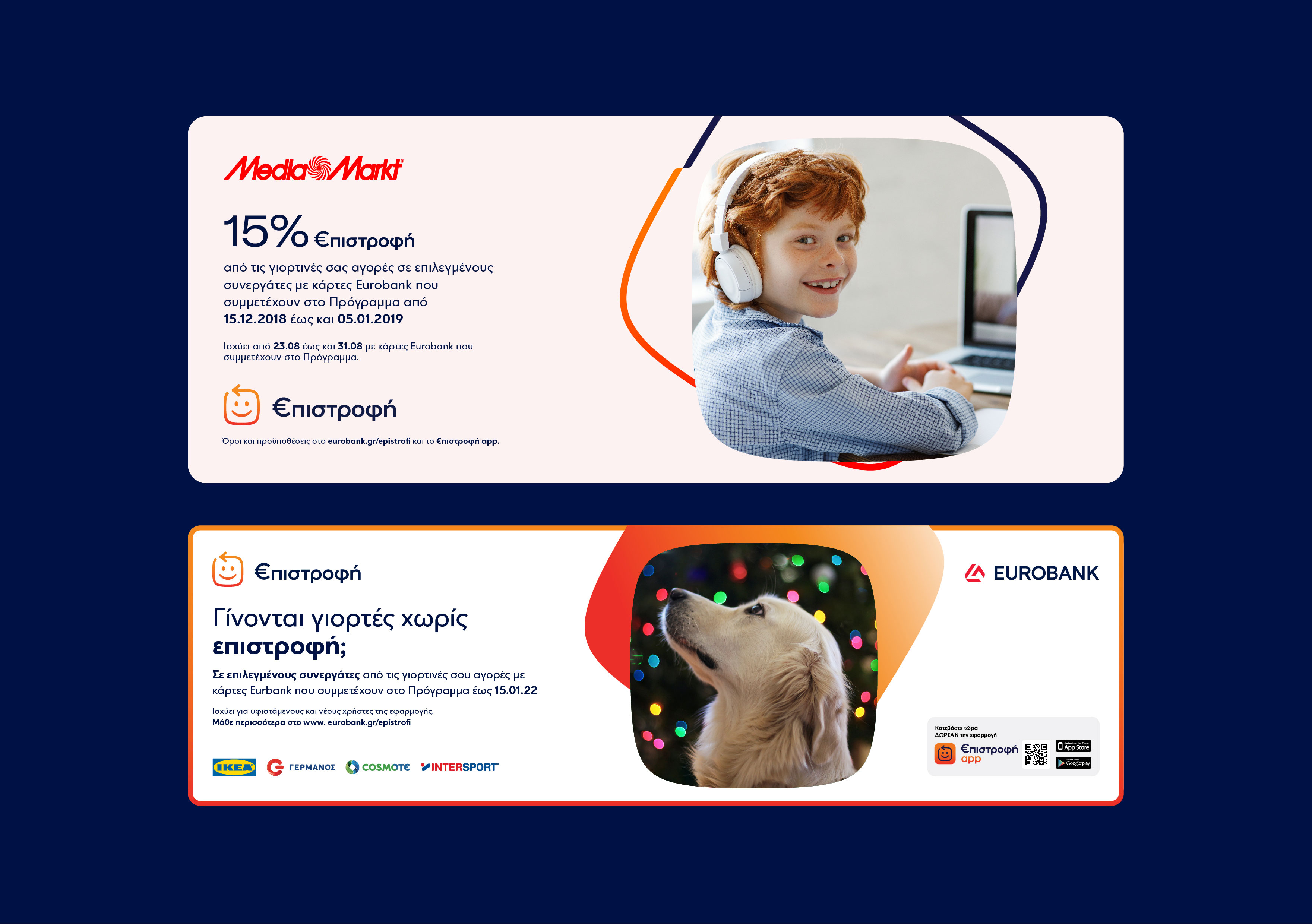
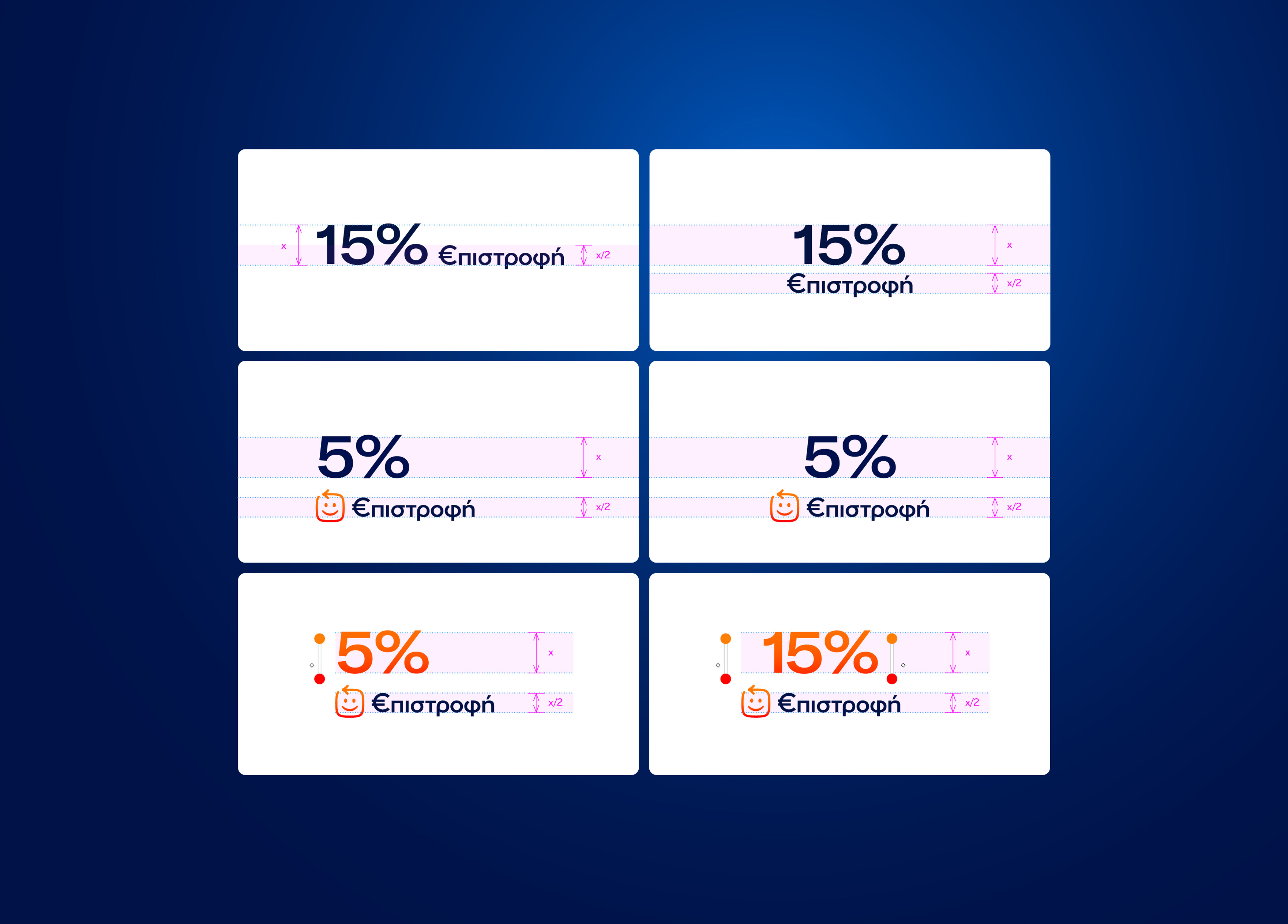
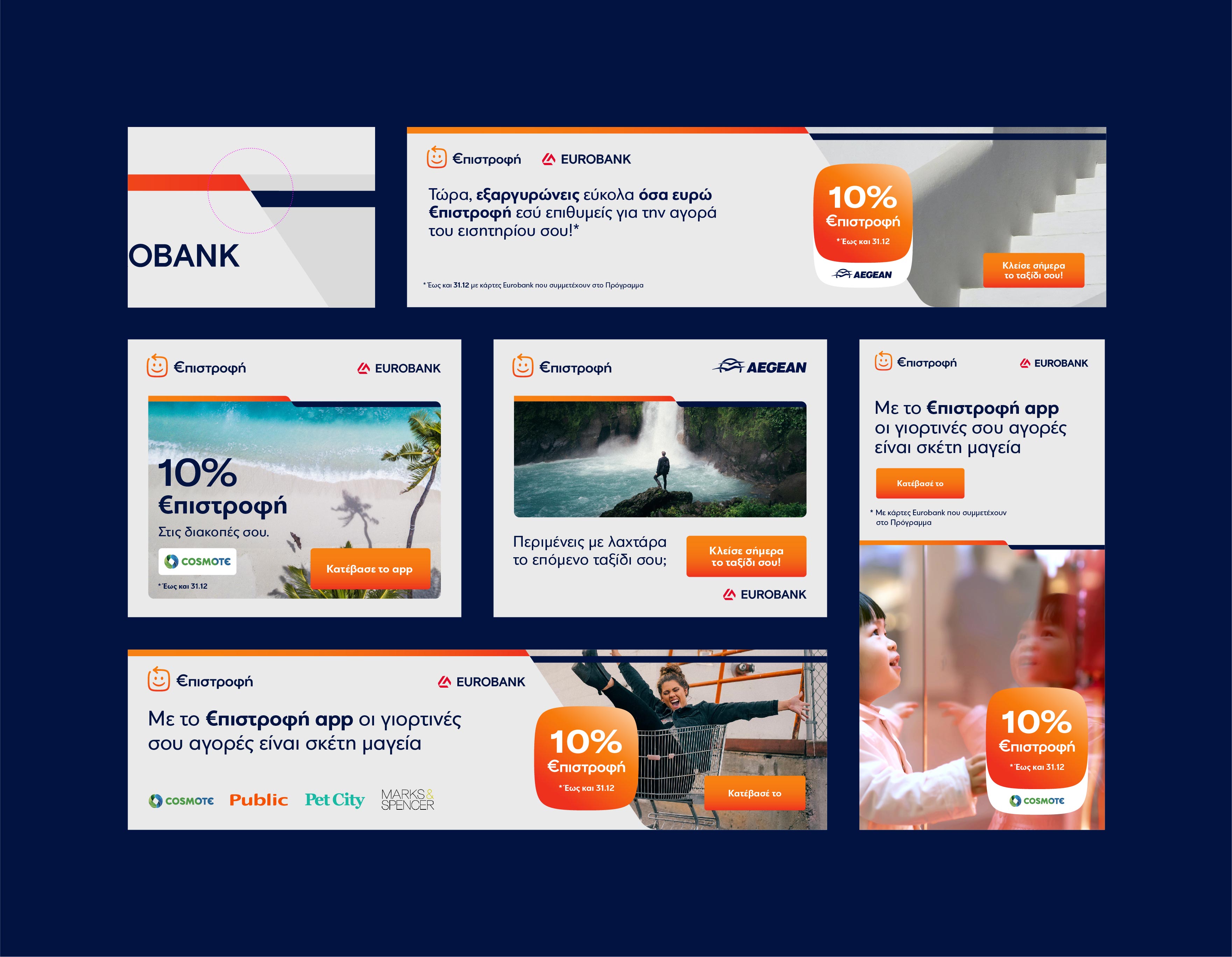
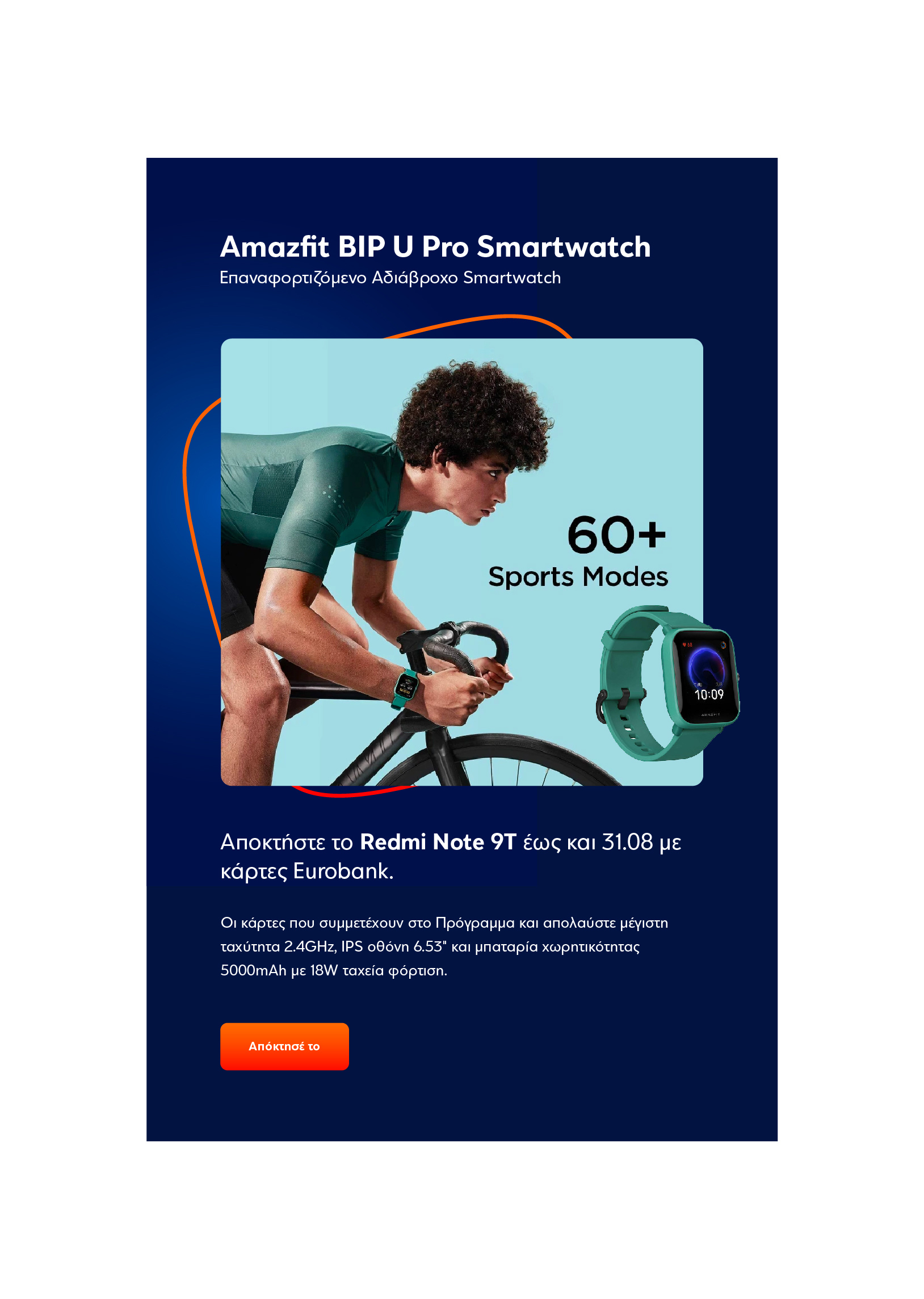
EUROBANK’s Reward program “€pistrofi”, enters its next era with a modular communication system, where the content of each communication is treated as king on all media used, by using the correct emphasis on reading and strengthening its brand awareness with a fresh, bright and optimistic design approach!
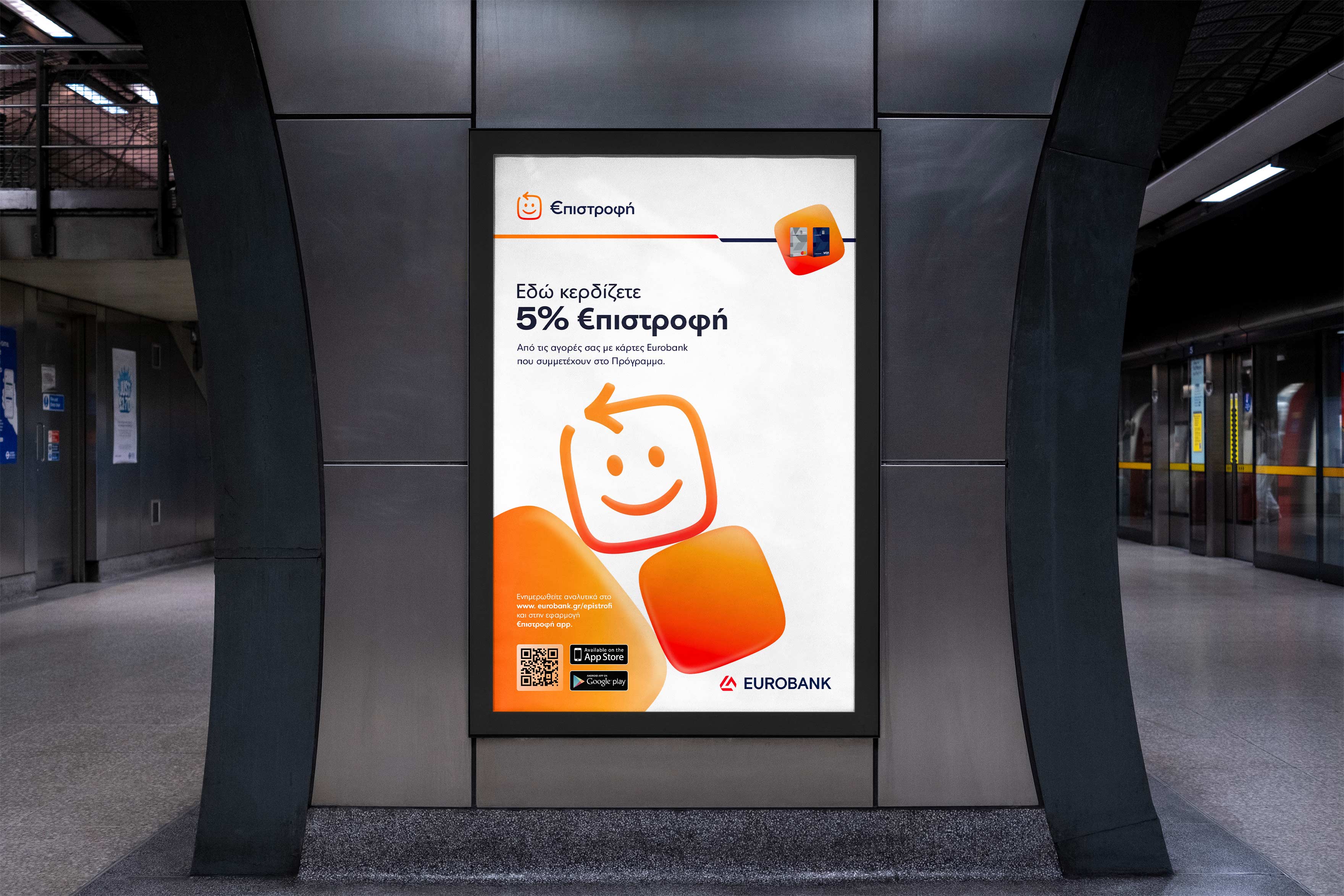
The redesign of the well-known “Smile” was the starting point for the later spread of an entire identity, with three structural changes in the following points:
- A change of the “Smile’s” shape.
- A change of the “Smile’s” eyes shape so that its positive mood is enhanced.
- A change in the direction of the arrow (one of the most important changes) from right to left empowers the scheme’s actual name and meaning.
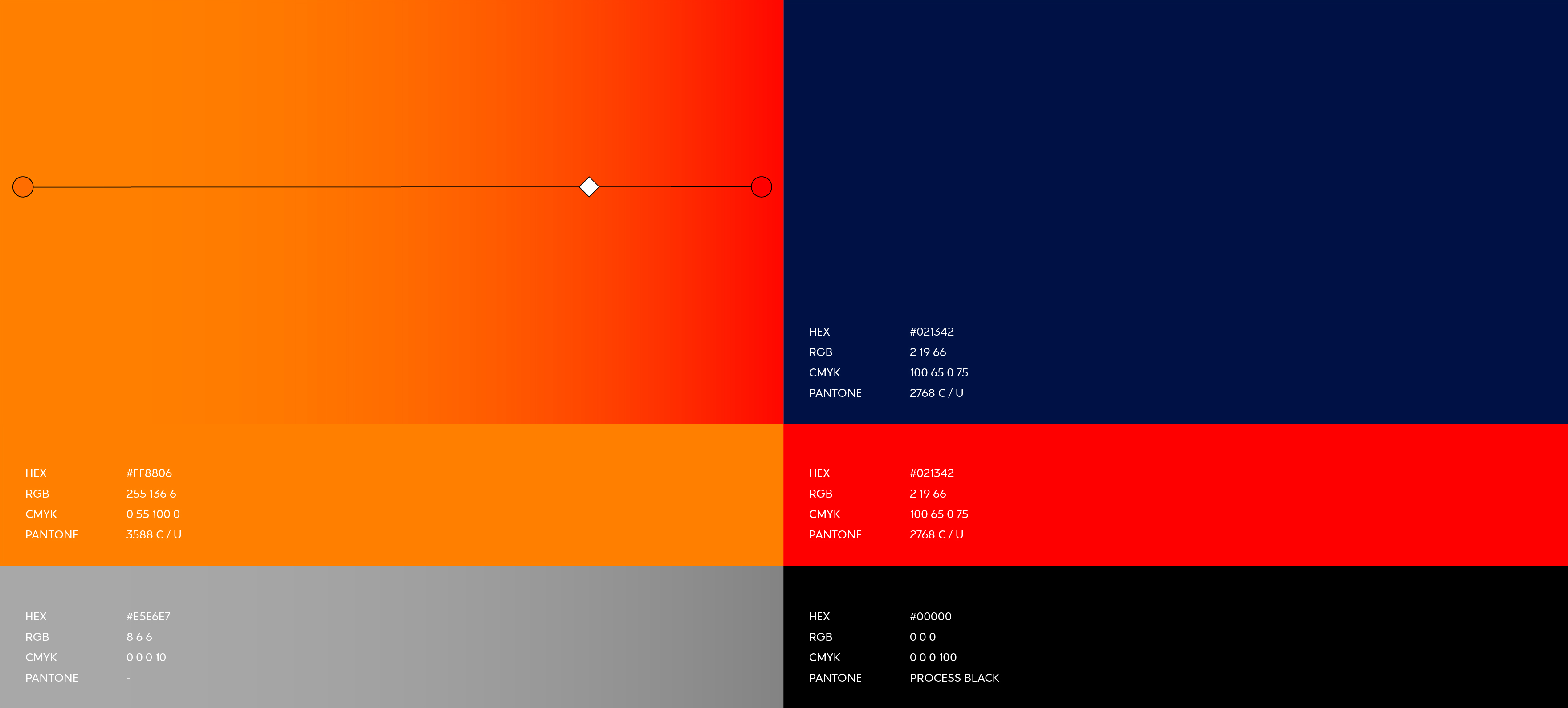
We updated the color palette to warmer and more intense shades of orange-red, in order to keep a part of the old identity (brand loyalty) as well as to refresh with an up today palette and finally at the same time aim at the future (digital applications – next day).
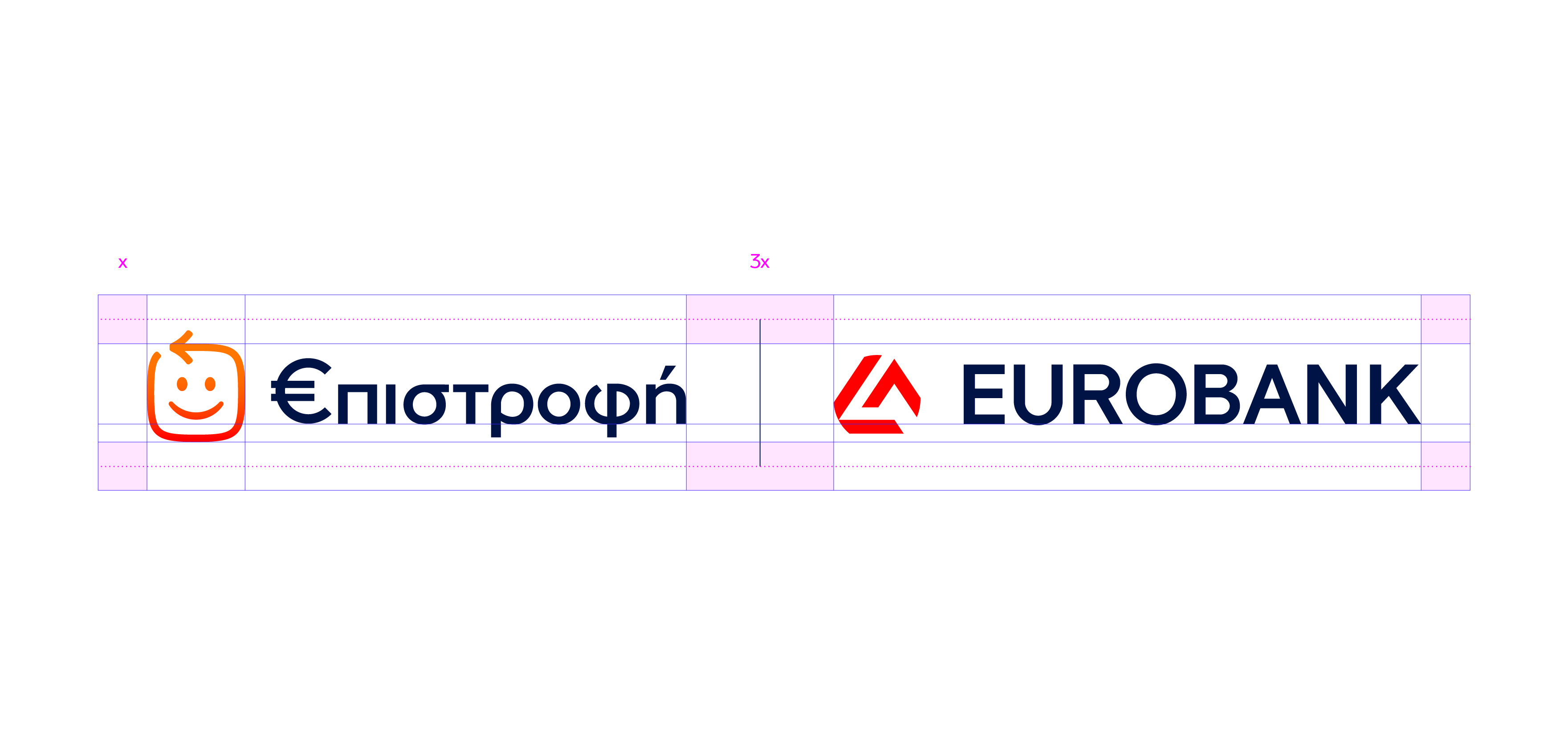
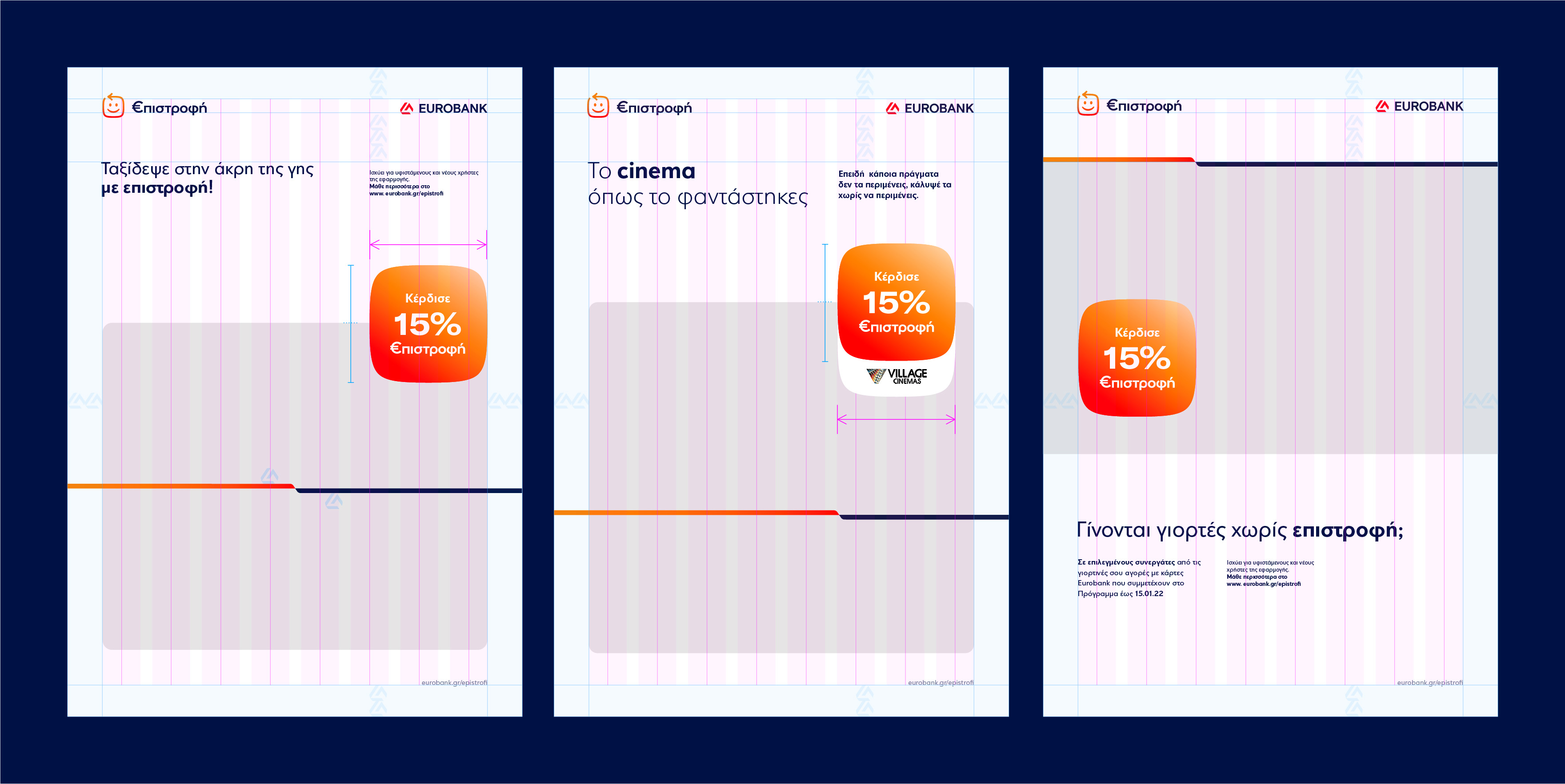
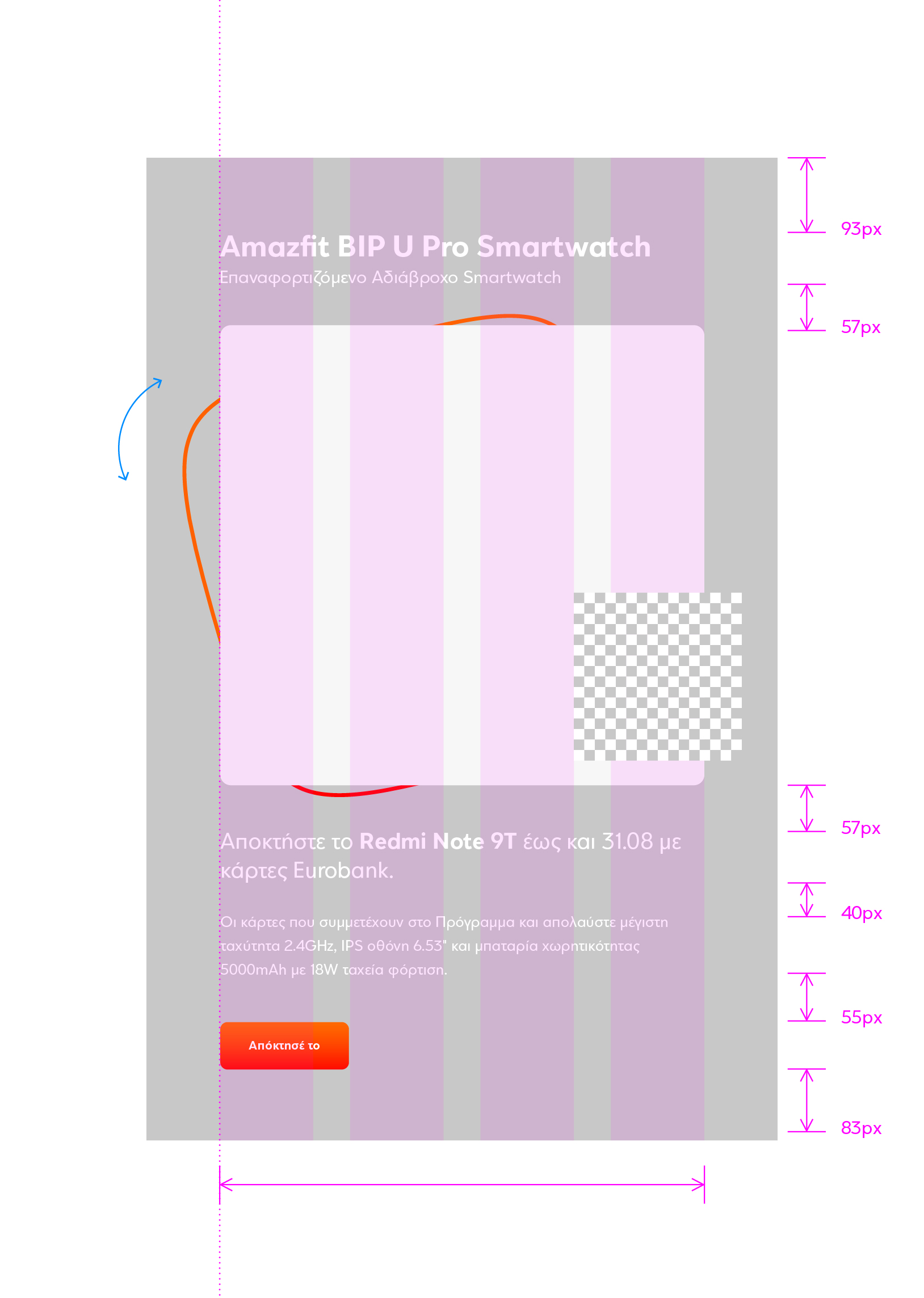
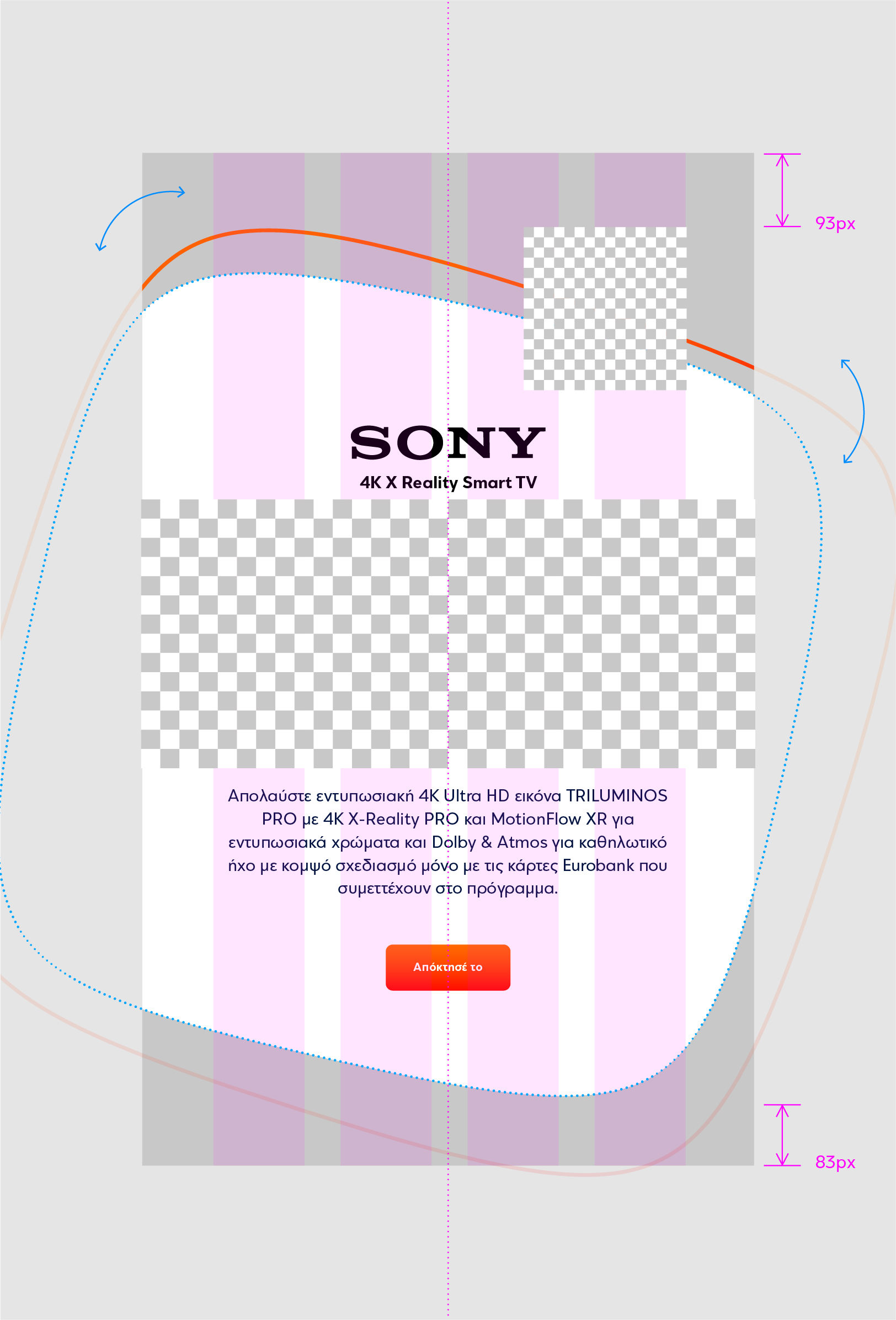
The connection between the “€pistrofi” reward program and EUROBANK is designed to be done effortlessly and successfully, through a multi-level and multifaceted communication system that shares rules, linear symbolisms, and structures of the basic identity of the bank.
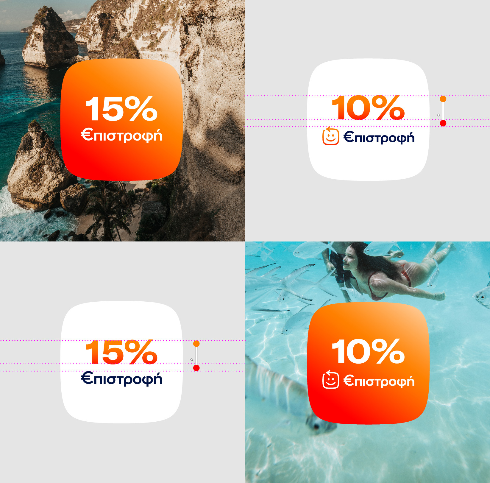
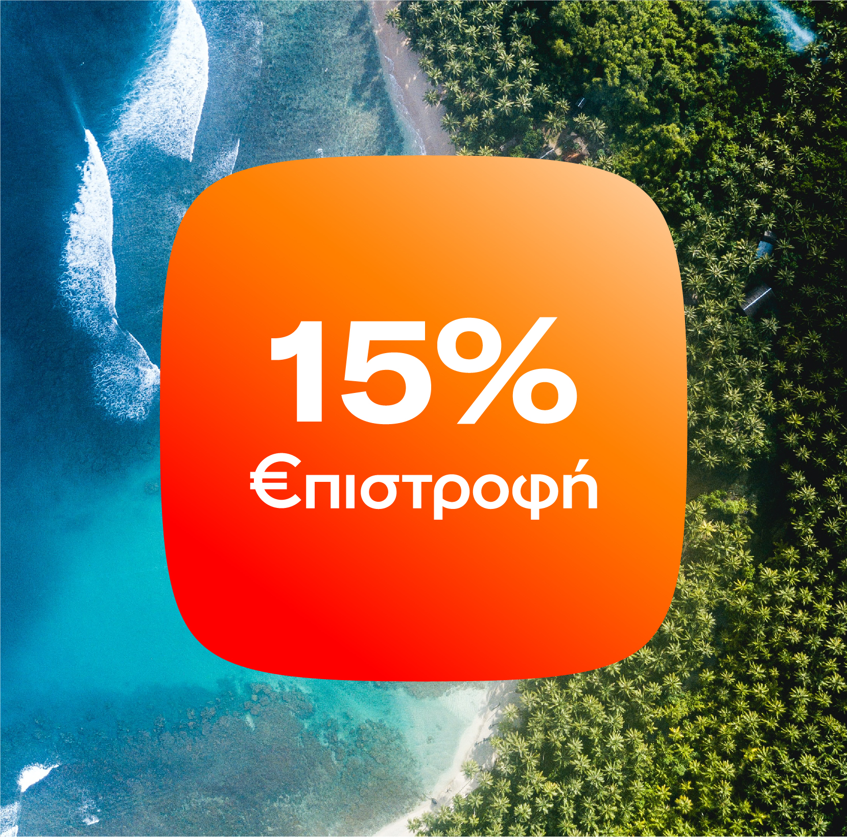
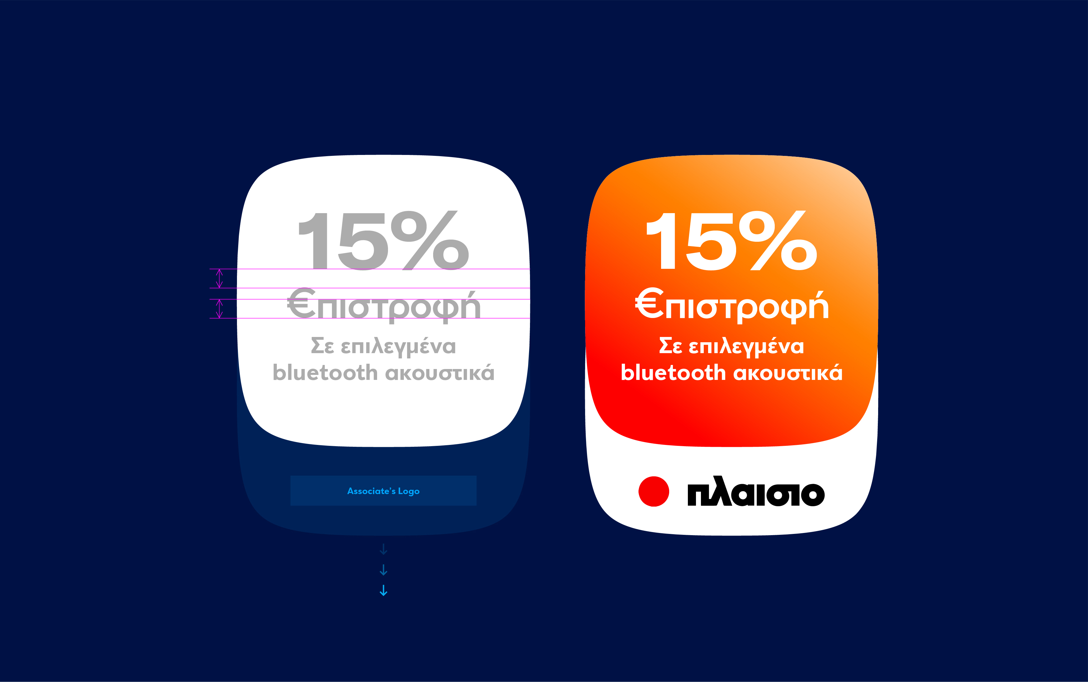
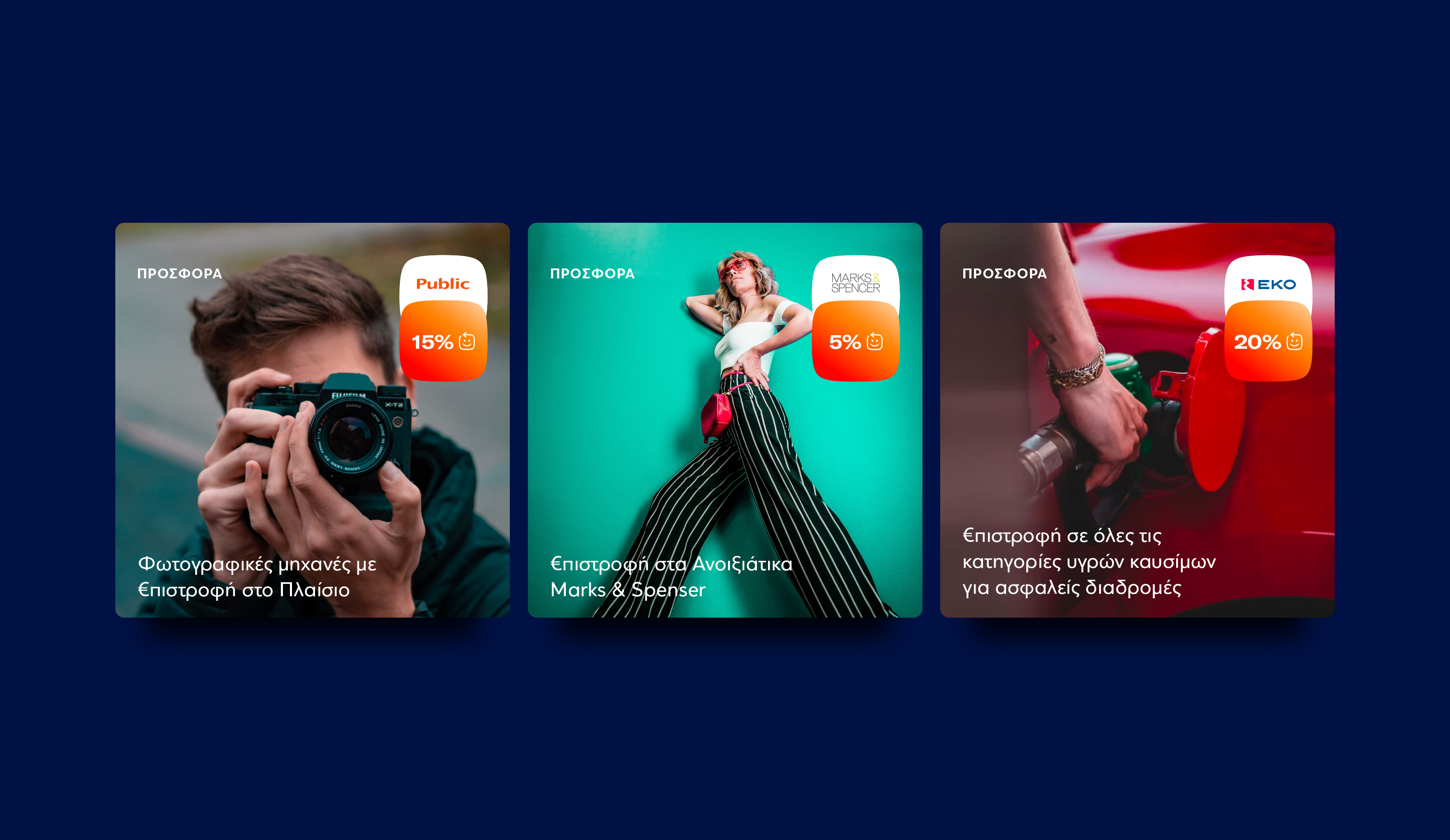
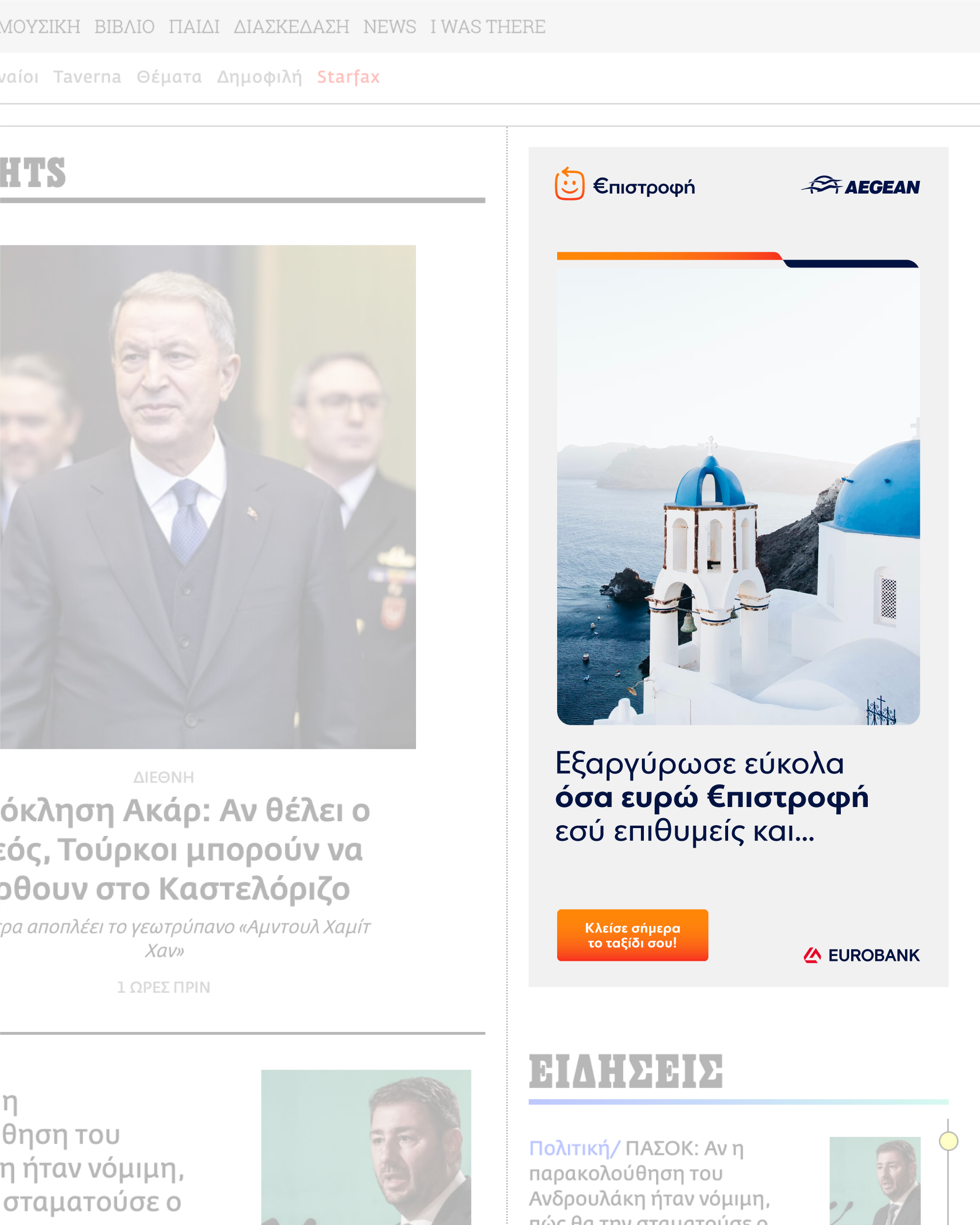
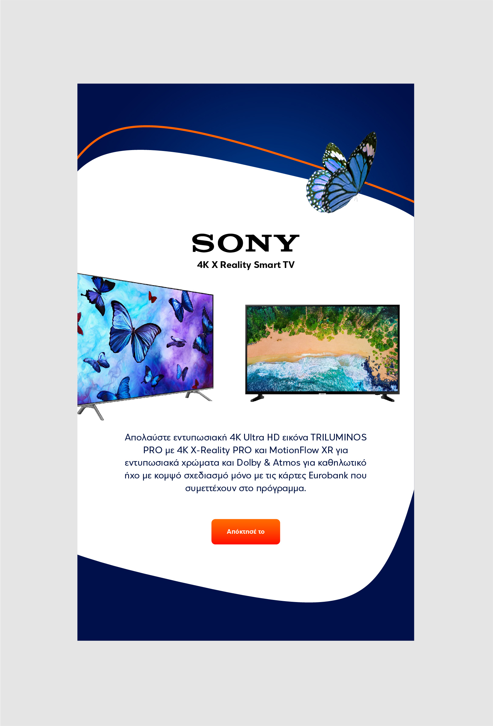
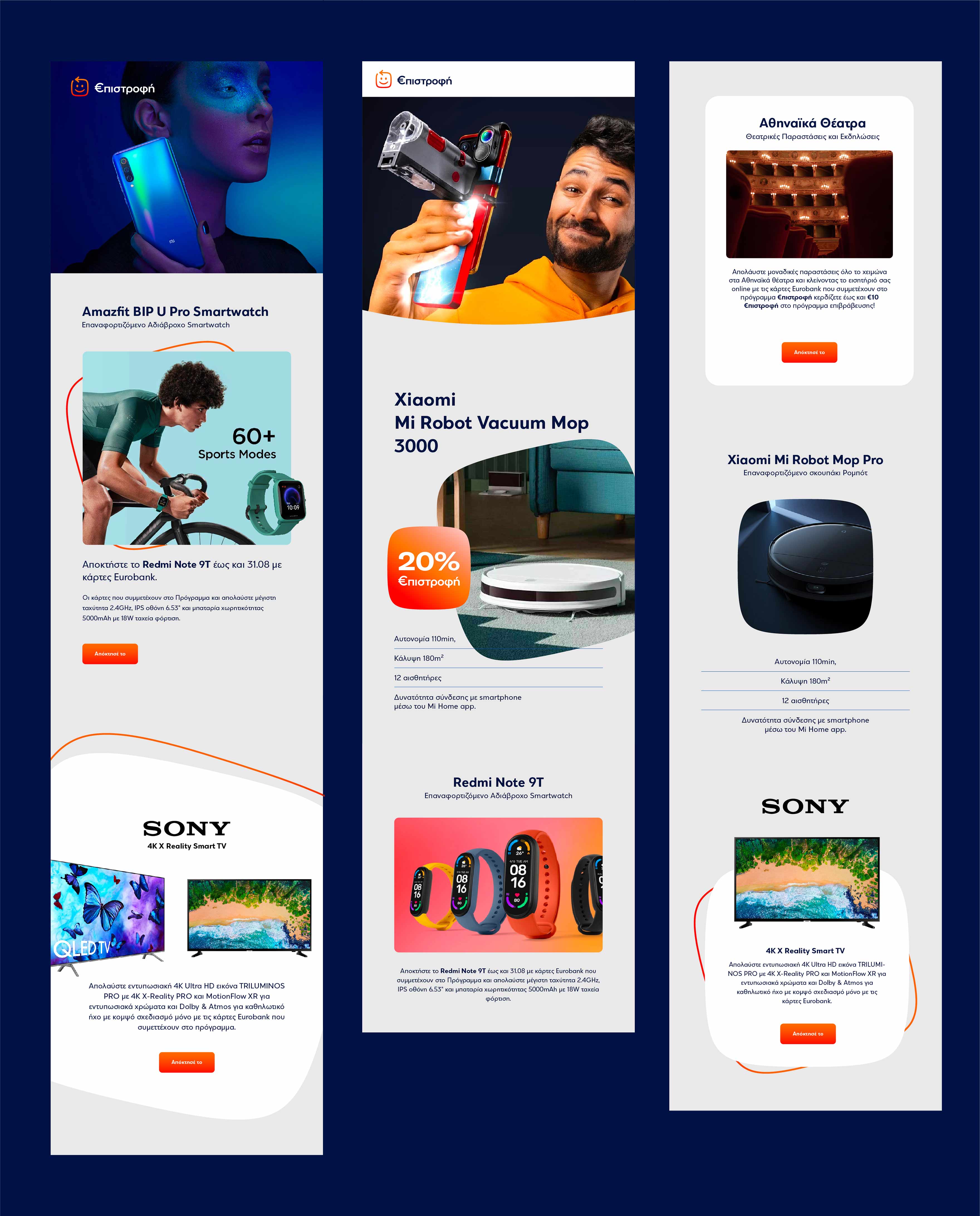
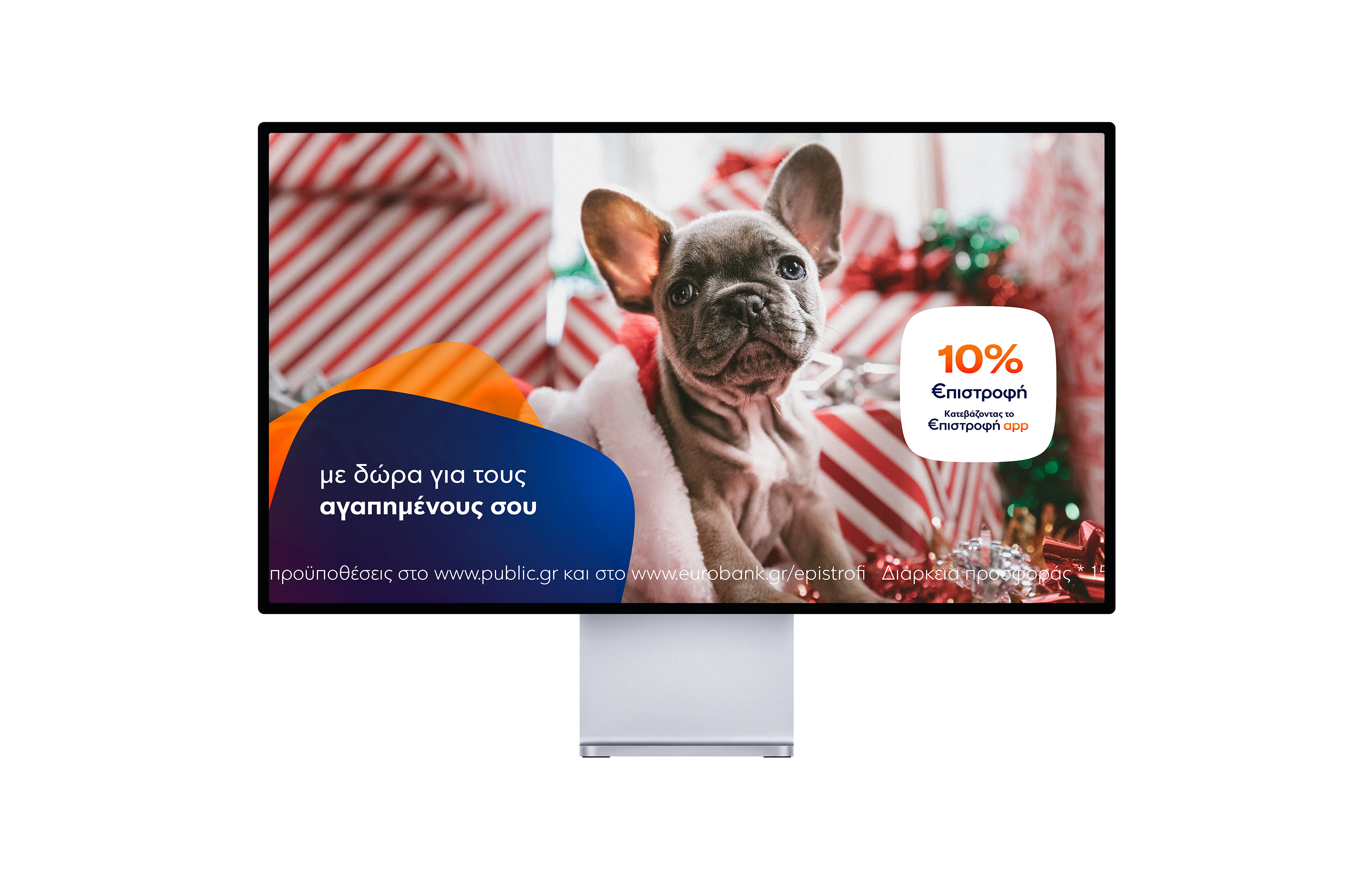
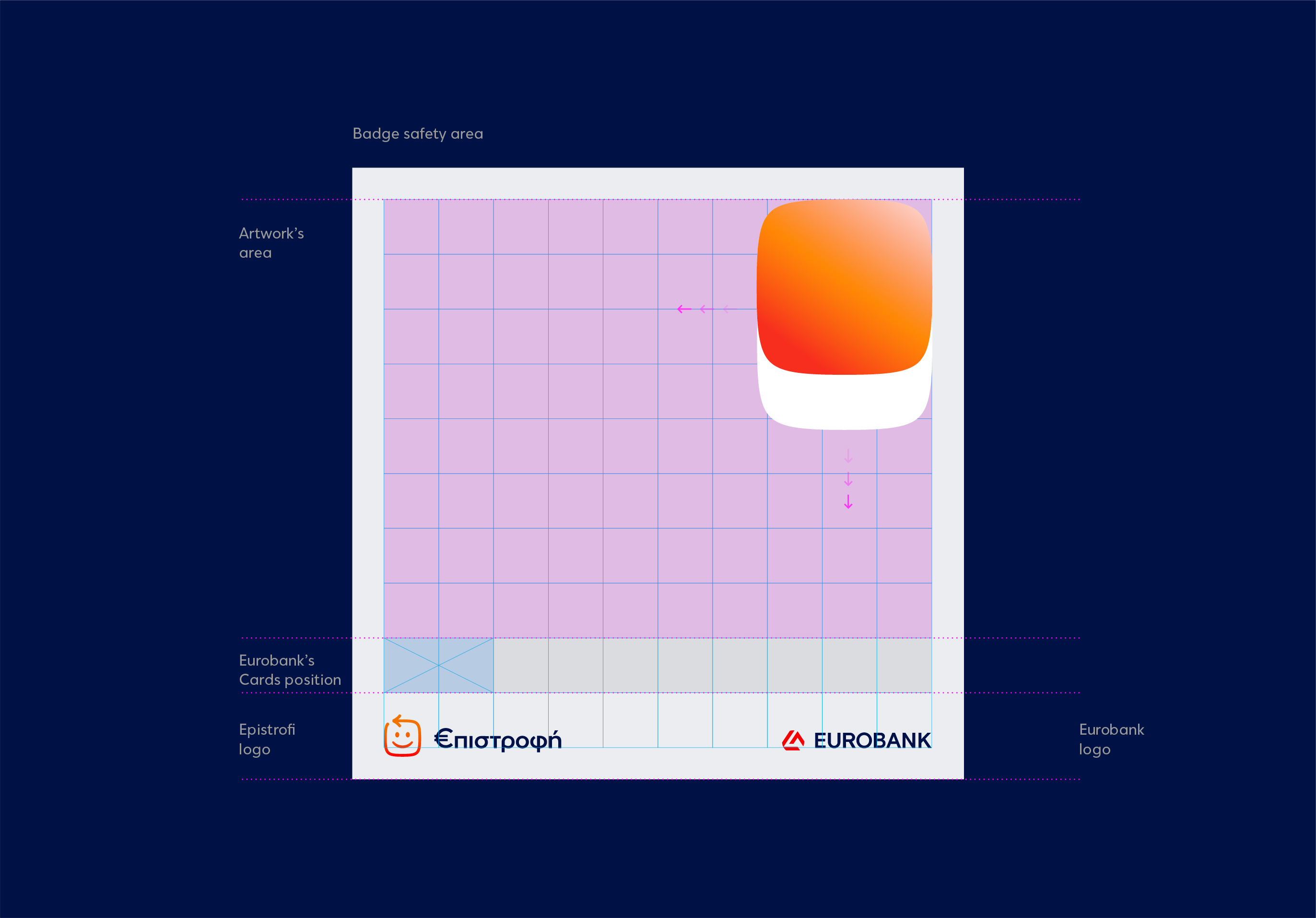
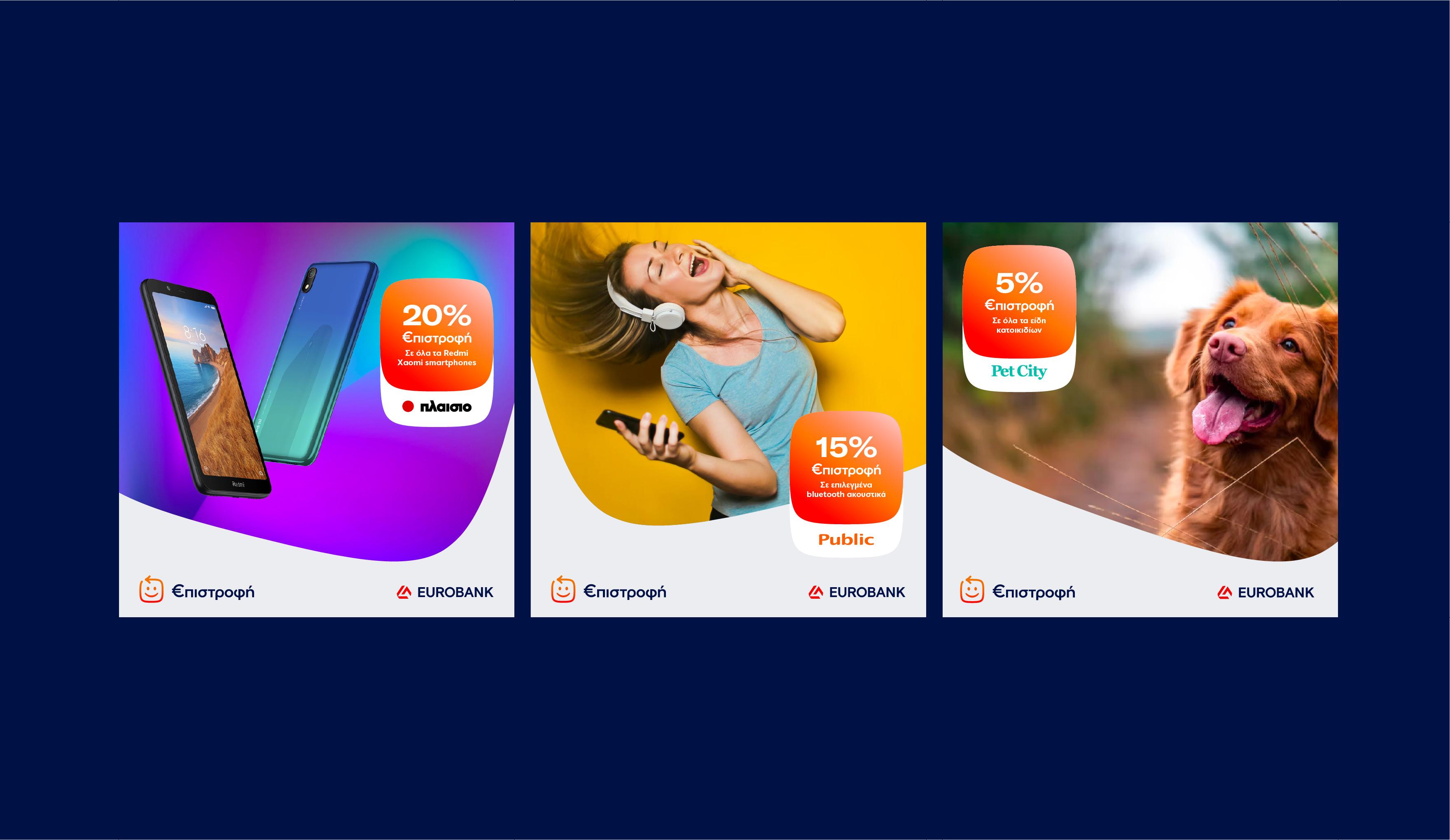
The goal of the new identity is the correct and clear communication on any physical or digital medium, whether it is to promote a collaboration or article content or more inspirational material, always emphasizing the main identity design. A communication system that is created from the shape (candy) of the “€pistrofi’s” logo, respecting the customers of the program but also, above all, creating trust!
We managed to creatively design a communication system that is based on and evolves the bank’s new identity and brand device in a friendly, pleasant, and also modern shape constituting the extension of the basic logo of €pistrofi.
The goal of the new identity per application is the correct and clear communication on any physical or digital medium, whether is promoting a collaboration or an article’s content or more inspirational material, always emphasizing the basic design identity becoming from the Epistrofi’s (app icon – shape) respecting the customers of the reward program but also and above all, creating trust!
