-
SERVICES:
- Web design
- UI - UX
- Content architecture
- Website development
-
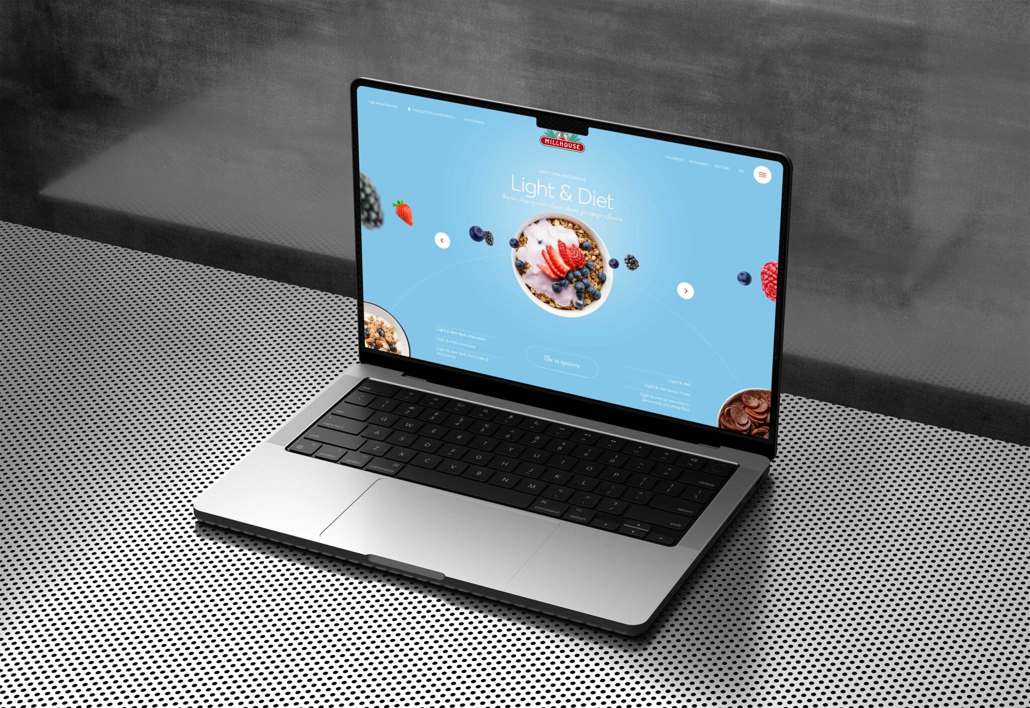
Millhouse is the first Greek cereal brand that already counts more than 30 years of innovation and quality, referring to all ages.
The redesign of its website was an important milestone in the company’s history, as it marks its overall re-positioning in the market.
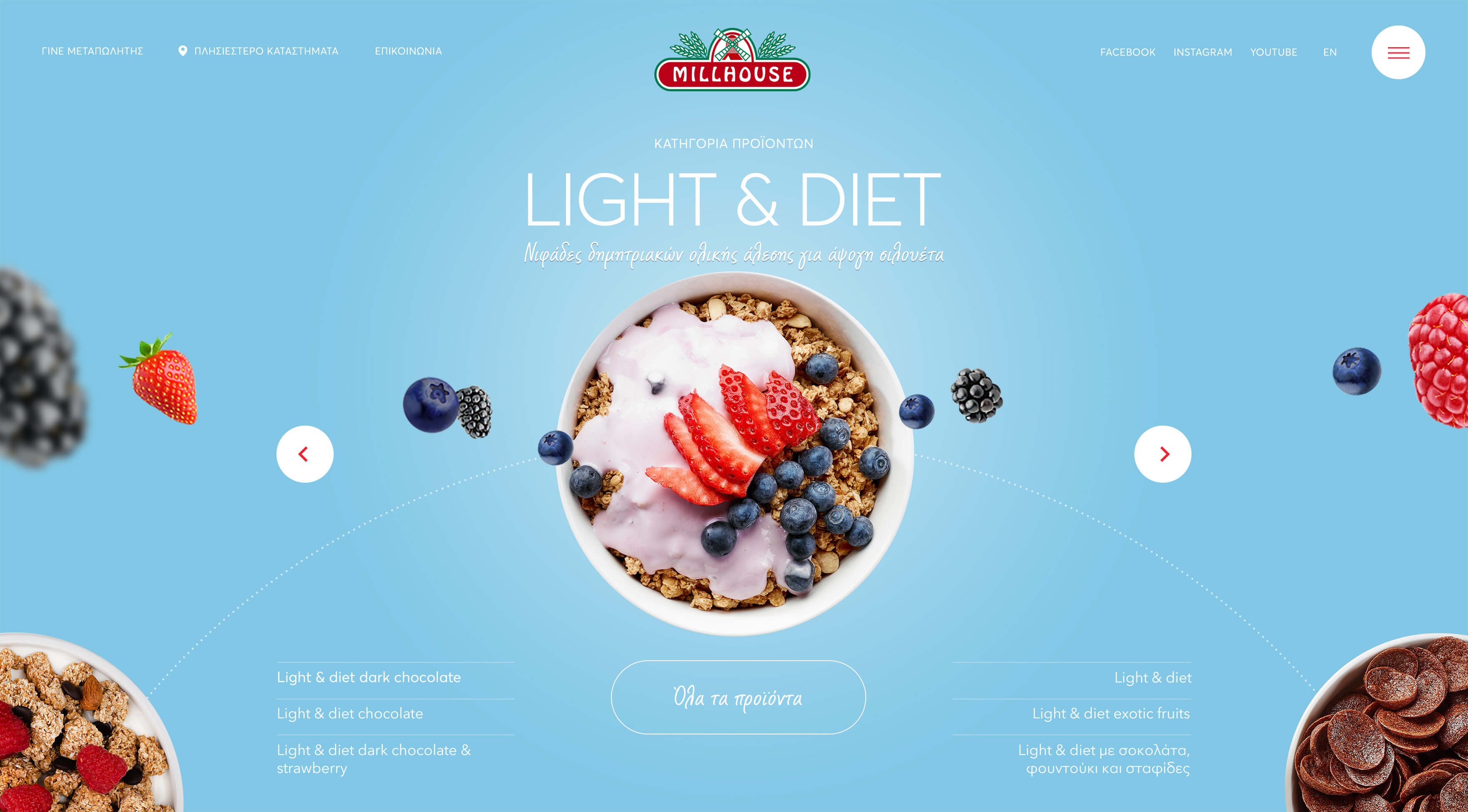
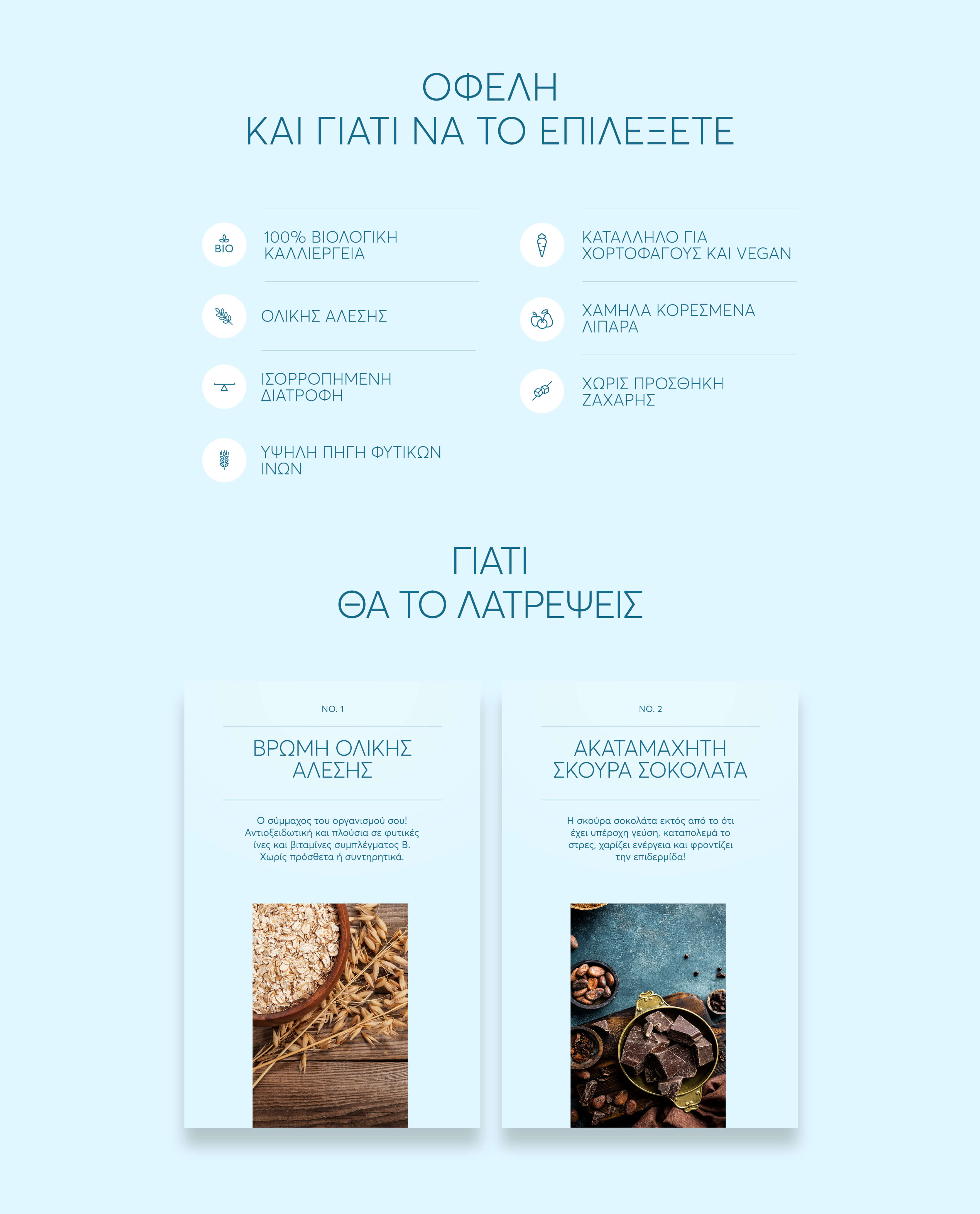
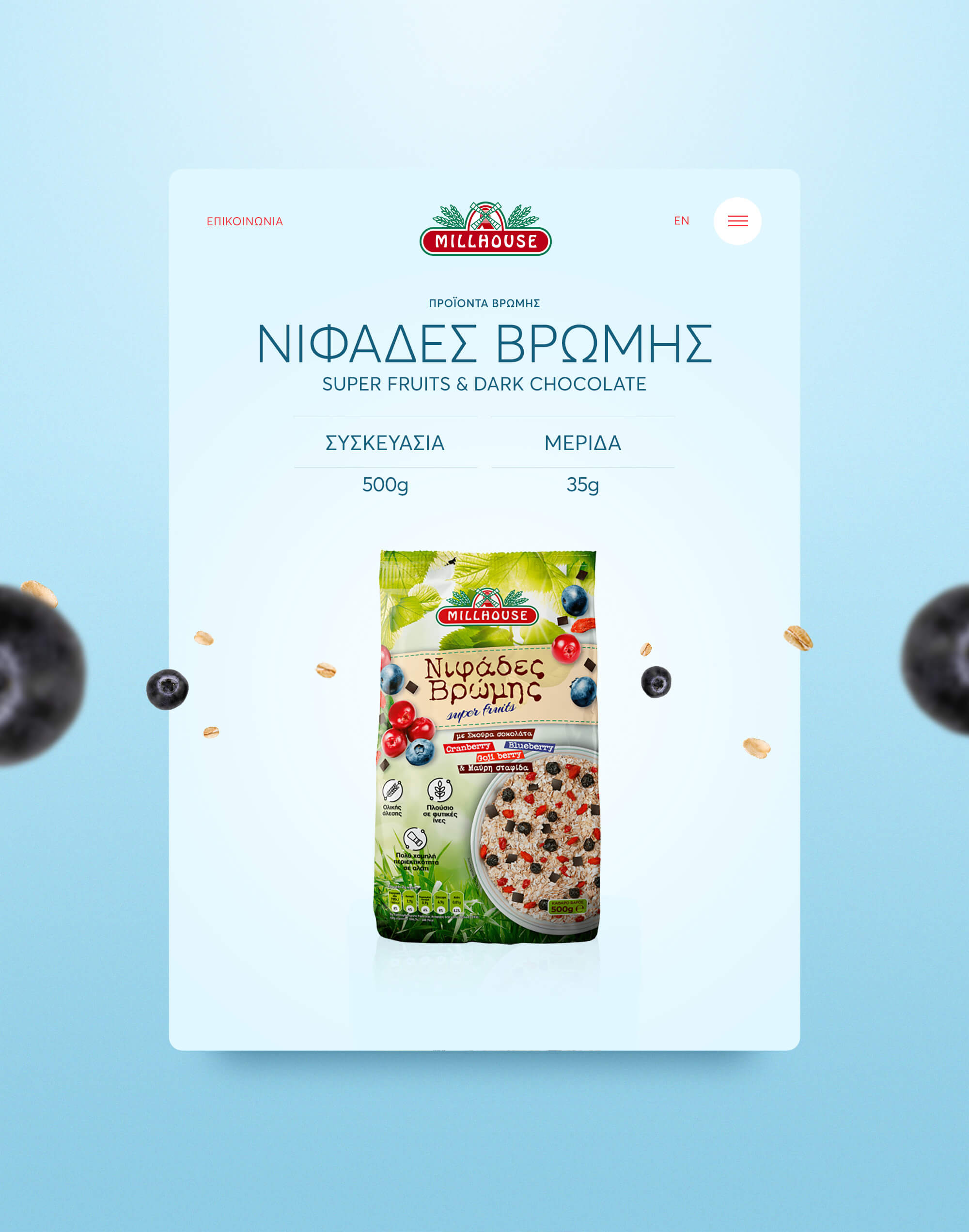
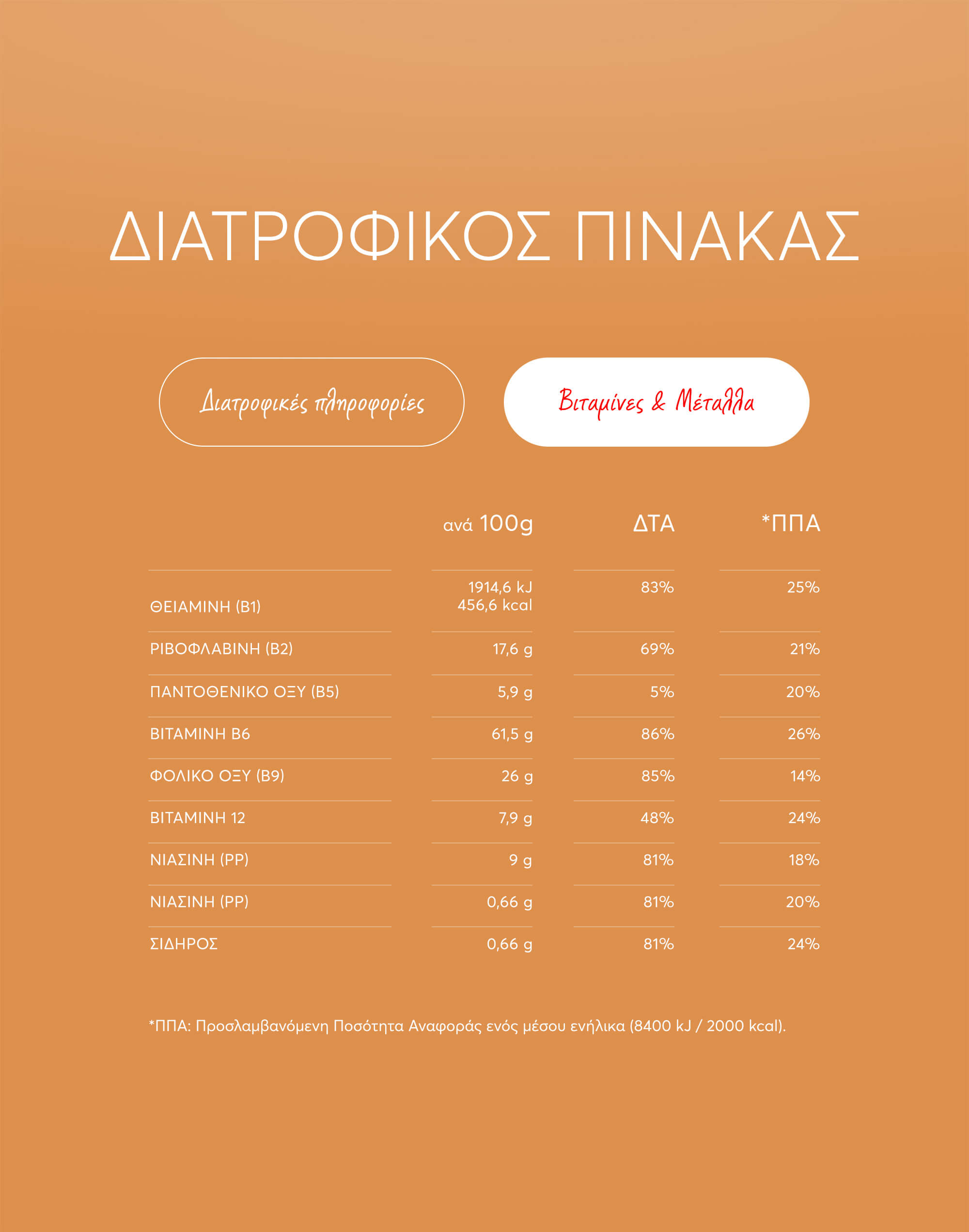
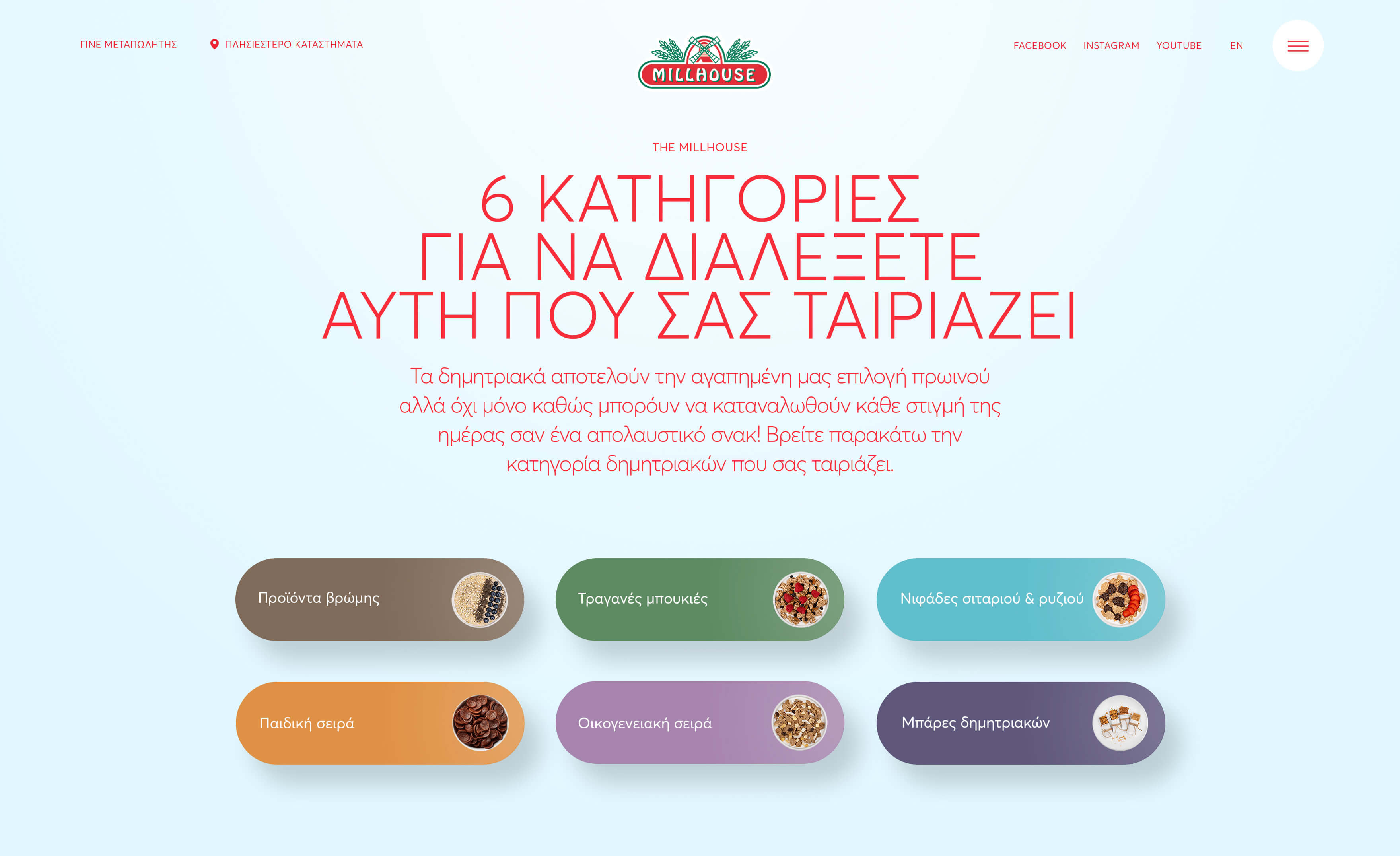
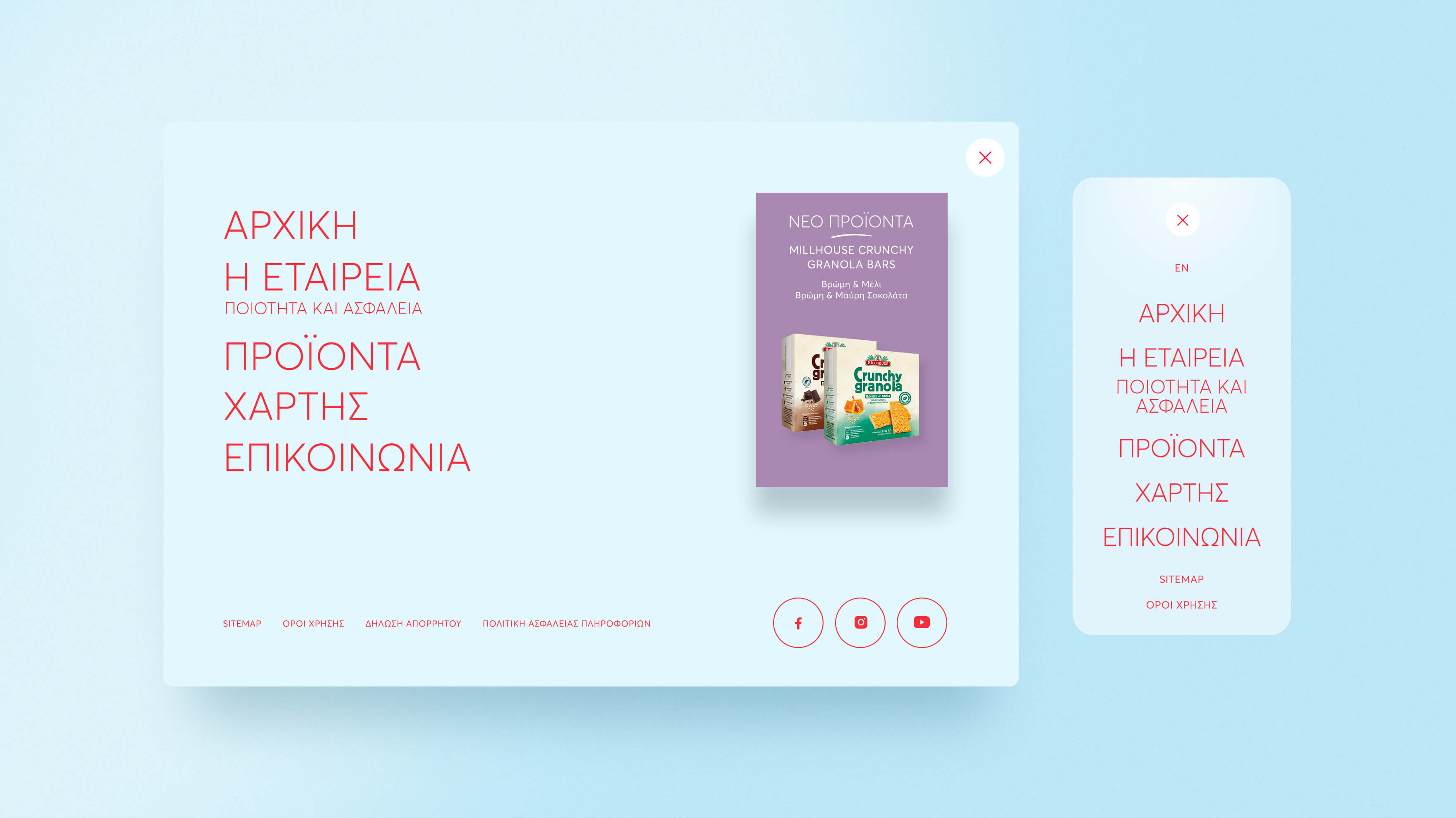
A great challenge for the design of the website was its content and especially the products in terms of packaging. There are many different product categories, lacking a specific identity. So the uniformity and the general corporate image that should be attributed to the design was one of the initial problems that we had to overcome and find a solution for.
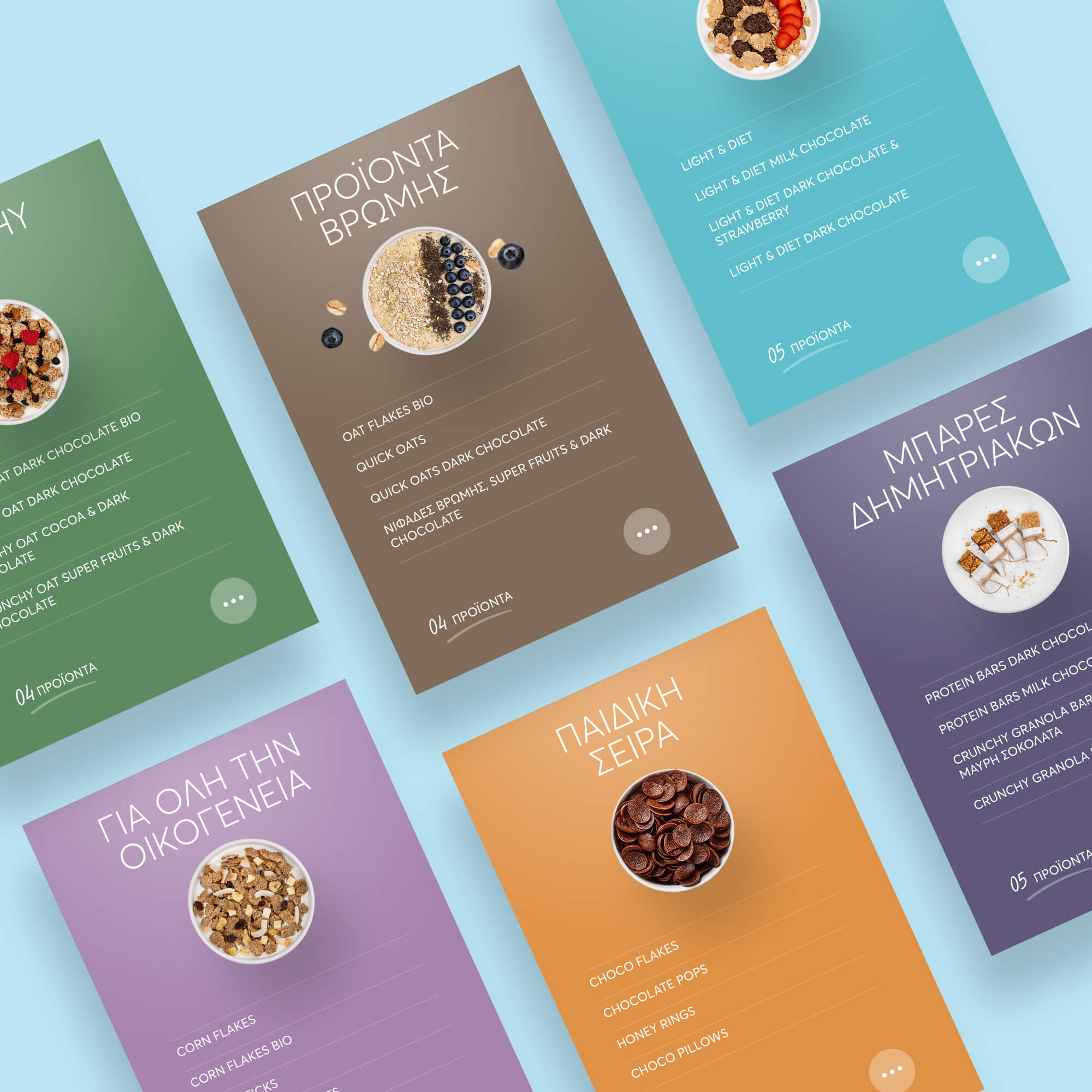
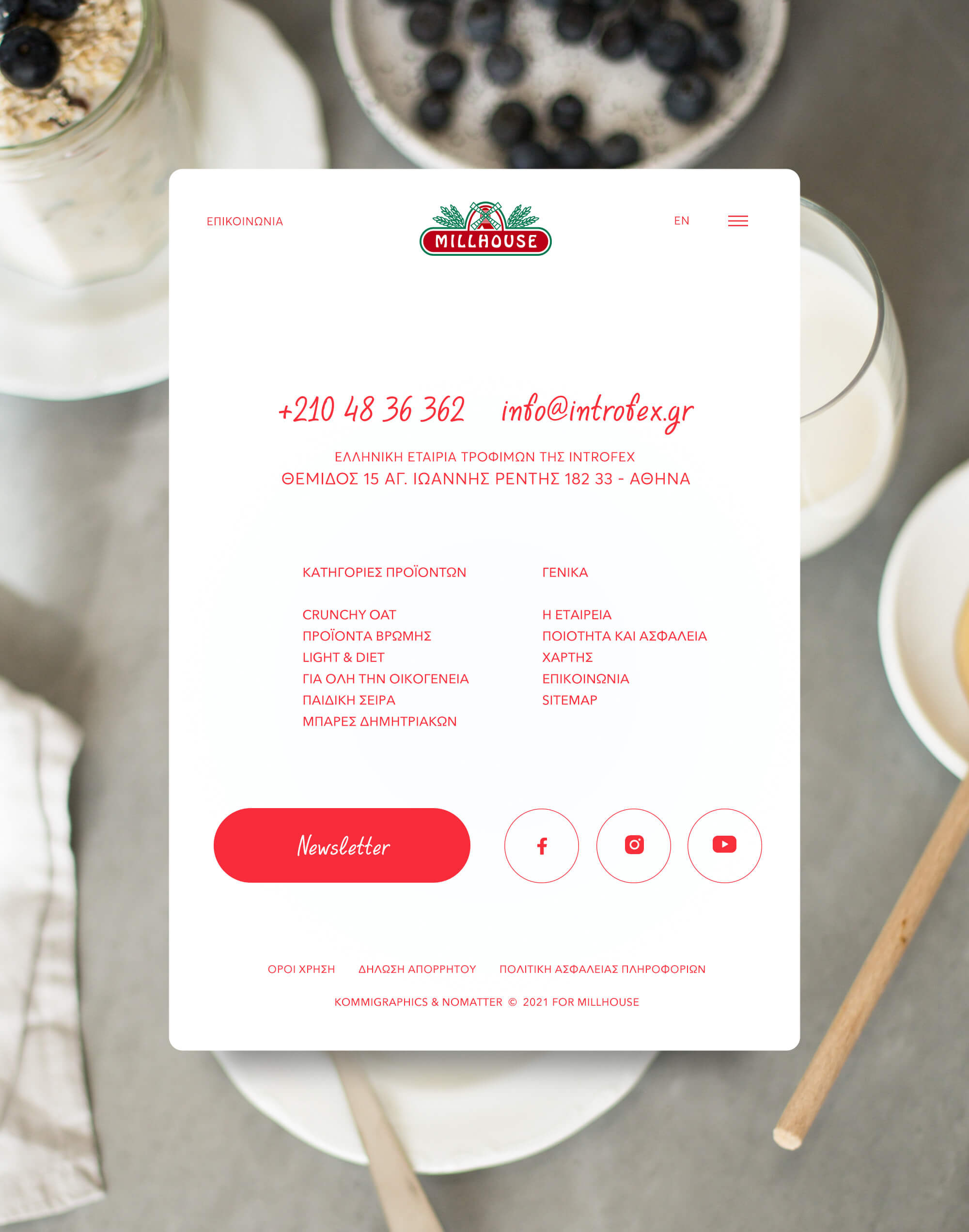
To create coherence in reading the content of the website, we first coded the different categories in color, so that the visitor can distinguish them easily and distinctly. Each product bears the corresponding color in parts of its typography, based on the category to which it belongs.
We created a homepage slider that is inspired by the circular motion of the mill (symbol of the millhouse logo), and also represents the different periods of the day (movement of the sun) so that one can enjoy the delicious products of the brand.
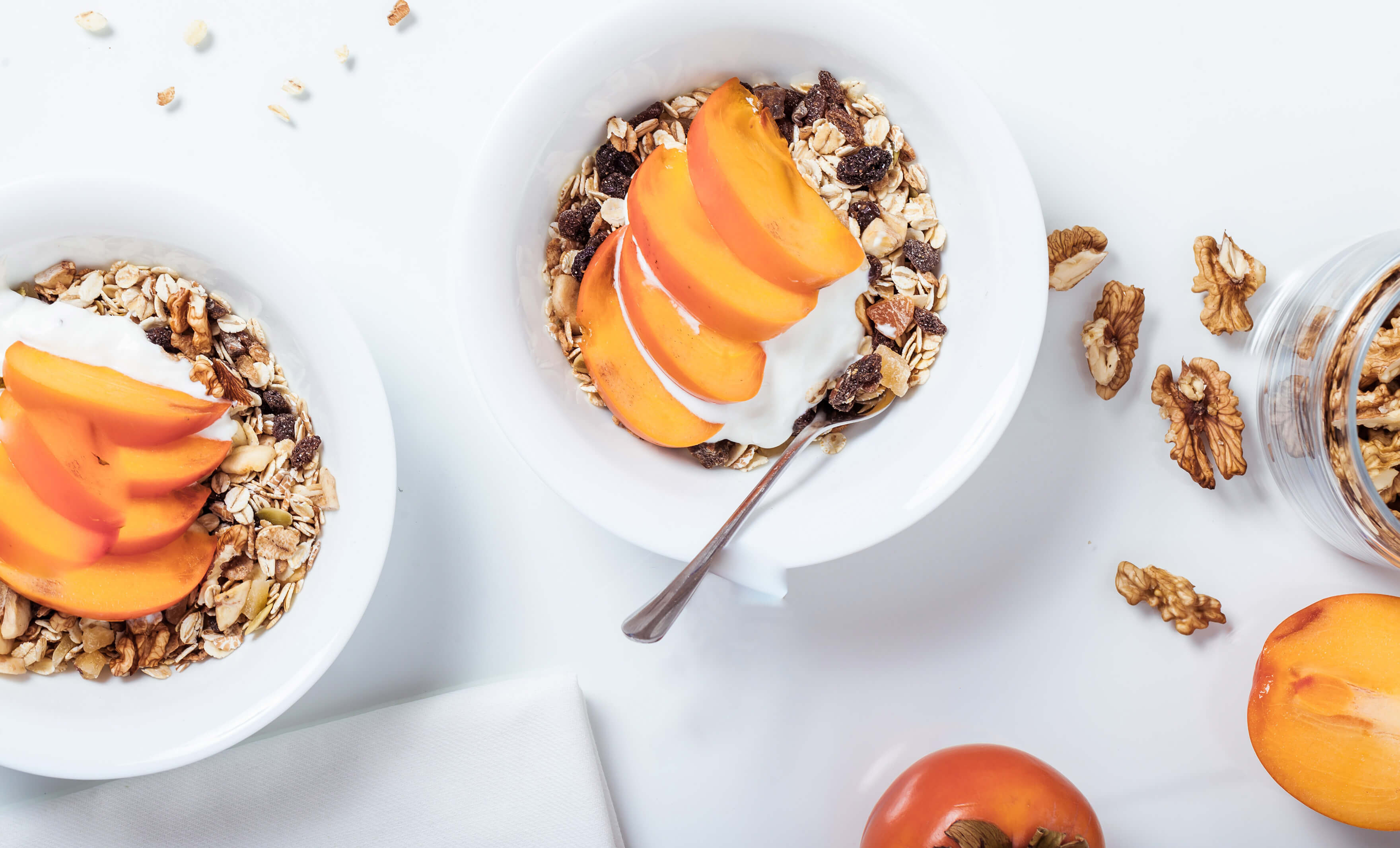
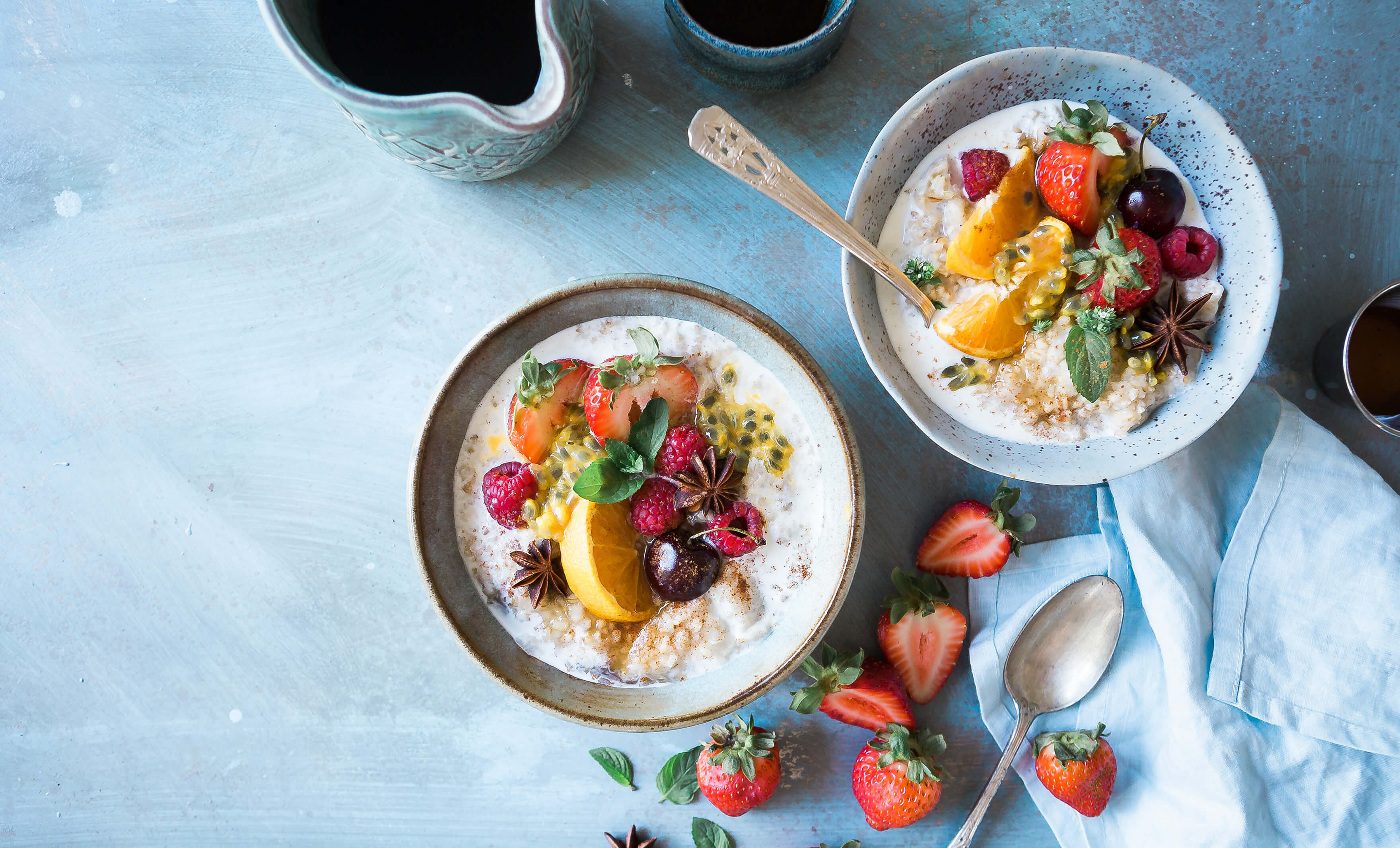
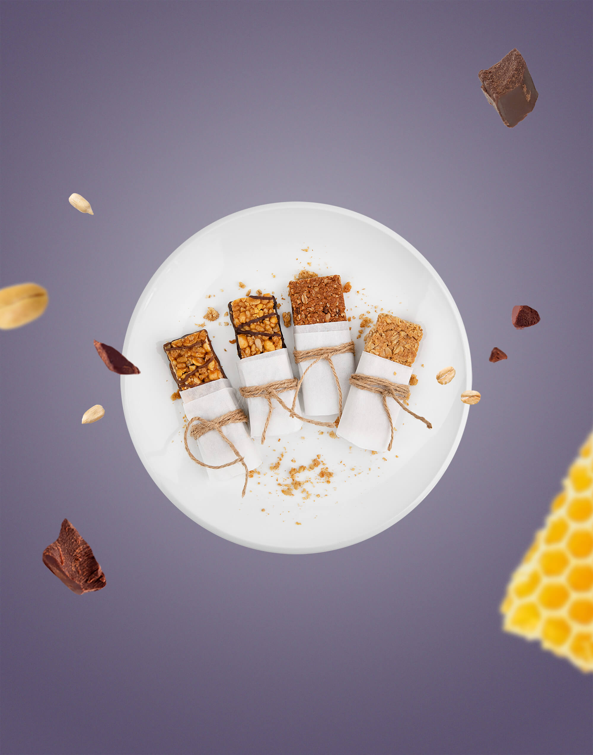
The concept was implemented by choosing to shoot custom photographs of bowls that contain the products of each category (without the packaging), while we gave depth and a more realistic dimension through the parallax effect to the floating elements, emphasizing, even more, the ingredients of the products.
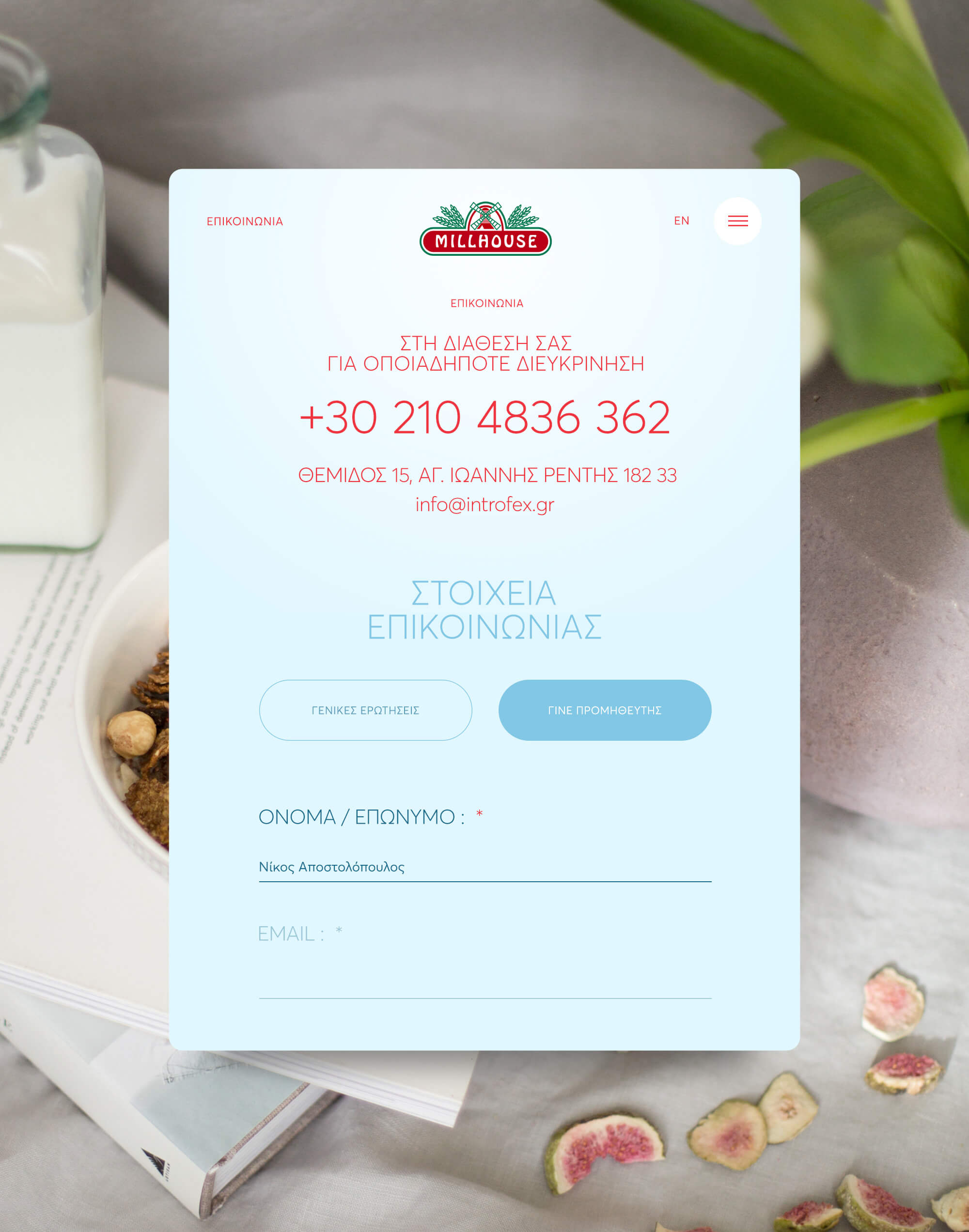
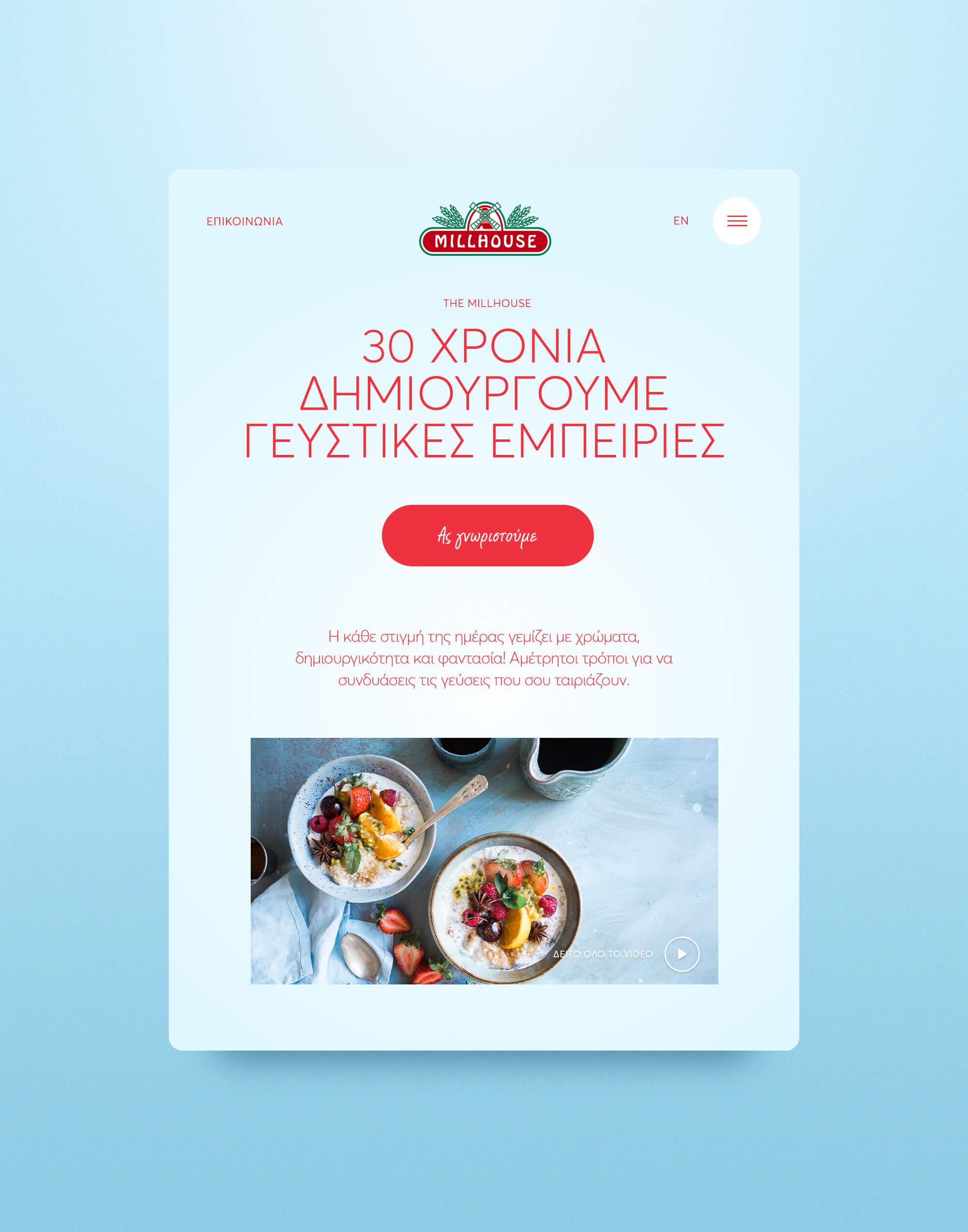
The general layout and user interface are intense, with large photos, and highlighted typography in selected areas. Our goal is to ease up reading by all visitors but also to highlight the different sections, especially on pages with heavy content.
Despite the plethora of content on the website, we had to come up with a light and optimistic aesthetic feeling, so that the visitor stays on the page and follows the content without making it harder for the users.
Great emphasis was given to the typography, with an eye for detail at all points and on every page, with the right volumes and hierarchy.
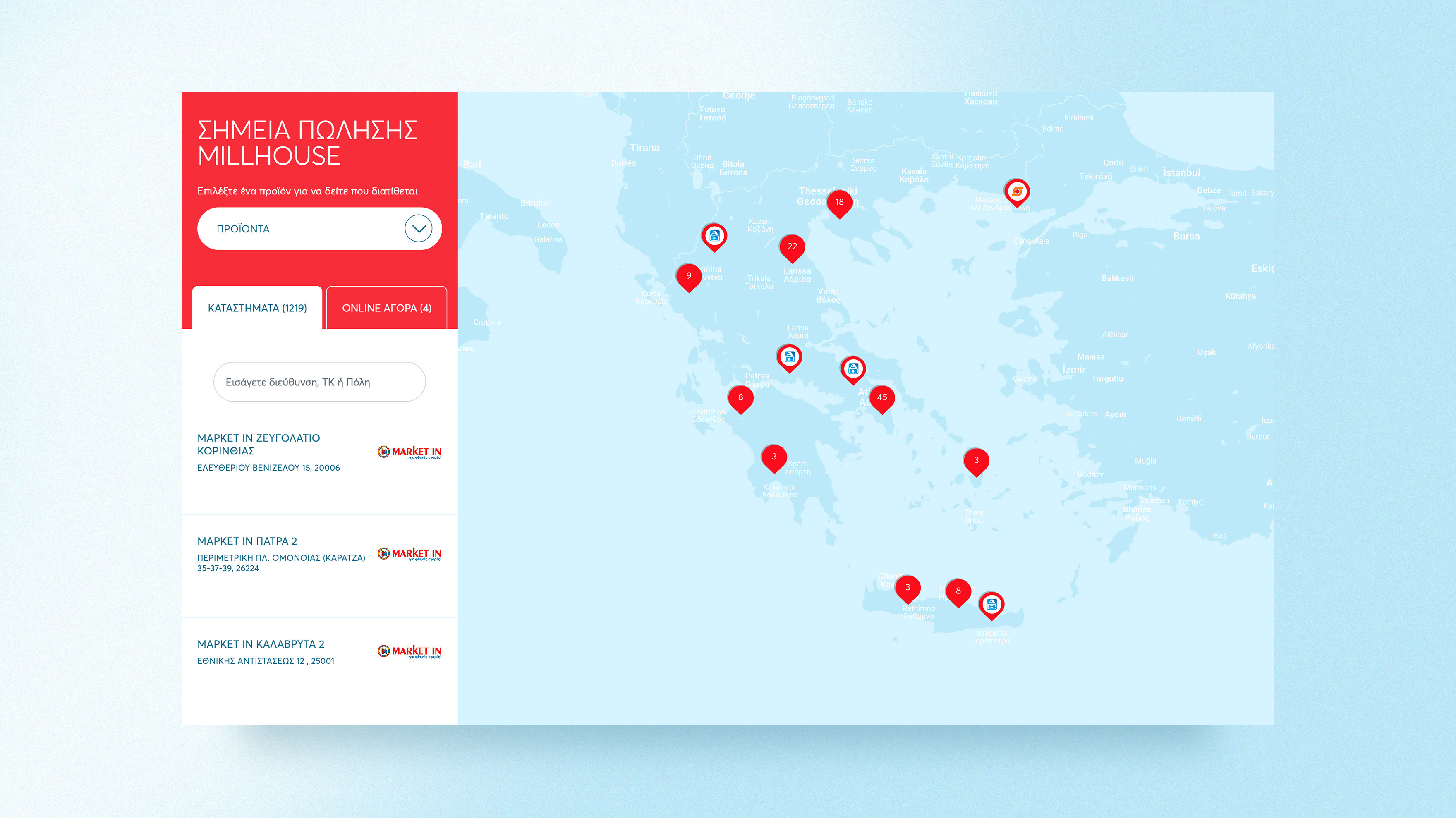
An important feature of the website is the map that lists the points of sale and had its own degree of difficulty, with great care we managed to create an easy-to-use environment, fully integrated with the new identity of the website.
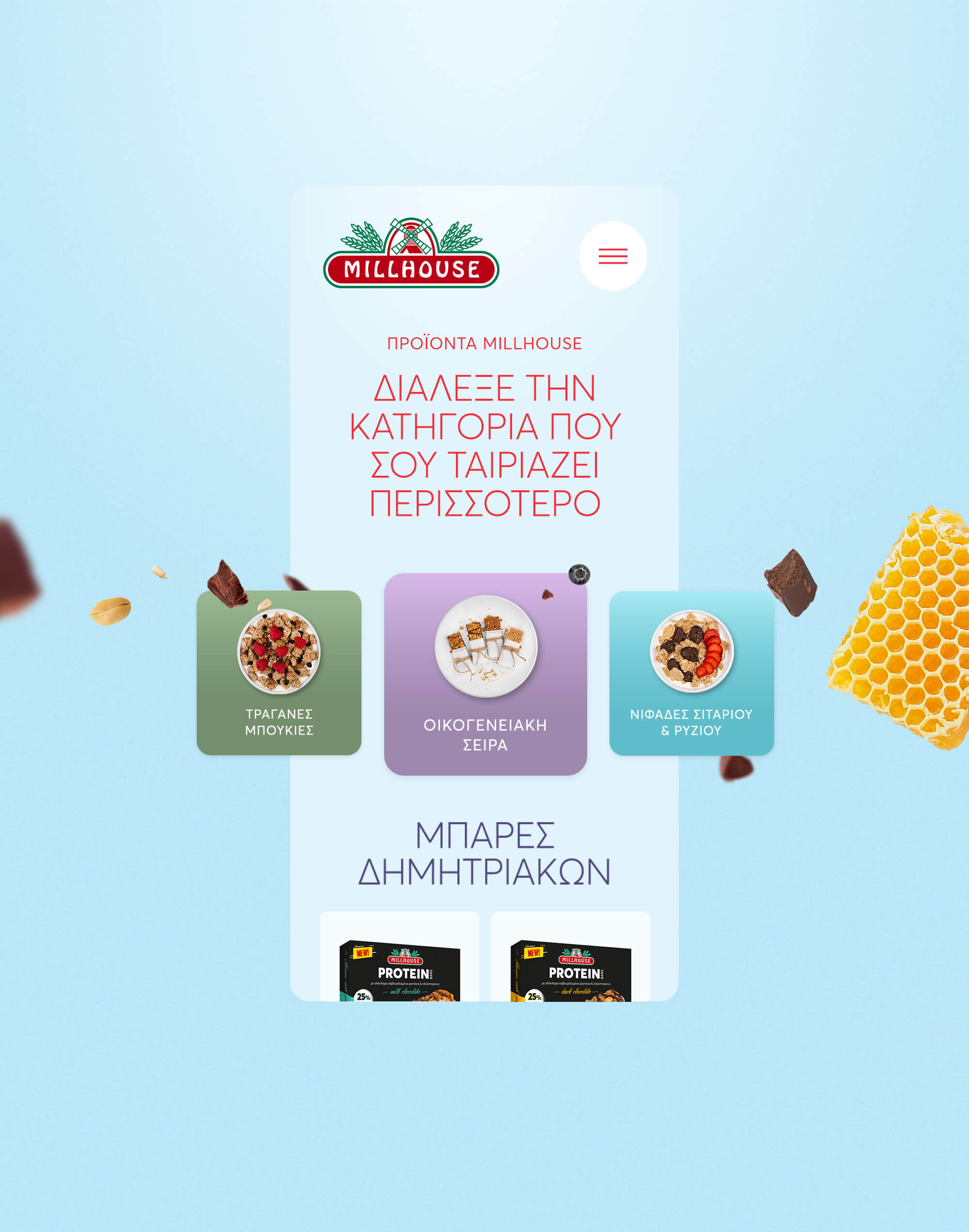
Finally, regarding the use of the website from mobile devices, the design was done for 4 different breakpoints. We have implemented changes in the style guide of the typography and customizations in the user experience, in order to achieve a direct and fast user journey.
Flowless navigation, and eye-catching design that delivers the mood, the character, and the quality of Millhouse Cereals was achieved with a seamless user interaction journey across all devices and resolutions!

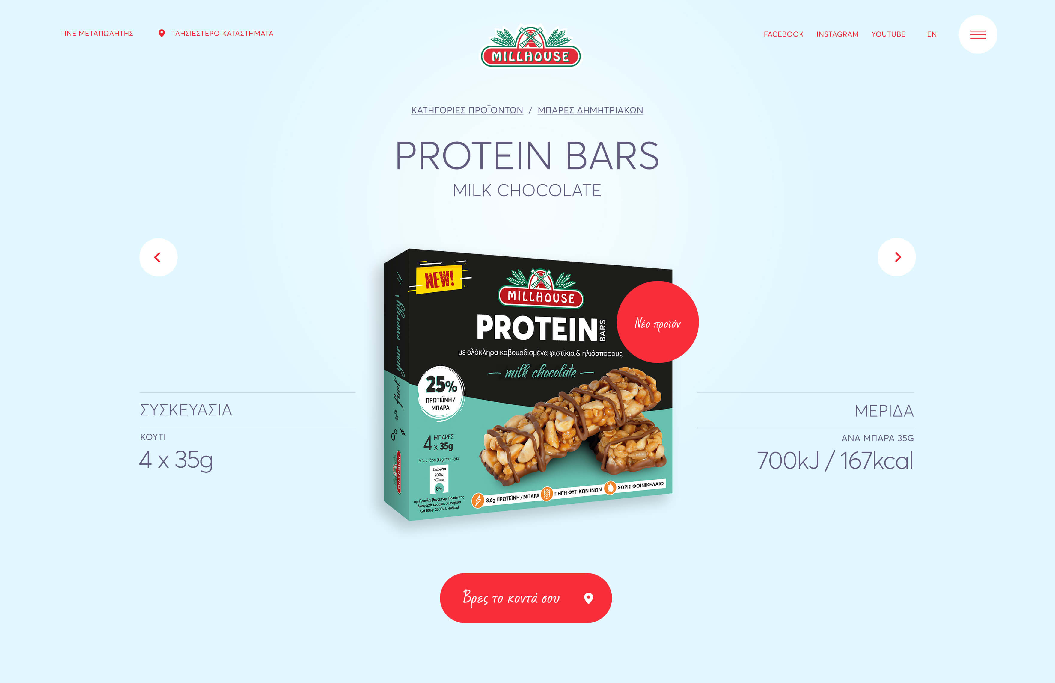
GREAT EMPHASIS WAS GIVEN TO THE TYPOGRAPHY
WITH AN EYE FOR DETAIL AT ALL POINTS AND ON EVERY PAGE, WITH THE RIGHT VOLUMES AND HIERARCHY
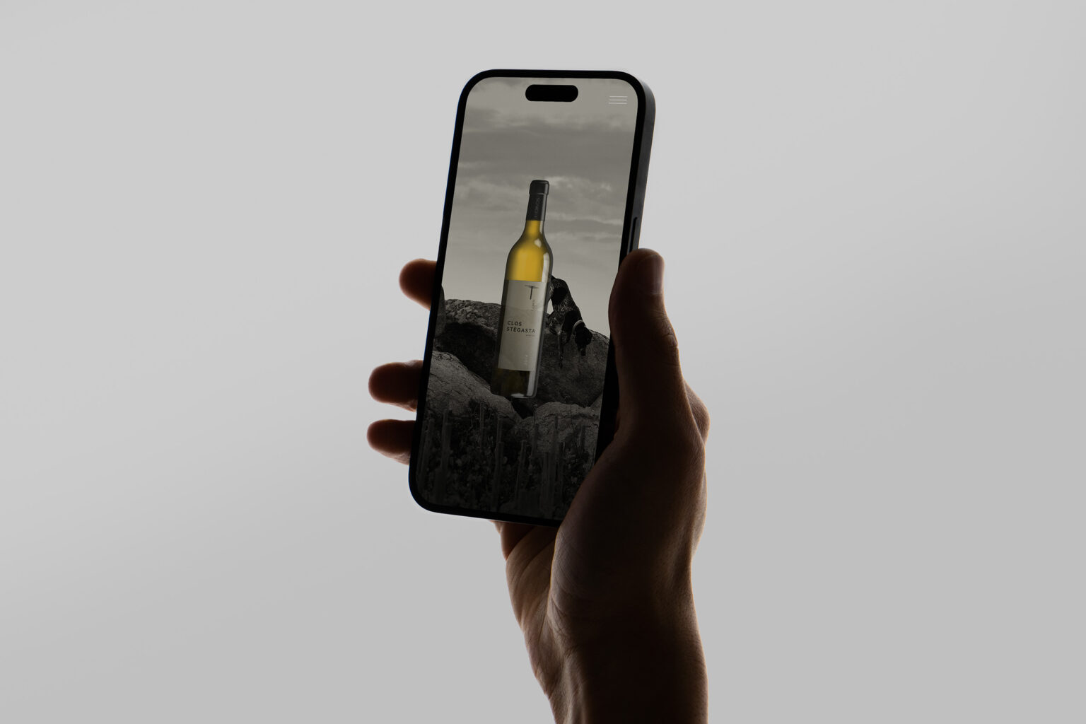
REGARDING THE USE OF THE WEBSITE FROM MOBILE DEVICES
THE DESIGN WAS DONE FOR 4 DIFFERENT BREAKPOINTS
RELATED PROJECTS