-
SERVICES:
- Typeface design
- Concept
- Lettering
-
AWARDED WITH:
- Red Dot Awards
-
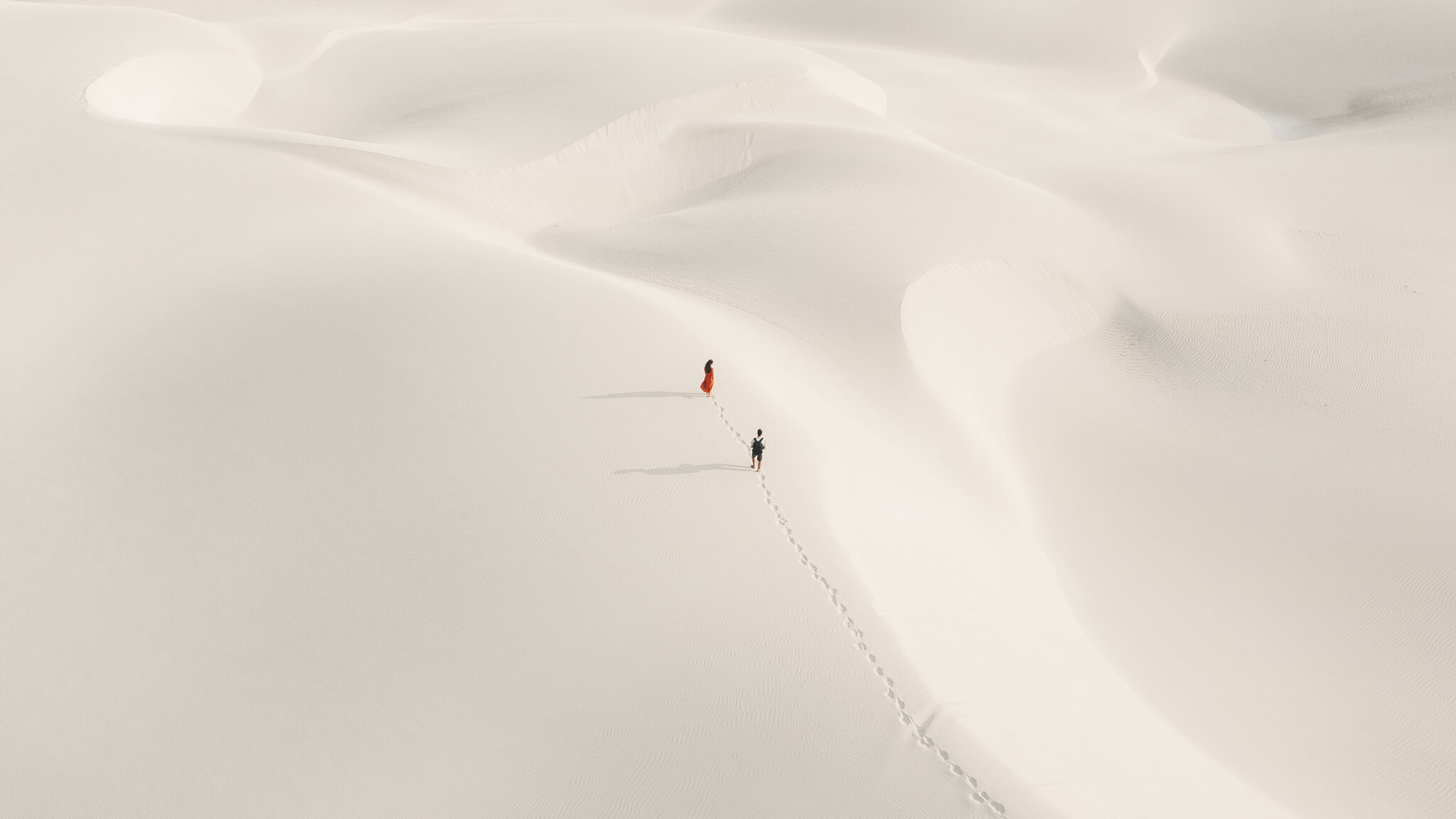
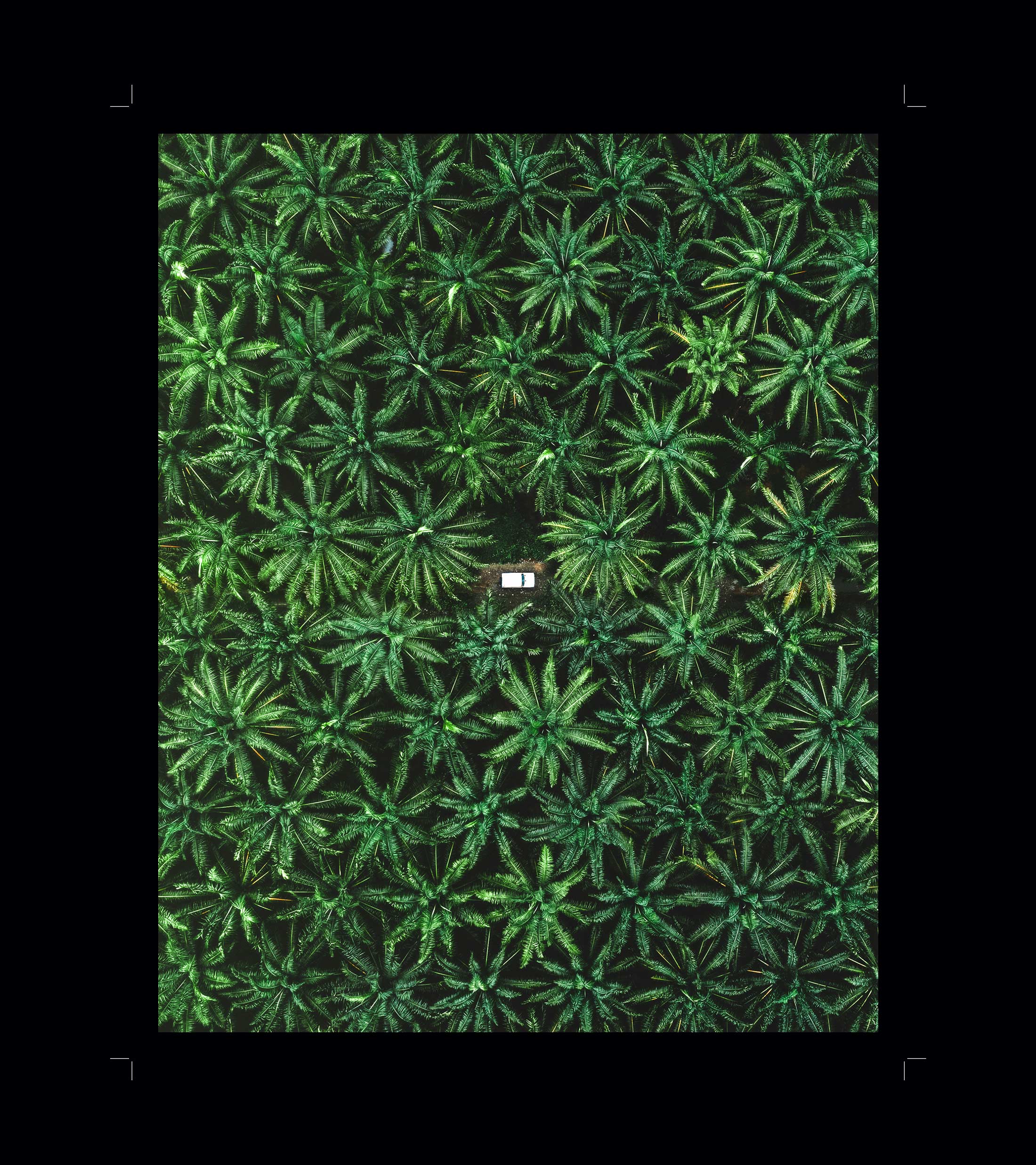
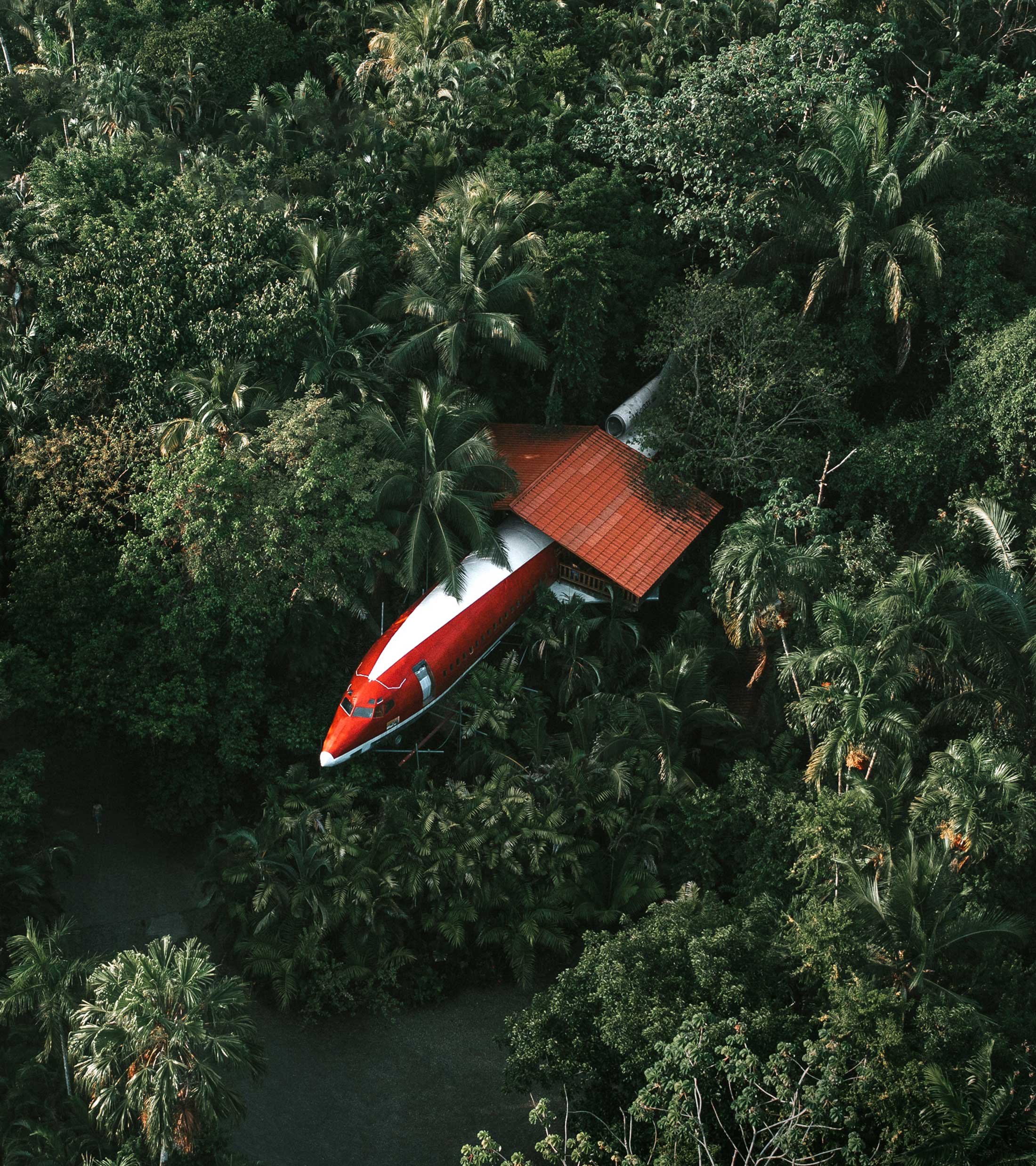
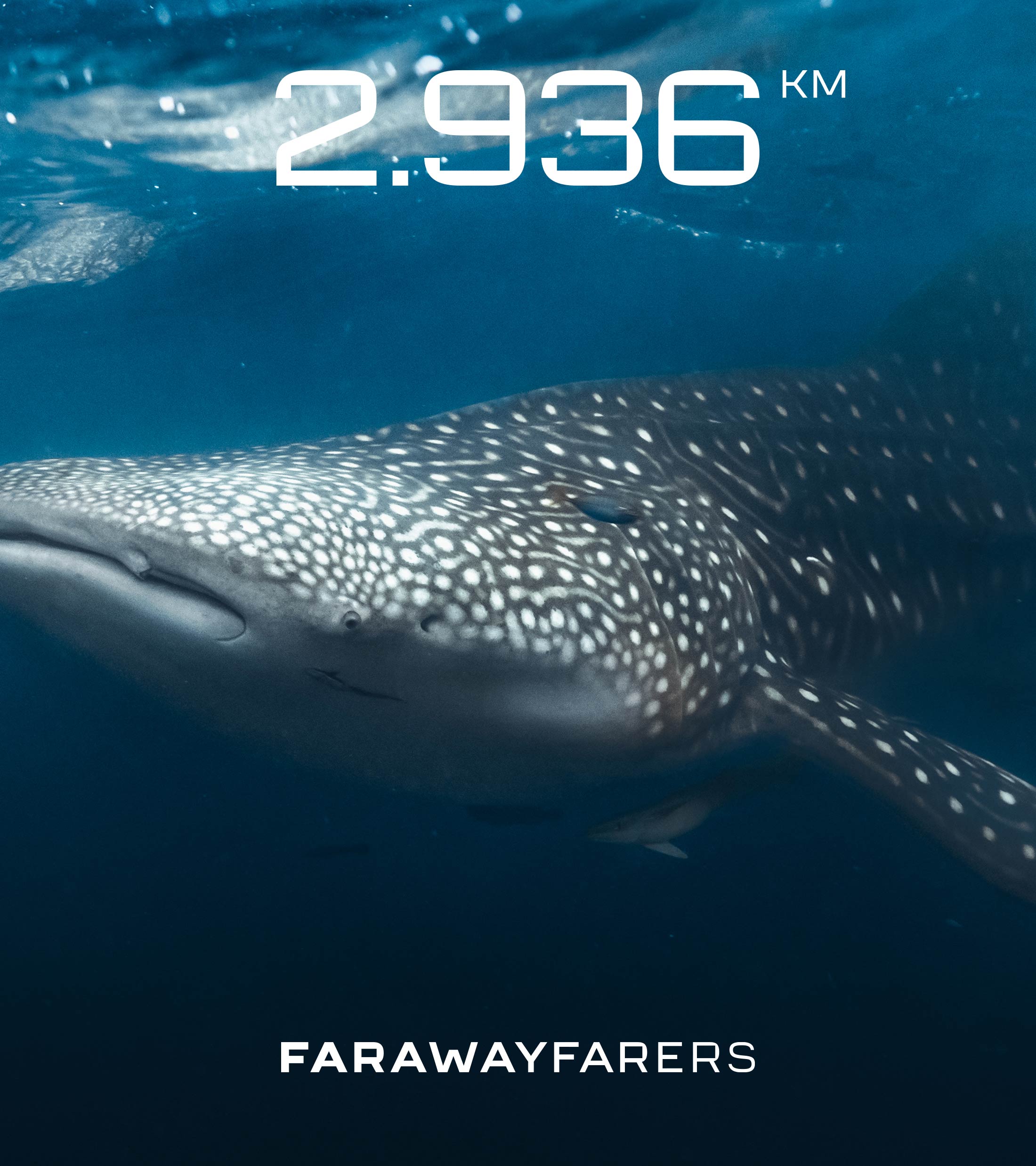
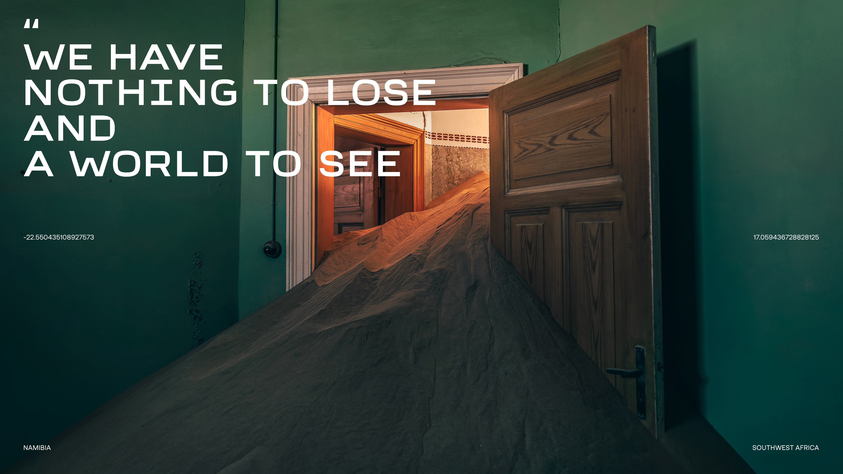
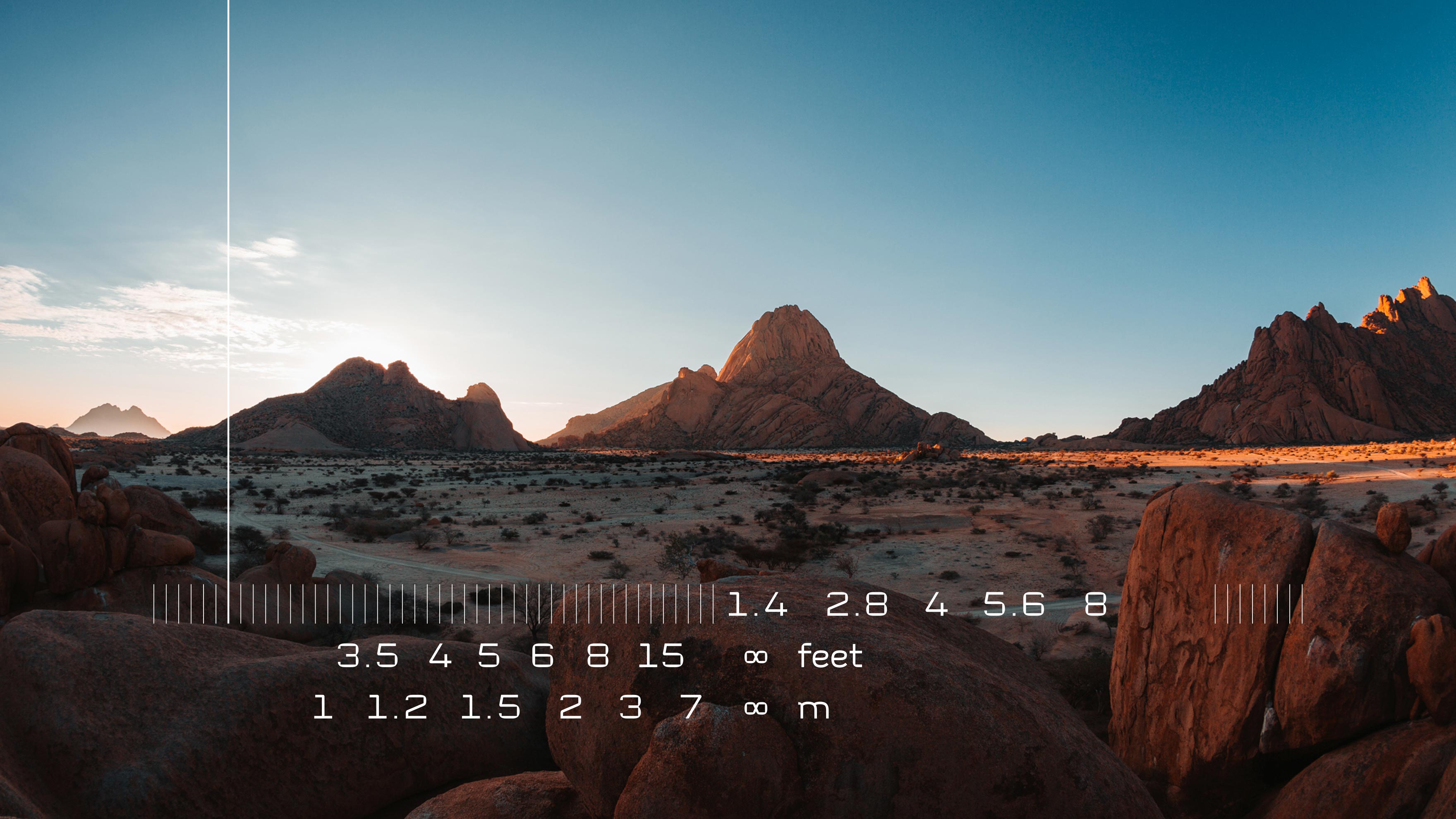
Farawayfarers (Maritina Laskaridou & Konstantinos Pappas) are a creative duo who narrate photographic stories from all over the world. As “Digital Nomads” they create images, films and short stories that mentally place us to the places they have visited.
It all started from the need to create the Farawayfarers logo and the visual representation of the concepts hidden in their elaborate and tangly name (far away – wayfarers).
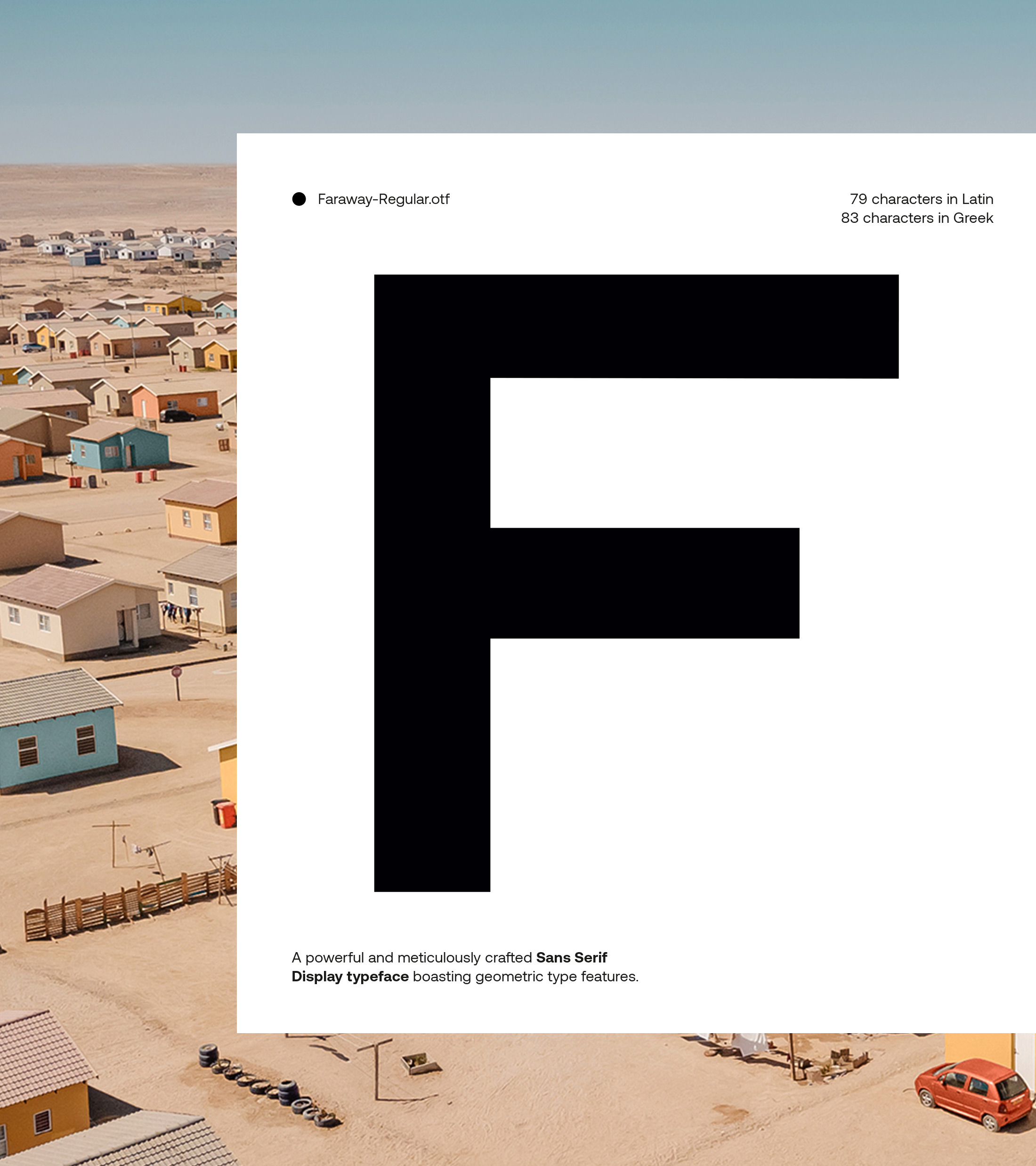
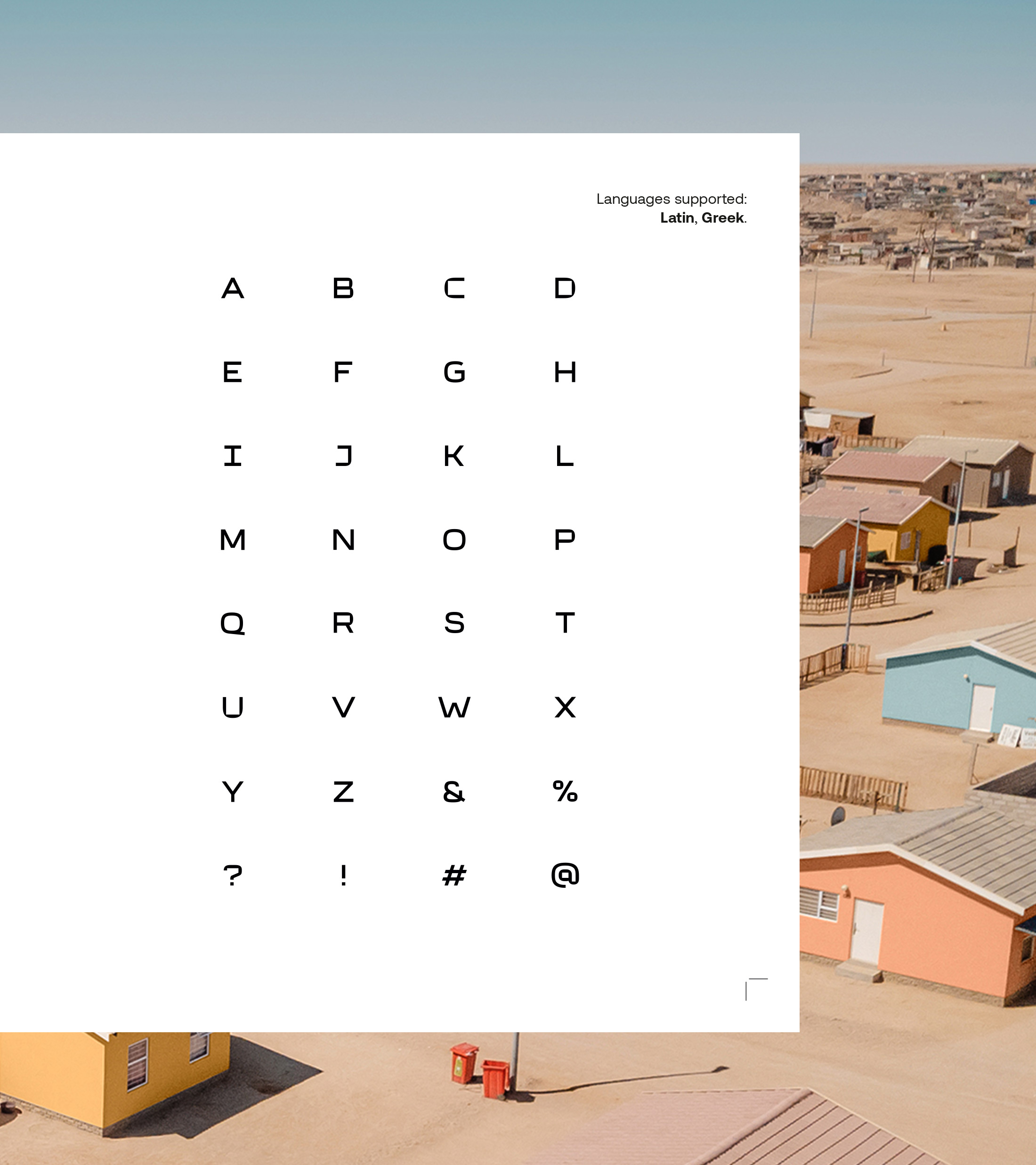
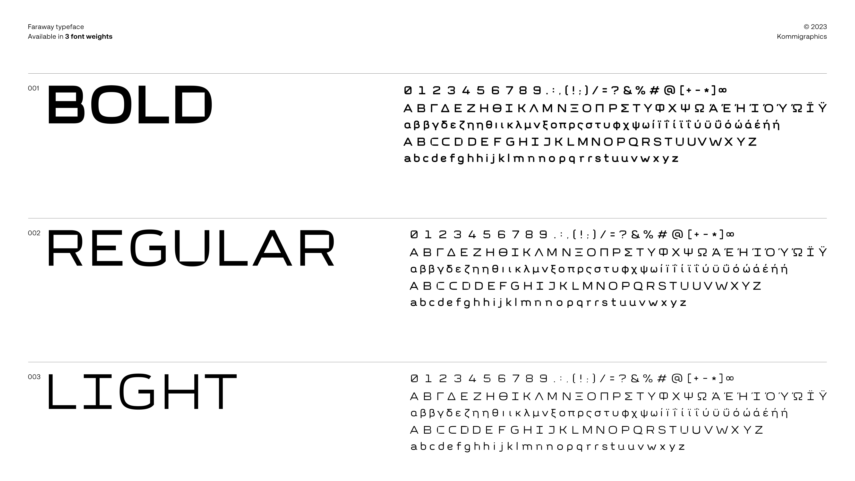
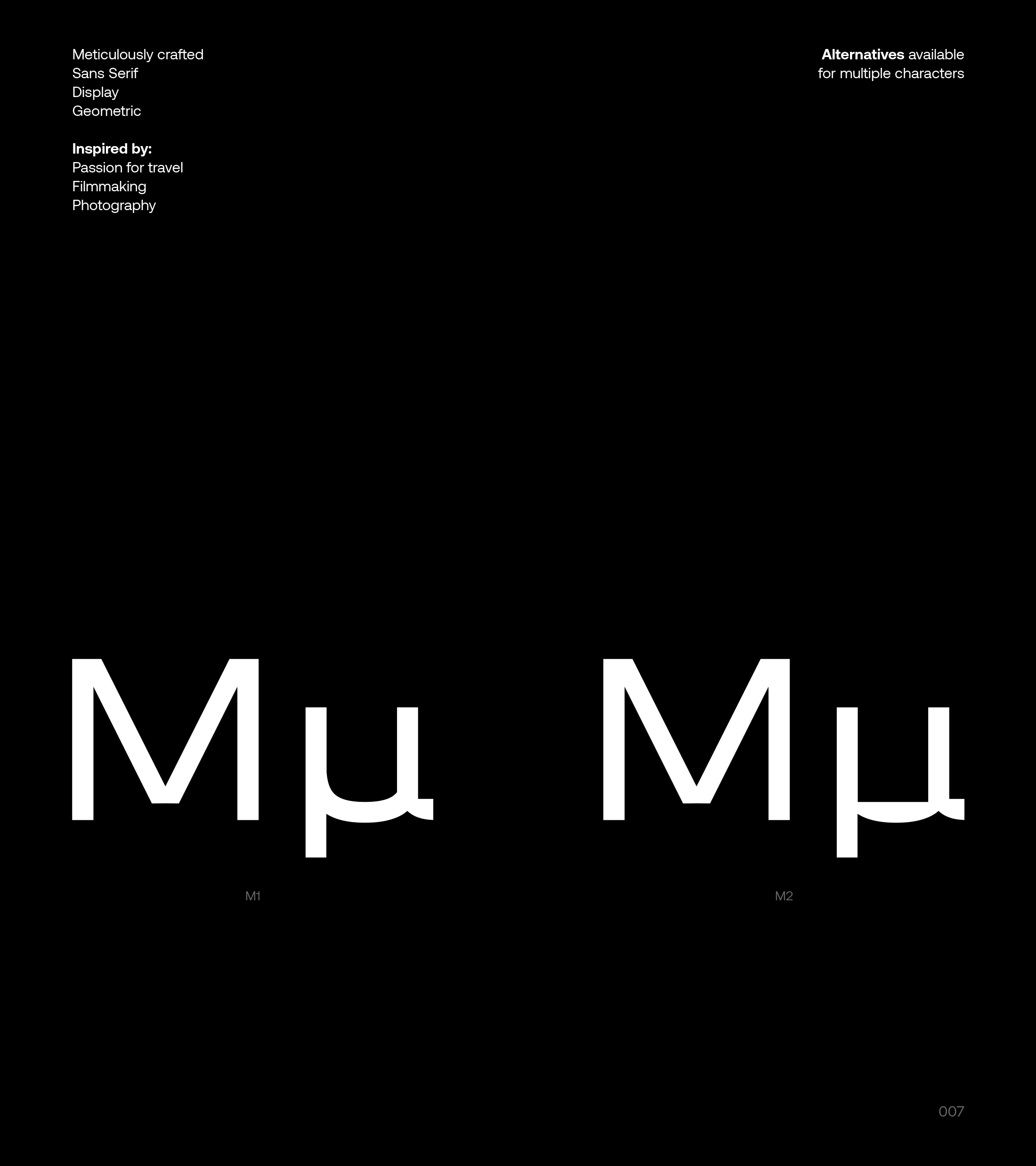
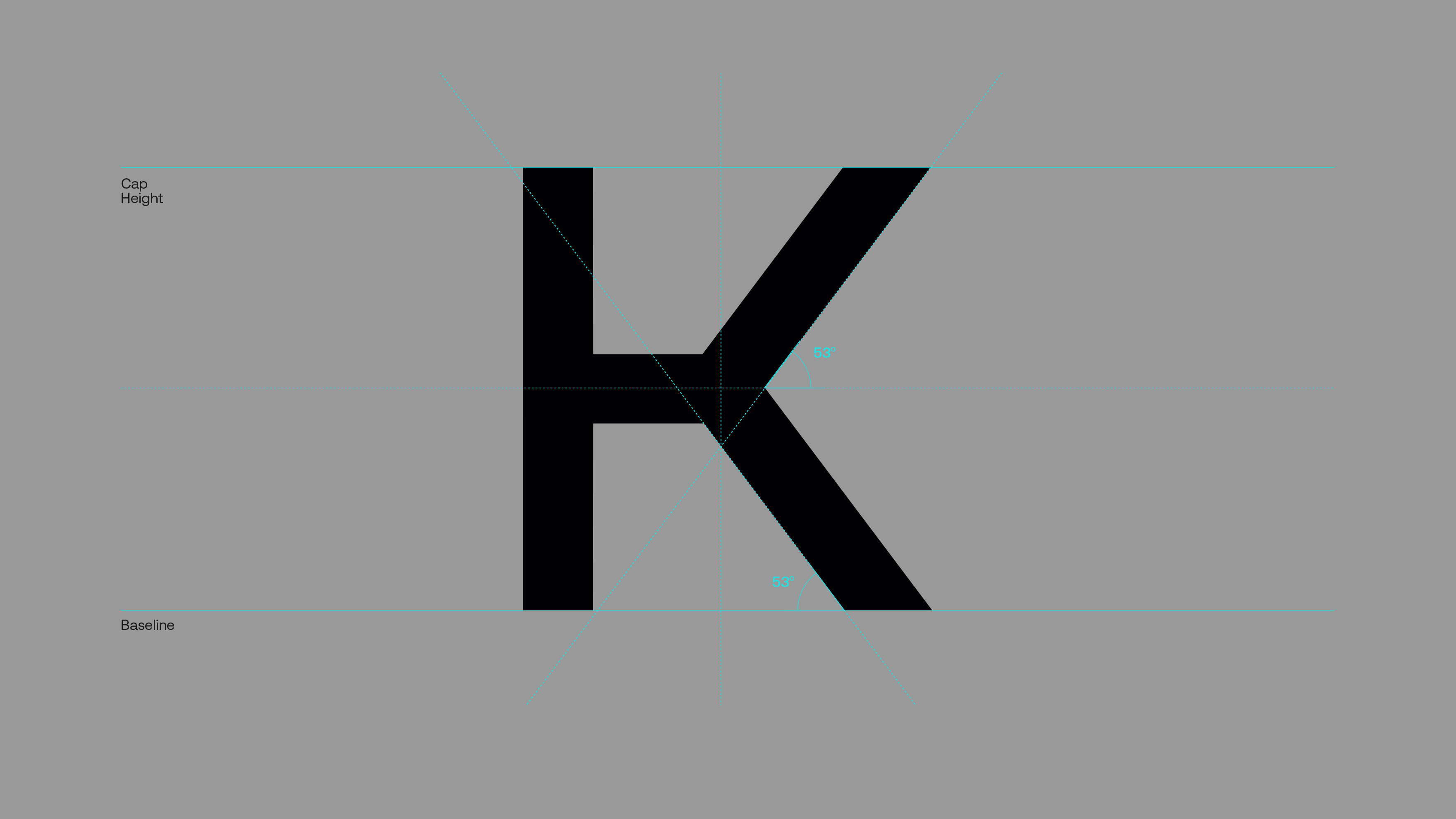
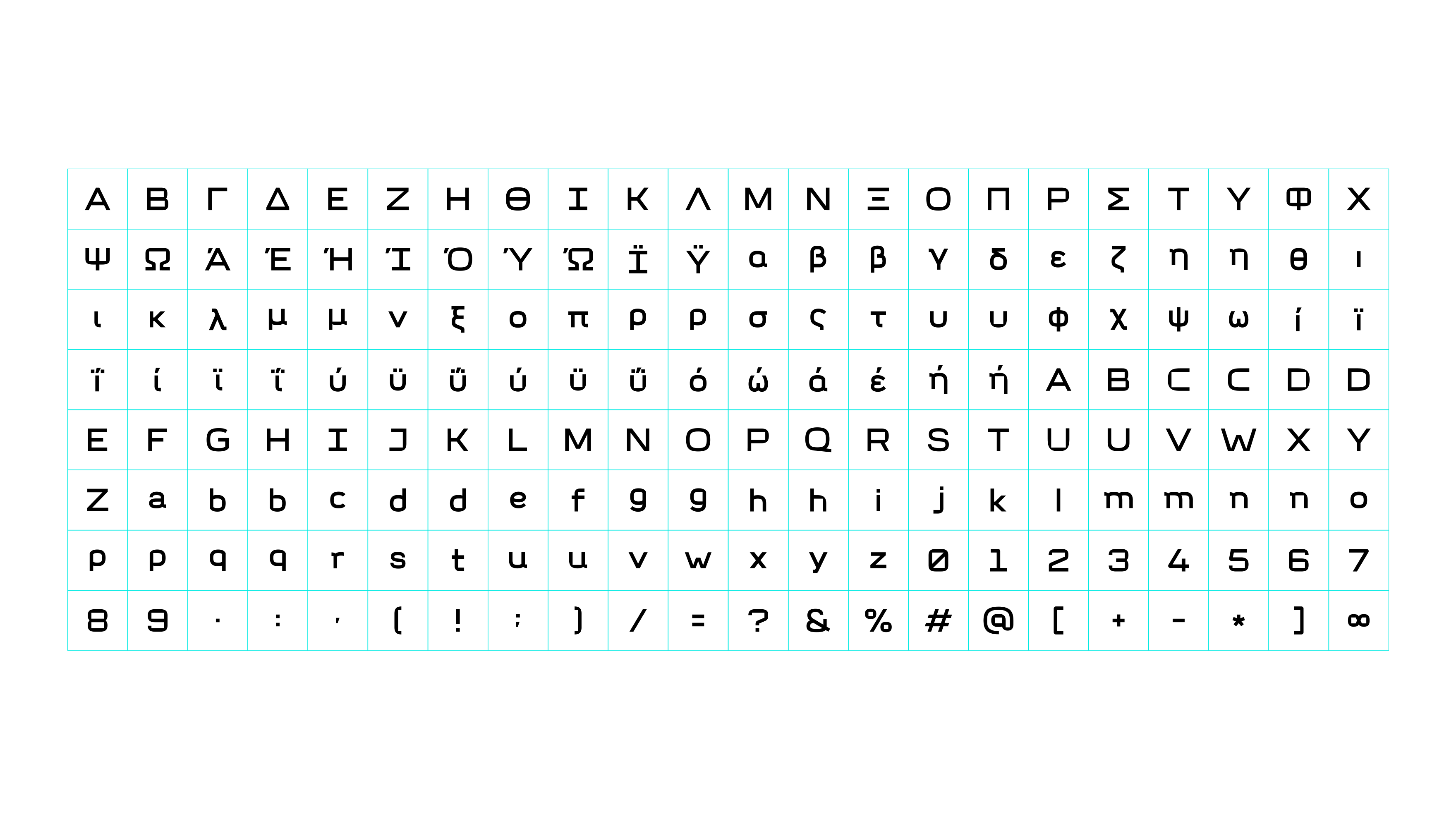
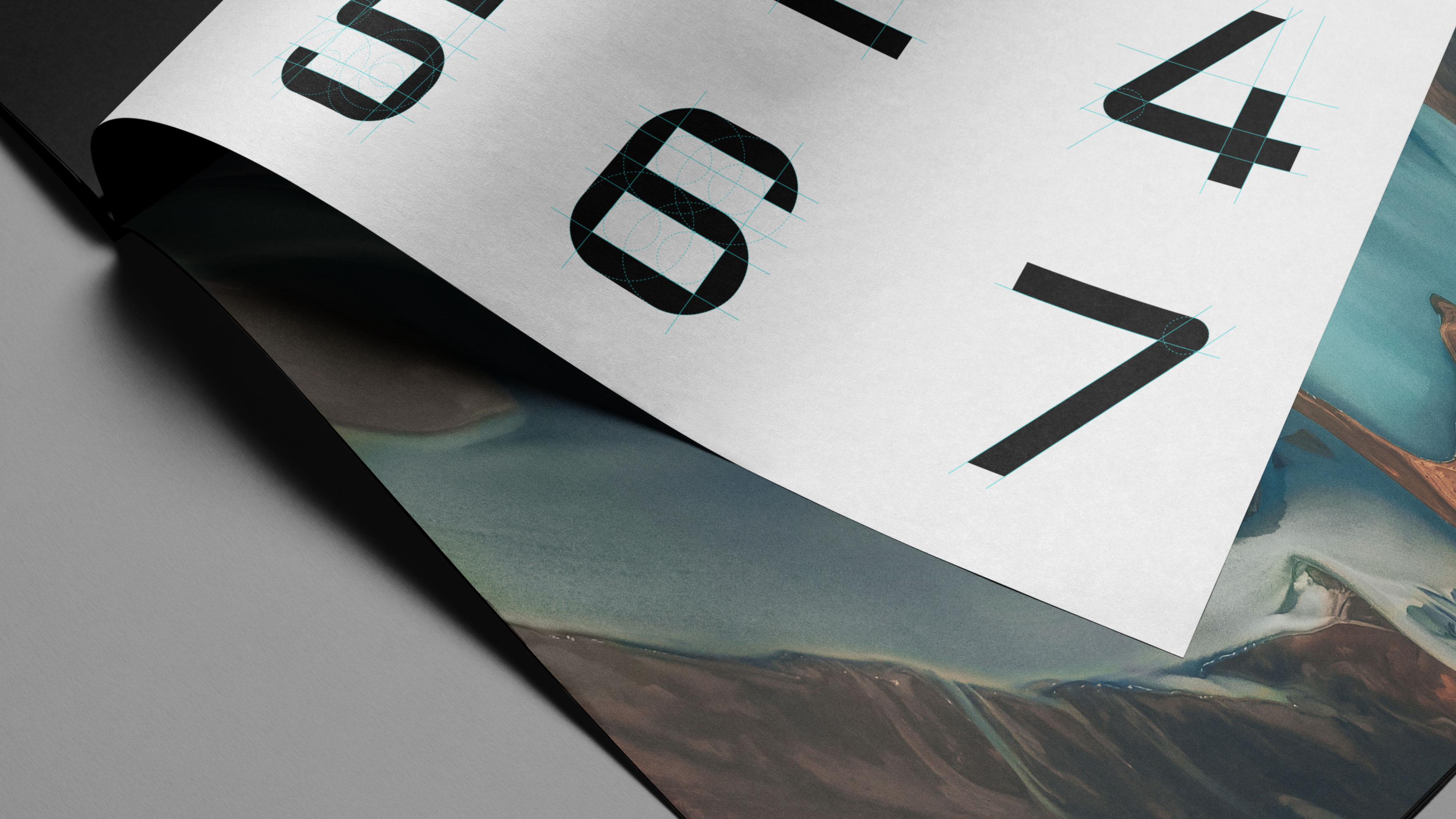
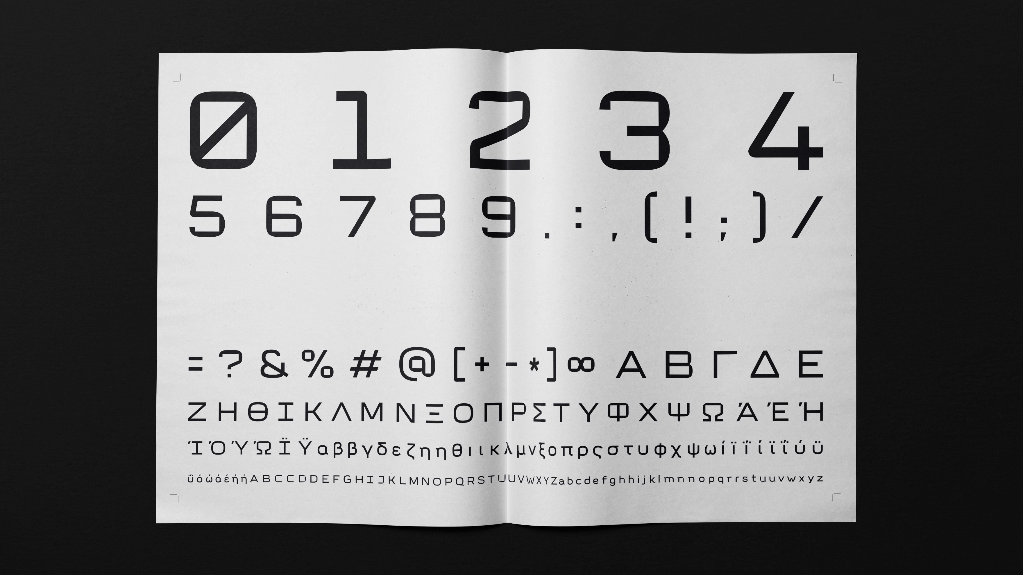
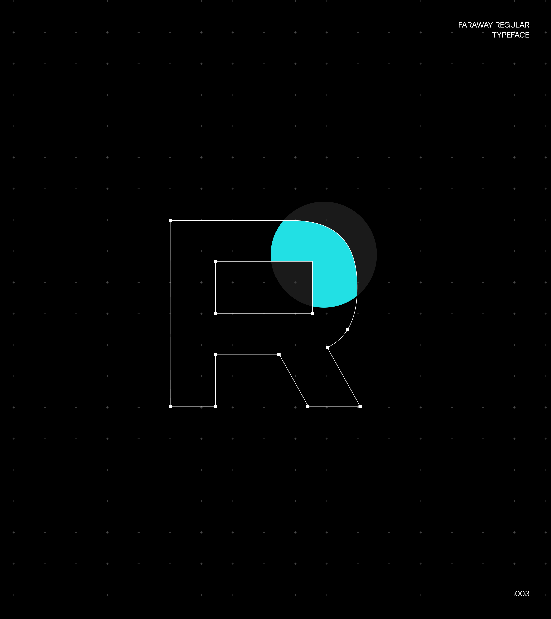
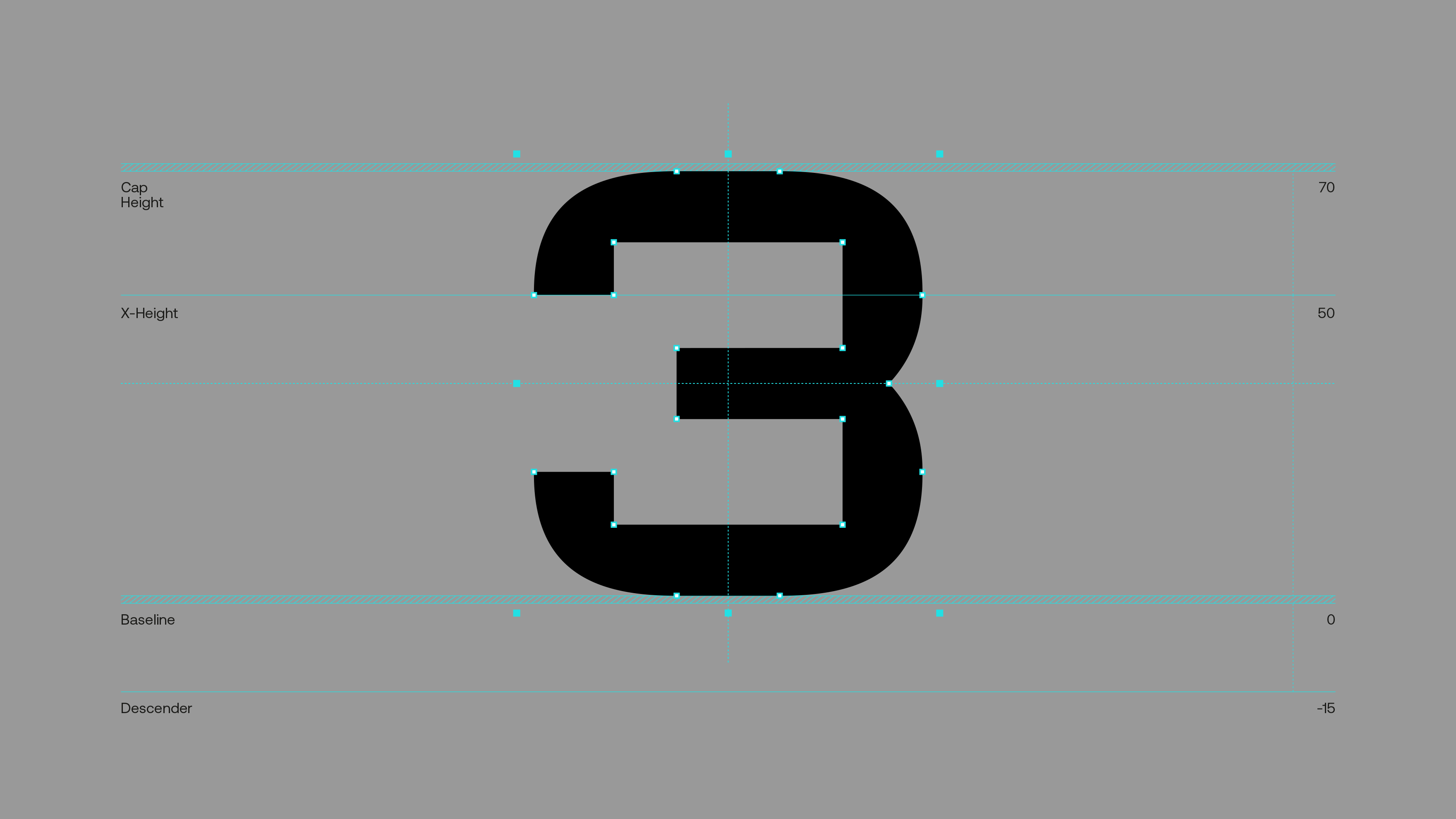
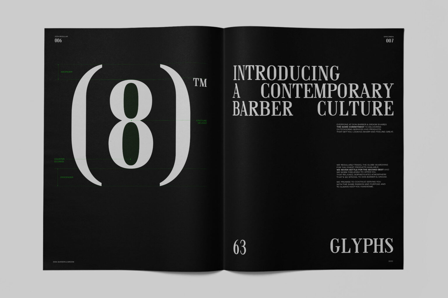
The custom Sans Serif characters were custom designed with features of intense geometry and successive contrasts in different weights, visually and abstractly expressing the concept of distance (far away), as well as the contrasts of the landscapes they visit (wayfarers). These individual characters then evolved into a full typeface, which consists of 3 font weights — Regular, Bold, and Light.
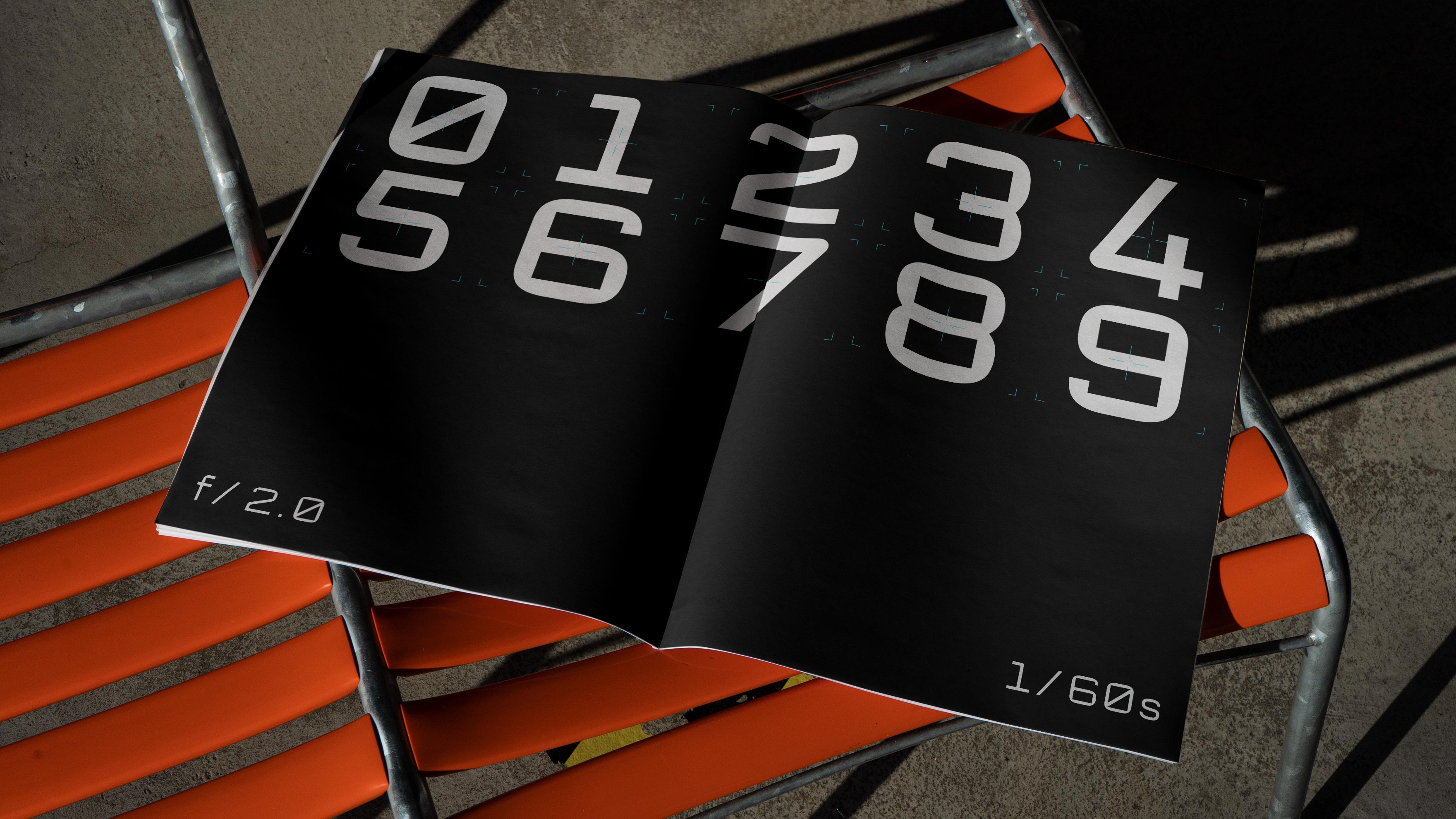
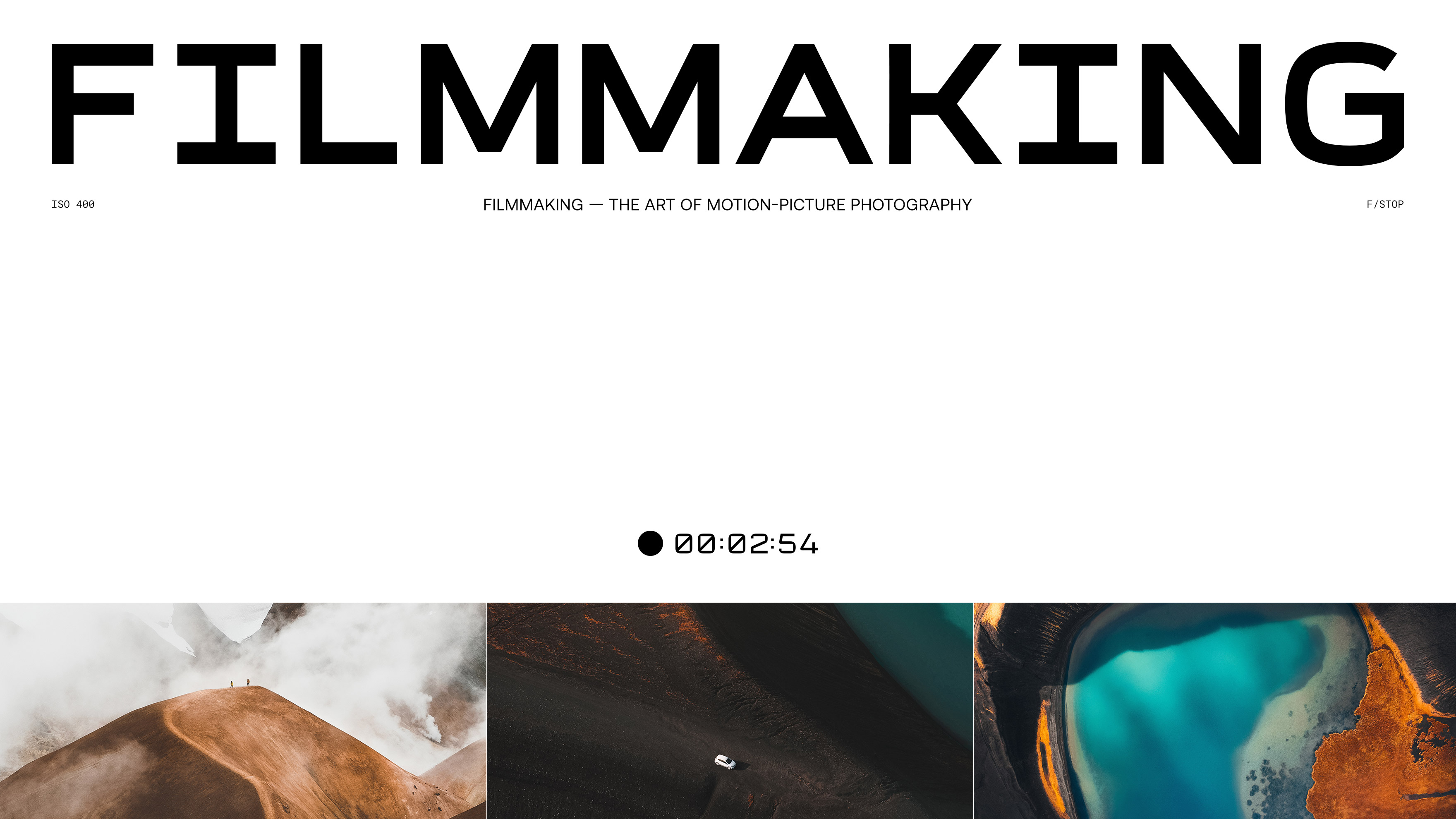
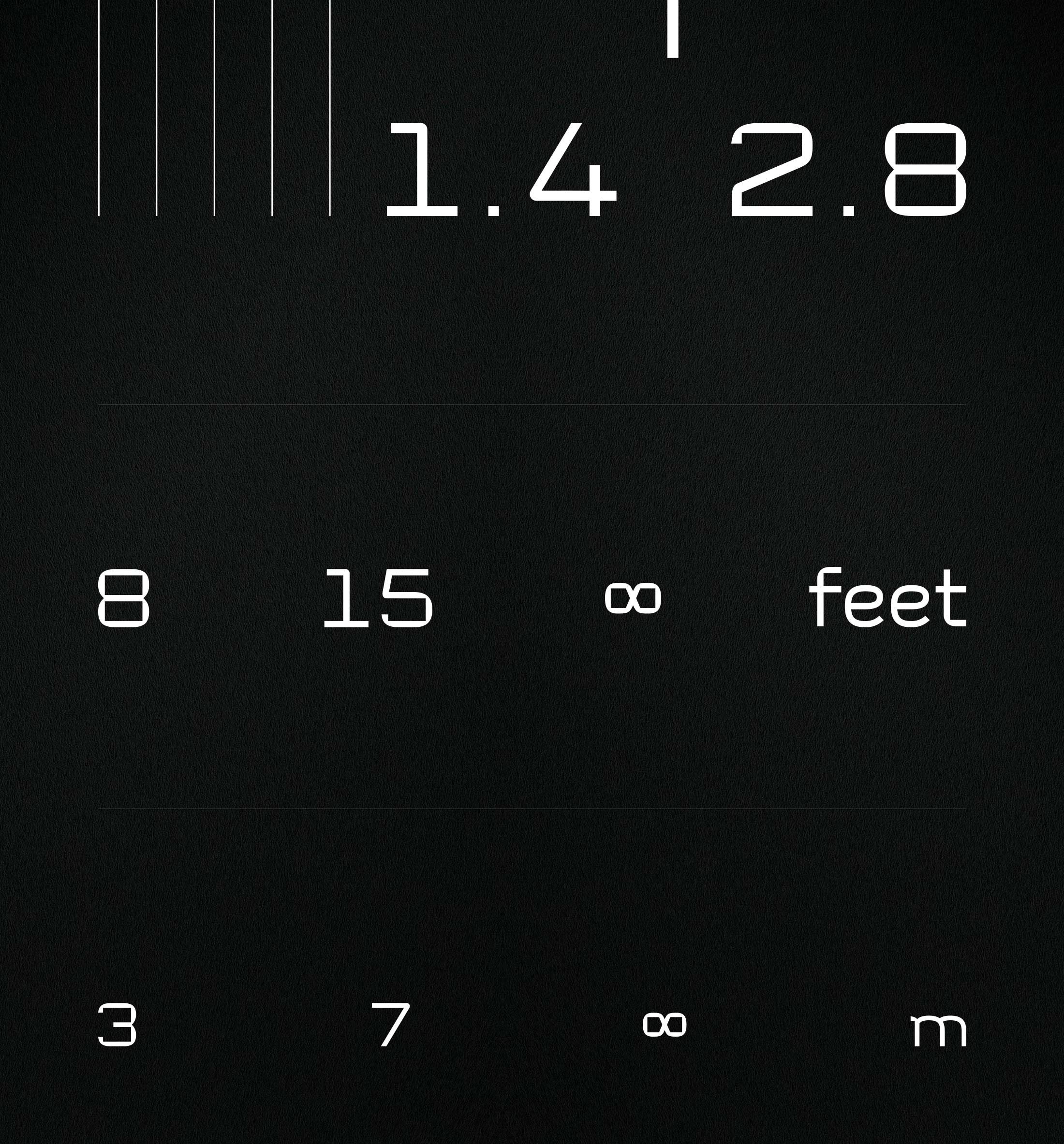
The initial aim of the design was to aesthetically convey the technocratic background of Farawayfarers’ work, as well as capture all those technical icons and specifications featured on the professional equipment they use.
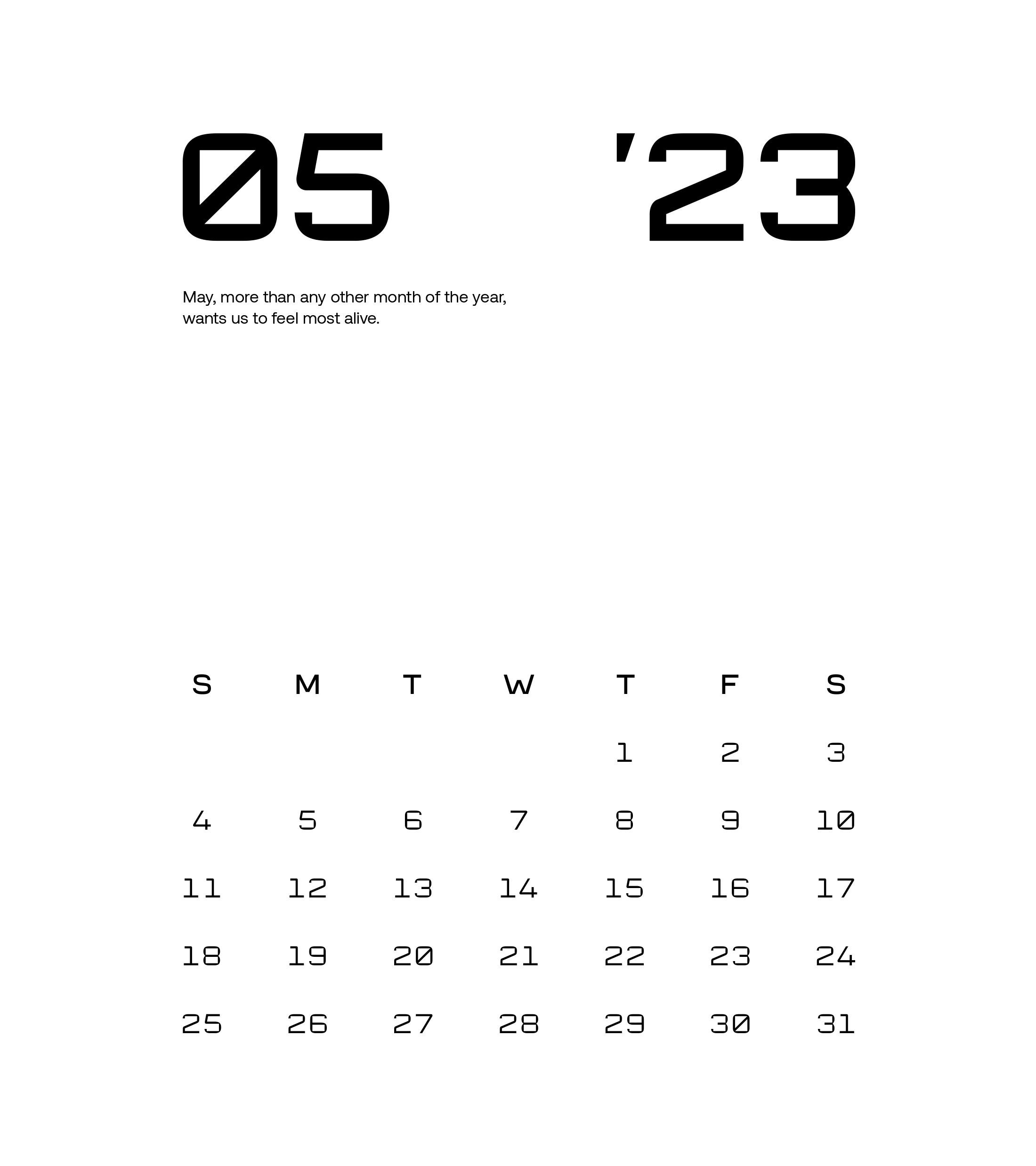
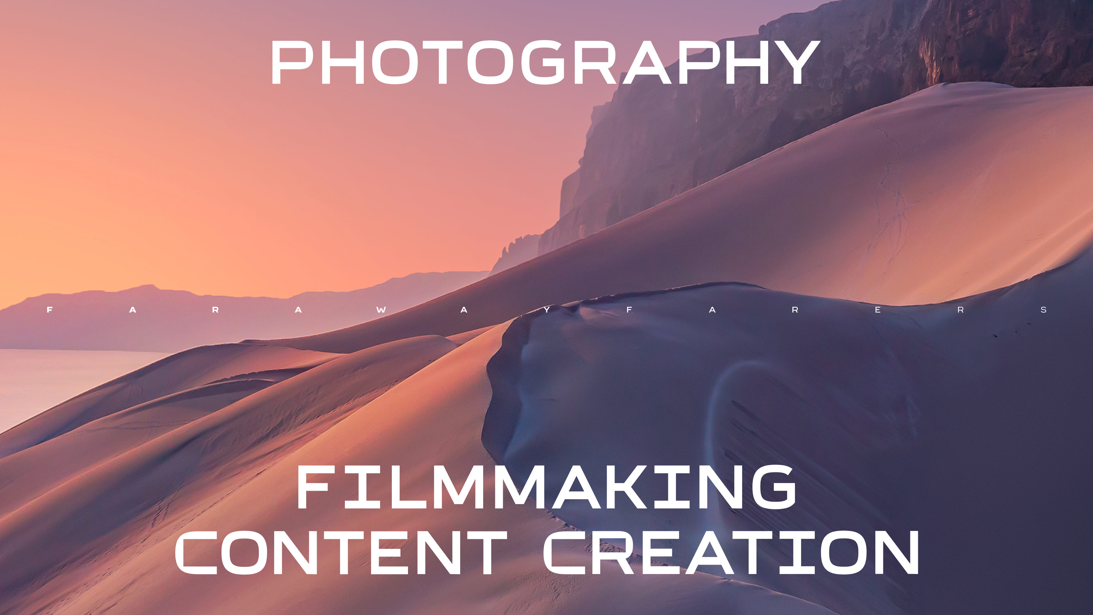
A Sans Serif Display typeface designed for titles and headlines, with the ability to be used in body copy too. Structured and balanced, its design is characterized by simplicity and also by the harmony of absolute shapes and endings in curved forms.
Its overall form extends more in width, giving it a more technocratic look and feel, which can be perfectly applied to merchandising products of any nature.