-
SERVICES:
- Art direction
- Brand identity design
- Typeface design
-
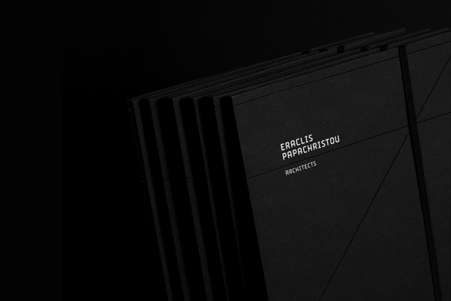
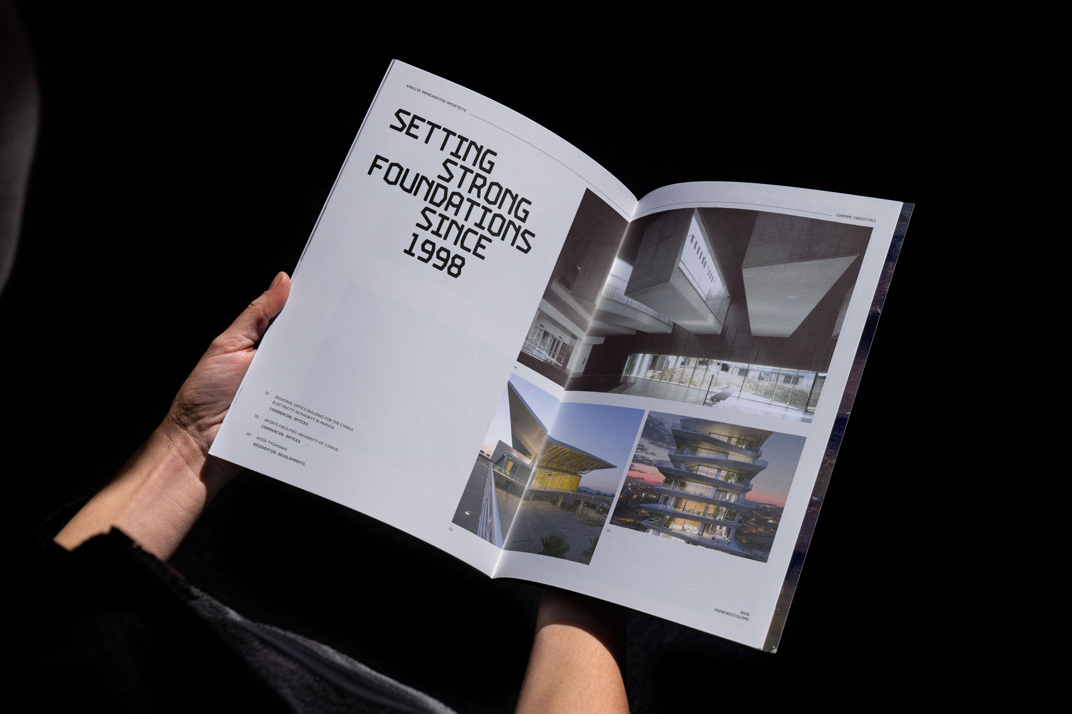
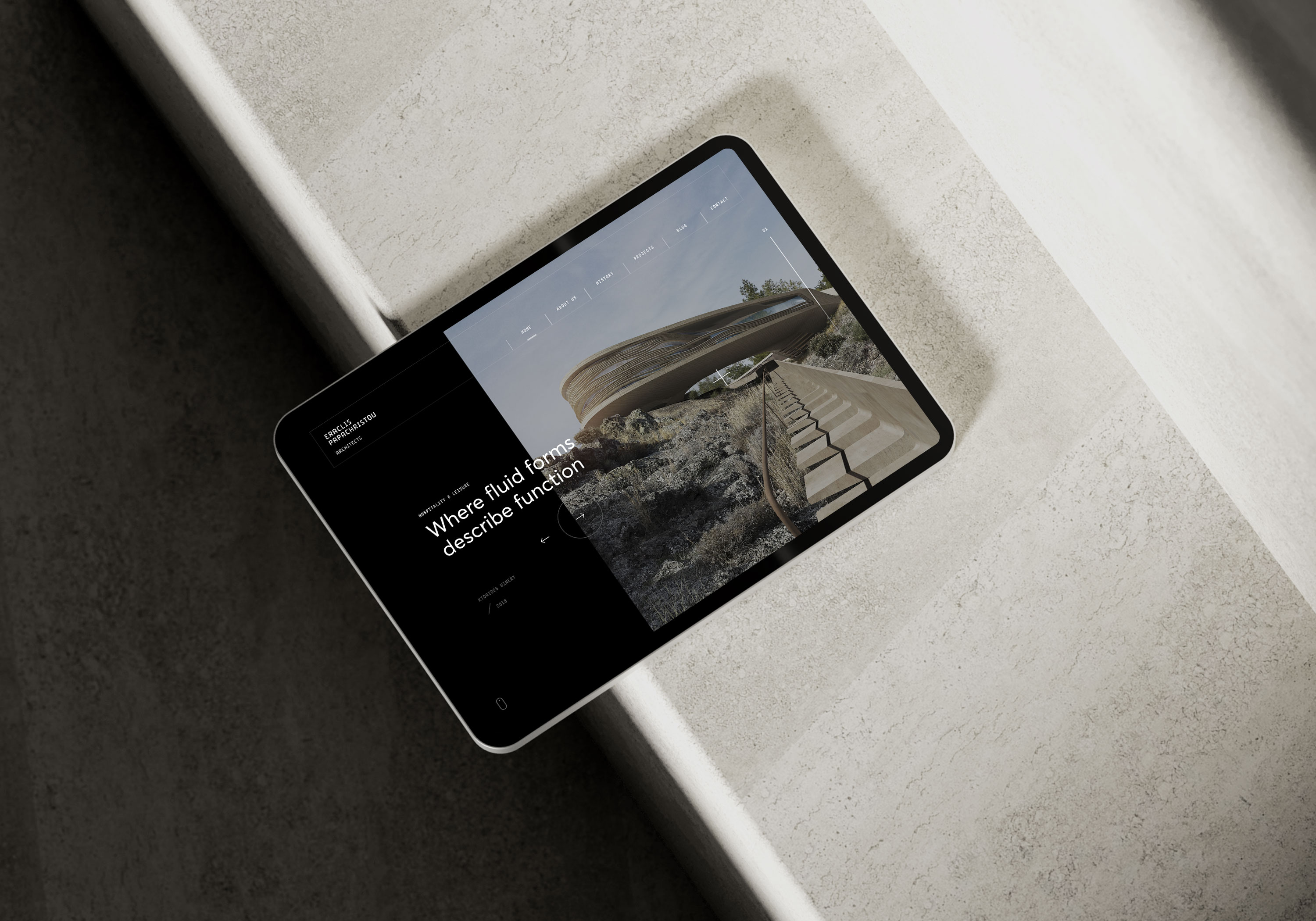
With more than 20 years of continuous presence in architecture, “Eraclis Papachristou Architects” entrusted Kommigraphics for the design of their new brand identity as well as their entire corporate image.
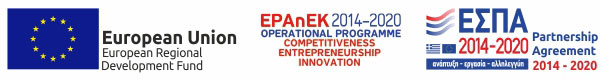
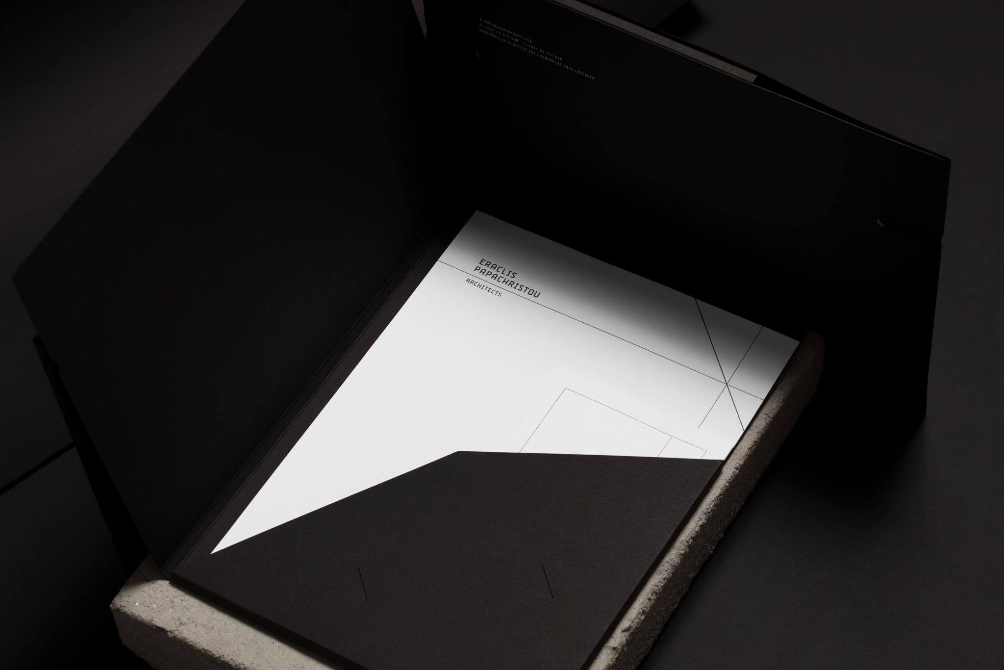
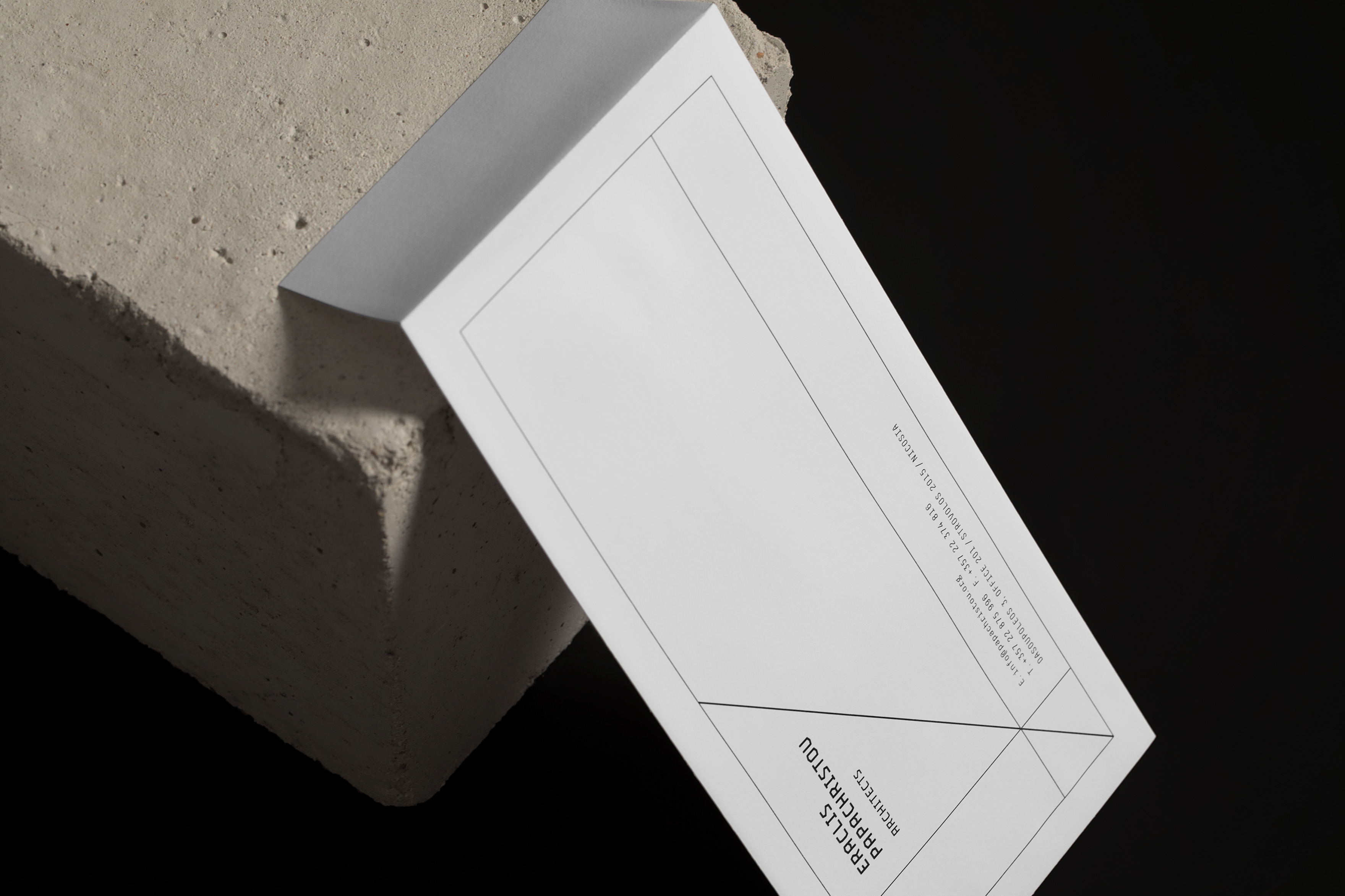
The custom typeface design, with references to the industrial and construction area, formed the basis of the company’s renewed logo, that connects the company’s specialization with its updated image. The identity’s geometric lines create a sharp and technocratic mood, with references to all three dimensions architects are using: length, width and depth, metrics essential to the architectural design.
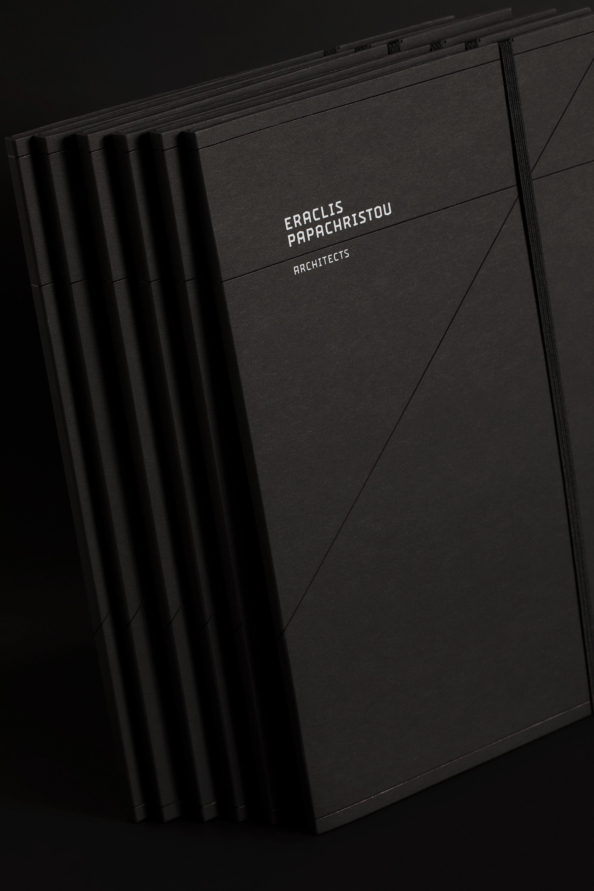
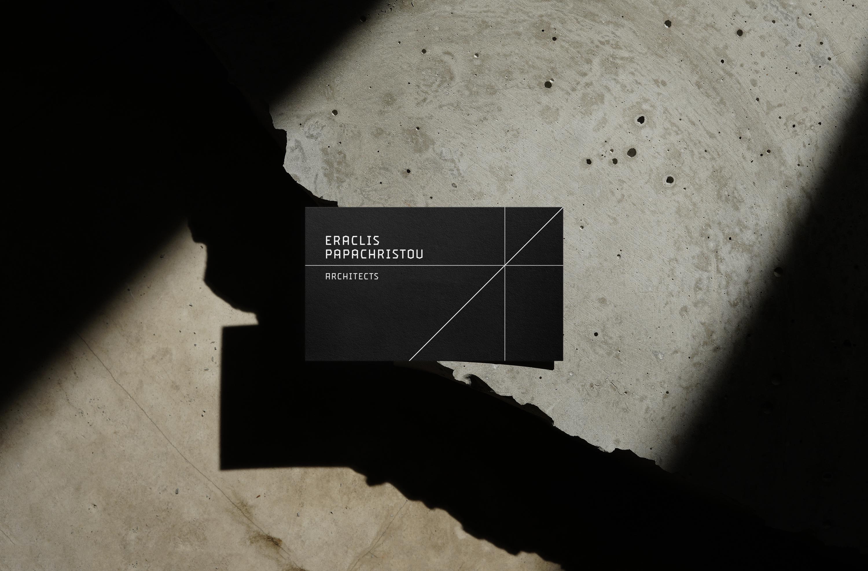
The use of a monospaced typeface on the company’s contact info was considered as the ideal choice for a market where geometry and sharp lines dominate. Finally, the black and white color palette combined with the rough textures of special papers, refer to the organic nature of architecture and materials, while achieving modern aesthetics with a timeless value.
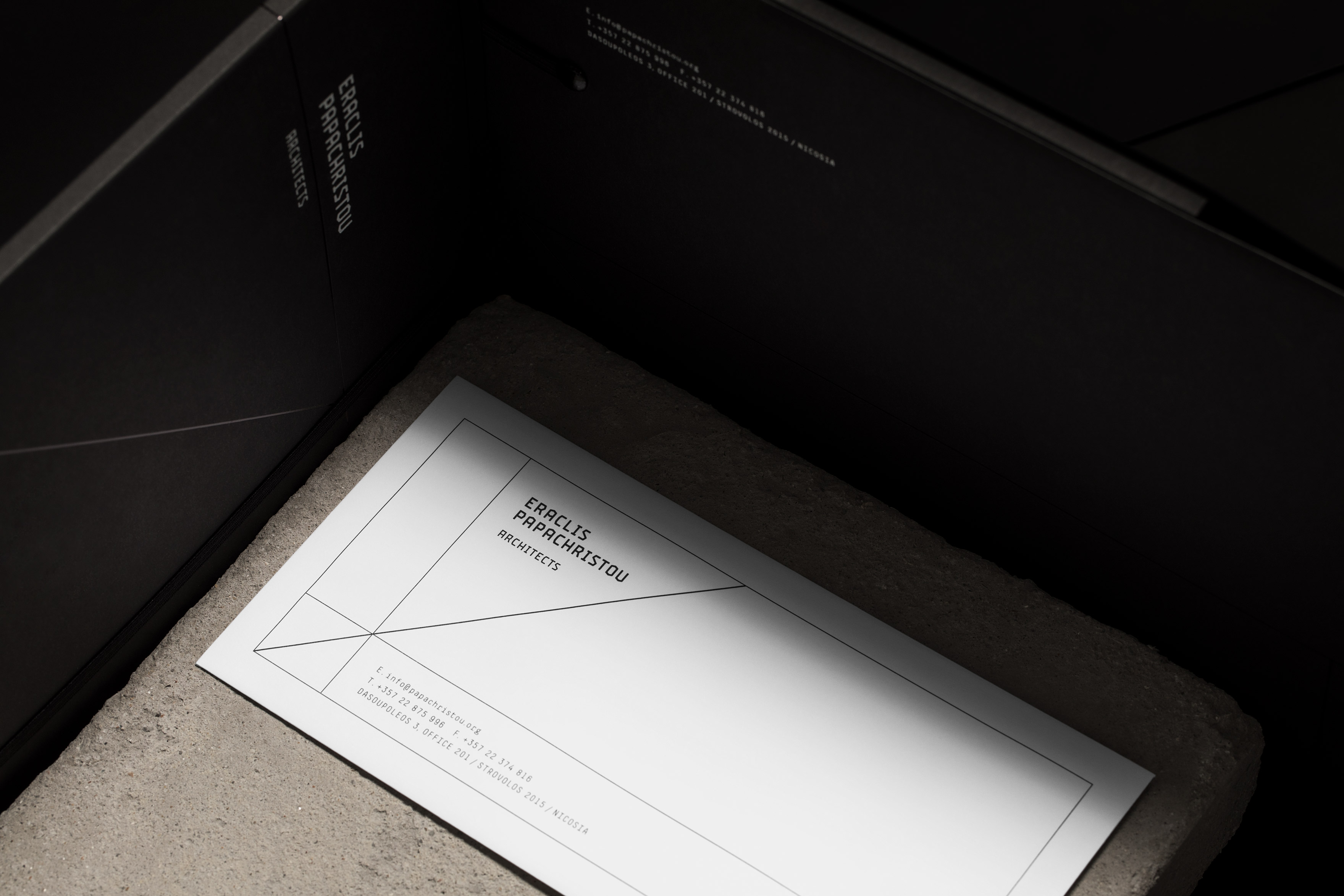
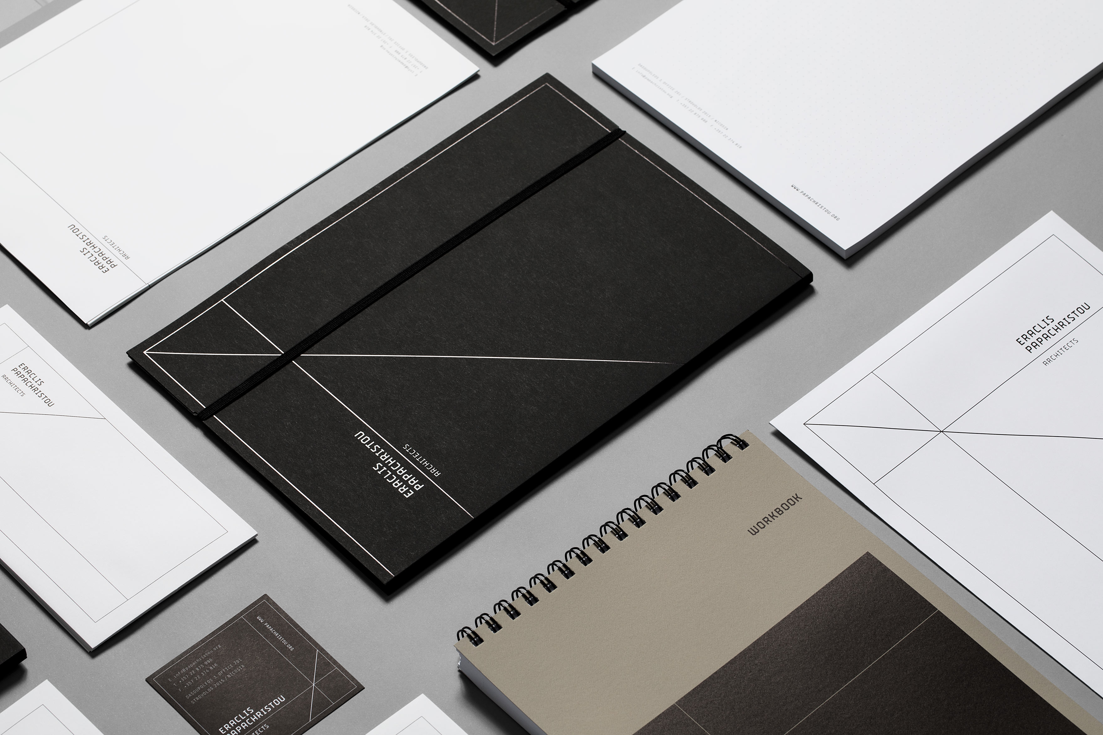
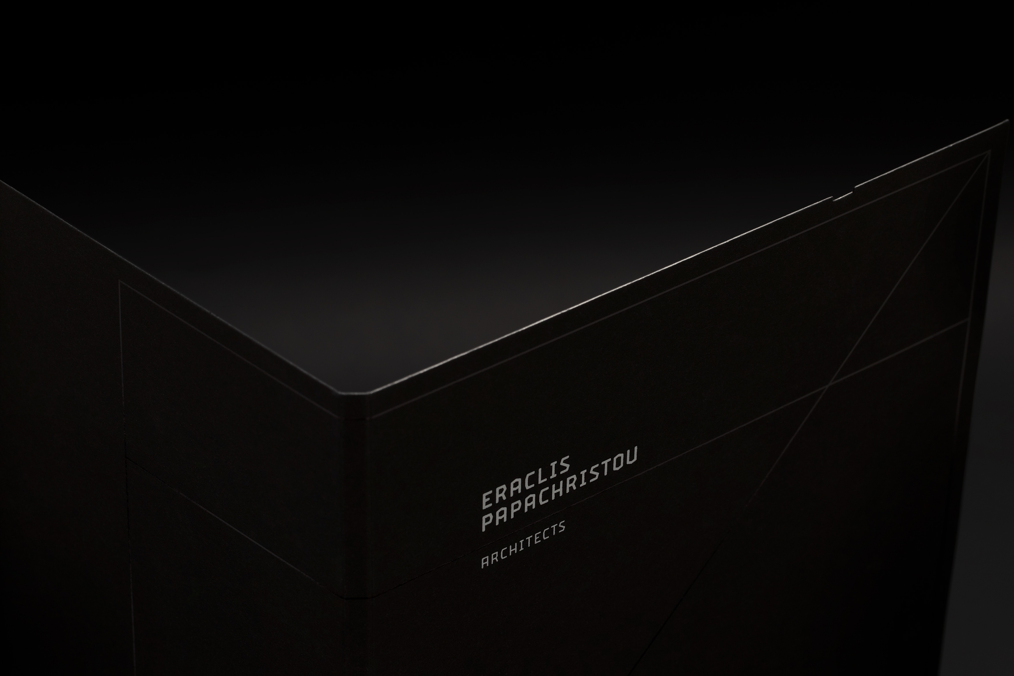
AN ENVIRONMENT WHERE GEOMETRY AND SHARP LINES DOMINATE
THE BLACK AND WHITE COLOR PALETTE COMBINED WITH THE ROUGH TEXTURES OF SPECIAL PAPERS
REFER TO THE ORGANIC NATURE OF ARCHITECTURE AND MATERIALS

RELATED PROJECTS