-
SERVICES:
- Website design
- Art direction
- UI - UX
-
AWARDED WITH:
- Ebge Awards
- European Design Awards
- Red Dot Awards
- CSS Design Awards
- Ermis Awards
-
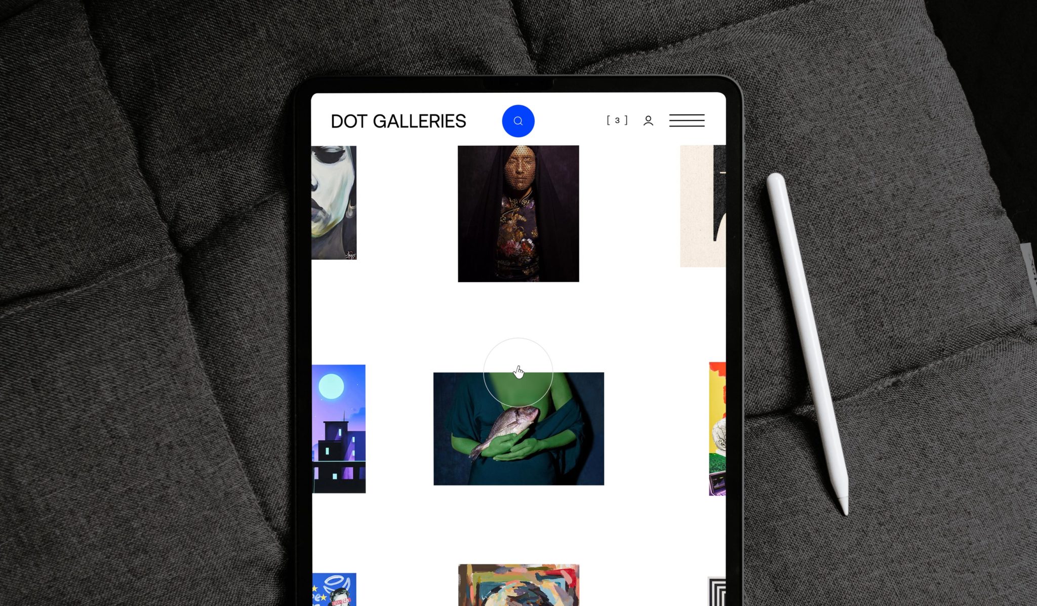
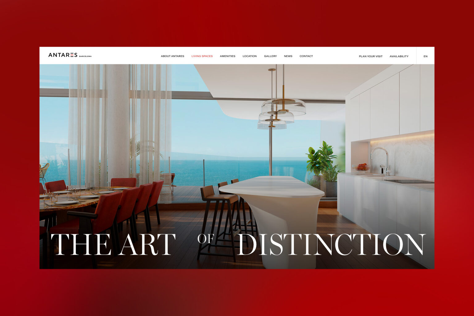
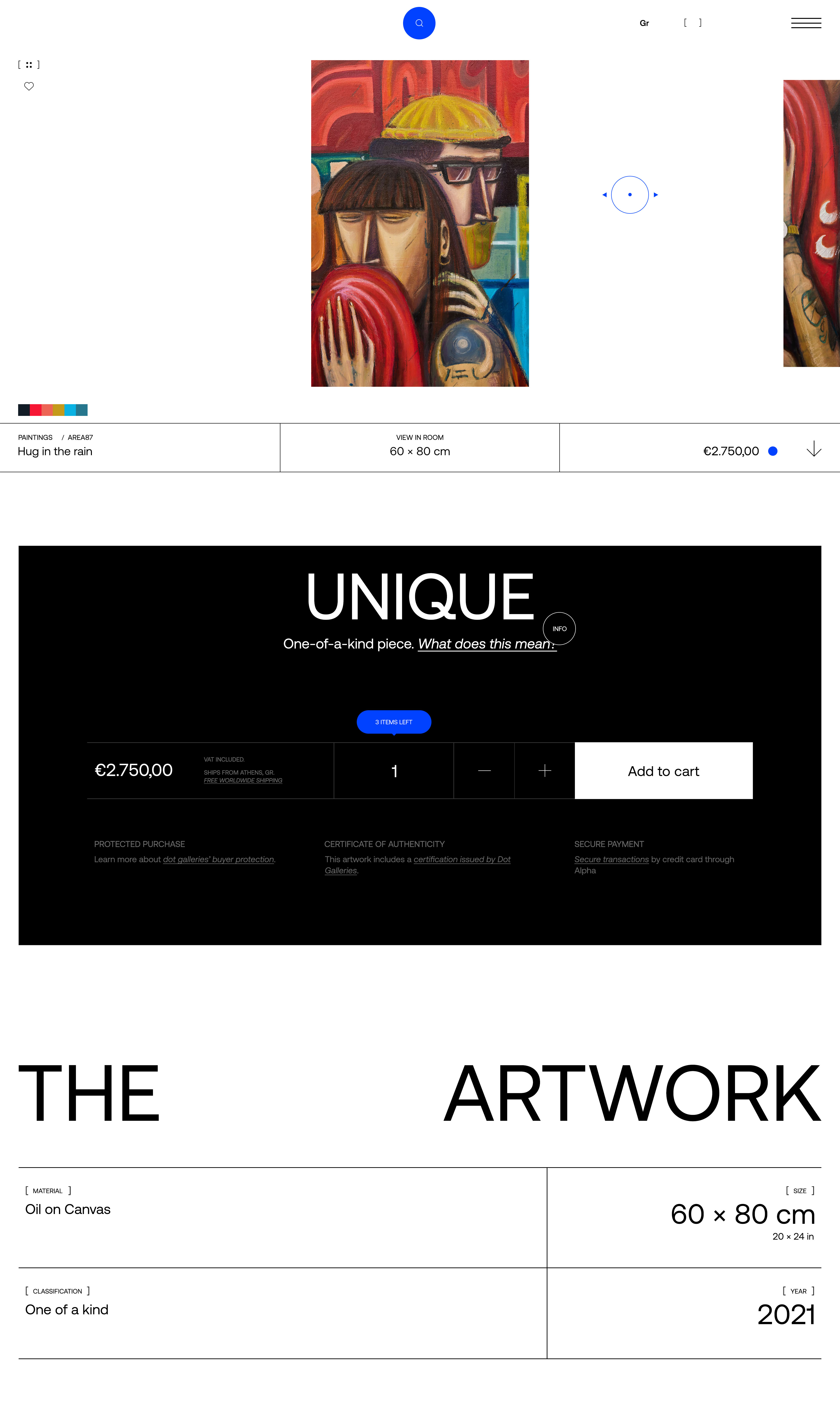
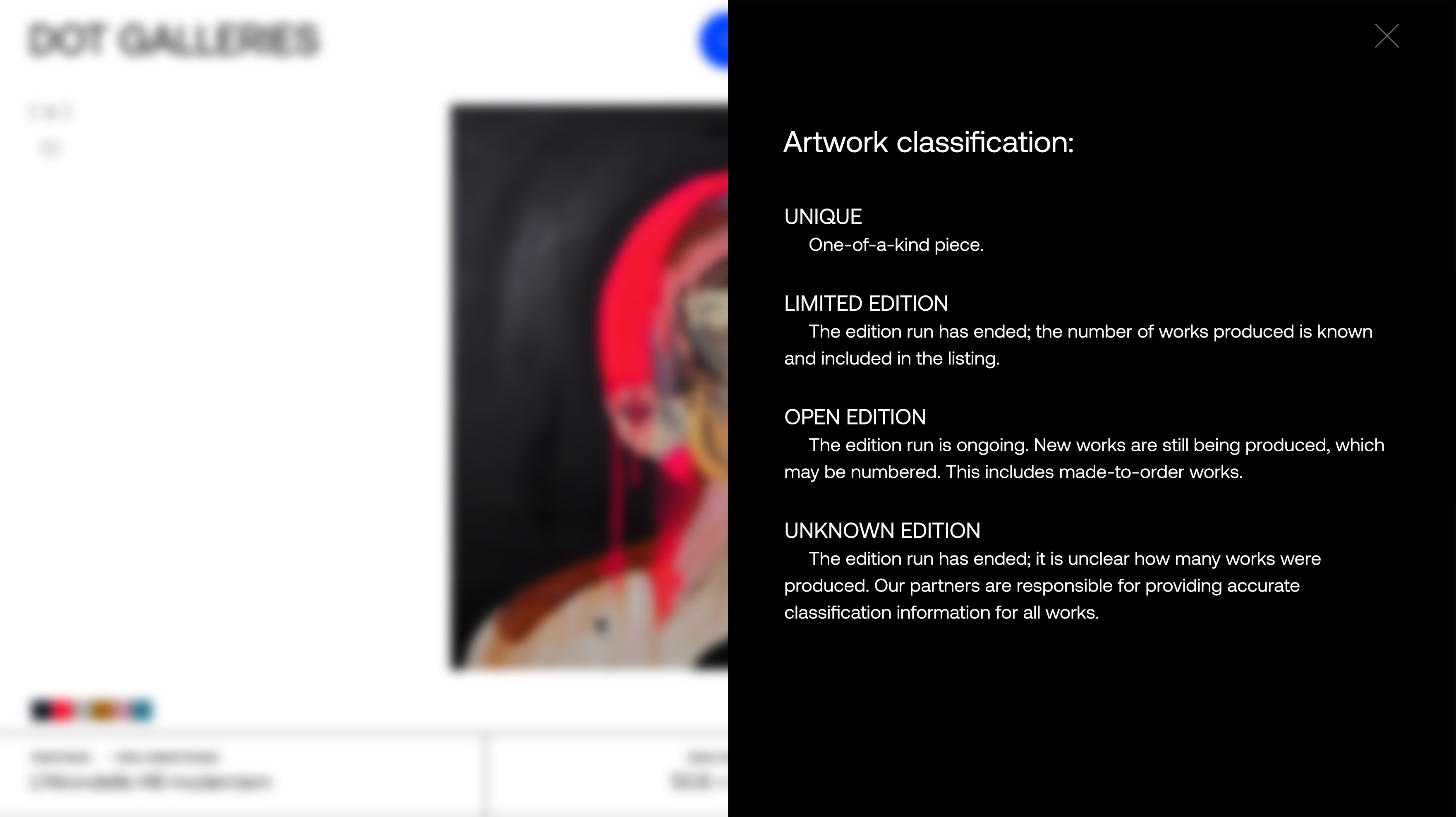
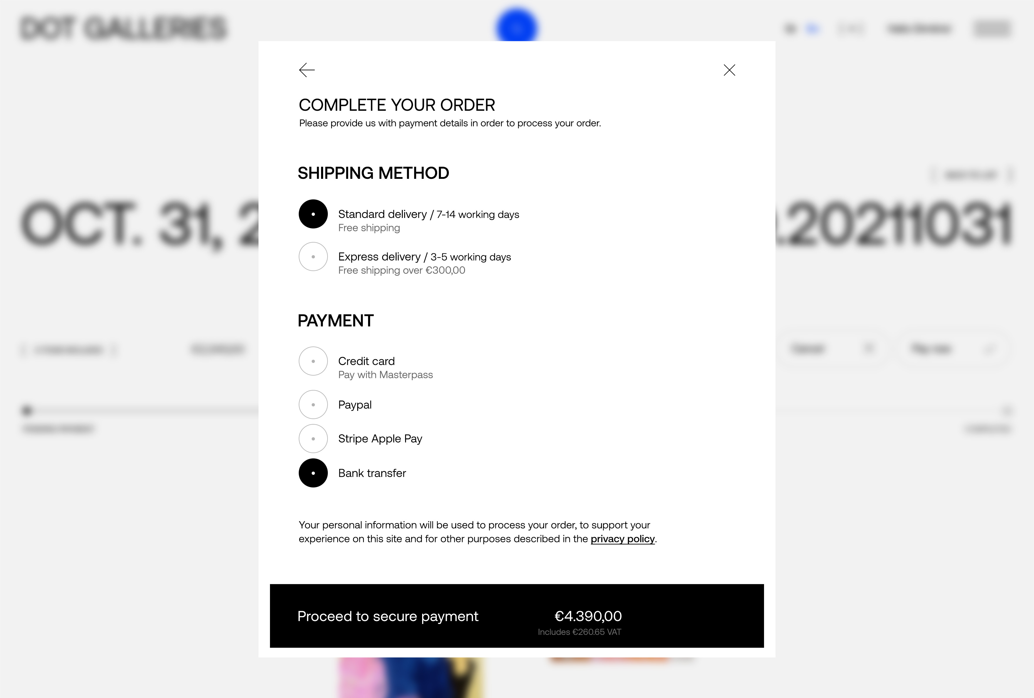
Website design for DOT GALLERIES, a brand-new platform initiative that sells art through an online platform without a physical presence.
DOT GALLERIES comes to support artists from the inside by legally protecting them with regards to their intellectual property. The aim is to give all the artists involved the opportunity to display and sell their work in all relevant market.
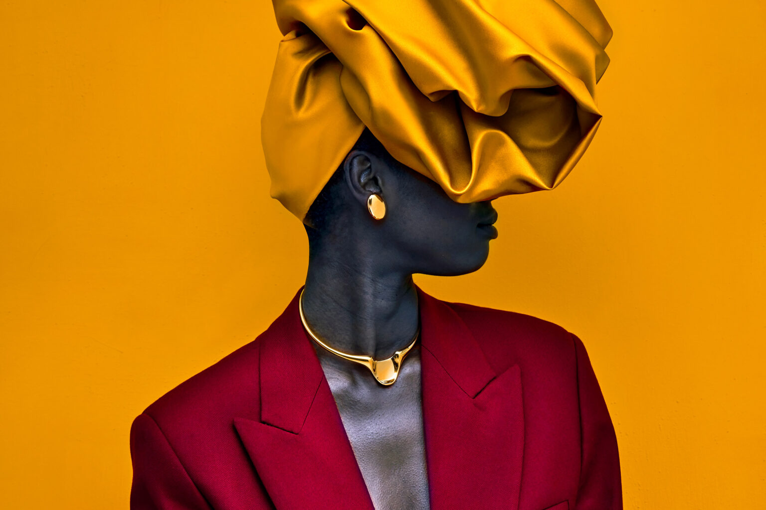
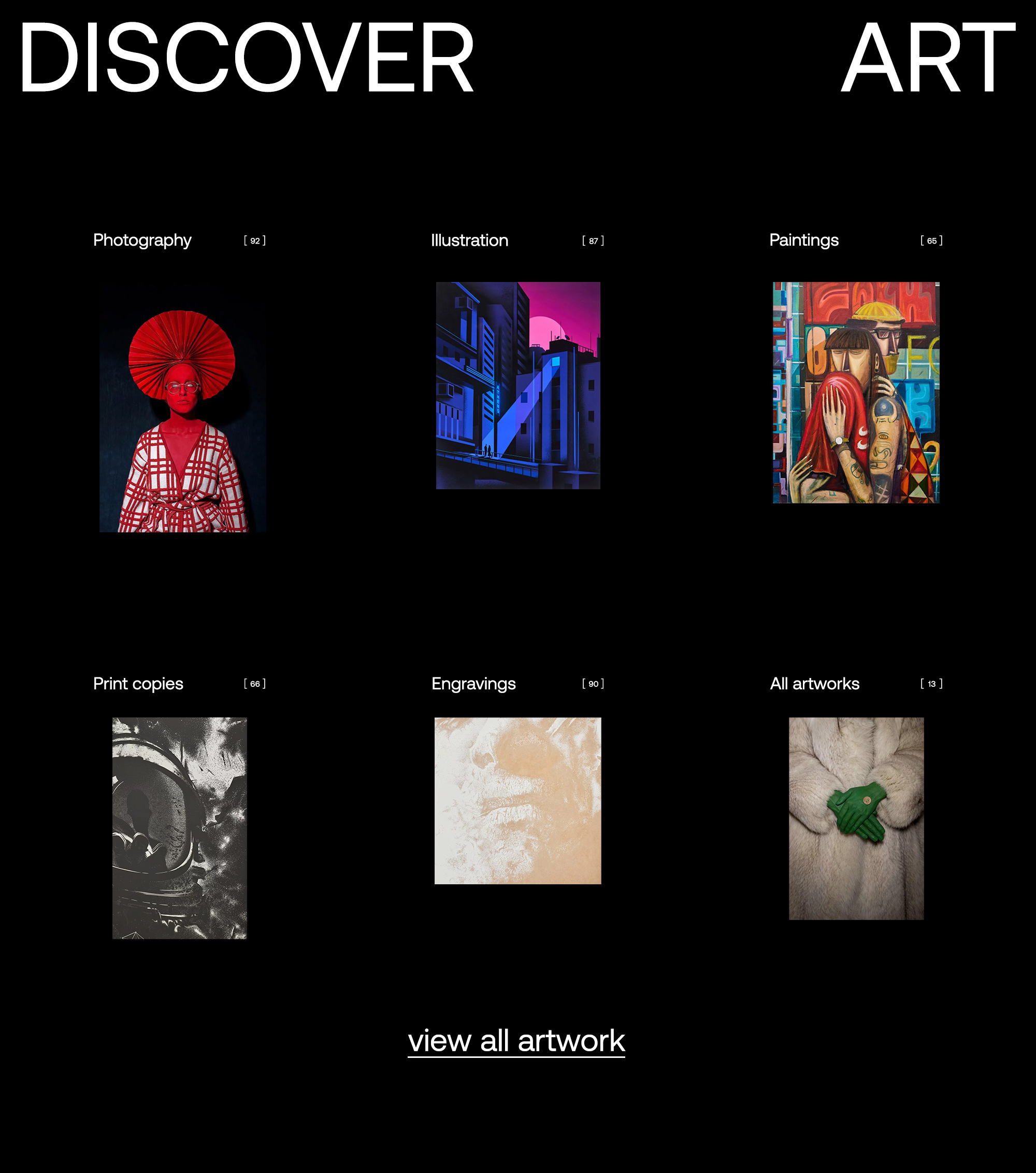
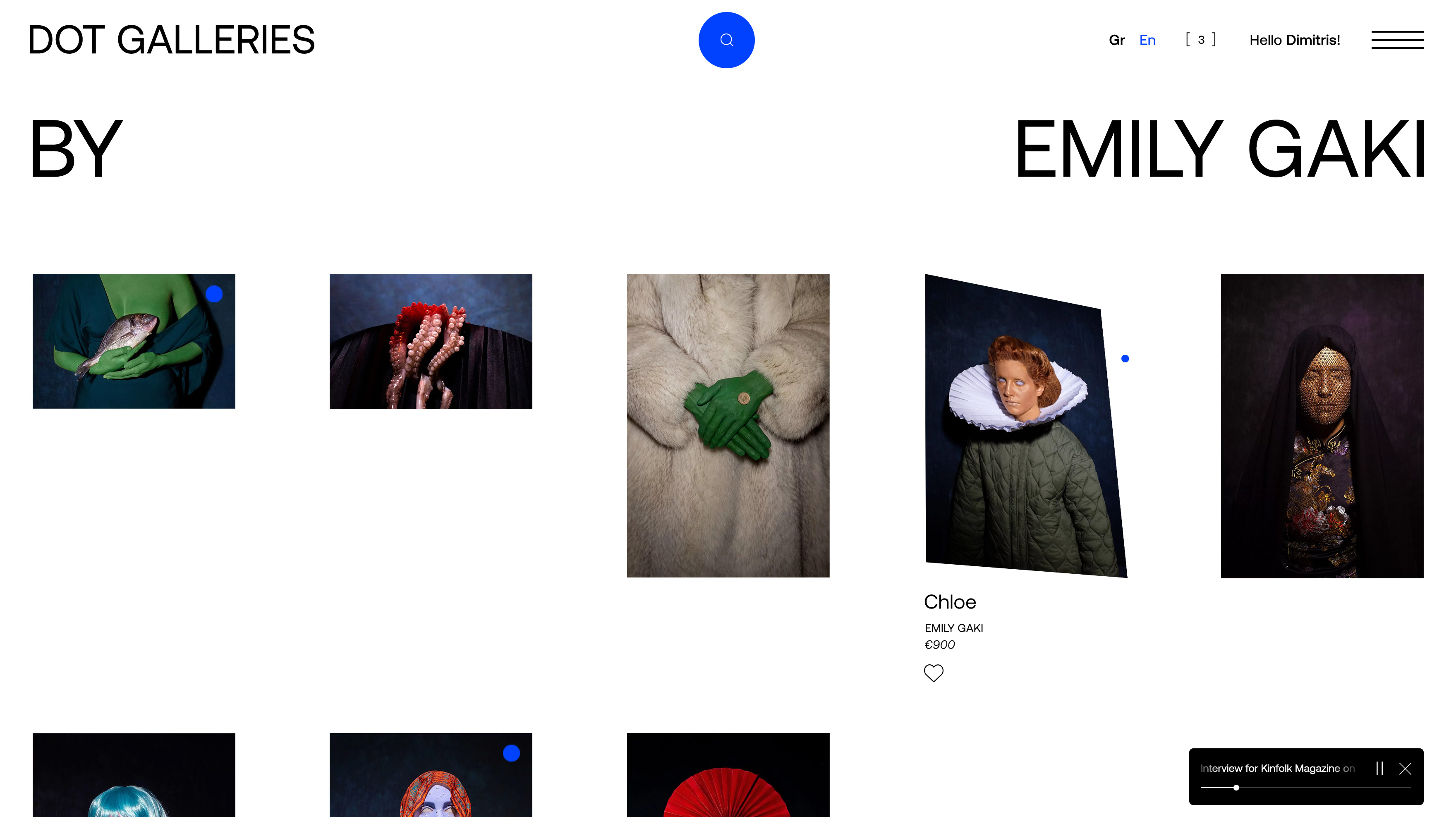
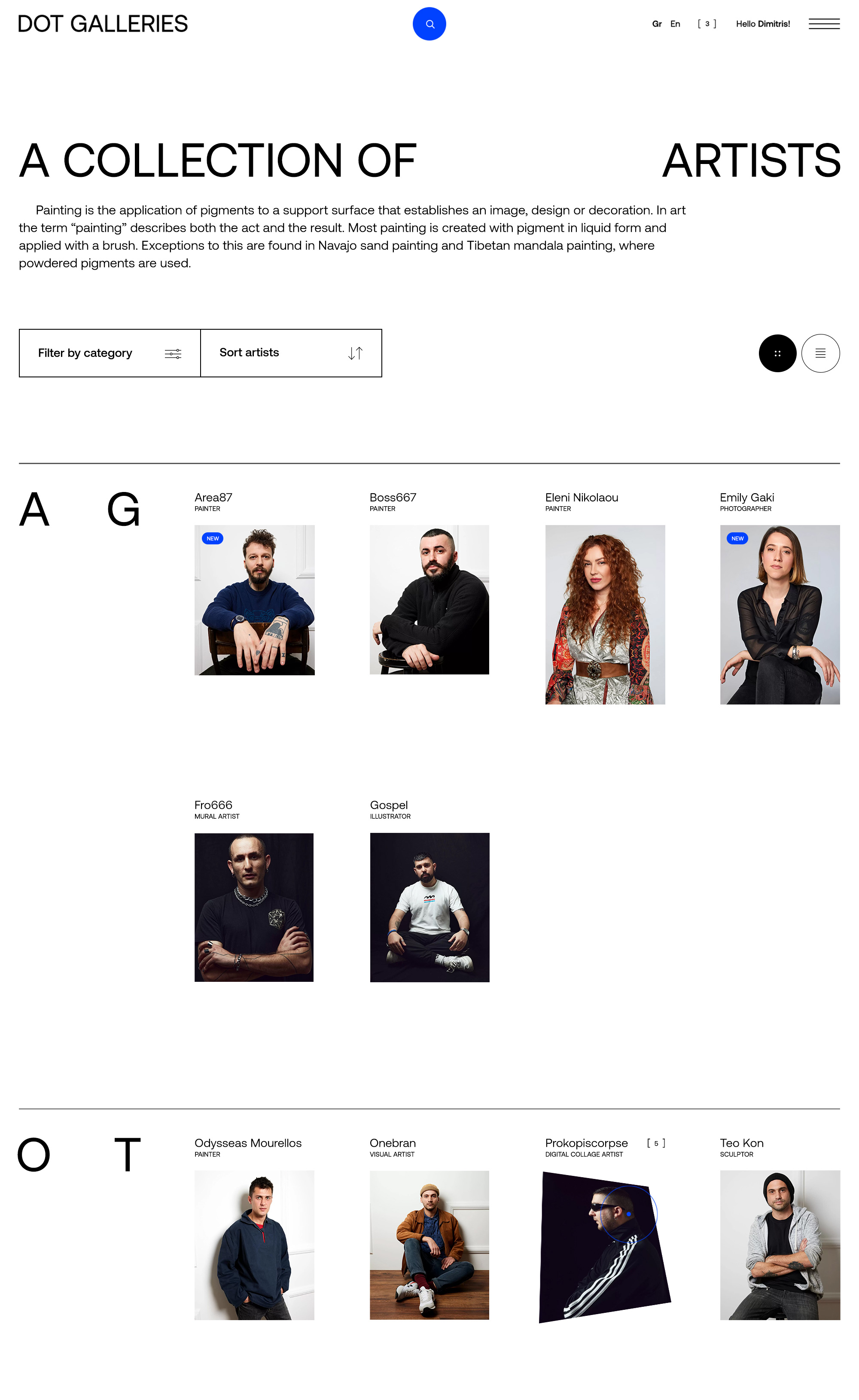
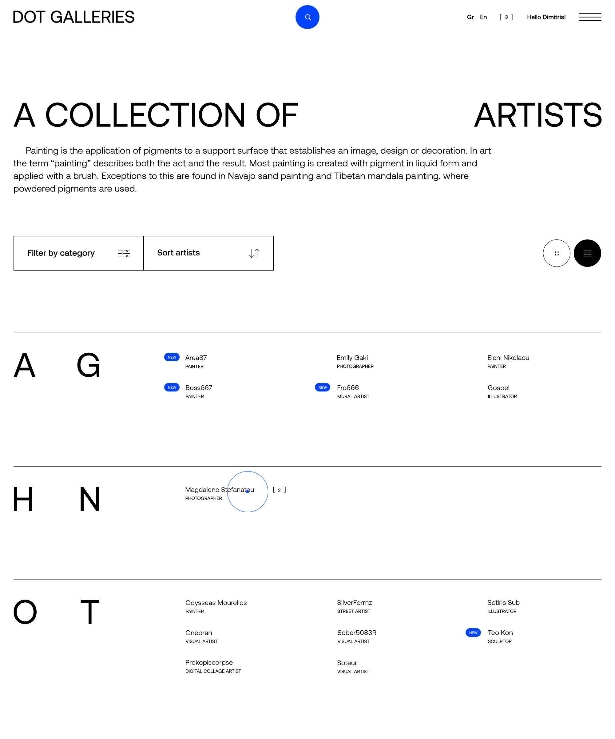
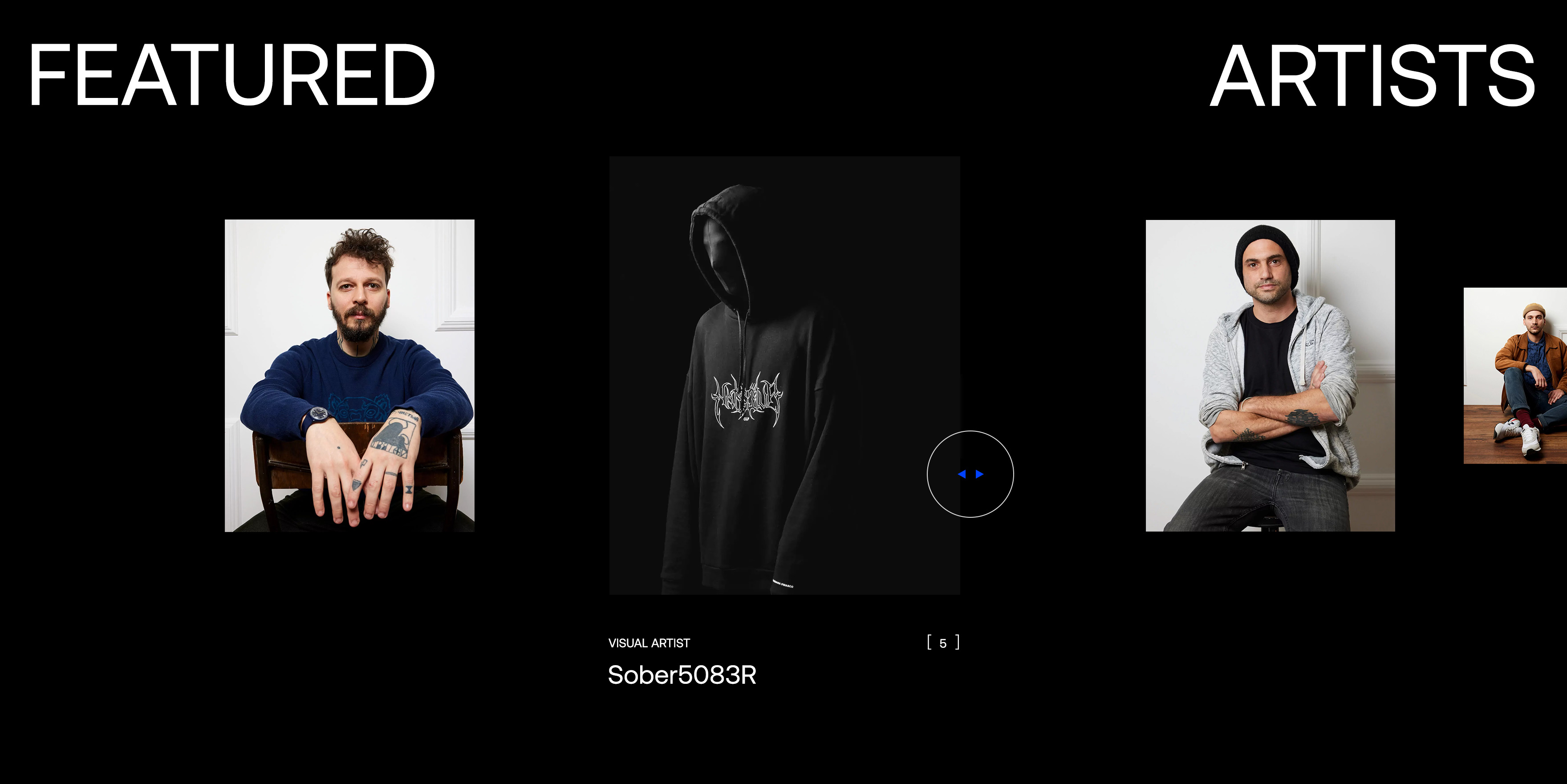
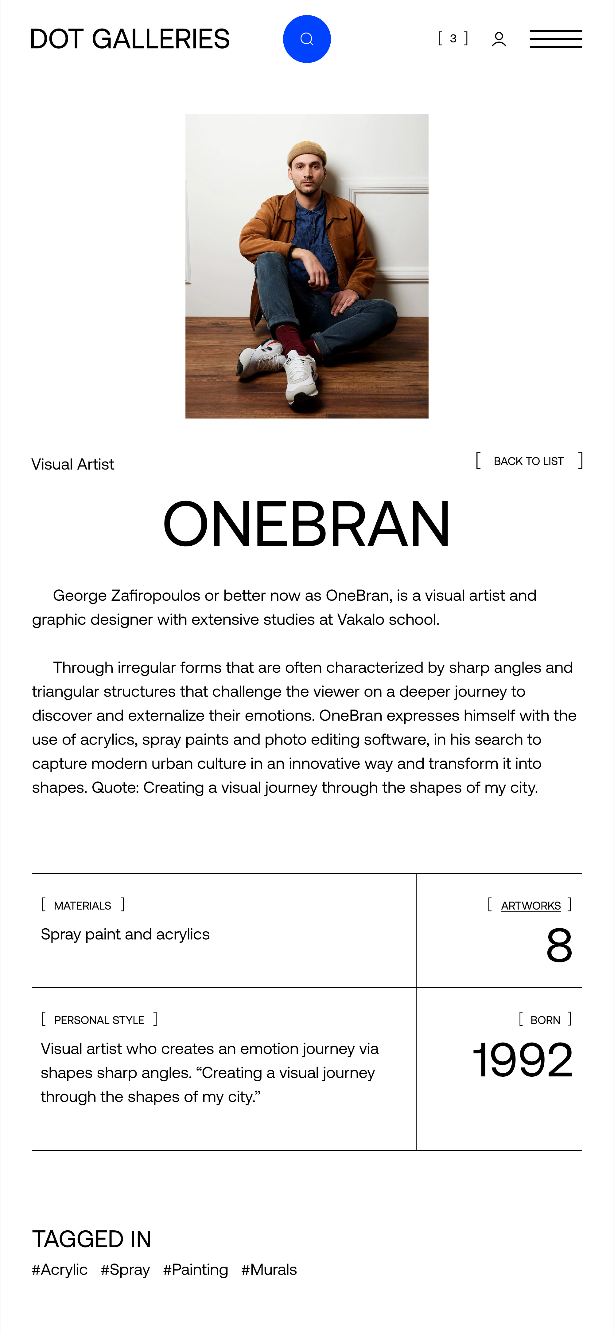
With art pieces from different fields (painting, sculpture, photography), DOT GALLERIES presents a range of young Greek artists that deserve the attention of the artistic – and not only – world.
The brand’s name derives from the distinctive dot, used by galleries, and being placed next to an art piece when sold.
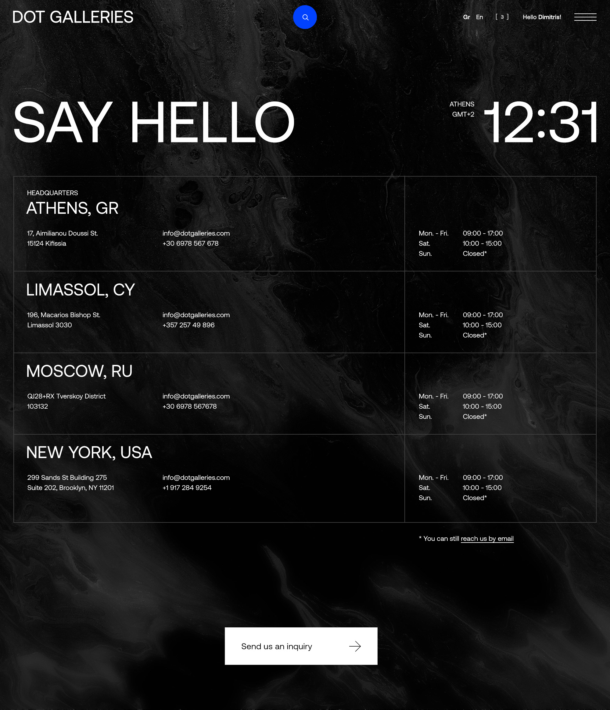
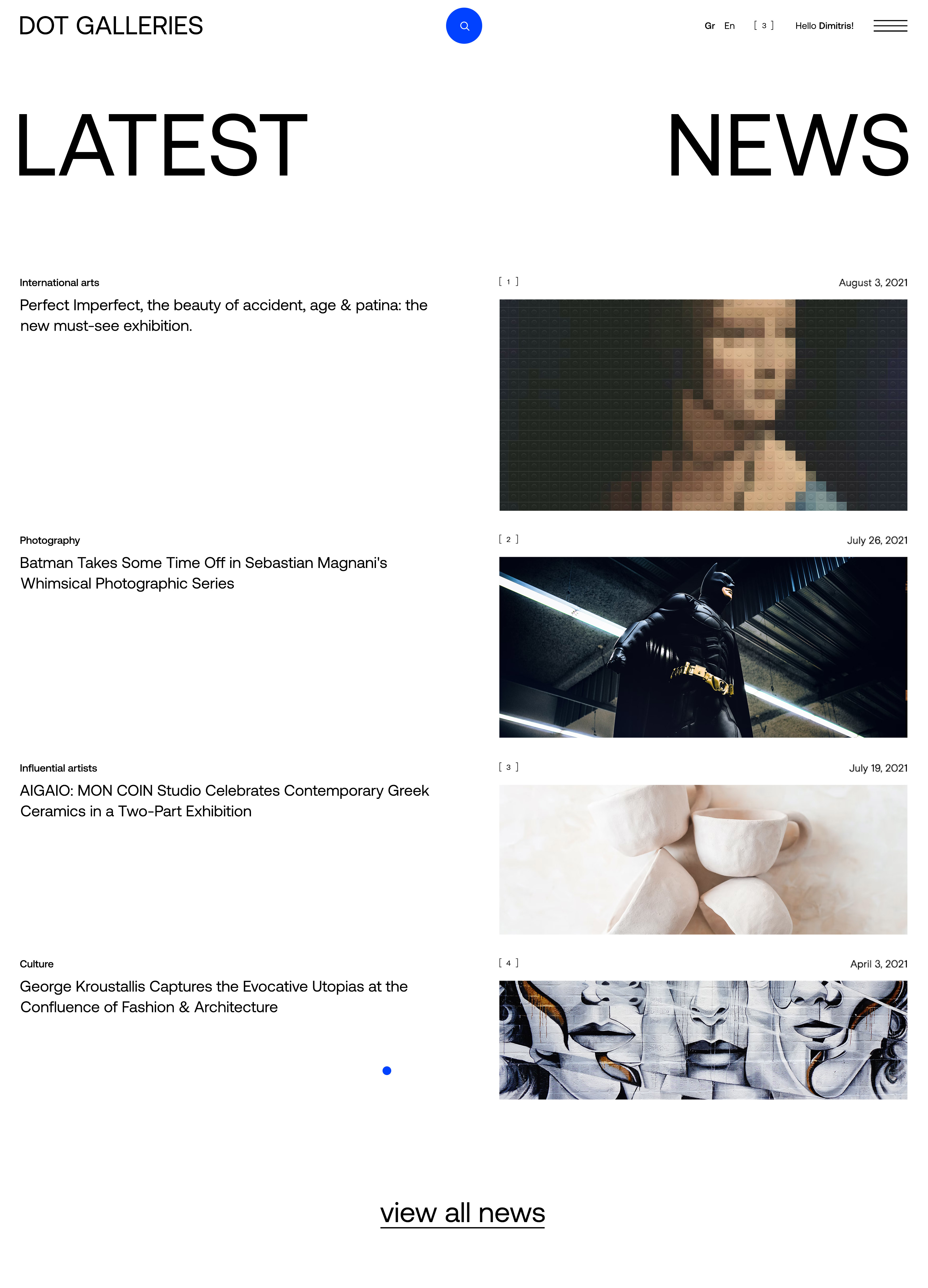
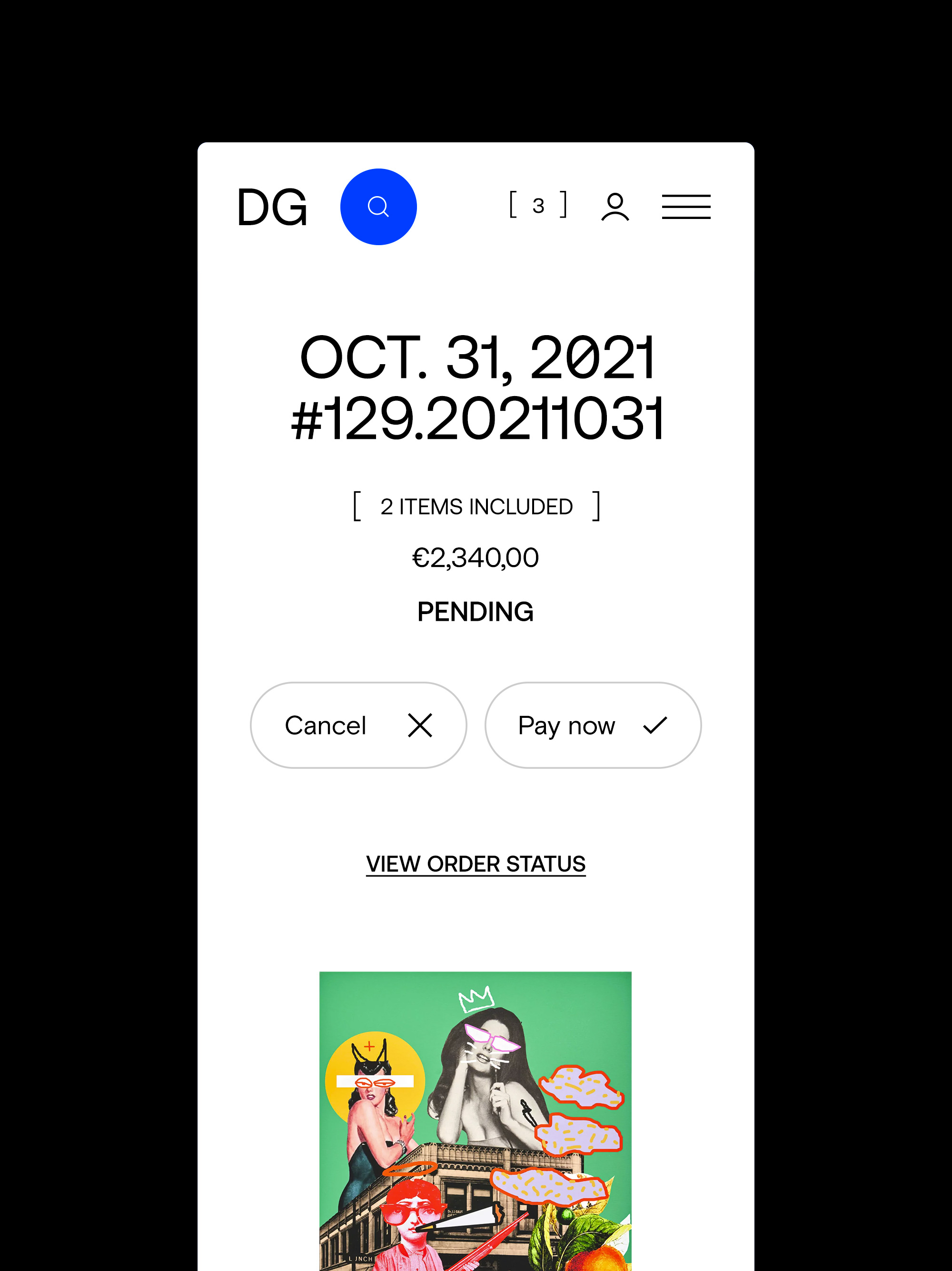
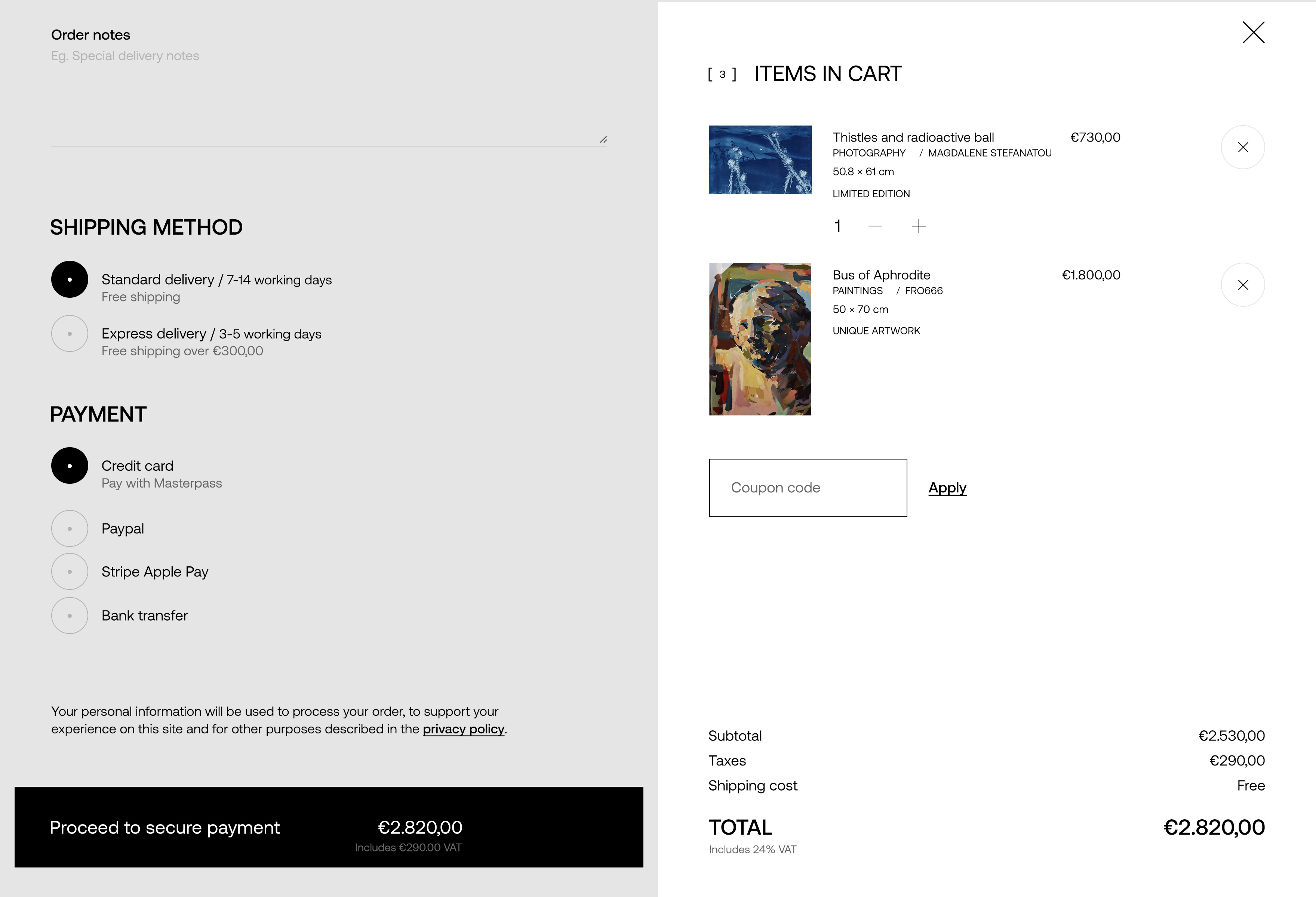
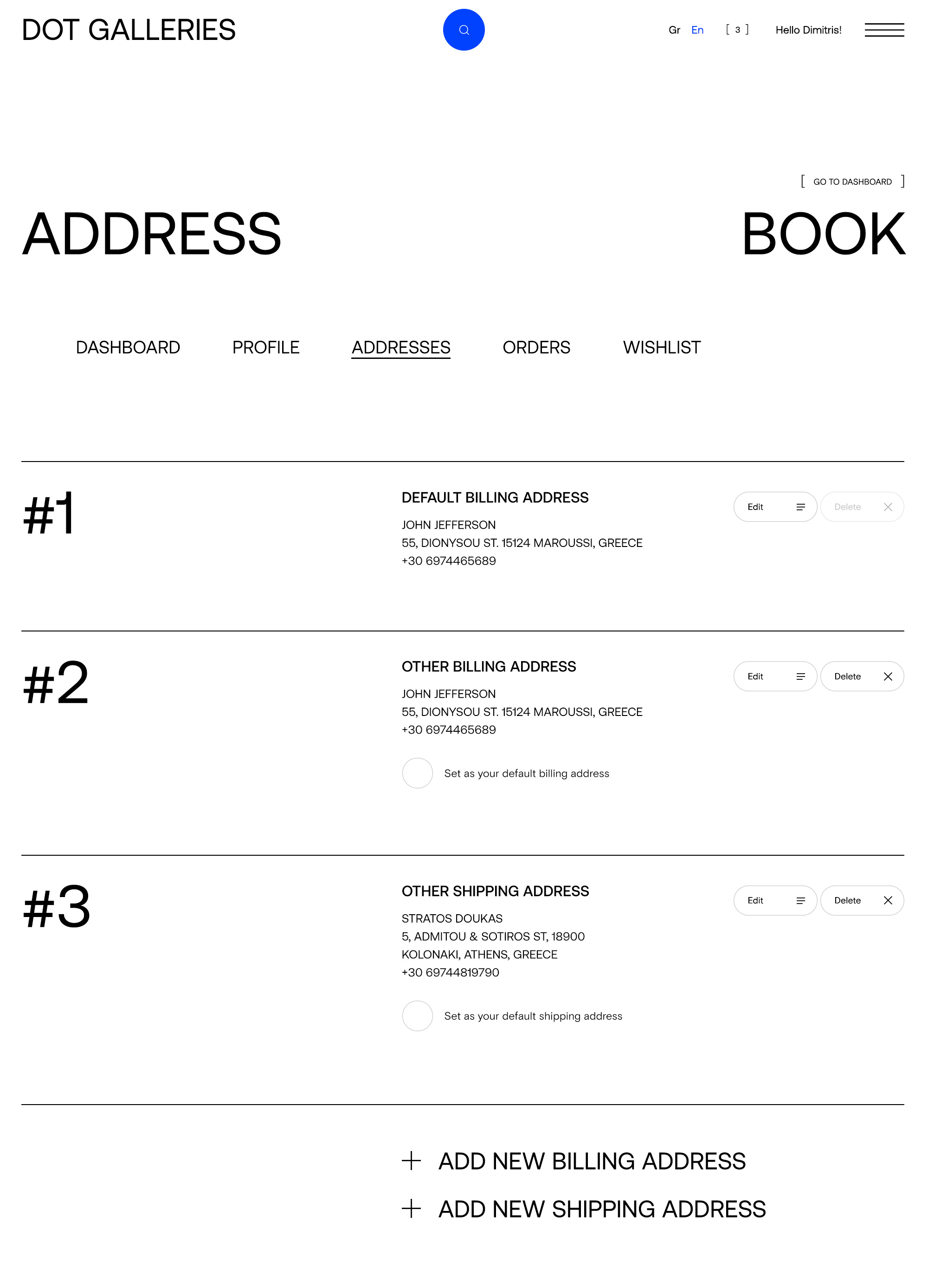
DOT GALLERIES assigned to us the design of the company’s online store, which is also the main point of reference for all the artists and the projects it hosts.
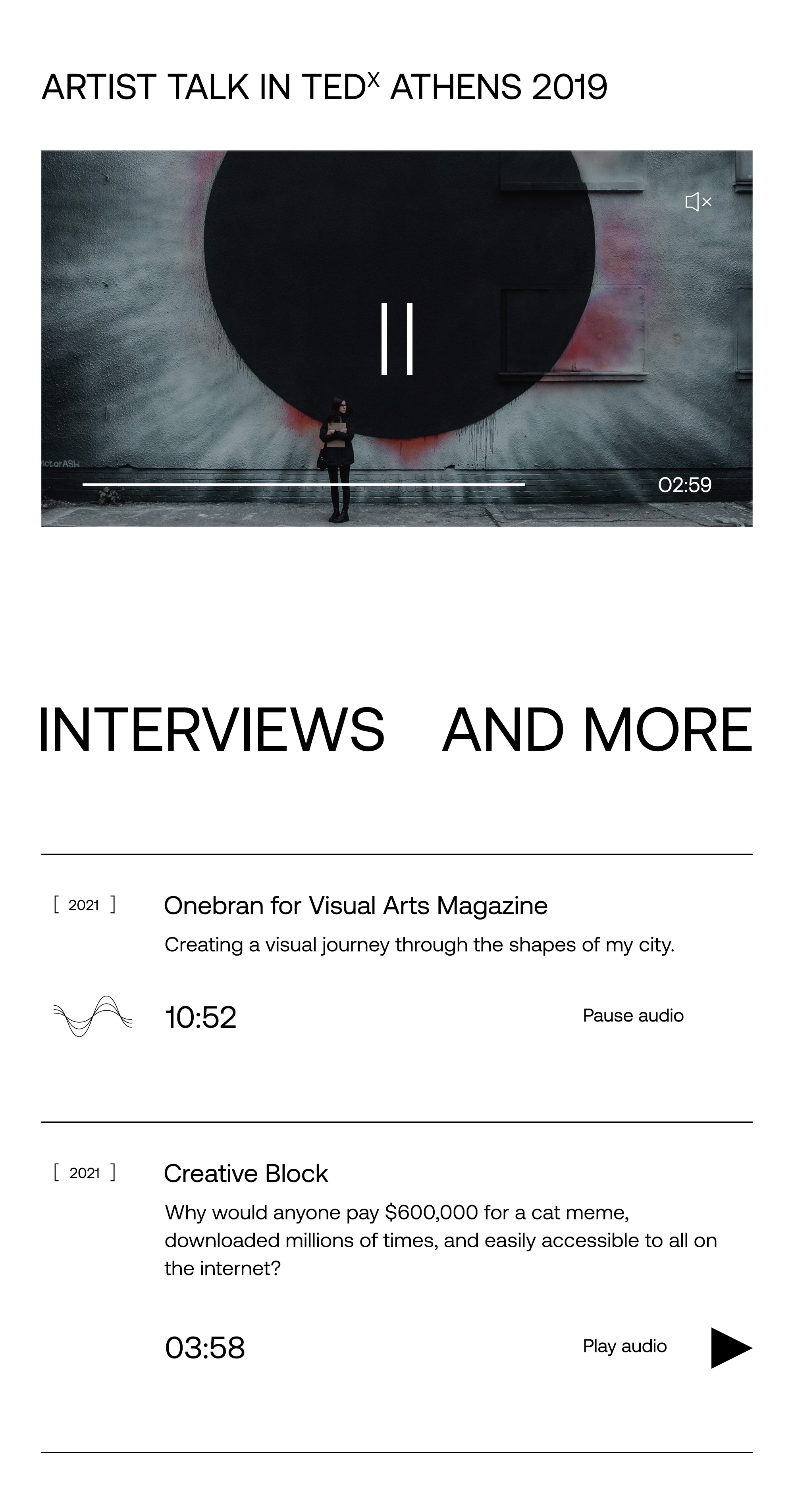
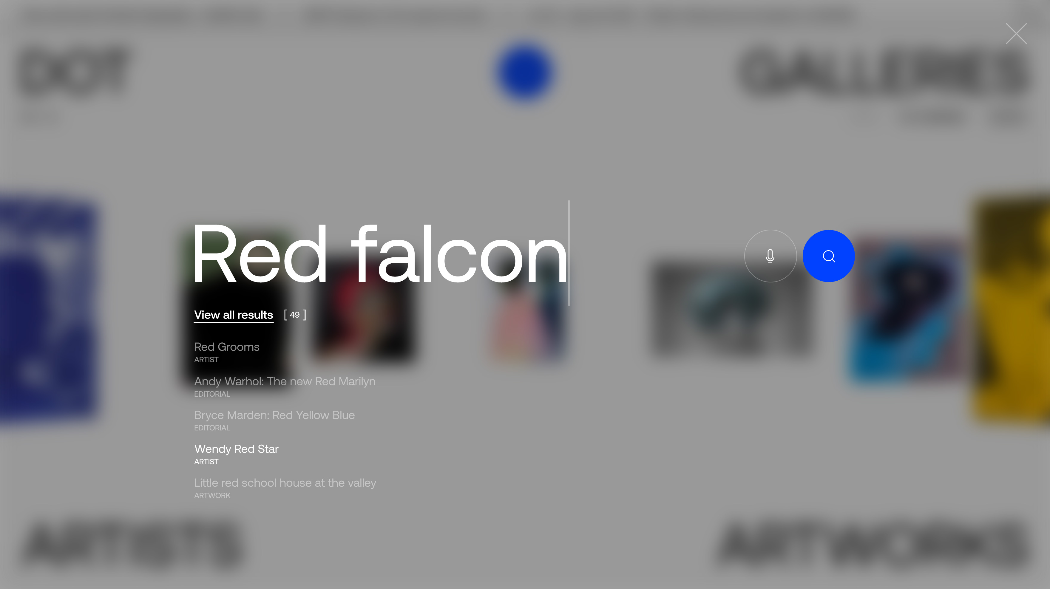
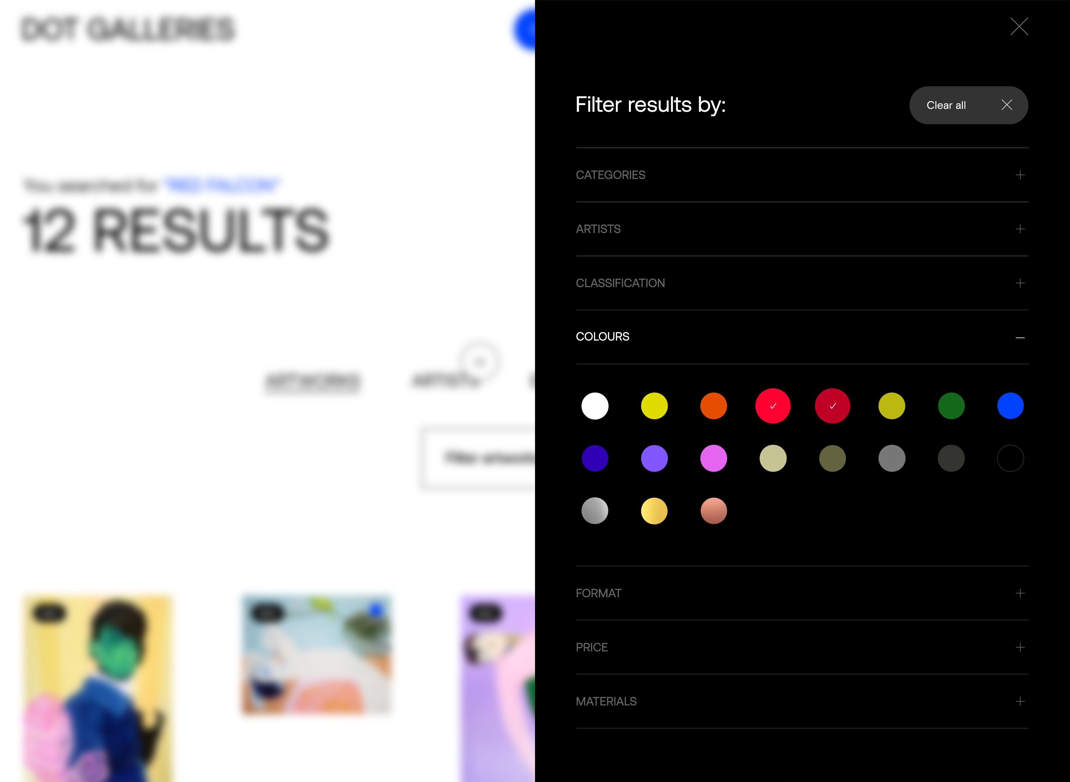
The goal of our design approach is to highlight the art works and artists themselves through an original experience, both when navigating and when purchasing a piece of art. Wanting to emphasize the quality of the art collection hosted by the platform, we designed in the most unpretentious way, letting the diversity, the multicolor and the uniqueness of the artworks be the protagonist on each page.
We were inspired by the “white space” that one encounters in exhibitions, the frame itself with the concept of a framework as well as the dot itself (sign of a sale).
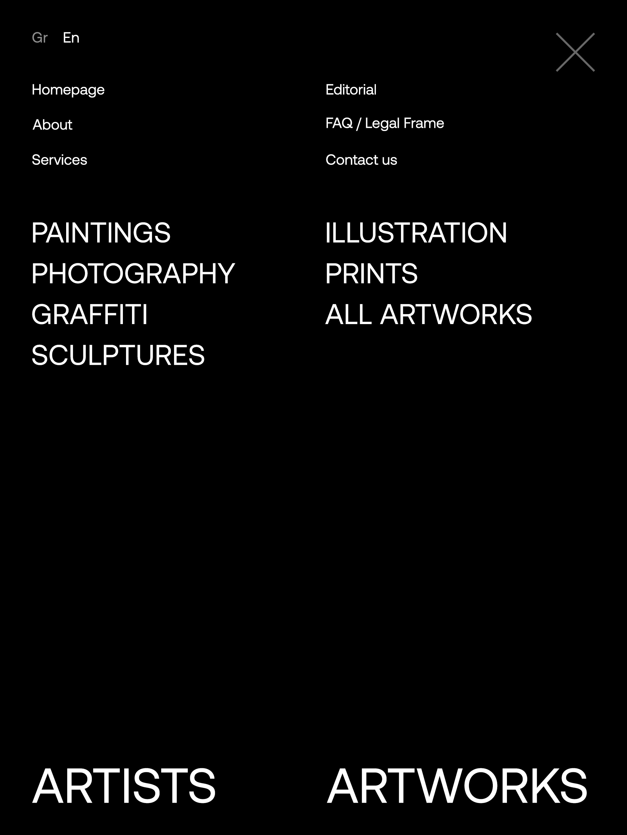
The application of the name DOT GALLERIES in combination with the most important menu items (ARTISTS & ARTWORKS), creates a framework that “protects” and surrounds the most special and contemporary art collection.
The basic blue corporate color is discreetly located between the pages during browsing, communicating on a second level the Greek origin of the artists it hosts.
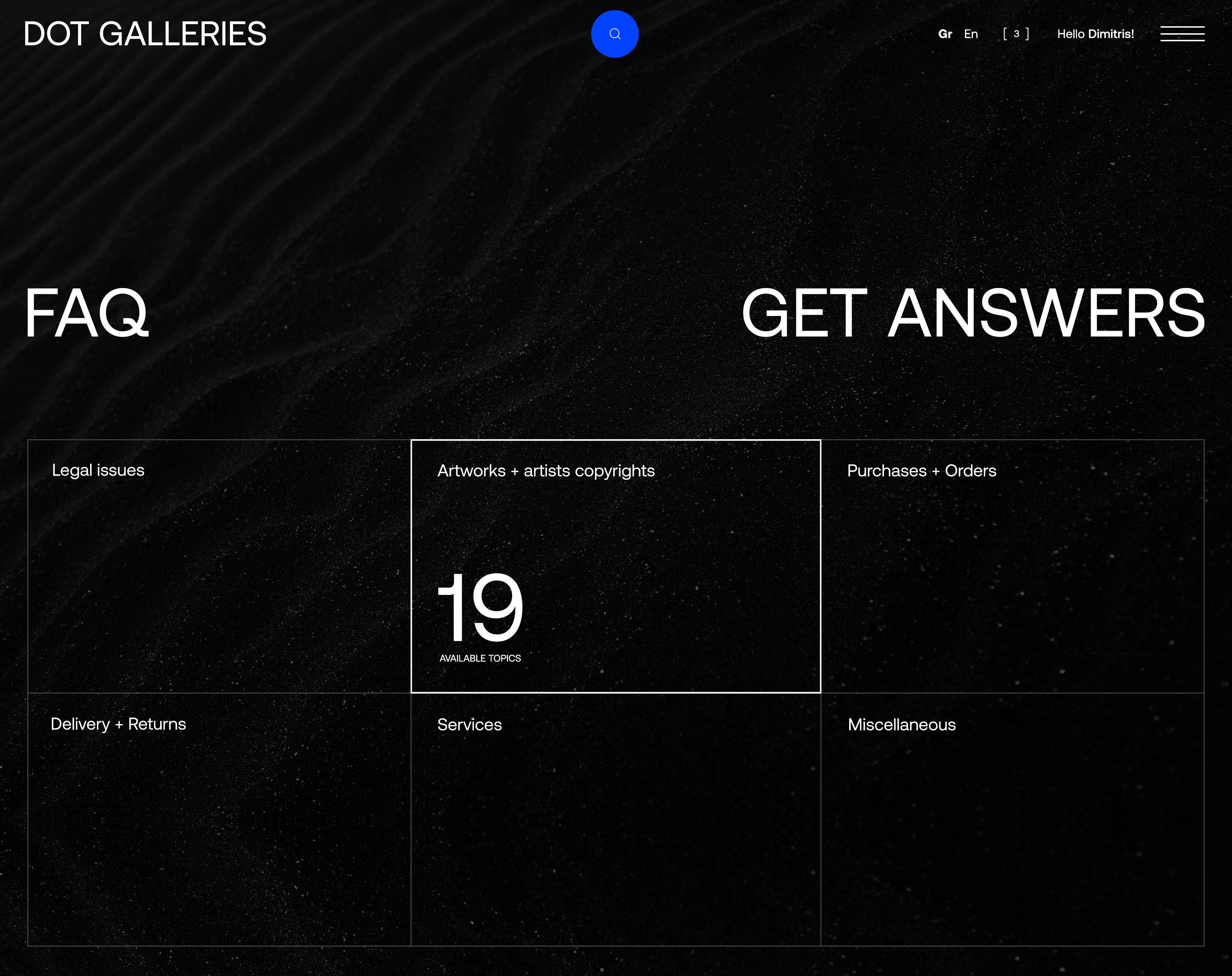
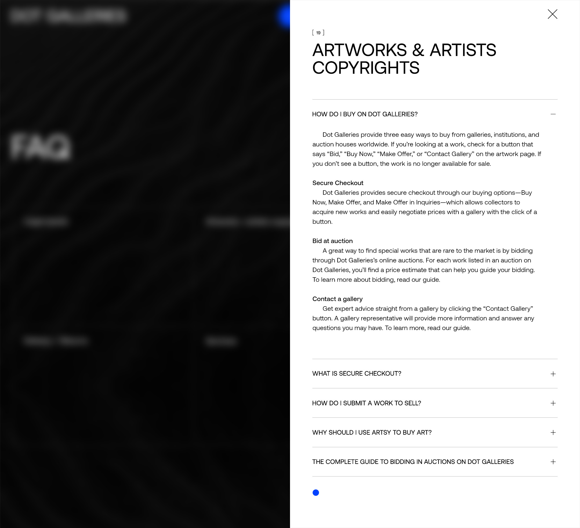
The simple combination of black and white, in turn, give space and breath to the artworks.
With an abstract mood, strong contrasts in the typography, we aim for a pleasant reading. Through the micro-interactions that we designed in detail, we give added value to the final deliverable and to the user experience across media, creating a uniform and harmonious result on a platform where its content must be attractive and correctly presented.
THE BRAND'S NAME DERIVES FROM THE DISTINCTIVE DOT
USED BY GALLERIES, AND BEING PLACED NEXT TO AN ART PIECE WHEN SOLD.
WE WERE INSPIRED
BY THE "WHITE SPACE" THAT ONE ENCOUNTERS IN EXHIBITIONS.
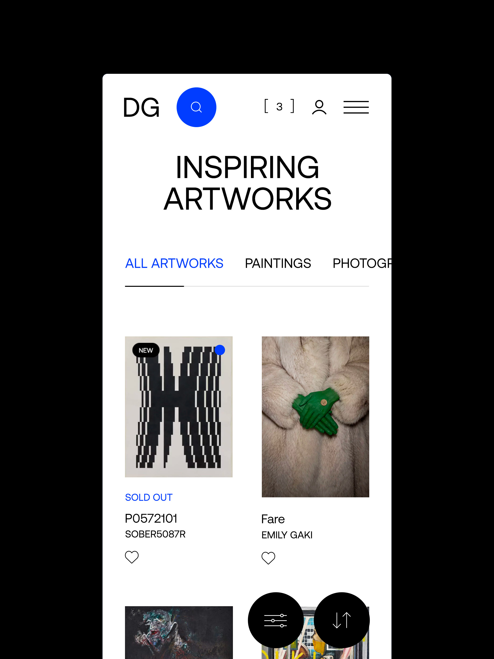
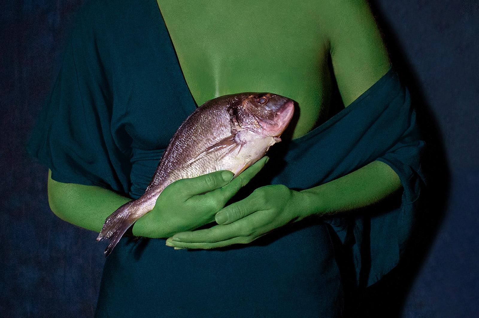 Feeding / Emily Gaki
RELATED PROJECTS