-
SERVICES:
- Branding
- Editorial design
- Infographics
- Illustration
-

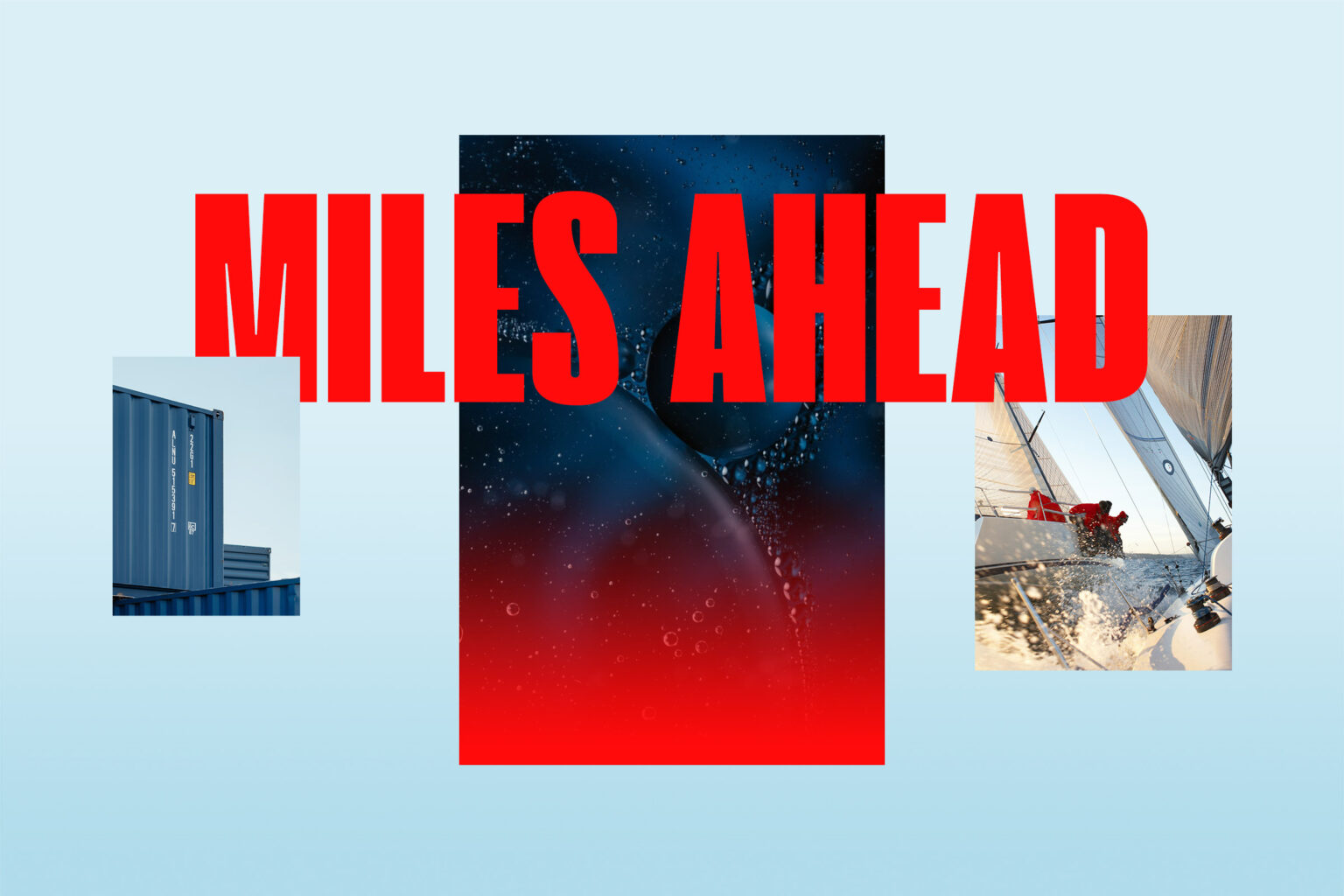
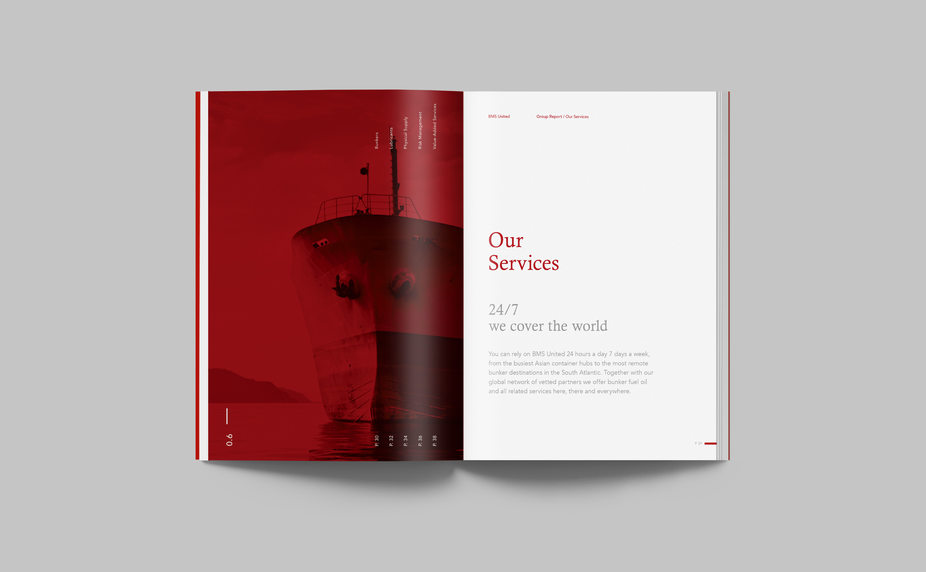
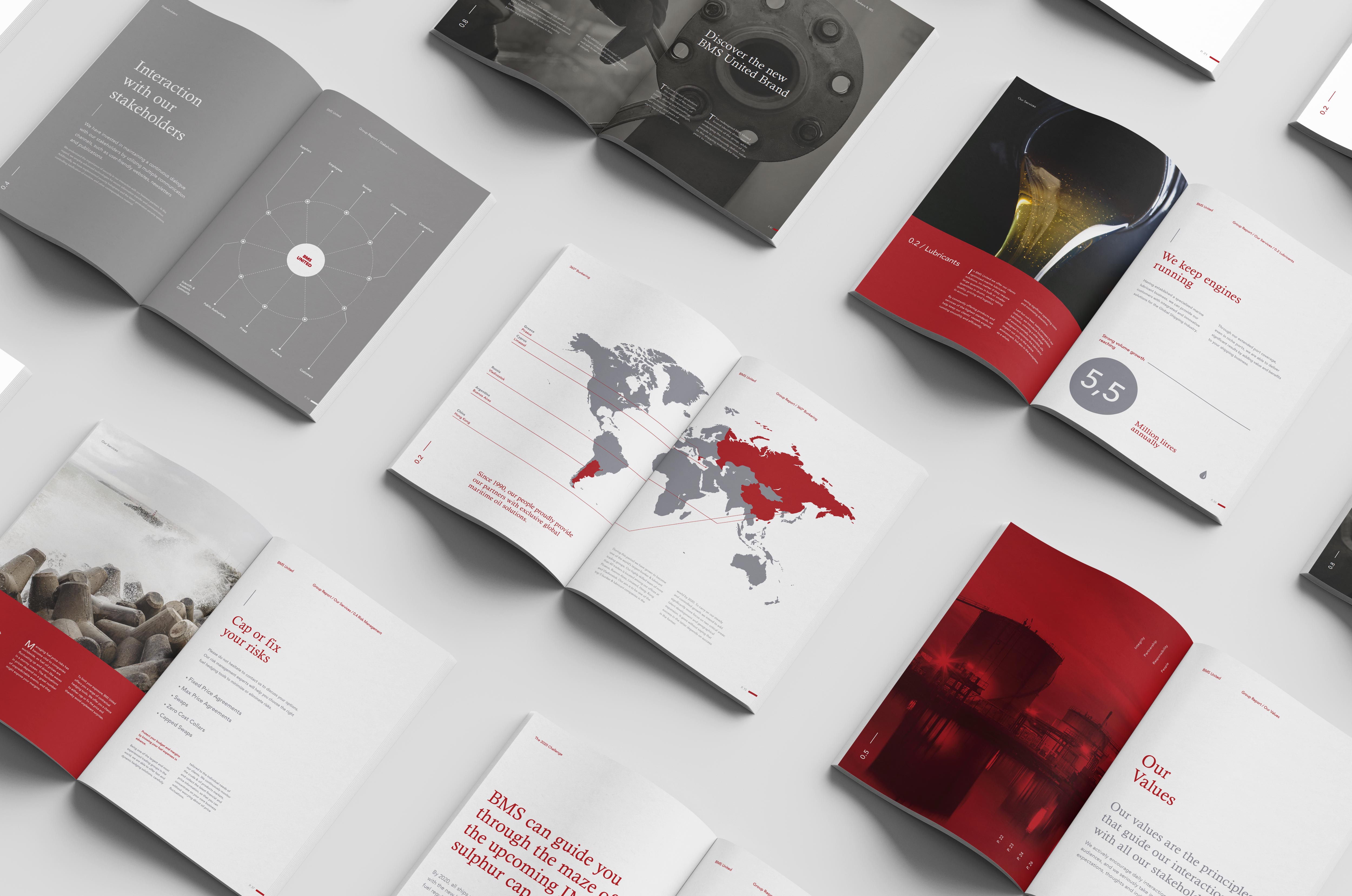
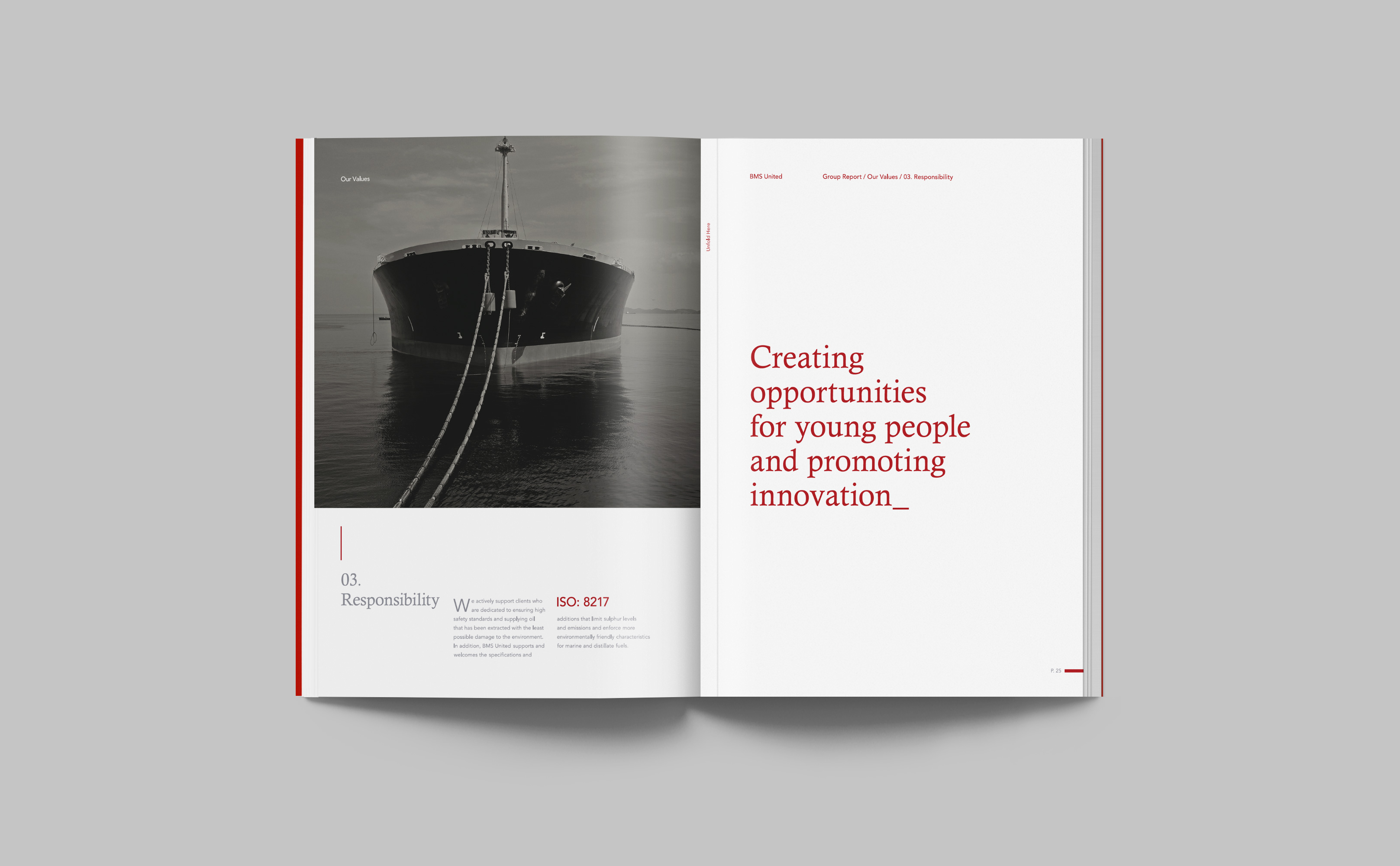
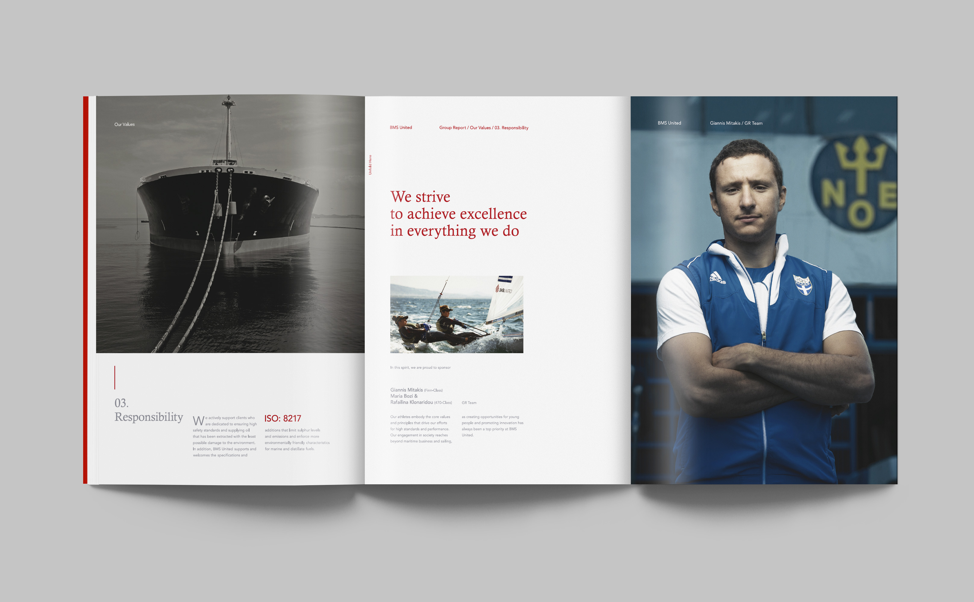
BMS United is a company specializing in supplying tankers and offshore with fuels and lubricants. We were assigned with redesigning a corporate annual, taking into account the understanding of the financial elements of the company by a wide audience.
The aim was to create an annual report that renders the financial elements of the company clear and comprehensible to the reader – whether he is specialized in the area or not – as well as the rest of the information about the company while renewing the corporate identity through a multipage bulletin.
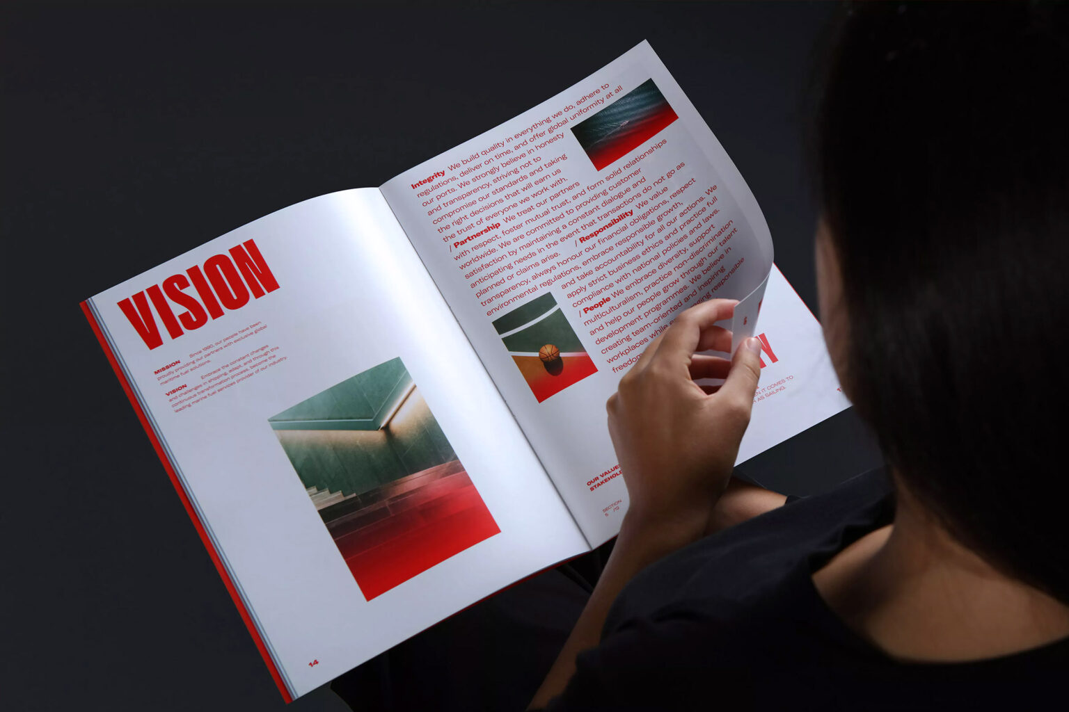
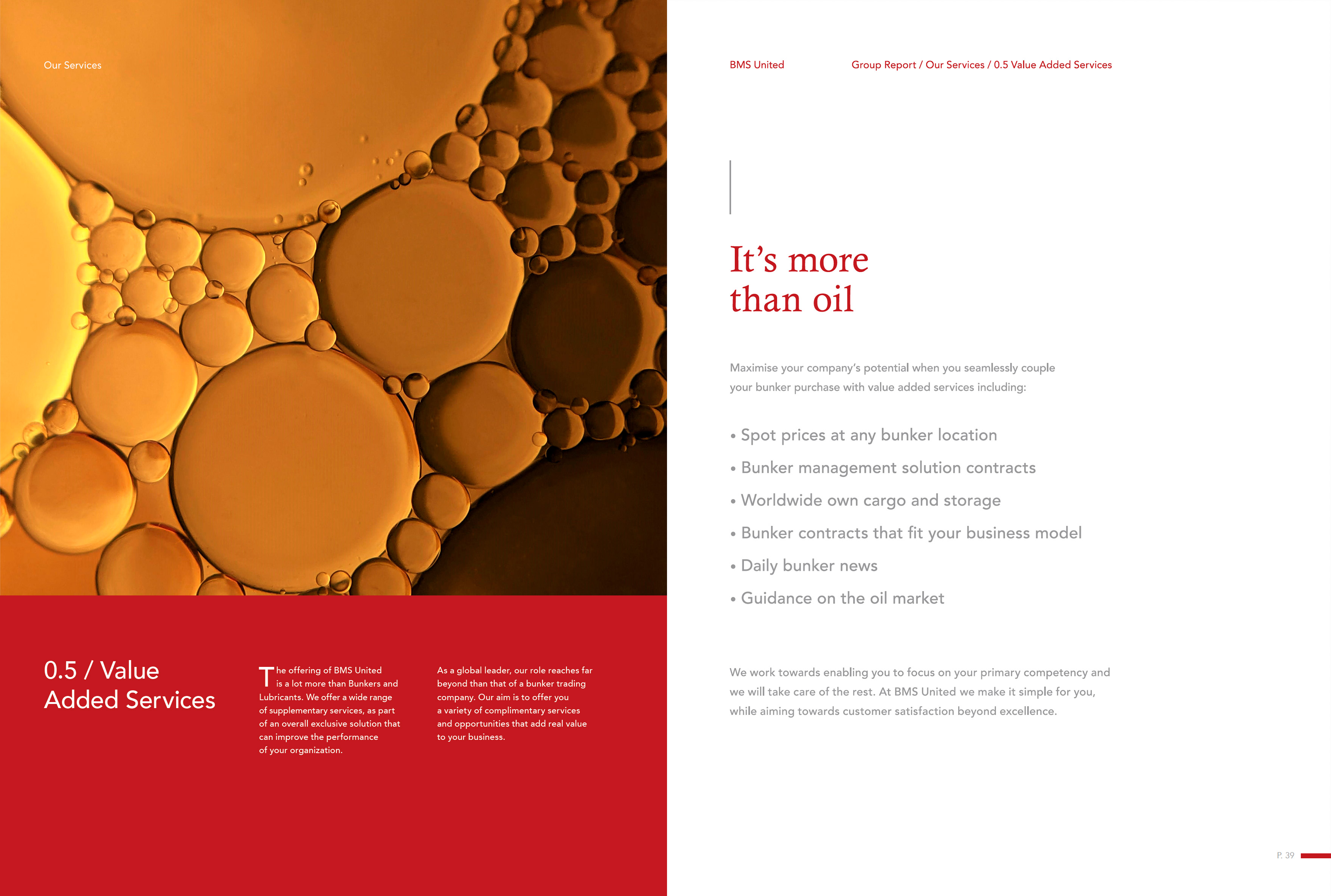
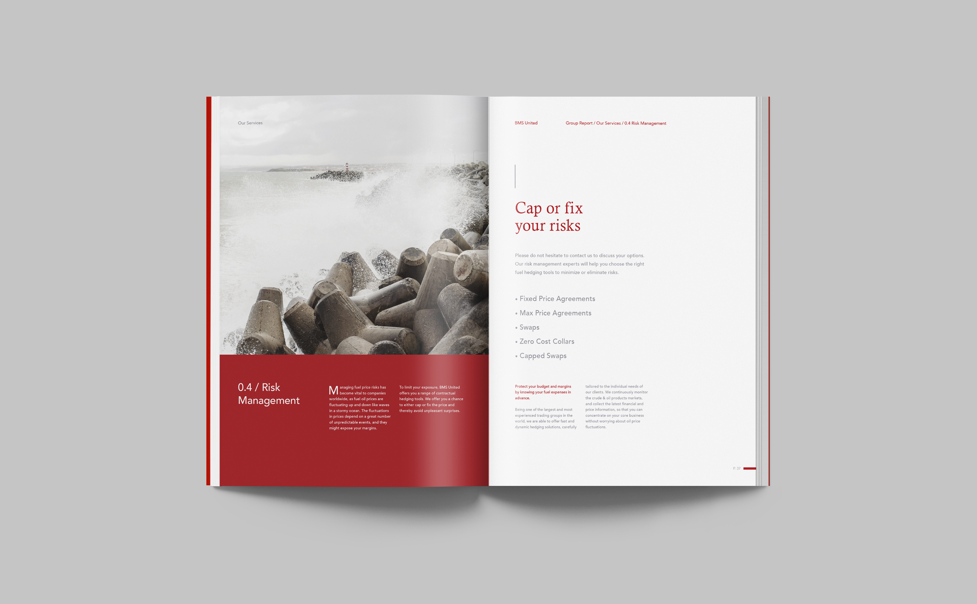
With a keen eye for the easy reading and understanding of the bulletin from a wide audience, the solution came through the clarity of the selected typography, expressing the severity of the specific company breeds, and through the right choice of colors in combination with the printing technology used.
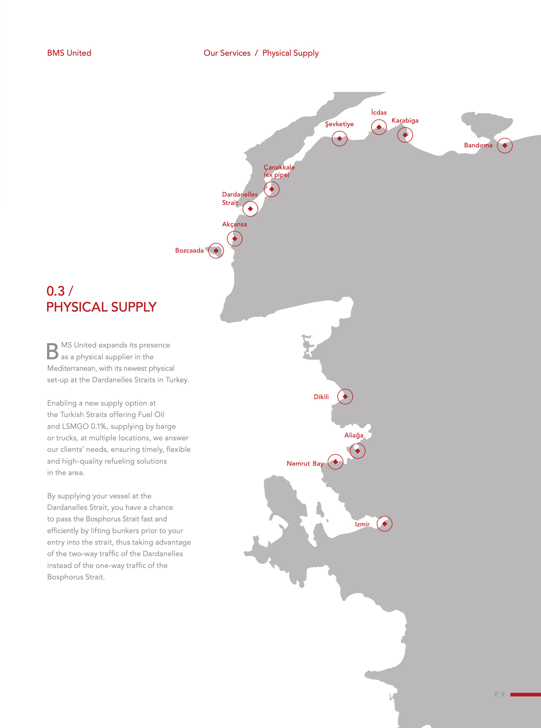
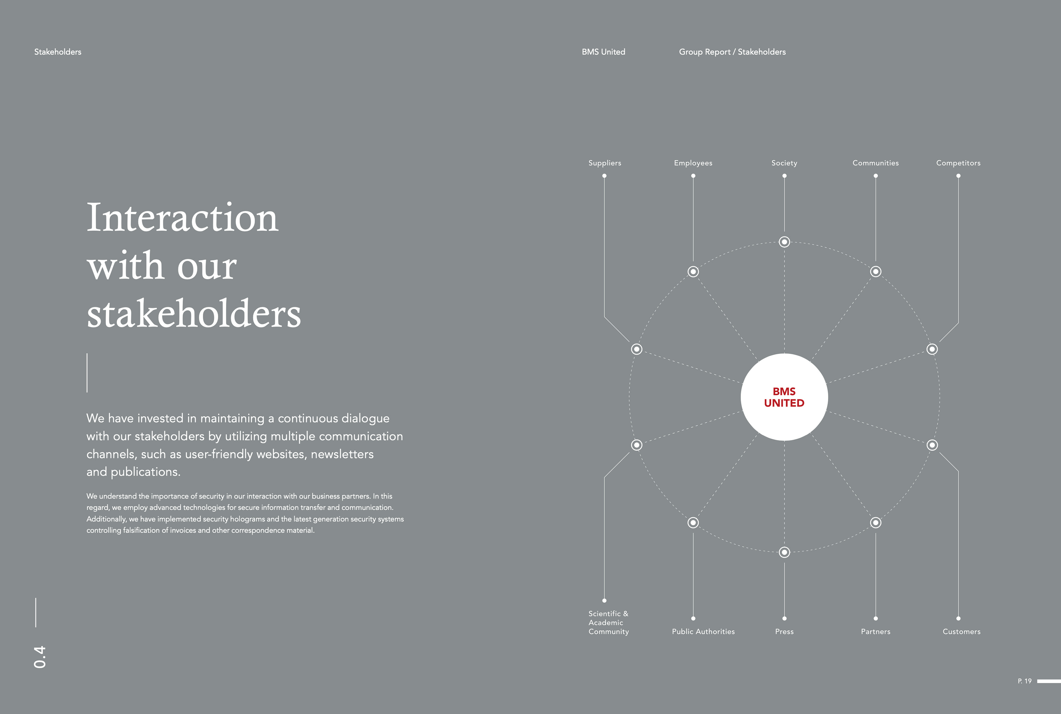
Starting with the cover, we chose a special rough paper to project the modern design but also the industrial nature of the specific area. In the interior, two-fold appear that act as a surprise for the reader while giving the necessary breathing space to the custom infographics designed to depict all these financial elements.
The right selection and editing of the photographic material were vital for the completion of the bulletin; using red as a main corporate color on our palette, while denuding the pictures from unnecessary noise and giving them a particular style, they effectively stand next to the intense typography without confusing the reader. All the above was presented optimally by special inks and high-quality paper, equal to those used by museums to present their works of art, thus giving an additional, even collectible value to the bulletin.
THE SOLUTION CAME THROUGH THE CLARITY OF THE SELECTED TYPOGRAPHY
EXPRESSING THE SEVERITY THE SPECIFIC COMPANY BREEDS.
SELECTING AND EDITING THE PHOTOGRAPHIC MATERIAL WAS VITAL
TO THE COMPLETION OF THE PUBLICATION, WHICH FEATURES A RED GRADIENT EFFECT, COMMUNICATING THE COMPANY'S RENEWED IDENTITY.
RELATED PROJECTS