-
SERVICES:
- Label design
- Concept
- Production overview
-
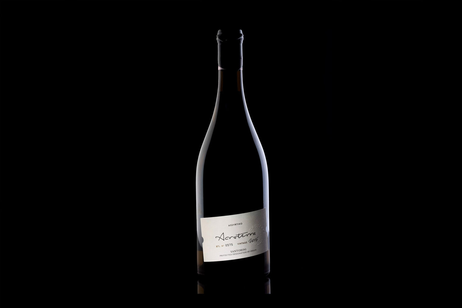
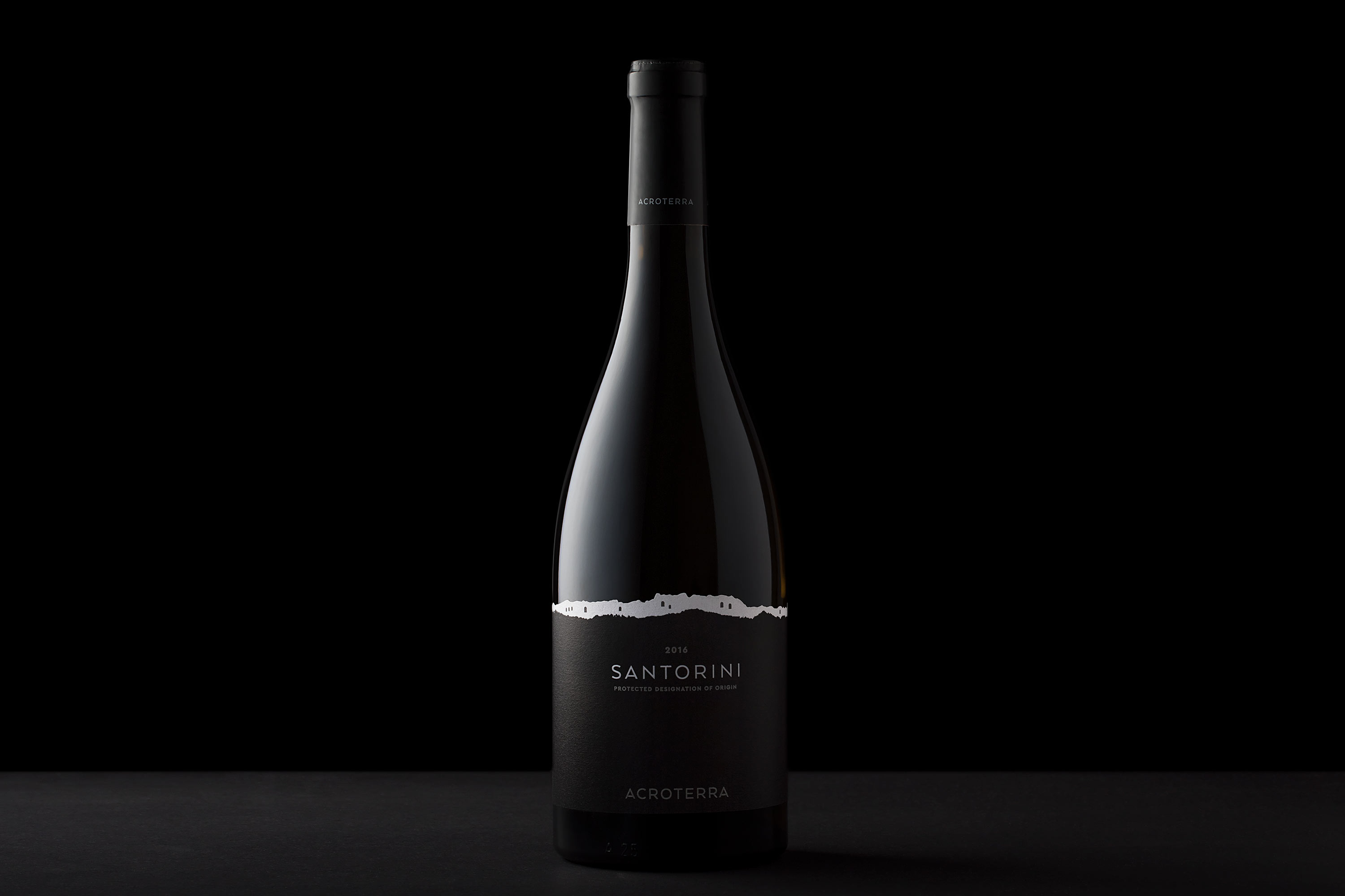
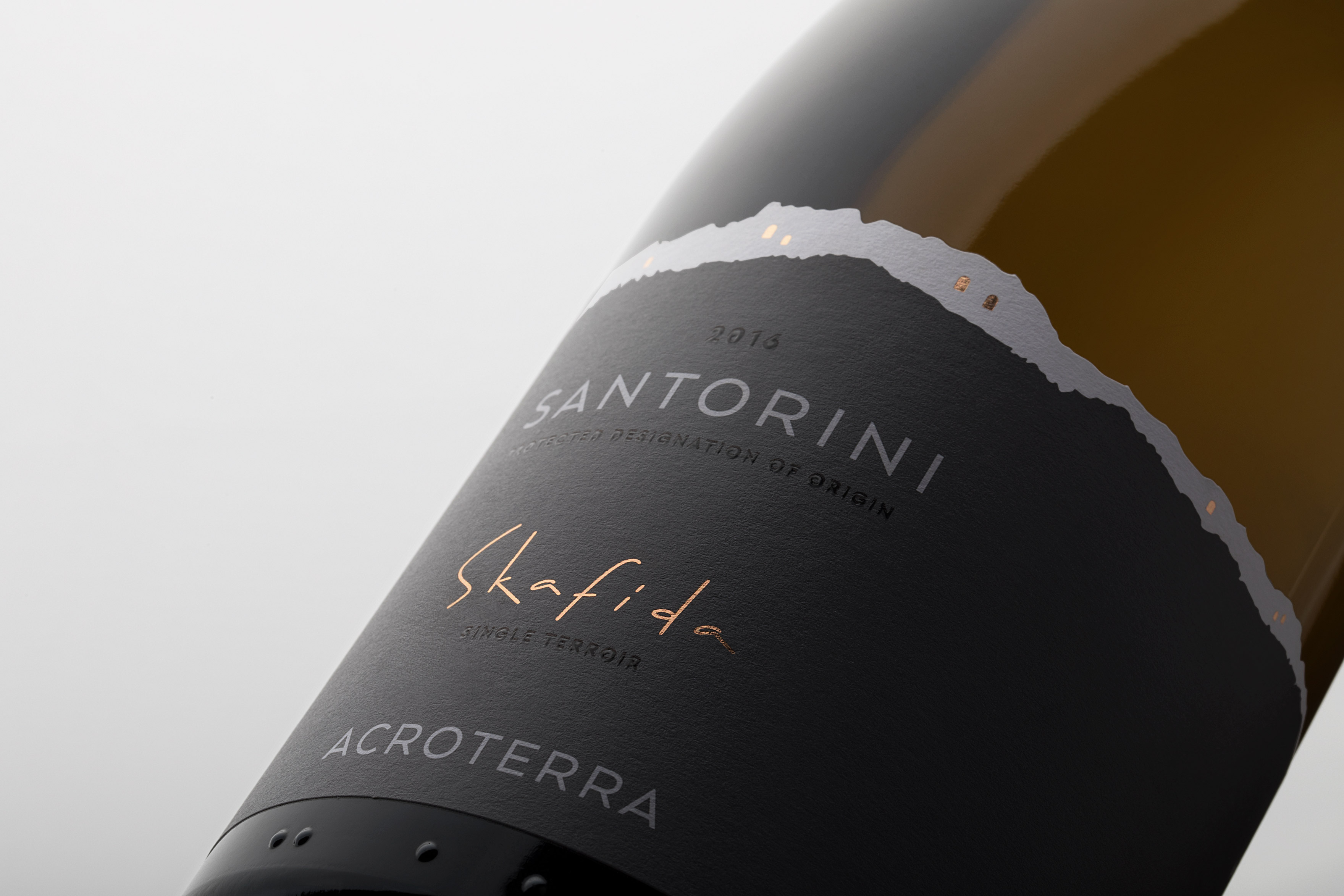
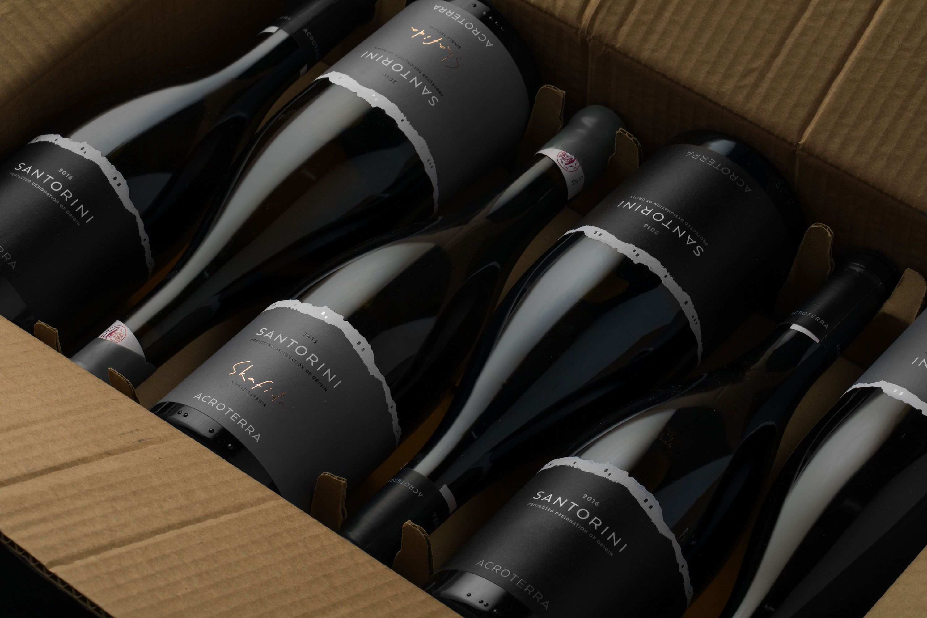
Acroterra winery was created by two young greek wine professionals, the oenologist Apostolos Thimiopoulos and the viticulturist Spyros hrysos, with knowledge, passion, and incredible love for wine. the Acroterra Santorini reflects the tradition and heritage of a wonderful place.
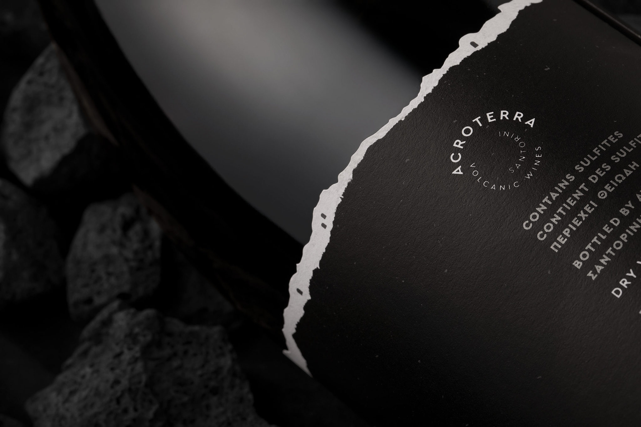
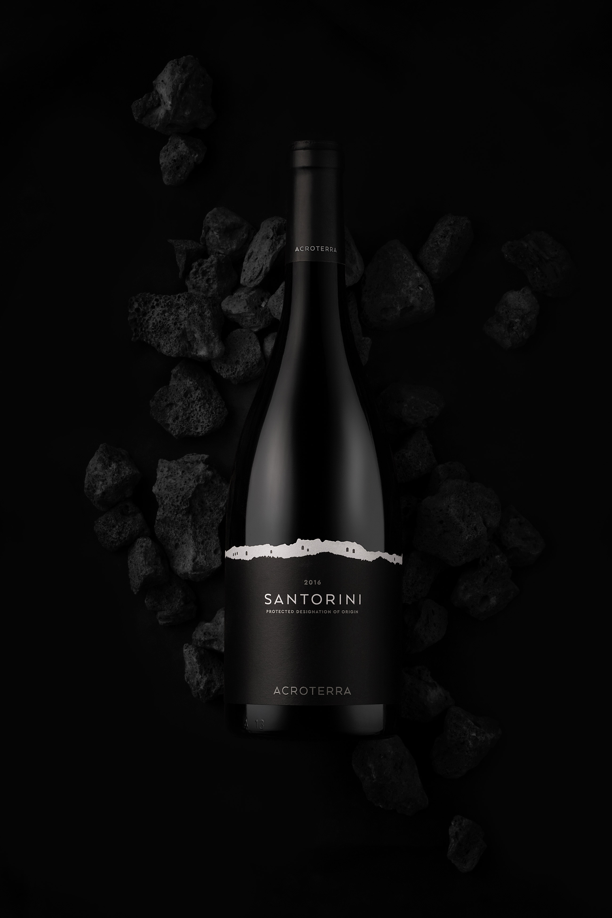
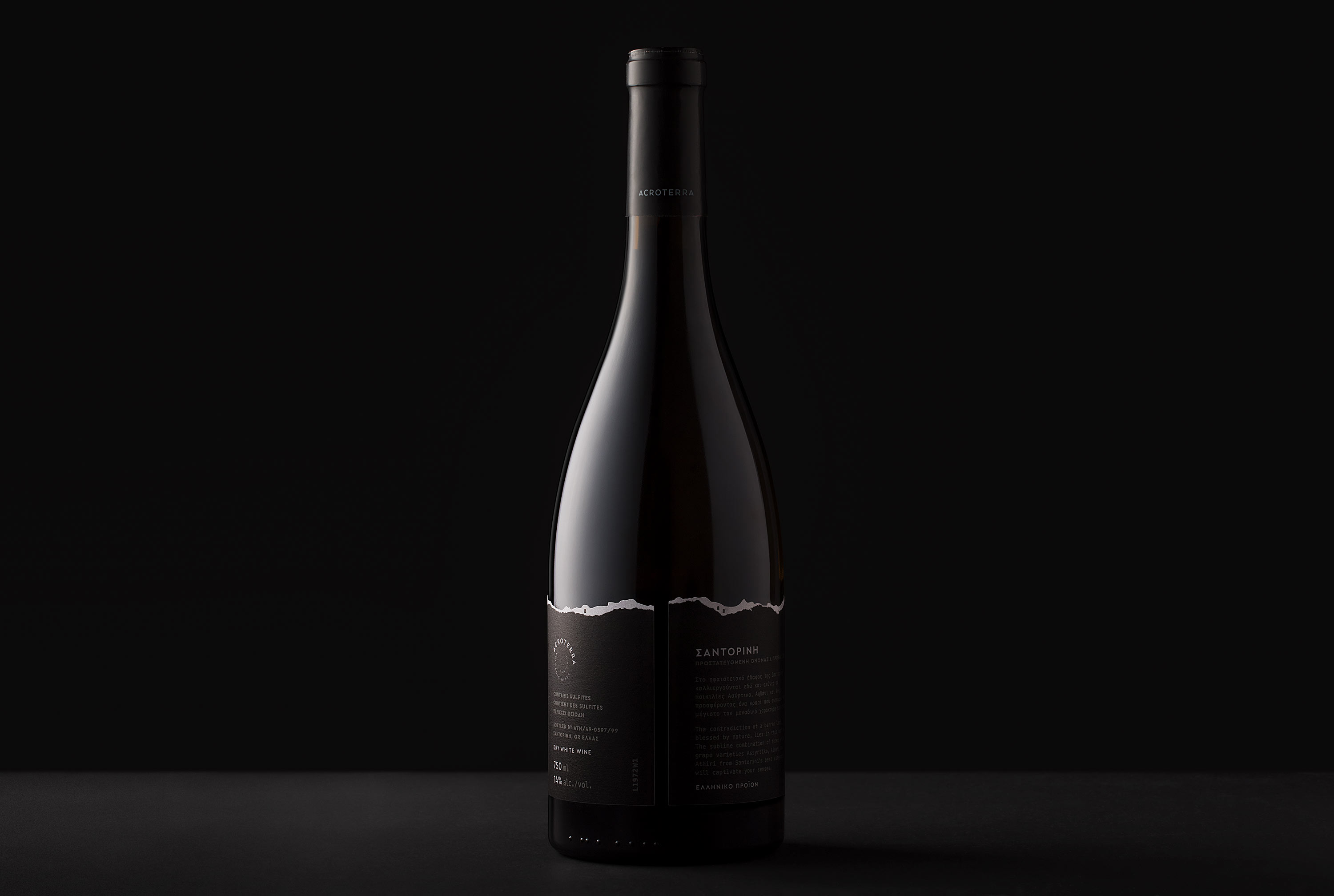
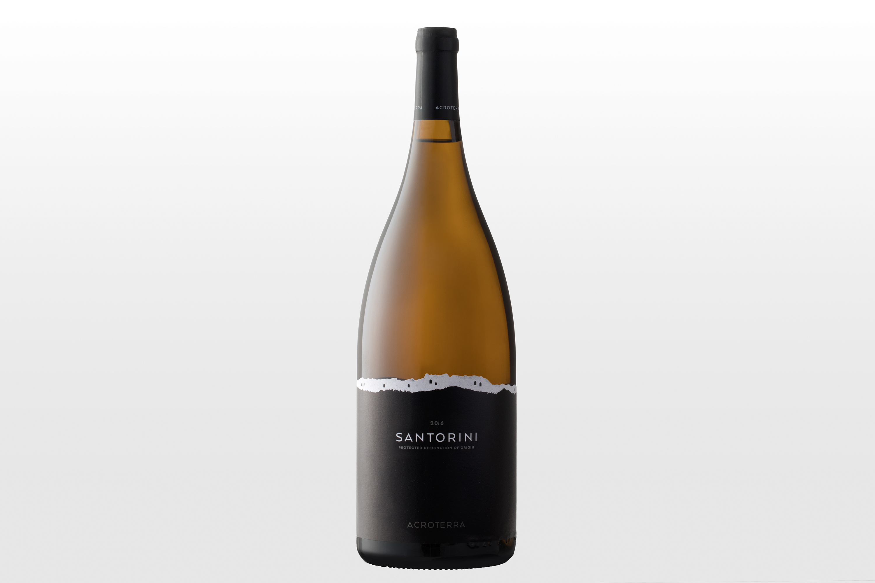
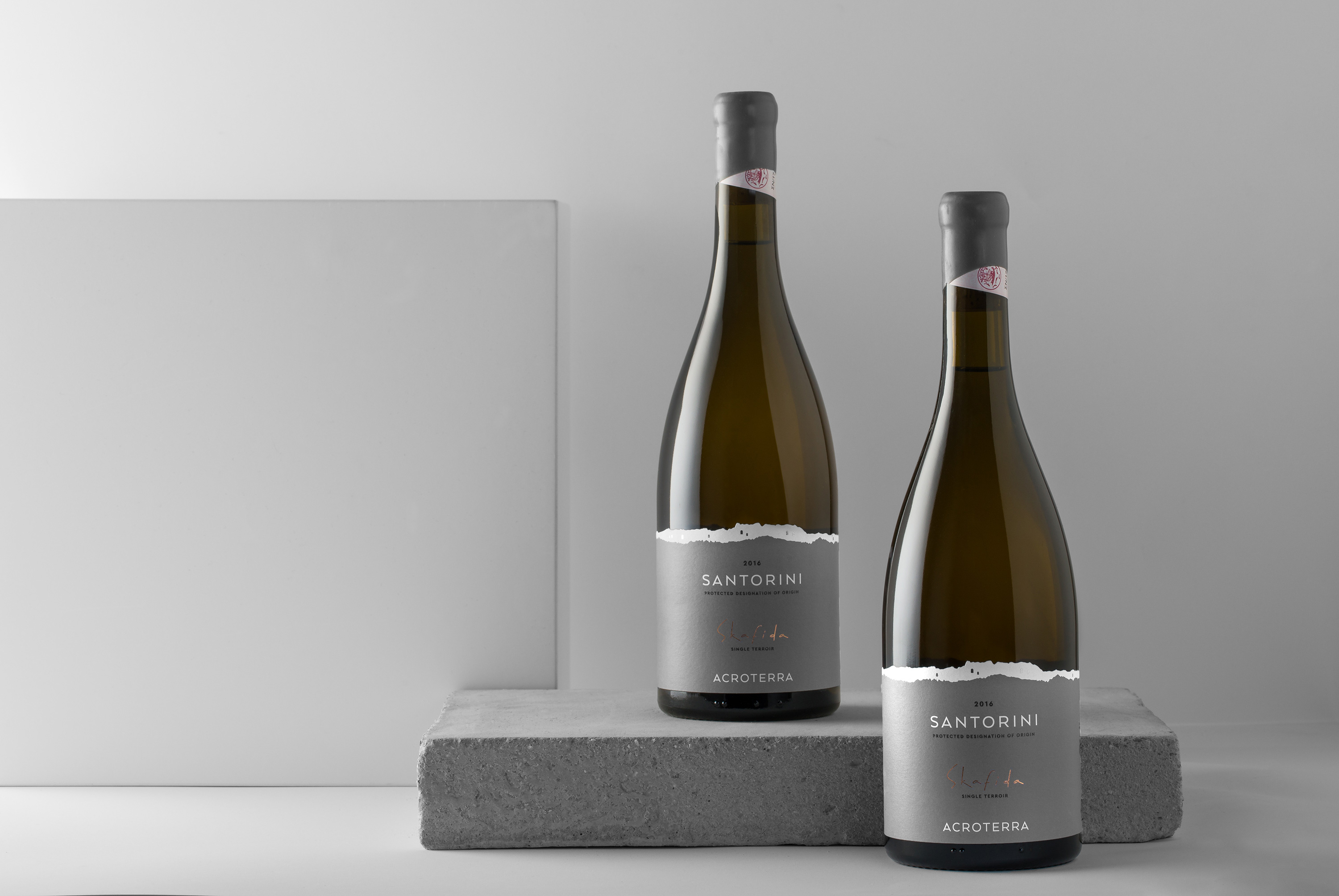
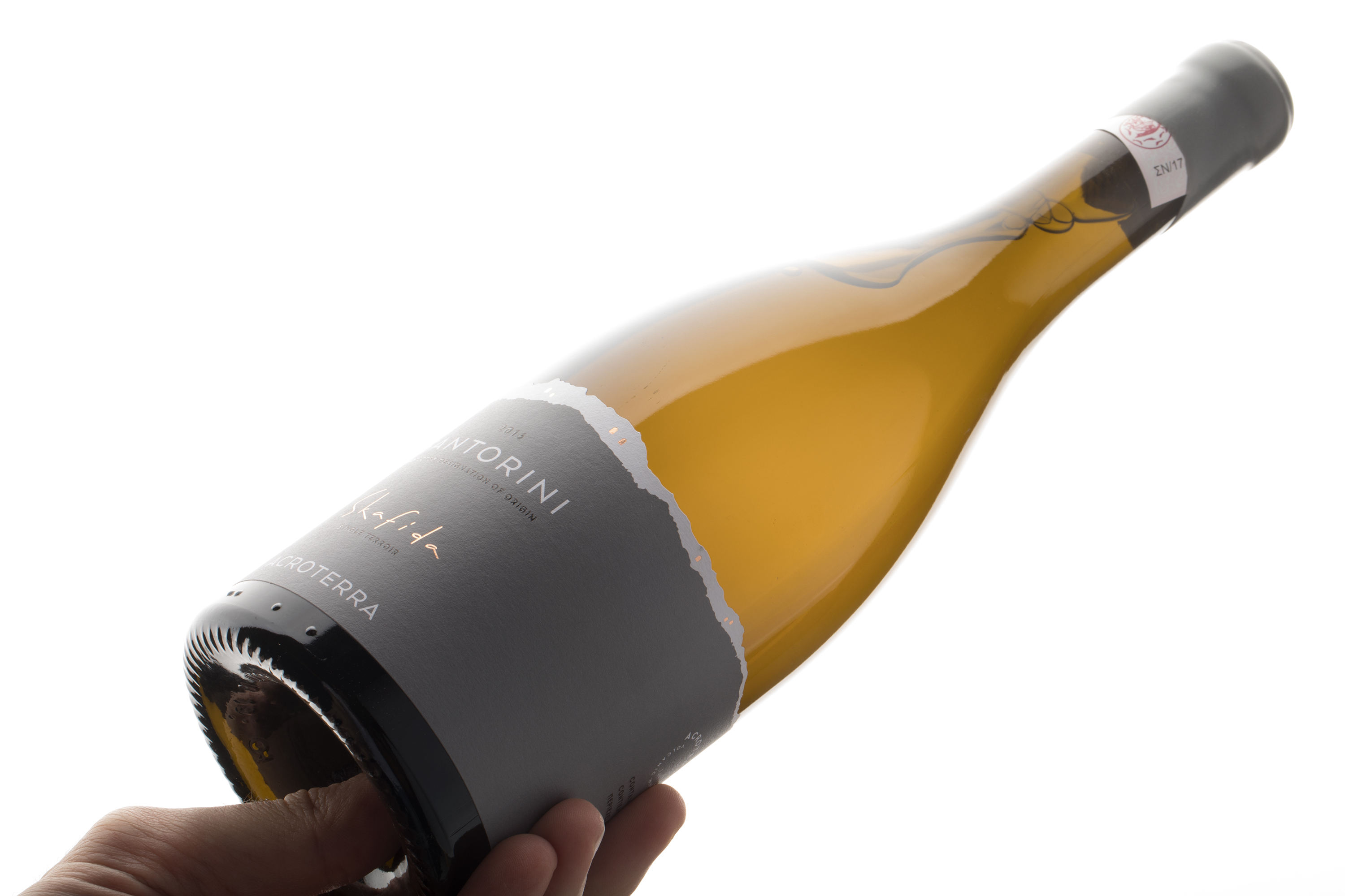
“Santorini Island in a bottle”. The most characteristic feature of Santorini is the white ridge that is created at the upper point of the island, as its black, suburban rock stands out.
We wanted to present both the color and the volumetric contrast of the place, as well as the connection of the material of the paper (label) with the name and place of origin of the wine (Santorini), so we attributed the white ridge through the “virtual” tear of the black label, letting its white disguise to emerge – which is no other than the characteristic white settlements of the island.
The scattered black geometric shapes, which extend around the bottle and hence of this white “ridge”, suggest at α glance the characteristic Cycladic architecture.
The aim of the design as a whole was to create a dramatic, non-chattering label which at the same time shows the maximum natural beauty of this natural landscape, in the simplest possible way.

WE WANTED TO PRESENT BOTH THE COLOUR AND THE VOLUMETRIC CONTRAST OF SANTORINI

RELATED PROJECTS